ON THIS PAGE:
P2 Explorer 4.5 addresses the need for users to build their own Explorer pages and trends. With the addition of two critical components, the Performance Curve and the Embedded Trend, Studio’s Toolbox has a comprehensive set of controls, enabling you to create the pages that you need, in order to optimise the way you display your data.
Explorer 4.5 offers a more usable Design Mode, and a Display Mode that makes it simpler for users to navigate through the displays, and easier to understand data and trends. Navigation has been streamlined to give a better user experience, allowing users to link to pages, trends or related information on external URLs through hyperlinks or drill-down charts on pages, as well as view a trend or point details of data displayed on pages. Workspaces are easier to work with than before, and the ribbon tabs have been consolidated.
Patch Release 4.5.2 introduces a new Text Input component, plus a variety of enhancements to the trend, performance curve, triggers, and printing as suggested by customers. It also addresses several other issues raised through P2 Customer Support.
Text Input Component
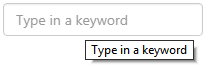
The Text Input component allows a user to type some text or a number that is used as input for a variable. This can be used to change the data displayed on the page, and is retained in snapshots and page links.
This can be used for a variety of situations, such as allowing the user to filter a dataset based on description.
The variable is bi-directional, meaning that it will update other variables on the page if the text input changes, and the text displayed in the input box will also change if something else changes the variable value (such as a value from a combo box).
In Design Mode
In design mode, the page designer simply specifies the variable that stores the user-supplied input, and some text that appears as a tooltip as well as a placeholder inside the input box.
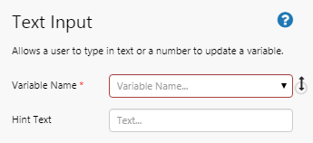
The default value for the variable can be specified using Page Defaults, and both Text and Number data types can be used.
Style designers can change the font size, family, weight, alignment, and case of the input text and placeholder text. Note that the colour can also be changed for the input text, but placeholder text will always be grey regardless of the colour specified in the style.
Performance Curve
The Performance Curve receives a number of feature and usability enhancements for page designers in this release. Some of the enhancements apply to each curve, some of them apply to the performance curve as a whole, and some of them apply to both.
|
Legend: There is now a ‘Show Legend’ check box, which allows you to display a legend below the chart, showing the name and colour of each curve. |
 |
|
Name: You can specify a name for each curve, which will appear in the legend. Only curves with an explicitly defined name will appear in the legend. |
 |
|
Colour: You can specify the colour of each curve, rather than colours being automatically allocated. |
 |
|
Line Thickness: You can change the thickness of each curve. Use 0 to hide a curve, or specify any number of pixels to make the line as thick as you want. |
 |
|
X-Min and X-Max: The previous Min and Max fields have been renamed to X-Min and X-Max. These now apply to both the whole Performance Curve and to each Polynomial Curve (does not apply to XY curves). When applied at the Performance Curve level, it determines the scale on the X-axis. When applied at the individual curve level, it reflects the leftmost position on the x axis that the curve starts and the rightmost position that the curve ends. |
 |
Step: This has been removed from the Performance Curve. Instead, the optimal value is calculated for each curve, based on the curve’s X-Min and X-Max values.
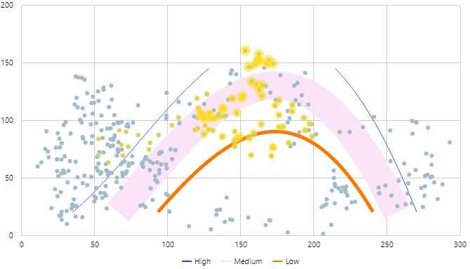
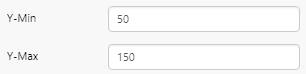
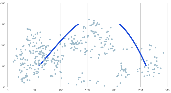
Y-Min and Y-Max: These new limits apply to both the whole Performance Curve and to each Polynomial or XY Curve. When applied at the Performance Curve level, it determines the scale on the Y-axis. When applied at the individual curve level, it determines what parts of the curve to display, and will only show the portion that appears between the specified minimum and maximum values on the Y scale. In the example below, the curve only appears between 50 and 150 on the Y axis.
 |
 |
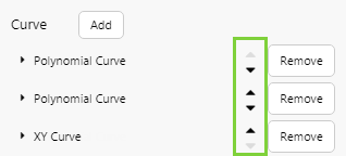
Re-ordering curves: You can now re-order curves in the editor by using up/down buttons.
Trend
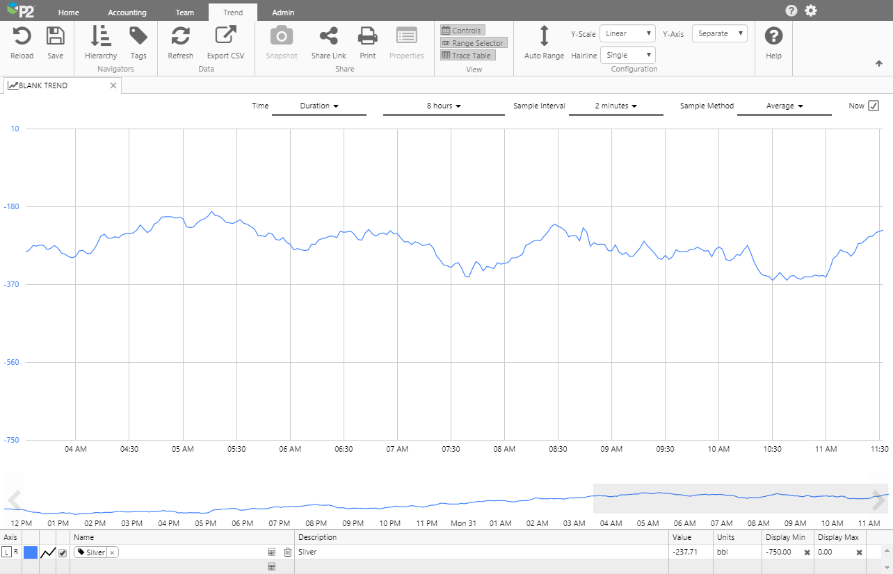
The trend has received a substantial facelift in order to maximise the size of the trace window, which was one of the most significant feedback items we received from a number of customers during our annual Customer Advisory Board workshop.
Trace Table
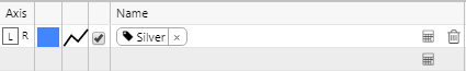
The amount of space taken by the trace table has been significantly minimised. The table will now only take as much space as is required to show all the traces, plus a blank row for adding new traces. The trace table will grow as needed up to 8 rows, and then will display a scrollbar if there are more than 8 traces.
The Axis column has been moved to the far left, and a Delete  icon has been added to the trace name. To remove a trace, click this Delete icon or highlight the row and press the Delete key.
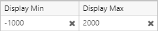
Changing the Display Min and Display Max values no longer requires a double click. Clicking the  to clear a custom value will return the value to that set by the tag.
The toolbar containing the Add Trace button, and other options, has been removed. The Add Trace button is no longer needed as an additional blank row will always be present in the trace table to add a new trace, and the other options have been moved to the ribbon (see below).
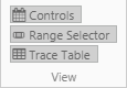
Controls in the Ribbon
In the ribbon, the existing View buttons (Controls, Range Selector, Trace Table) have been compacted to stack vertically.
The following controls have been moved from the trace table and the trace window, providing a single point of configuration for the entire trend.
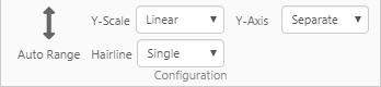
From the trace table: Auto Range, Y Axis, Y Range
From the trace window: Hairline (renamed from Hairlines), Y Scale (renamed from Y Scale Type)
The New Calc  button has also been removed from the Trend ribbon, as this functionality is now available using the Calculation Editor in the trace table.
Performance Improvements
This release sees some changes to the way the trend renders traces, to improve load times.
The trend will now open with a duration of 8 hours as the default timebase, instead of 1 week. This is configurable in the web.config file (DefaultTrendDuration).
To prevent overloading the trend with too much data, the available Sample Interval will now change depending on the selected timebase. For example, if the timebase spans 4 weeks the smallest sample interval available will be 20 minutes. But if the timebase spans 1 day, the smallest Sample Interval available will be 10 seconds. This responsive sampling behaviour is designed to prevent accidental loading of too much data when a user modifies the sample settings, and better reflects the actual sampling combinations likely to be used to produce useful results.
When displaying raw data, the trend will limit the timebase to 8 hours, however this can also be changed in the web.config file (MaximumRawDuration).
Keyboard Shortcuts
You can now use the following keyboard keys and shortcuts in the trend:
- Arrow keys: Up and down arrows will move the selected item in the trace table.
- Delete: Remove a trace from the table.
- Esc: Cancel out of whatever you are editing.
- Spacebar: Use the spacebar as a toggle to show or hide a trace.
Range Selector
The highlighted section of the Range Selector is now aligned to the end of the time range by default. The height of the Range Selector has also been reduced, to allocate more space to the trace window.
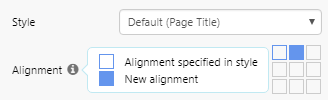
Override Alignment from Style
Alignment of a component is normally defined as part of the style for a component. In some situations, it is desirable to use a different alignment than what is defined in the style, especially when they are used in a Grid Layout.
A typical example is a Text Label, where the alignment in the style might be specified to be top-left. However, in some cases the page might look better if the alignment was top-middle, for example. Previously, a new style would have had to be created to cater for this special circumstance.
In this release, page designers can override the alignment defined in a style for a component on a specific page. All other elements within the style still apply, but the designer can now choose a different alignment from the component editor.
An override for alignment is available for all components in which the visual portion does not stretch to fill a grid cell. These include:
- Breadcrumb
- Combo Box
- Comments Button
- Current Data/Time Toggle
- Date Picker
- Date/Time Picker
- Date/Time Range Picker
- Duration Picker
- Data Label
- Hierarchy Picker
- Hyperlink
- Month Picker
- Options Links
- Status Indicator
- Target Label
- Text Label
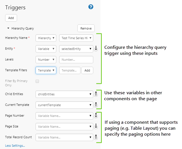
Reporting Structures/Hierarchy Query Trigger
In this release, the Reporting Structures trigger has been renamed to Hierarchy Query, and is now able to be defined and configured from within Explorer Studio. Previously, reporting structures relied on a template structure defined in the Web.config file; this is no longer required.
The Hierarchy Query trigger is designed to produce a list of child entities in a hierarchy, and limits the list by:
- Searching a defined number of levels deep in the hierarchy (e.g. return only the direct children of an entity by limiting the search to 1 level).
- Finding all descendants of a particular type (e.g. find all children of type ‘Well’).
- A combination of the above.
The resulting list is stored in the childEntities variable, which can be used to drive other components on the page, for example to pre-select the entities in an Entity Picker.
A common way of setting up a Hierarchy Query trigger is to specify a hierarchy and starting entity, along with a list of templates and the number of levels down the hierarchy to traverse. This configuration will search for all child entities with one of the specified templates, and the returned list of entities is subsequently used in other components on the page.
The Hierarchy Query also stores the primary template of the starting entity, in the currentTemplate variable. This can also be used to drive the data displayed on a page and is usually reserved for more powerful drill-down analyses.
Pages that used the old Reporting Structures Trigger will be migrated to use the new Hierarchy Query Trigger, however the new trigger may not work as expected. The following fields have been removed:
| Structure | Replaced by the new Template Filters field. Previous reporting structures defined in the web.config file will not be migrated, and must be recreated manually using the Template Filters field. |
| Child Template | Replaced by the new Template Filters field. |
| Current Entity | Removed as this is no longer required. |
| Mode | The new Trigger assumes the All Children mode. The Templated Children mode is no longer available. |
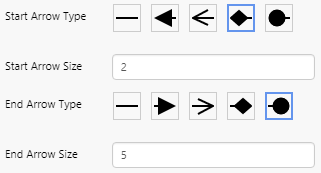
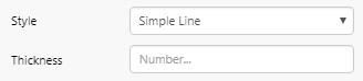
Simple Line
The Simple Line component has been given greater flexibility. Not only can it change direction, it can now also display an arrowhead at the start and end of the line.
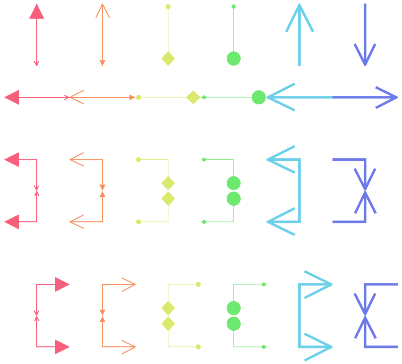
Page designers can define the style of the arrowhead, its size in pixels, and whether it appears at the start or end of the line, or both.
Page designers can now also override the thickness of the line style, within the component editor.
Writing to Tags
If a datasource has been configured to allow writing to the database, right-clicking a component using that data allows users to update the tag’s value at a point in time. For example, right-clicking on a Data Label displays a Write Value option, which allows the user to update the value of the data label at a point in time in the database.
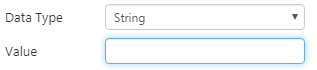
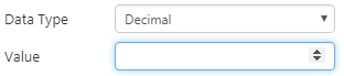
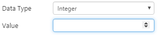
In this release, a field has been added to the Write Value screen that shows the data type, and allows the user to change it if required.
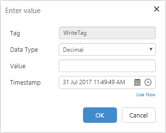
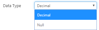
If the data type of the value in the database is known, users have the option of changing the value to a ‘Null’ data type. This is useful in circumstances where a datum is not present at a point in time, and it is important to indicate so.
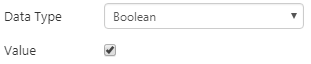
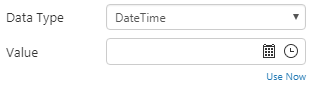
The Value input field also changes to reflect the value’s data type:
|
|
|
|
 |
 |
Precision Layout
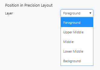
The number of layers for a precision layout has been increased from 3 to 5.
Components on the precision layout now have 2 additional layers to choose from in design mode:
- Upper Middle sits between Foreground and Middle.
- Lower Middle sits between Middle and Background.
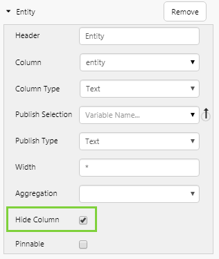
Data Table
In the Data Table, page designers are now able to hide a column.
This could be useful in situations where you might want to set a publishing variable on a column in the Data Table, but not have that column displayed on a page. For example, you might want to set a date/time for a row and use that to drive a chart on the screen in context.
Charts
This release sees 2 minor changes to the Chart components:
- Only series with an explicitly defined name will appear in the legend.
- Null values are now rendered as a gap in the chart.
Print Options
The Print Options have been removed from Page Properties. Printing has been enhanced so these are no longer needed.
Previous Releases
For a complete list of P2 Explorer release notes, see Explorer Releases.