ON THIS PAGE:
- Mentions and Hashtags in Commentary
- Explore Entity Overview and Commentary
- Chart and Embedded Trend Hairline Display Options
- Link Action Components Updating Variables
- Image Flip and Rotation
- Image Conditional Data in Component Editor
- Extra Date Formatting Options
- Meters Showing Limits
- Options to Disable Auto Login
- Data Label Timestamp Option
- Autocomplete for Workspace, Page and Trend Lists
- Previous Releases
P2 Explorer version 4.6.2 is a patch release, with a strong focus on customer requests.
Features and enhancements include: Mentions and Hashtags in commentary throughout Explorer, entity overview in the Explore panel, with links to point details, new chart hairline options, image rotations, and additional date formatting options.
This version of Explorer introduces mentions @ and hashtags # in the commentary.
When adding a comment in Explorer, you can type an at @ symbol, followed by one or more characters, then choose a user from the list of Explorer users that appears.
You can also type in the hash # symbol, followed by one or more characters, then choose an entity from the list of Explorer entities. Entities can also be included in Knowledge Management fields in this way.
Live Preview
When adding a comment, there is now a Live Preview tab below the edit box, showing the entity and user names, if any have been used.
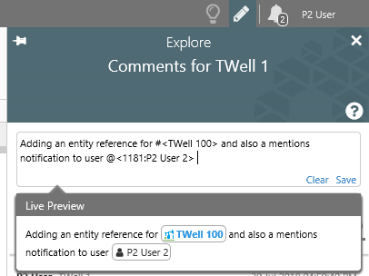
After saving, the pills appear as they did in the Live Preview.
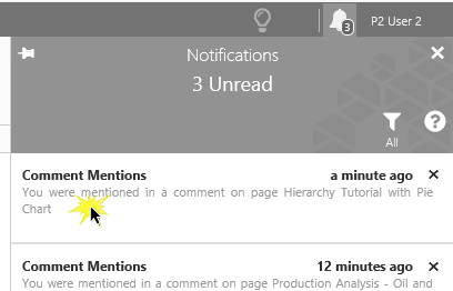
Comment Mentions Notifications
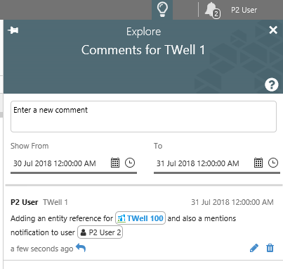
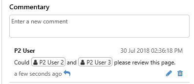
When you add a user to a comment by using the @ symbol, their name appears in a pill in the comment, together with a user  icon.
icon.
 |
| Two users have been mentioned in this comment |
Each of the mentioned users receives a new type of notification, called a Comment Mentions notification.
Here, P2 User receives a new Comment Mentions notification.
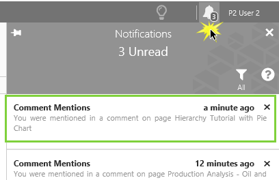 |
| Click the Notifications icon to open the Notifications panel |
 |
| Click on a Comment Mentions notification, to open the Comment mention in the Explore panel. |
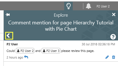 |
| Click on the back button to return to your Notifications panel. |
As the mentioned user, you can also reply to the comment from the Comment mention. Editing and deletion of comments is dependent on whether it is a comment you wrote; otherwise, it depends on the privileges allocated to your assigned roles.
Entities in Comments
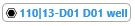
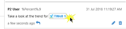
When you add an entity to a comment by using the # symbol, the entity name appears, prefixed by its primary template icon, in a pill in the comment. If there is no icon, then the standard entity  icon is shown. The entity name is in blue, indicating that it is a hyperlink.
 |
 |
| An entity with a well icon | An entity with the standard entity icon |
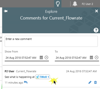
Click an entity pill to open that entity’s overview and commentary in the Explore panel.
Explore Entity Overview and Commentary
When you click an entity pill within a comment or a Knowledge Management field, the Entity Overview and Entity Commentary sections appear in the Explore Panel.
 |
| Clicking an entity pill in a Comment on the Explore panel |
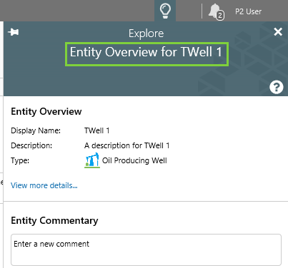 |
| The Entity Overview and Entity Commentary sections appear in the Explore panel |
Click View more details… to expand the Entity Overview section, and Hide details… to collapse it.
The entity’s templates, attribute groups, and attributes appear in a tree view. Navigate by clicking the arrow icons to expand  or collapse
  nodes, and click on the info icon
  next to an attribute to open its Point Details page in a new Explorer tab.
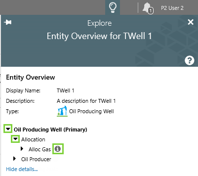
Chart and Embedded Trend Hairline Display Options
When a chart is configured to allow hairlines, the hairline information boxes (pills) are sometimes unnecessary and can obscure other information, especially if the chart is small.
In Explorer 4.6.2, you can now select from the Hairline Display Option drop-down list (when configuring a chart or embedded trend in Studio):
- Show Values And Timestamp (this was previously the default setting for hairlines)
- Show Timestamp Only
- Show Values Only
- None
This feature is especially useful if you want a small chart/trend for selecting the hairline to be used in conjunction with one or more larger charts. For example, you could configure the hairlines on the smaller chart to show values only, and the hairlines on the larger charts to show values and timestamp.
Link Action Components Updating Variables
Components that have a Link Action can now be configured to set one or more page variables, using the new Set Variables Link Action Type.
The Link Action is a function of the following page components:
- Hyperlink
- Hotspot
- Status Tile
- Chart (where the X Axis is a String data type)
Choose from the following Link Action types:
- Open Page
- Open Trend
- Open URL
- New Trend
- Set Variables (new in this version)
When configuring Set Variables for a component, define one or more page variables to be updated when the component is clicked in Display mode.
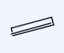
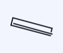
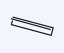
Image Flip and Rotation
Images, including the images in the pre-defined set (such as Crusher, Distiller, Ore Ship) can now be rotated to suit other elements on the page. Choose Flip X to flip the image on the horizontal axis, Flip Y to flip the image on the vertical axis, or set a rotation by typing a numerical value between 0 and 360 into the Rotate edit box (numbers represent degrees).
The image in the example below has been rotated as follows:
 |
 |
 |
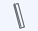 |
| Image with no rotations | Image with Flip X | Image with Flip Y | Image with a Rotate of 90 |
Image Conditional Data in Component Editor
The image component (including images from the pre-defined set) can be configured to display one of several selected images, based on a set of conditions.
In this release, configuring image conditions, in Studio, is now more logical and is easier to read.
1. Define the Comparison data type and operator (e.g. >).
2. Define the Data property.
3. Define the Compare To property.
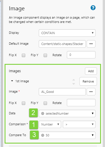
The condition in the example above reads clearly as: if selectedNumber > 50.
Extra Date Formatting Options
Several additional Date Formats are now available for components that include date formatting, such as the Data Table and the Text Label.
The example below shows some of the formatting applied to the Start Date column of this data table’s data:
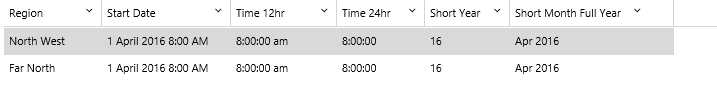
The full list of date and time formatting options is:
- Full Date
- Date
- Short Date
- Time 12hr
- Time 24hr
- Month
- Short Month
- Day
- Hour
- Year
- Short Year
- Short Month Year
- Short Month Full Year
Meters Showing Limits
Several of the meter components can be configured to show limits (such as Low Low, Low, Outside Target, High, etc.).
In earlier versions, the meter could be configured to show the limits when a mouse was hovered over the control. In this version, the component can now also be configured to show limits without hovering.
Options for the new Show Limits property are: Always, On Hover, and Never. Previously, the property was called Show Limits on Hover, and could be set to True or False.
The components that have the Show Limits property are: Temperature Meter, Pressure Meter, Level Meter and Gauge.
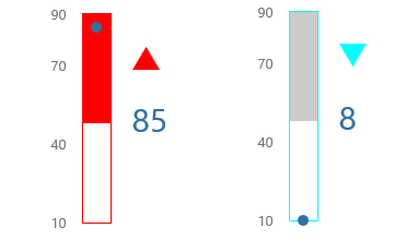 |
| Two pressure meters side-by-side, both with their limits showing |
Options to Disable Auto Login
Explorer now has a configuration option called SecurityAutoLoginIdentityProvider which can be set to Windows or None. The default is Windows.
Previously, a user who was on the domain network could use either forms or Windows authentication. For cases where some users were on the domain and others were not, this caused an issue for the non-domain users when the system automatically attempted a Windows authentication when loading Explorer.
To combat this issue, the new feature allows you to disable automatic Windows authentication when loading Explorer.
- With SecurityAutoLoginIdentityProvider set to Windows, the user is automatically logged in as a Windows user when Explorer is loaded and they are not already logged in. They can still choose to log out and will have both authentication options available on the login screen.
- With SecurityAutoLoginIdentityProvider set to None, both Windows and Forms authentication are available to the user when logging in, but automatic authentication will not be attempted. The user will be presented with the login screen when Explorer is loaded and they are not logged in. Use this option if you have some users who are on the domain network, and others who are not.
Data Label Timestamp Option
In this release, the Data Label component can be configured to show the data item’s timestamp.
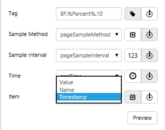 |
| Selecting the Timestamp for tag BF.%Percent%.10 |
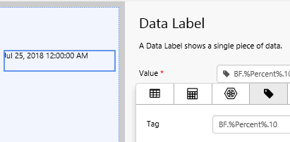 |
| The tag's timestamp appears in the data label |
Autocomplete for Workspace, Page and Trend Lists
In Studio, components such as the Hyperlink component, that can use workspaces, pages and trends in their properties, are now easier to configure as the lists for workspaces, pages and trends are now autocompleted.
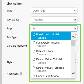 |
| Here we start typing to get a list of autocompleted page names in the Hyperlink component |
Each of the edit boxes using one of these lists has a clear button x. Click this to clear the edit box and start typing in a new name.
Previous Releases
For a complete list of P2 Explorer release notes, see Explorer Releases.