ON THIS PAGE:
Overview
The gauge is used for measuring rates or speeds against defined limits, called alarm thresholds.
The component changes in appearance when limits/alarm thresholds are exceeded.
The measured value and any of the limits can be fixed or variable, using tags, attribute values, dataset values or a fixed or variable value defined in Studio.
For example, you can configure a gauge to compare the actual value of the selected well's flowrate against limits defined for that well, or against tags that contain fixed values for the various limits.
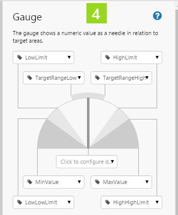
Properties of the Gauge
This section describes what needs to be configured in the Gauge, in three main sections:
- Minimum, Maximum and Limit Thresholds
- Measured Data
- Appearance
|
|
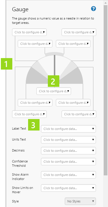
As well as defining the measured values and limits, you can define a label and units, and you can configure whether to show the alarm indicator and the limits.
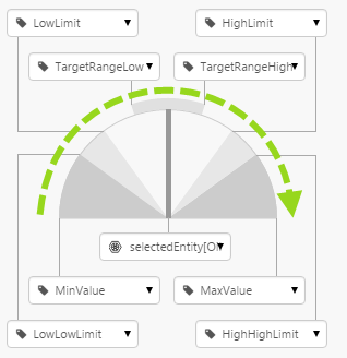
Minimum, Maximum and Limits
Choose values that range from low to high, using the Data Selector for each limit in the property panel.
There are five separate categories of data that you can select for the minimum, the maximum and for each limit: Dataset Column, Ad hoc Calulation, Attribute, Tag, and Value.
Measured Data
Use the Data Selector to configure the data to measure. There are five separate categories of data that you can choose from: Dataset Column, Ad hoc Calulation, Attribute, Tag, and Value.
Appearance
Each of the configuration options can be selected from the five different data categories: Dataset Column, Ad hoc Calulation, Attribute, Tag, and Value, using the Data Selector.
To simplify the explanation, we'll just look at using fixed values.
Label Text: Type a label for the component, which appears on the page in run mode. This should describe the rate you are measuring.
Units Text: Type the unit of measure here. In run mode, the unit of measure (for example, cubic m/s) is displayed next to the value.
Decimals: Type in an integer for the number of decimal places for the measured value.
Confidence Threshold: The confidence value of the measured data is measured against this threshold. Both are percentage values. If the confidence value is below the threshold, the Low Confidence Data Indicator appears in run mode.
Show Alarm Indicator: Select this option (set to true) if you want alarm indicators on the control.
Show Limits on Hover: Select this option (set to true) if you want limits to appear when the user hovers the mouse over the gauge.
Style: The style you want to apply to the Gauge component. If you are a Style Administrator, you can add a new Gauge style.
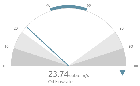
The Gauge in Run Mode
The gauge's appearance is partially based on the configured in the design mode, and partially based on the measured data and the alarm limits.
|
|
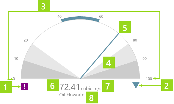
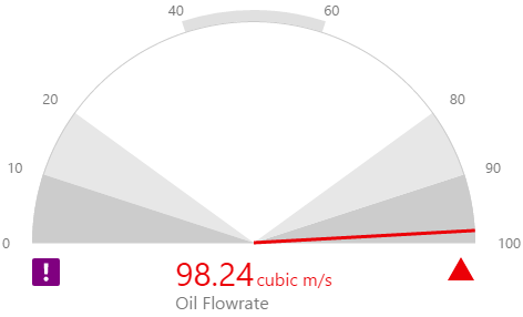
Alarm Indicator
The Alarm Indicator only appears if Show Alarm Indicator is selected. This can be variable, depending on the data that determines this selection.
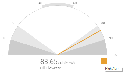
The Alarm Indicator is a coloured symbol representing the current state of the measurement, such as the red triangle on the screenshot below.
Hover over the alarm indicator to see the tooltip.
The symbol depends on what segment the measured value falls into. From highest to lowest segment, here is the key:
| Segment | Alarm Indicator | Symbol | Tooltip | ||
| High High | Red Triangle |
|
High High Alarm | ||
| High | Orange Square |
|
High Alarm | ||
| Outside Target | Blue Triangle |
|
Outside Target | ||
| Target | No Indicator |
|
|||
| Low | Orange Square |
|
Low Alarm | ||
| Low Low | Red Triangle |
|
Low Low Alarm |
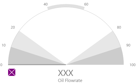
No Data Indicator
The No Data Indicator is a purple symbol that appears next to the High High segment, with the tooltip 'No Data'.
The No Data indicator  appears when there is no data to measure. For example, if the gauge is configured to measure the actual flowrate of the selected entity, and the selected entity does not have this attribute value. Three Xs mark the place where the value would normally appear.
Low Confidence Data Indicator
The Low Confidence Data Indicator is a purple symbol with an exclamation mark that appears next to the High segment, with the tooltip 'Low Confidence'.
The Low Confidence data indicator  appears when the measured data's confidence is lower then the defined confidence threshold. Data confidence threshold is measured as a percentage.
Tutorial
Watch the video below to see how the gauge's appearance changes as the value is updated.
The tutorial describes how to configure the gauge shown in the video.
There are four steps in the tutorial:
- Step 1. Prepare the new tutorial page.
- Step 2. Update the selectedEntity default value.
- Step 3. Add hierarchy, labels and a current date/time toggle.
- Step 4. Add and configure a gauge.
- Pressure Meter tutorial
- Level Meter tutorial
- Temperature Meter tutorial
Step 1. Prepare the Tutorial Page
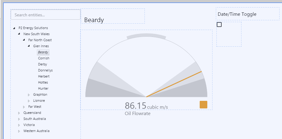
Step 2. Update the selectedEntity Default Value
In this step we're going to assign a value to the selectedEntity page default.
1. Open the Default Values panel.
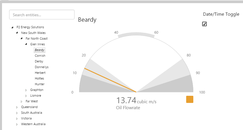
2. Type Beardy in the selectedEntity value text box.

Step 3. Add Hierarchy, Labels and a Current Date/Time Toggle
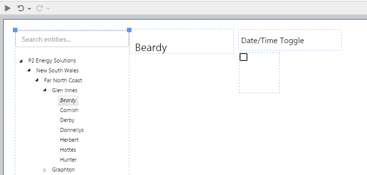
The hierarchy is for selecting a new entity, and the current date/time toggle is to refresh the data on the page. The labels are just for providing context to the page and can be left out, if you prefer.
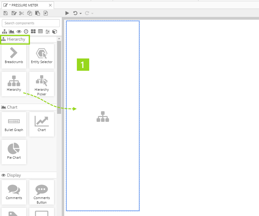
1. Drag a Hierarchy onto the page. Resize it to fit the full height of the page.
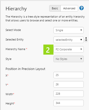
2. In the Hierarchy component's property panel, select P2 Corporate from the drop-down list of avaliable hierarchies for the Hierarchy Name.
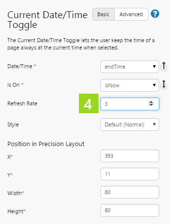
3. Drag a Current Date/Time Toggle onto the page.
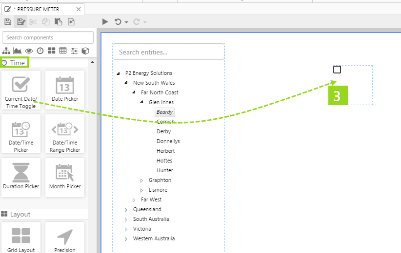
4. In the Current Date/Time Toggle component's property panel, type 3 in the Refresh Rate edit box, so that the page's endTime default is refreshed every three seconds.
5. Drag a Text Label onto the page, to the right of the hierarchy. Widen the label slightly.
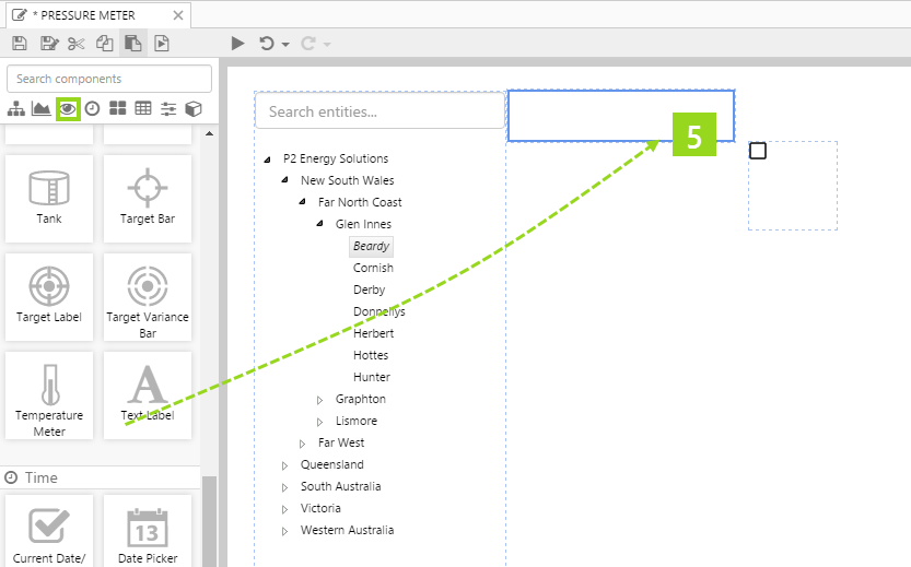
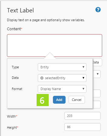
6. In the Text Label component's property panel, add data to the label's Content: the selectedEntity variable.
7. Drag another Text Label onto the page, above the current date/time toggle. Widen the label slightly.

8. In the Text Label component's property panel, type Date/Time Toggle in the Content.

Step 4. Add and Configure a Gauge
- Pressure Meter tutorial
- Level Meter tutorial
- Temperature Meter tutorial
1. Drag a Gauge component to the right of the hierarchy. (If you are using the saved copy of the Pressure Meter/Level Meter/Temperature Meter page, first remove the Pressure Meter/Level Meter/Temperature Meter component, then move the date/time toggle and its label over to the right, to provide more space for the Gauge component.)
2. Click and drag the edges to widen and lengthen the component.
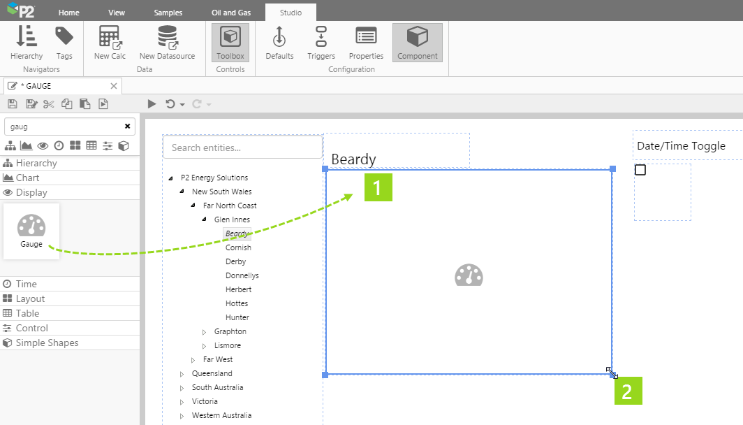
3. Click on the Gauge so that the properties appear in the component's panel on the right.
4. Assign tags to the maximum, limits and the minimum of the component. For each separate property, use the Data Selector to select Tag Data.
|
|
5. Now use the Data Selector to select the selectedEntity's Oil Flowrate!Current Flowrate attribute value, from the Oil Producing Well template, to the measured value's Attribute Data.
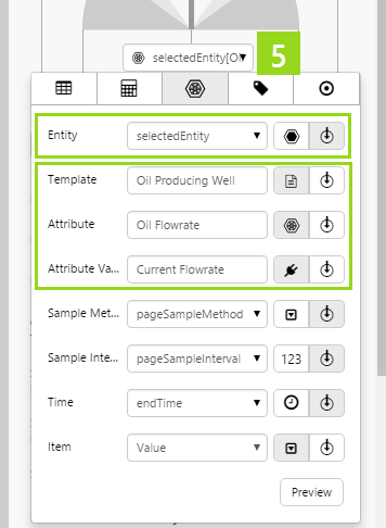
This assigns the selectedEntity's Oil Flowrate!Current Flowrate attribute value to the measured value: selectedEntity[Oil Producing Well]:Oil Flowrate!Current Flowrate. selectedEntity is a variable, which the end-user can change by selecting different entities from the hierarchy on the page.
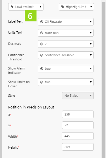
6. Configure the appearance of the gauge. For each separate property, use the Data Selector to select Value Data.
- Label Text: Type in a Value of Oil Flowrate.
- Units Text: Type in a Value of Cubic m/s.
- Decimals: Type in a Value of 2.
- Confidence Threshold: Select the variable Value of confidenceThreshold (this is a page default) .
- Show Alarm Indicator: Select the Value to set it to true.
- Show Limits on Hover: Select the Value to set it to true.
You now have a functioning gauge.
Try out the New Component
- Click the Preview
 button on the Studio toolbar to see what your page will look like in run-time.
 - Select the current date/time toggle so that the data can refresh at the configured refresh rate.
- Select a different entity from the hierarchy, to see how the flowrate changes.
Note how the data updates every three seconds, because of the current date/time toggle.