ON THIS PAGE:
Overview
The Histogram is similar to a bar chart except it groups normalized data into multiple ranges, with each bar representing one range. The fit of the bell curve to the histogram gives an indication of how well the data matches a normal distribution curve.
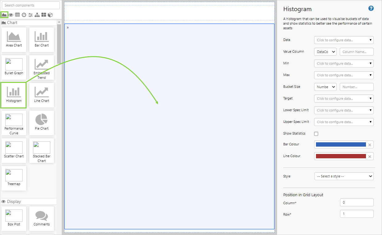
The following diagram shows a Histogram being configured:
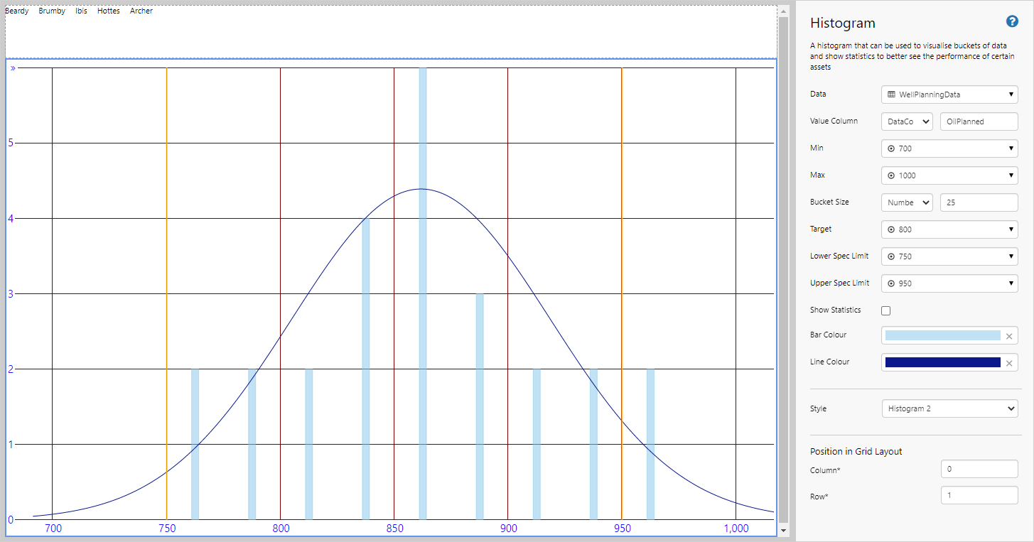
| Data | The source data for the graph. |
| Value Column | The column of the data that will be used to get the values for the component to display. See Filter Column and Filter Value for more information on how this field works with dataset data. |
| Min, Max | The minimum and maximum values for the x-axis. |
| Bucket Size | The interval into which the data is divided. |
| Target | The value aspired to. |
| Lower and Upper Spec Limits | The limits on the optimal data range. |
| Show Statistics | Show or hide the statistics panel on the left side of the plot area. |
| Bar and Line Color | Customize the bar and line colors, or use the default values. |
| Style | The style applied to the graph. Styles can be created and edited by an administrator. |
| Position in Grid Layout | The column and row position of the graph in the grid layout. |
Tutorial: Plotting a Histogram
If you're unfamiliar with the process of building pages, read the article Building an Explorer Page.
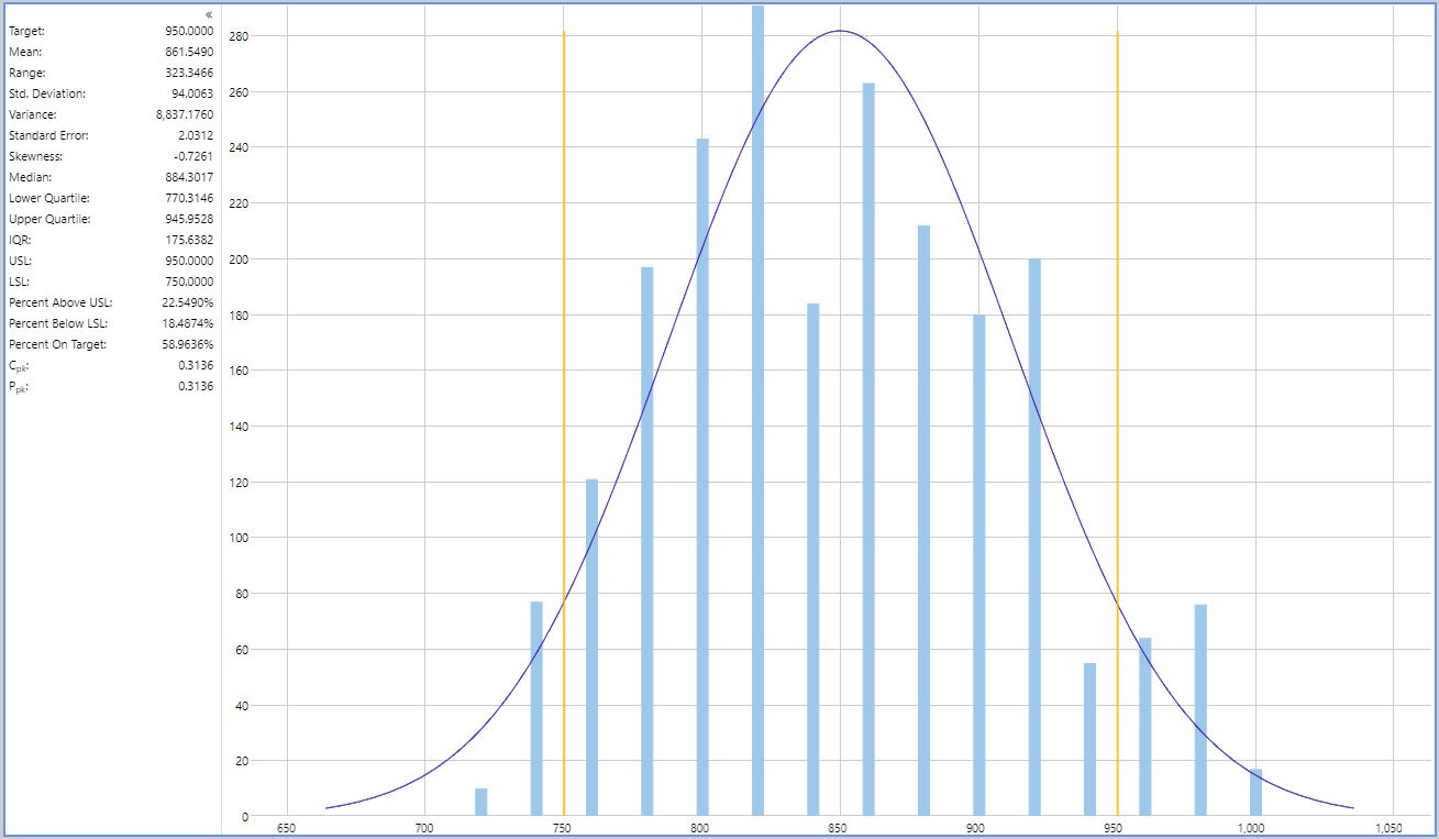
The Histogram is a useful component to display frequency distributions, and their fit to a bell curve. In this tutorial, we’ll show you how to use the Histogram to display your production data. The graph will vary depending on the entity that is selected from an Option Links, and at the end of the tutorial, your page should look something like this:
Step 1. Prepare a Studio Page
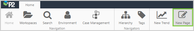
Before you start, click the New Page button on the Home tab of the ribbon. Choose the Grid layout.
- For this exercise, we will use a grid of two rows.
- Remove a column.
- Assign the first row a height of 50.
- Assign a row spacing of 10.
Step 2. Set the Defaults
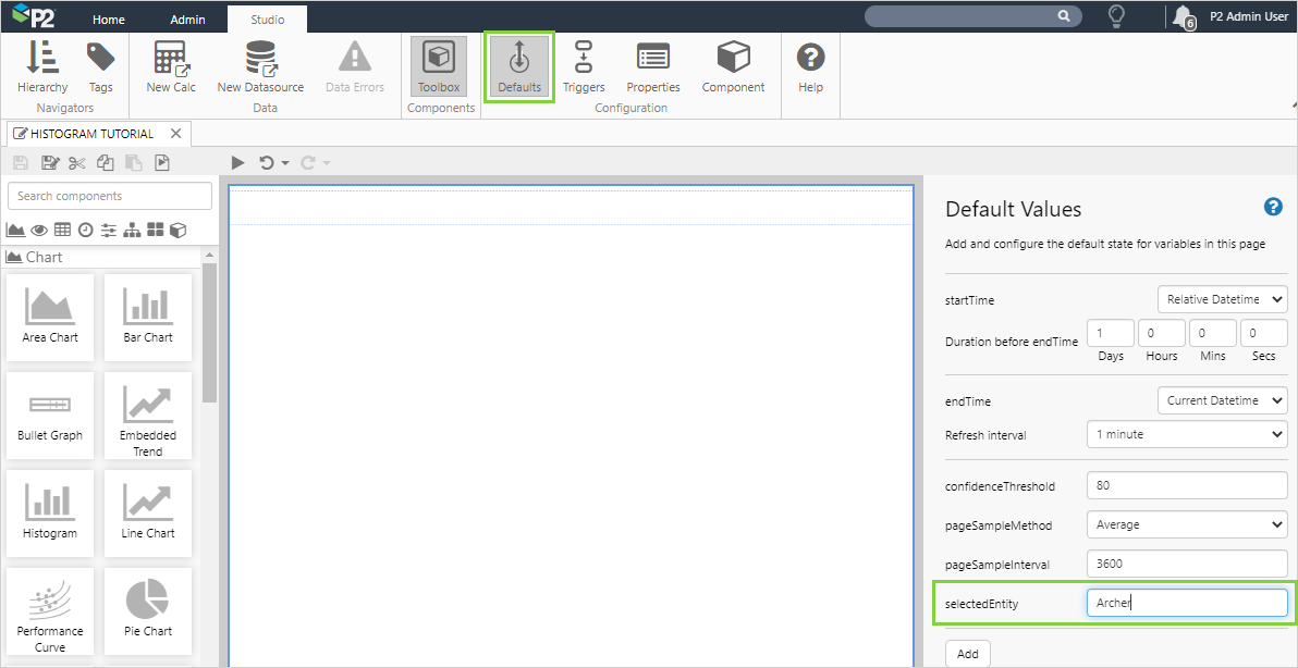
The Histogram displays data for a particular entity. We will use the selectedEntity variable to define the entity of interest.
Although this variable exists as a default value, no value has been assigned to it. We want the initial value of the Histogram to show data for the well, Archer. We can set that here.
- Click the Defaults button in the Studio tab of the ribbon.
- Update the value for selectedEntity to: Archer
In the next steps, when we configure the Histogram, we will see values for the Archer well. If we did not specify the default here, a "No data" message would appear instead of the histogram.
Step 3. Add the Histogram
Drag and drop the Histogram component onto the page. The Histogram is in the Chart ![]() group.
group.
Step 4. Configure the Histogram
In this example, we want the Histogram to change according to the entity selected from the Option Links. Configure the Histogram as follows.
Configuring the Data value:
- Open the Data Data Selector by clicking on the field. Click the Dataset
 tab, and fill in the fields as follows:
| Field | Click This First | Parameter to Enter | Notes |
| Dataset Query | WellPlanningData | Click the Dataset |
|
| EndDate | endTime | Select the variable from the drop-down list. This will adopt the end time configured as the page default. | |
| EntitiesList | selectedEntity | Select the variable from the drop-down list. If it is not available, you will need to type this in. This will adopt the default value for the selected entity, as per the previous step. | |
| StartDate | startTime | Select the variable from the drop-down list. This will adopt the start time configured as the page default. |
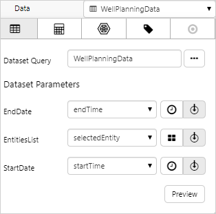
- Click away from the Data Selector.
Click the Preview button to check that you are getting data. If the preview window is blank, you may have filled in a parameter incorrectly.
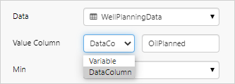
Configuring Value Column:
- Click on the first Value Column field and select DataColumn from the drop-down list.
- Type OilPlanned into the second field.
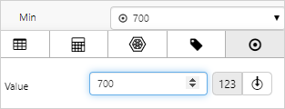
Configuring Min:
- Open the Min Data Selector by clicking on the field. Stay on the Value
 tab.
tab. - Type 700 into the Value field.
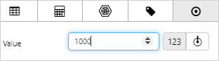
Configuring Max:
- Open the Max Data Selector by clicking on the field. Stay on the Value tab.
- Type 1000 into the Value field.
Configuring Bucket Size:
- Click on the first Bucket Size field and select Number from the drop-down list.
- Type 25 into the second field.
Here we are saying that the data is collected into ranges of values, where the upper limit of a range is 25 units higher than the lower limit.
![]()
Configuring Target:
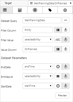
- Open the Target Data Selector by clicking on the field. Click the Dataset tab, and fill in the fields as follows:
| Field | Click This First | Parameter to Enter | Notes |
| Dataset Query | WellPlanningData | Click the Dataset |
|
| Filter Column | Entity | ||
| Filter Value | selectedEntity | You will need to type this in, it will not be available for selection. | |
| Value Column | OilPlanned | See Filter Column and Filter Value for more information on how this field works. | |
| EndDate | endTime | ||
| EntitiesList | selectedEntity | You will need to type this in, it will not be available for selection. | |
| StartDate | startTime |
Configuring Lower Spec Limit:
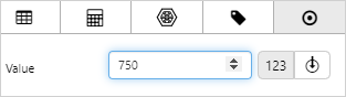
- Open the Lower Spec Limit Data Selector by clicking on the field. Stay on the Value tab.
- Type 750 into the Value box.
Configuring Upper Spec Limit:
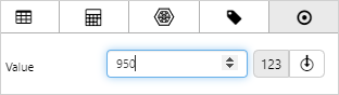
- Open the Upper Spec Limit Data Selector by clicking on the field. Stay on the Value tab.
- Type 950 into the Value box.
Configuring Show Statistics:
- Leave the Show Statistics field selected.
![]()
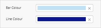
Configuring Bar and Line Colour:
- Click on the field to open the colour selector box.
- Select a colour and click OK.
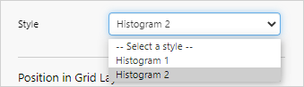
Configuring Style:
- Click on the Style field and select a style from the drop-down list.
The styles change the appearance of the histogram.
Step 5. Add and Configure Option Links
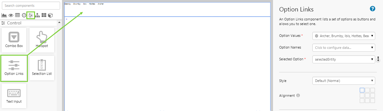
The Option Links will provide a list of entities that the user can select from. The Bullet Graph will change accordingly.
- Drag and drop an Option Links component onto the page.
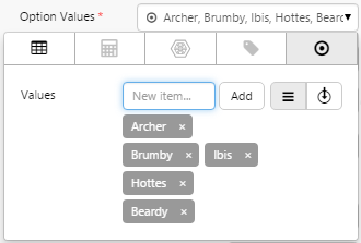
- Open the Option Values Data Selector by clicking on the field. Add the following 5 values: Archer, Brumby, Ibis, Hottes, Beardy.
- For the Selected Option field, choose selectedEntity from the drop-down list.
Step 6. All done!
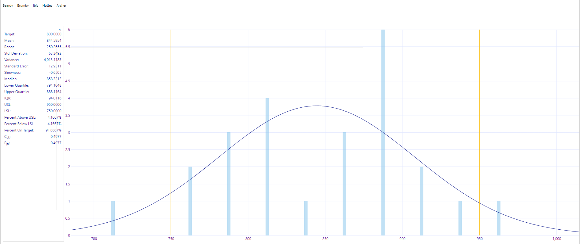
Congratulations! You now have a Histogram that will show you the distribution of your data set.
- Click the preview
 button on the Studio toolbar to see what your page will look like in display mode.
 - Select different entities and observe the changes in the graph.
![]() Don’t forget to save your page!
Don’t forget to save your page!