ON THIS PAGE:
Overview
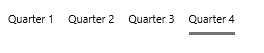
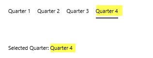
The Option Links component is used for selecting an option, from a row of options. The selected option is underlined, and updates a variable which can be used elsewhere on the page.
Quick Start
You can configure an Option Links component to show fixed values as shown here, where we've configured four Option Values:
- Quarter 1
- Quarter 2
- Quarter 3
- Quarter 4
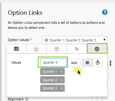
In the component editor, set the Option Values.
- Open the Option Values Data Selector by clicking on the field. Stay on the Value
 tab.
tab. - Type the following values into the Values field, pressing Enter or clicking Add after each entry: Quarter 1, Quarter 2, Quarter 3, Quarter 4.
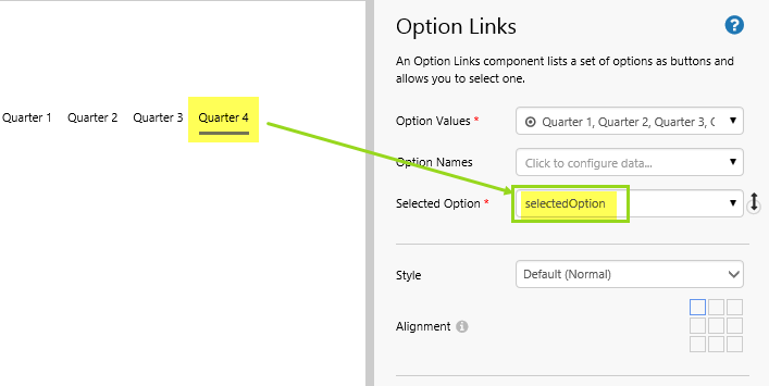
Well done! The Option Links component configuration is complete.
When a user selects one of the options, the variable for Selected Option is updated with the value of the selected option.
Using the Selected Option Variable
To demonstrate how the user-selected option updates the Selected Option variable, we'll show this variable in a Text Label.
We'll use the same Option Links component that we have just configured.
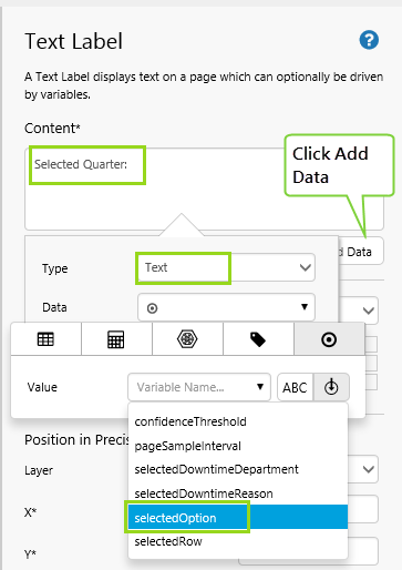
1. Drop a Text Label onto the page, below the Option Links.
2. Click on the Text Label to open it in the component editor.
- In the Content, type Selected Quarter:
- Click Add Data, then add the SelectedOption variable (Text).
Well done! You now have an Option Links that updates a variable shown in a Text Label.
- Click the preview
 button on the Studio toolbar to see what your page will look like in display mode.
 - See what happens to the Text Label when you click on the different options in the option links.
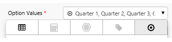
Configuration
The following diagram shows a configured Option Links component:
|
|
Tutorial: Entity Downtime Hours for Selected Downtime Reasons
If you're unfamiliar with the process of building pages, read the article Building an Explorer Page.
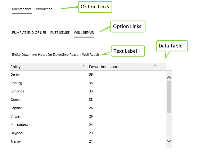
In this tutorial, we'll add two Option Link components, a Text Label, and a Data Table.
At the end of the tutorial, your page should look something like this:
Let’s go through this process, step-by-step.
Step 1. Prepare a Studio Page
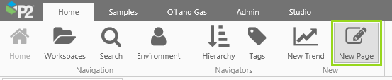
Before you start, click the New Page button on the Home tab of the ribbon. Choose the Precision layout.
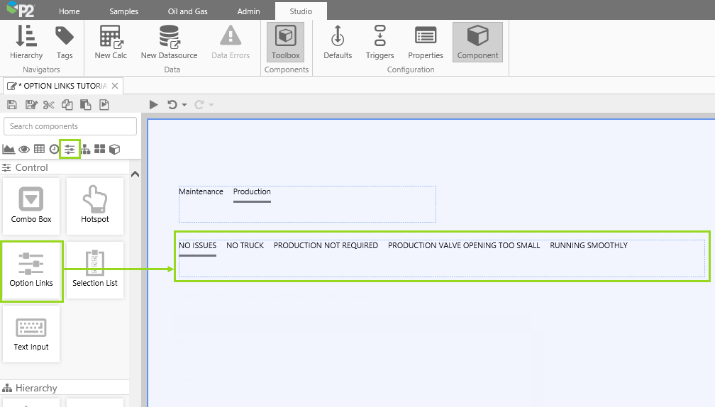
Step 2. Add and Configure an Option Links component
In this step we'll add an Option Links component, and configure it to use downtime departments for its Option Values, and selectedDowntimeDepartment as its Selected Option.
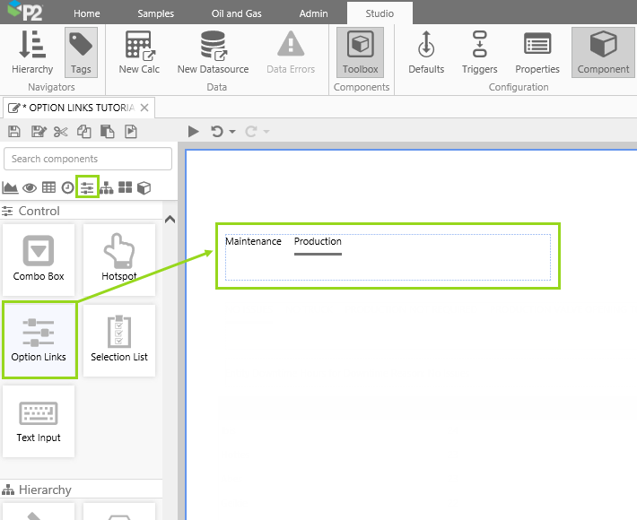
1. Drag and drop an Option Links component near the top left of the page. The Option Links is in the Control  group.
2. Configure the Option Values to use the list of downtime departments returned by a dataset query.
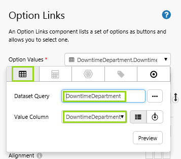
- Open the Option Values Data Selector by clicking on the field. Select the Dataset tab.
- Select the DowntimeDepartment Dataset Query.
- Select DowntimeDepartment as the Value Column.
- Click in the Option Values field again, to close the Data Selector.
This dataset query will return all downtime departments.
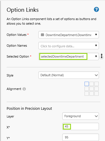
3. Type a variable name selectedDowntimeDepartment in the Selected Option field.
4. Position the Option Links: type 45 in the X edit box.
Step 3. Add and Configure another Option Links component
In this step we'll add a second Option Links component, and configure it to use downtime reasons for its Option Values, downtime display reasons for its Option Names, and selectedDowntimeReason as the variable for its Selected Option.
1. Drag and drop an Option Links component below the first one.
2. Configure the Option Values to use the list of downtime reasons returned by a dataset query.
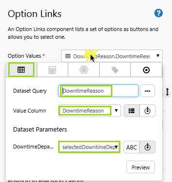
- Open the Option Values Data Selector by clicking on the field. Select the Dataset tab.
- Select the DowntimeReason Dataset Query.
- Select the selectedDowntimeDepartment variable as the DowntimeDepartment Dataset Parameter.
- Select DowntimeReason as the Value Column.
- Click in the Option Values field again, to close the Data Selector.
3. Configure the Option Names to use the list of downtime display reasons returned by a dataset query.
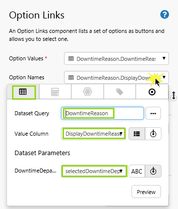
- Open the Option Names Data Selector by clicking on the field. Select the Dataset tab.
- Select the DowntimeReason Dataset Query.
- Select the selectedDowntimeDepartment variable as the DowntimeDepartment Dataset Parameter.
- Select DowntimeDisplayReason as the Value Column.
- Click in the Option Names field again, to close the Data Selector.
The dataset query used for Option Values and also for Option Names will return downtime reasons (and downtime display reasons) for the selectedDowntimeDepartment variable.
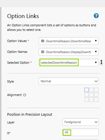
4. Type a variable name selectedDowntimeReason in the Selected Option field.
5. Position the Option Links: type 45 in the X edit box.
Step 4. Add Default Values
In this step we'll add default values for the two Option Links components.
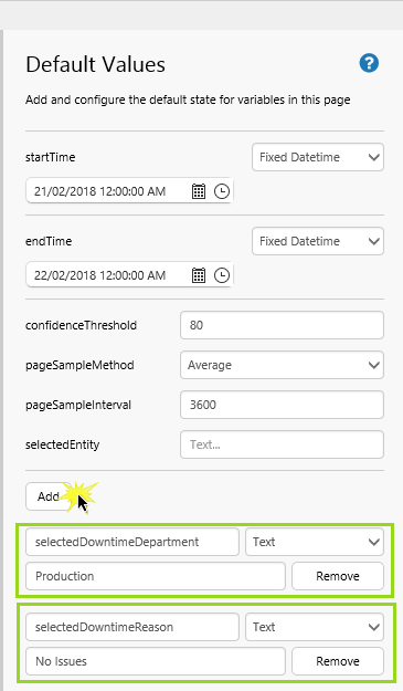
1. Click Defaults on the Studio ribbon tab, to open the Defaults Panel.
2. Click Add twice to add two default values.
3. Configure the first default value:
- Type selectedDowntimeDepartment in the Variable Name edit box.
- Select Text from the drop-down list.
- Type Production in the Text edit box.
4. Configure the second default value:
- Type selectedDowntimeReason in the Variable Name edit box.
- Select Text from the drop-down list.
- Type No Issues in the Text edit box.
Step 5. Add a Text Label
In this step we'll add a Text Label showing the downtime reason variable, selectedDowntimeReason.
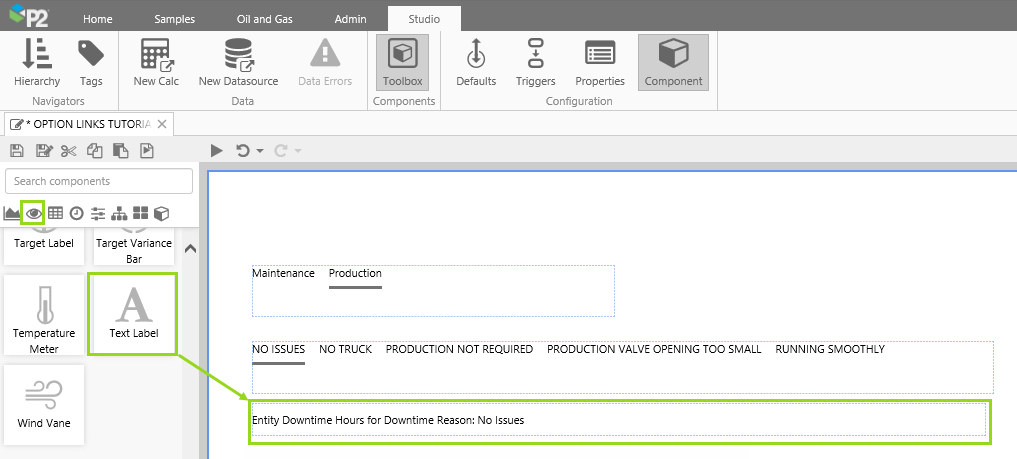
- Drag and drop a Text Label below the second Option Links.
- In the Content edit box, type Entity Downtime Hours for Downtime Reason: then click Add Data and add the selectedDowntimeReason variable.
- Position the Text Label: type 45 in the X edit box.
Step 6. Add a Data Table
In this step we'll add a Data Table showing the downtime hours, per entity, for the Downtime Reason variable, selectedDowntimeReason.
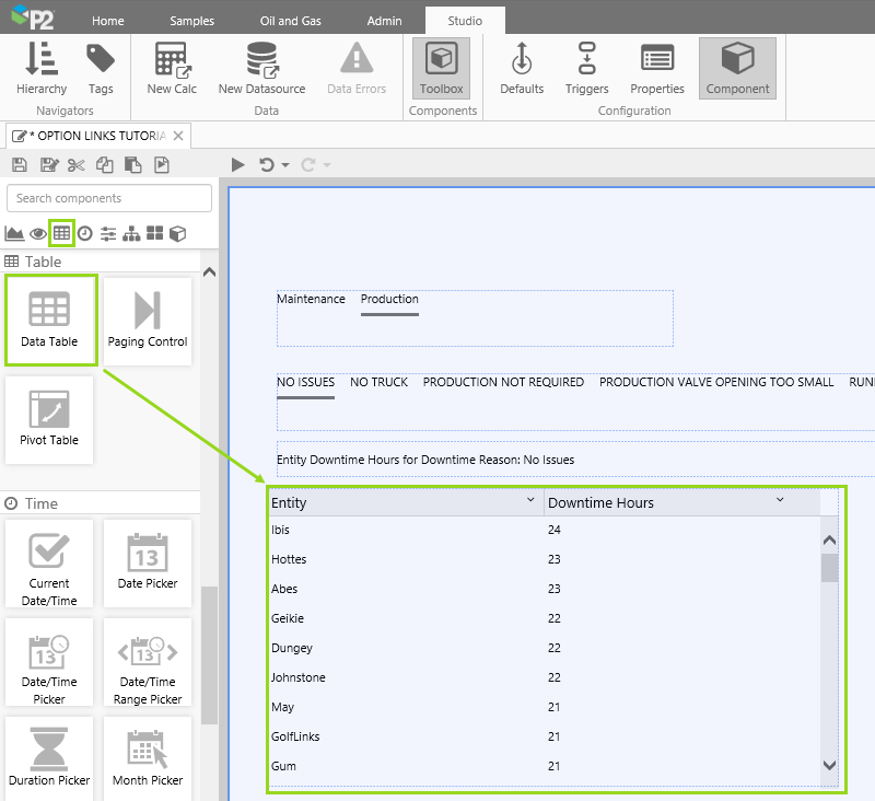
1. Drag and drop a Data Table below the Text Label.
2. Configure the Data Table's Data to return downtime per entity, for the Option Link's downtime reason, selectedDowntimeReason:
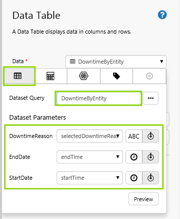
- Open the Data Data Selector by clicking on the field. Select the Dataset tab.
- Select the DowntimeByEntity Dataset Query.
- Select selectedDowntimeReason as the DowntimeReason Dataset Parameter.
- Select endTime as the EndDate Dataset Parameter.
- Select startTime as the StartDate Dataset Parameter.
This dataset query will sum and group the downtime hours per entity, for the period defined by startDate and endDate, and for the selectedDowntimeReason variable.
3. Click Add Column and add a column for Entity:
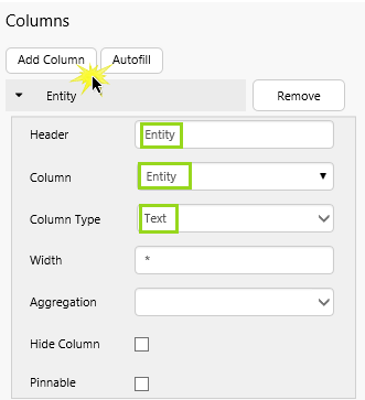
- Header: Type Entity
- Column: Select the Entity column from the drop-down list
- Column Type: Select Text from the drop-down list
4. Click Add Column and add a column for Downtime Hours:
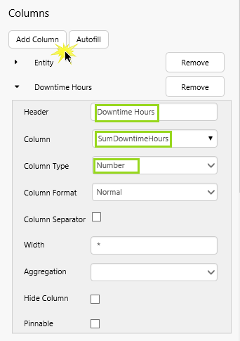
- Header: Type Downtime Hours
- Column: Select the SumDowntimeHours column from the drop-down list
- Column Type: Select Number from the drop-down list
5. Deselect Filterable, Column Resizable, Sortable.
6. Position the Data Table: type 45 in the X edit box.
Step 7. All done!
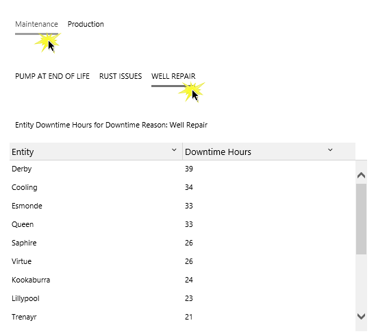
Congratulations! You now have an Option Links that changes another Option Links' option values, which in turn updates a Text Label and a Data Table.
- Click the preview button on the Studio toolbar to see what your page will look like in display mode.
- Select a different Downtime Department from the first Option Links. Note how the second Option Links shows Downtime resons for that department. Select one of the downtime reasons, and note how the Text Label and Data Table update.
 Don’t forget to save your page!
Release History
-
Option Links 4.5.2 (this release)
- In this release, you can override alignment of the selected style.