ON THIS PAGE:
The Performance Curve is used to analyse the performance effects of process changes or equipment efficiency (such as the performance of pumps). It plots data from various sources against one or more curves, and can be used wherever there is a relationship between two factors, such as temperature and pressure.
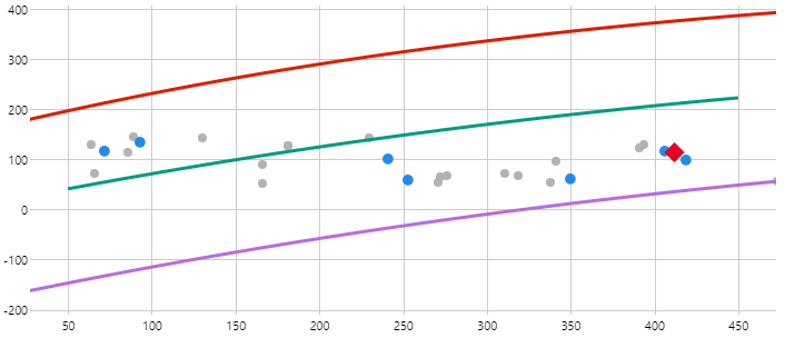
The Performance Curve draws curves defined by representative formulas, and then draws an X-Y plot of real data over these curves. In the example below, the red curve represents a pump with a new impeller and the orange curve represents the pump with a worn impeller. The data values are indicated by dots that fall between the two curves.
Why Use a Performance Curve?
The primary function of the Performance Curve is to facilitate informed decision-making for plant or facility operations, by analysing changes to performance due to process changes or equipment efficiency. It allows historical operating data to be displayed together with design operating curves. Time series data can be highlighted to show the progressive changes in performance over time, which enables informed decisions to be made regarding operation.
The Performance Curve offers considerable cost benefits to operators and maintainers of equipment (such as pumps, compressors, and separators), by accurately determining how efficiently their equipment is operating. It draws curves defined by representative formulas, and then draws an X-Y plot of real data over these curves. In the event of a failure, they offer the ability to easily analyse the cause to obtain an effective resolution.
Example Scenario: A pump has a relationship between RPM and output flow. The pump will also have upper and lower limits set for both of these variables for optimum performance. As the impeller wears out, the output flow decreases. This is a reliable indicator that the impeller needs to be replaced. You can action this manually, or if you also have P2 Sentinel installed, a maintenance request can be sent through to the inventory system (such as SAP), and the impeller replacement routine can be managed ahead of failure to reduce downtime and optimise task sequencing.
What Type of Curve Should I Choose?
There are two types of curve to choose from:
- Polynomial Curve
- XY Curve
The Polynomial Curve draws a smooth line that is calculated using a polynomial equation with specified coefficients. If the equipment you want to analyse comes with specific details on the coefficient of curves, you should choose the Polynomial Curve.
The XY Curve draws lines between a defined list of XY value pairs. In some cases, the equipment only comes with a picture of a graph of a performance curve, like what you might see on packaging. To get that information into a performance curve, it is usually easier to just approximate the data points and draw lines using those XY points, rather than attempting to determine the coefficients for a polynomial curve. If you do not have specific details on the polynomial coefficients, you should choose the XY curve.
Performance Curve Editor
The Performance Curve Editor has 3 main sections.
The top section is where you configure the real-time data points, the middle section is where you configure the axes, and the bottom section is where you configure the curves.
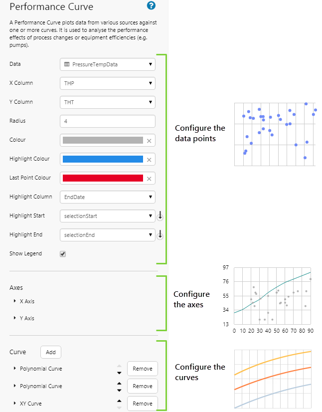
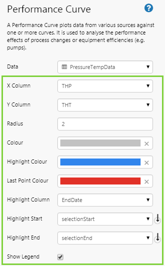
Configuring the Data Points
| Data | Use the Data Selector to specify the source of the data points. Data points can come from a dataset, tags, attributes, or calculations. As the performance curve shows correlation between two variables, such as pressure and temperature, the resulting set of values must supply both. Therefore:
|
| X Column | The variable that is to be used for the x-axis. |
| Y Column | The variable that is to be used for the y-column. |
| Radius | The size of each point, indicated by a numerical value. The regular size is 2. |
| Colour | The colour of the plotted data points. |
| Highlight Colour | The colour to use when highlighting data points. In the tutorial below, we highlight data points within a certain time period, using a range selector. Tip: Use the opacity setting if you want the highlight to appear as a “halo” around the data point. |
| Last Point Colour | The colour of the last data point (diamond), used when highlighting. This is the last point of data relative to the end time of the selected highlight range. |
| Highlight Column | The column that is used when determining whether to highlight a data point. This is typically a timestamp, or other date/time column. Highlighted data points will appear to be bigger when their timestamp is closer to the end time. |
| Highlight Start | The variable that indicates the start of the highlighted range. By default, this is selectionStart. We recommend not changing this default. If you do, you will also need to change this in the range selector chart, which also uses this variable. |
| Highlight End | The variable that indicates the end of the highlighted range. By default, this is selectionEnd. We recommend not changing this default. If you do, you will also need to change this in the range selector chart, which also uses this variable. |
| Show Legend | Select the check box to display a legend below the chart, showing the name and colour of each curve. Only curves with an explicitly defined name will appear in the legend. |
Configuring the Axes
| X Label | The label to be displayed along the x-axis. By default, there is no label. |
| X-Min | The lowest value along the x-axis. By default, the scale starts at 0. |
| X-Max | The highest value along the x-axis. By default, the scale ends at the highest plotted x-value. |
| Y Label | The label to be displayed along the y-axis. By default, there is no label. |
| Y-Min | The lowest value along the y-axis. By default, the scale starts at 0. |
| Y-Max | The highest value along the y-axis. By default, the scale ends at the highest plotted y-value. |
Configuring a Polynomial Curve
| Type | Polynomial Curve |
| Degrees | The number of coefficients to use in the curve. By default, 2 coefficients are shown. When you increase the Degrees, more coefficients are added. |
| X2 Coefficient | The second coefficient in the polynomial equation. When more degrees are added, additional coefficients appear in order. |
| X Coefficient | The first coefficient in the polynomial equation. Upon saving, decimals may be converted to scientific notation. |
| Constant | The constant term in the polynomial equation. This reflects the position along the y-axis that the curve starts (i.e. moves the curve up and down). The y-axis scale changes to accommodate the highest and lowest constants from all curves. Note: In P2 Explorer 2.6, this was the first coefficient in the comma-separated list of coefficients. |
| X-Min | The minimum X value that will be used to calculate the curve. This reflects the leftmost position on the x axis that the curve starts. |
| X-Max | The maximum X value that will be used to calculate the curve. This reflects the rightmost position on the x axis that the curve ends. |
| Y-Min | Show only the portion of the curve that is above this minimum value on the y-axis |
| Y-Max | Show only the portion of the curve that is below this maximum value on the y-axis |
| Name | The name of the curve to show in the legend. If the curve does not have a name, it will not appear in the legend. |
| Colour | The colour of the curve. Clicking the field opens the colour picker, where you can choose your colour. |
| Line Thickness | The thickness of the curve, in pixels. To hide a curve, use 0. |
Configuring an XY Curve
| Type | XY Curve |
| Number of Points | Enter the number of XY points you want to use for the line. This can be a maximum of 25 points. The number of points entered here determines how many rows are added to the table below. |
| Table | In each row, enter an X value and a Y value. The lowest and highest x values determine the scale of the x-axis of the resulting chart. The y-axis always starts at 0, however the highest y value determines the y-scale of the resulting chart. |
| Y-Min | Hide the portion of the curve that is below this minimum value on the y-axis. |
| Y-Max | Hide the portion of the curve that is above this maximum value on the y-axis. |
| Name | The name of the curve to show in the legend. If the curve does not have a name, it will not appear in the legend. |
| Colour | The colour of the curve. Clicking the field opens the colour picker, where you can choose your colour. |
| Line Thickness | The thickness of the curve, in pixels. To hide a curve, use 0. |
Tutorial: Displaying Pressure vs Temperature against a Polynomial Curve
If you're unfamiliar with the process of building pages, read the article Building an Explorer Page.
In this tutorial, we’ll show you how to use the Performance Curve to display temperature vs pressure production data for a selected entity, against performance coefficients supplied via the equipment manufacturer. The data points are linked to a range selector chart, which the user can use to change the highlighted data points. After following the tutorial, your page should look like this:
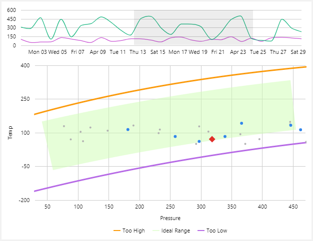
Let’s go through this process, step-by-step.
Step 1. Prepare a Studio Page
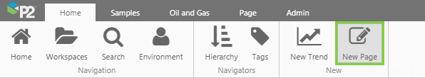
Before you start, click the New Page button on the Home tab of the ribbon. Choose the Grid layout.
- Add another row.
- Assign the second column a width of 600.
- Assign the first row a height of 100.
- Assign the second row a height of 350.
- Assign a row spacing of 10.
Step 2. Set the Page Defaults
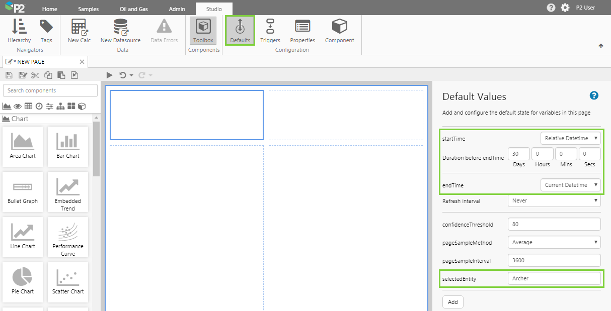
Before we start, let’s set the default entity we want to analyse. By doing this, the page will show the values for the entity we want, rather than the default values that have been set for the dataset in P2 Server. We'll also set a date range for the data we want to display.
You should specify all default values that are appropriate for your intended purpose.
The variable we are most interested in is the selectedEntity variable. Although this variable exists as a default value, no value has been assigned to it. We want the initial value of the Performance Curve to show data for the well, Archer. We can set that here.
Click the Defaults button in the Studio tab of the ribbon, and configure the following:
- startTime: Relative Datetime with a duration of 30 days.
- endTime: Current Datetime
- selectedEntity initially has no value, so let’s update this. Type in the following entity name: Archer
Step 3. Add the Performance Curve
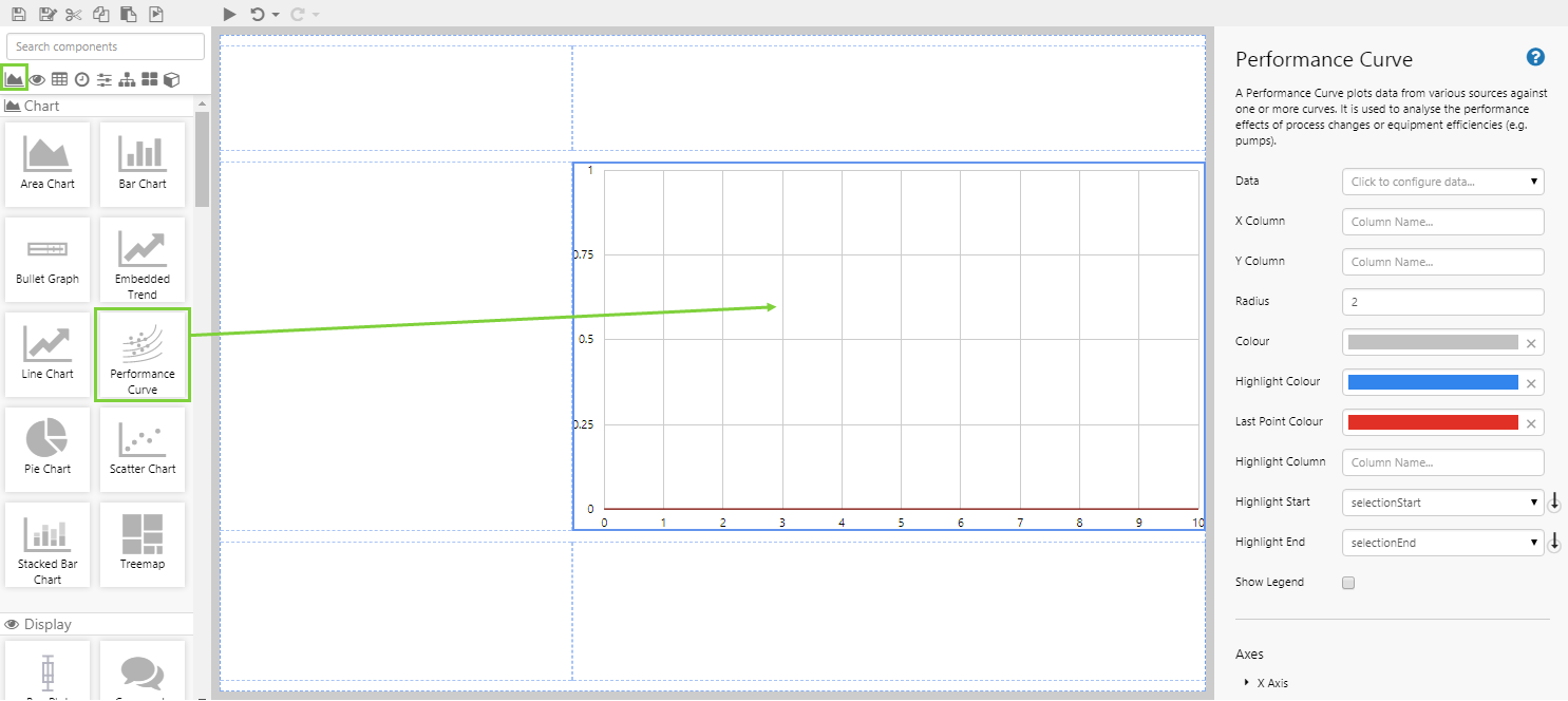
Drag and drop the Performance Curve component onto a grid cell. The Performance Curve is in the Chart ![]() group.
group.
Step 4. Configure the Performance Curve Data
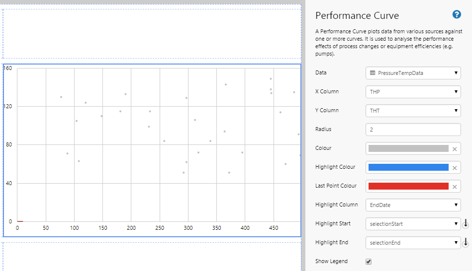
There are 3 main aspects to configuring a performance curve component: configuring the data points, configuring the axes, and configuring the curves. In this step, we will configure the data points.
Configuring the Data value:
- Open the Data Data Selector by clicking on the field. Click the Dataset
 tab, and fill in the fields as follows:
| Field | Click This First | Parameter to Enter | Notes |
| Dataset Query | PressureTempData | Click the Dataset |
|
| EndDate | endTime | Select this from the drop-down list. | |
| EntitiesList | selectedEntity | Select the variable from the drop-down list. If it is not available, you will need to type this in. This will adopt the default value for the selected entity, as per the previous step. | |
| StartDate | startTime | Select this from the drop-down list. |
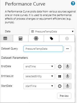
Click the Preview button to check that you are getting data. If the preview window is blank, you may have filled in a parameter incorrectly.
Configuring the Other Data Options:
- Click away from the Data Selector.
- Fill in the remaining fields as follows:
 |
|
Step 5. Configure the Axes
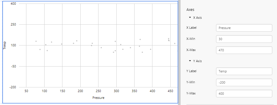
In this step, we want to refine the ranges along each axis, and give the axes appropriate labels. Complete the fields as follows:
| X Label | Pressure | The label for the x-axis. |
| X-Min | 30 | Sets the left-most value of the x-axis. |
| X-Max | 470 | Sets the right-most value of the x-axis. |
| Y Label | Temp | The label for the y-axis. |
| Y-Min | -200 | Sets the lower value of the y-axis. |
| Y-Max | 400 | Sets the upper value of the y-axis. |
Step 6. Configure the Polynomial Curves
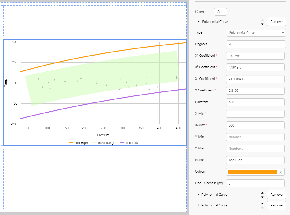
In this example, we are going to configure 3 polynomial curves using the following performance data table.
Note: To get the coefficients for the upper and lower bounds (safe operating range) for an item of equipment, you may need to perform a regression analysis from information on the Material Data Sheet, available from the equipment manufacturer.
- Click Add Data twice to add 2 more curves (for a total of 3 curves).
- They should all have the Type of Polynomial Curve.
- Enter the following values for each curve. Refer to Configuring a Polynomial Curve for what each value means.
| Curve 1 | Curve 2 | Curve 3 | |
| Degrees | 4 | 4 | 4 |
| X4 | -0.00000000009379 | 0 | 0 |
| X3 | 0.0000004181 | 0.0000001095 | 0.0000001035 |
| X2 | -0.0008412 | -0.0004898 | -0.0004893 |
| x | 0.8109 | 0.6748 | 0.7103 |
| Constant | 160 | 10 | -180 |
| X-Min | 0 | 50 | 0 |
| X-Max | 500 | 450 | 500 |
| Y-Min | |||
| Y-Max | |||
| Name | Too High | Ideal Range | Too Low |
| Colour | #FE9D0B | #CDFDAF (Opacity=50) | #B76BE6 |
| Line Thickness | 3 | 100 | 3 |
Step 7. Add and Configure a Range Selector Chart
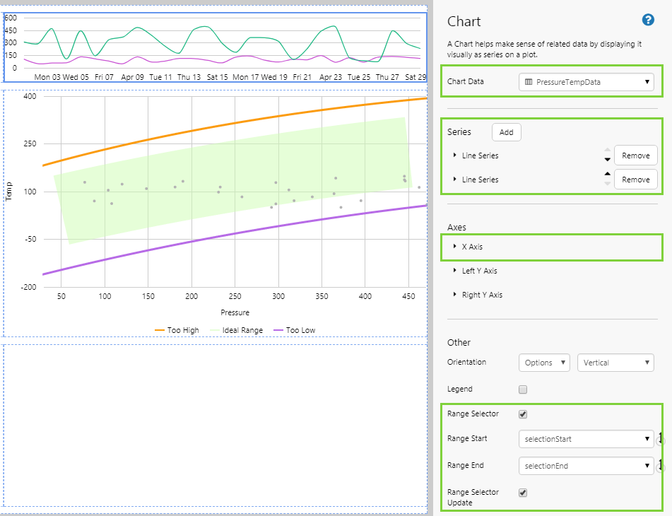
This Range Selector Chart will enable the user to select data points on the Performance Curve for highlighting. To start, drag and drop a Line Chart ![]() component onto the page.
component onto the page.
Configuring the Data value:
- Open the Chart Data Data Selector by clicking on the field. Click the Dataset tab, and fill in the fields as follows:
| Field | Click This First | Parameter to Enter | Notes |
| Dataset Query | PressureTempData | Click the Dataset |
|
| EndDate | Leaving this empty will use the default values for this parameter, as configured in the dataset. | ||
| EntitiesList | selectedEntity | Select the variable from the drop-down list. If it is not available, you will need to type this in. This will adopt the default value for the selected entity, as per the previous step. | |
| StartDate | Leaving this empty will use the default values for this parameter, as configured in the dataset. |
- Click the Preview button to ensure you are getting data, and then close the preview window.
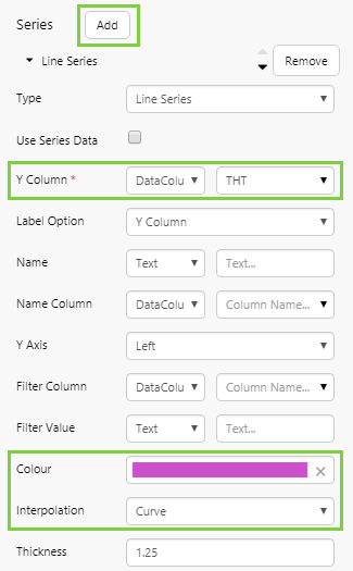
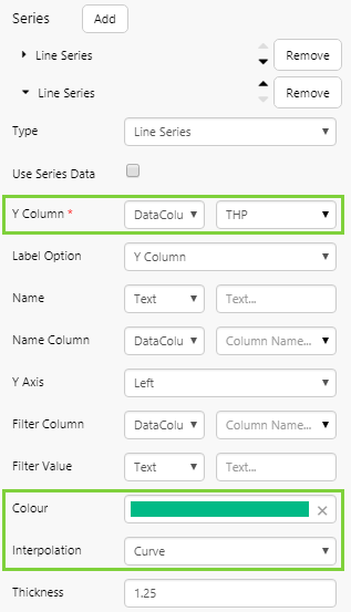
Configuring the Series:
- You only need to configure 2 fields for each series: the Y Column and the Colour.
| Field | Line Series 1 | Line Series 2 | Notes |
| Y Column | THT | THP | First select DataColumn from the drop-down list on the left. |
| Colour | #CA56D2 | #24B781 | First specify Colour from the drop-down list on the left, and then type the provided value into the Hex field of the colour picker. |
| Interpolation | Curve | Curve | Select from the drop-down list. |
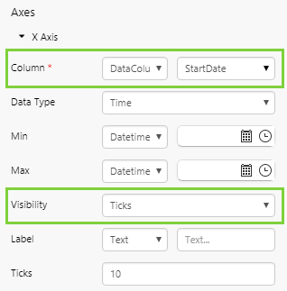
Configuring the X Axis:
- We will use a time value along the X Axis, and remove the gridlines. There are 2 fields to complete:
| Field | Value | Notes |
| Column | StartDate | First ensure DataColumn is selected in the drop-down list on the left - this will be the default. |
| Data Type | Time | Choose from the drop-down list. |
| Enable Gridlines | No | Clear the check box. |
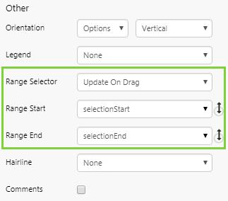
Configuring the Other options:
- These options are required to set up the chart as a Range Selector.
| Field | Value | Notes |
| Range Selector | Update on Drag | Enables the Performance Curve to update dynamically when the user drags the mouse over the chart selector. |
| Range Start | selectionStart | Determines the start of the selected range. This is the default value, and corresponds to the variable for the Highlight Start option on the Performance Curve. |
| Range End | selectionEnd | Determines the end of the selected range. This is the default value, and corresponds to the variable for the Highlight End option on the Performance Curve. |
Step 8. All done!
Congratulations! You now have a Performance Curve that will show you the pressure vs temperature points for a selected entity.
- Click the preview
 button on the Studio toolbar to see what your page will look like in display mode.
 - Use the range selector chart to select a date range, and play with this to observe the highlight changes.
- Change the constant of the curves and observe the changes.
- Change the Y min and Y max of the curves and observe the changes.
![]() Remember to save your page!
Remember to save your page!
Release History
- Performance Curve 4.5.5 (this release)
- Changes to the chart editor (see release notes for details)
- Performance Curve 4.5.3
- Highlighted dots are a uniform size, slightly larger than un-highlighted dots
- Diamond shape now represents the last point of data relative to the end time of the selected highlight range.
- Highlighted dots are in a different colour to un-highlighted dots.
- Separate colour is used for the diamond shape.
- The regular dot size default is 2, and can be configured by adjusting the 'Radius' property.
- Colour and Highlight Colour now have a default colour (grey and blue, respectively).
- New Last Point Colour is used for colouring the diamond shape and defaults to red.
- The X and Y axes are separated out in the editor, and they can now be named.
- Default data type for the Data Selector is 'Tag'
- Performance Curve 4.5.2
- Added Legend, Name, Colour, Line Thickness, Step, X & Y Min/Max, Re-ordering
- Performance Curve 4.5.0