ON THIS PAGE:
Overview
The Selection List can be configured to allow a user to select a single item, or multiple items from a defined list.
The selection is usually used by some other component or dataset query in the page.
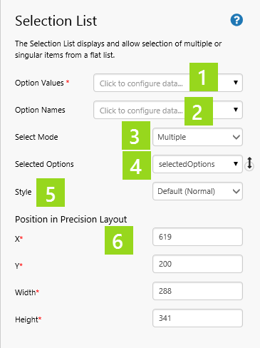
Properties of the Selection List
|
|
While this component could be used on a page to select Entities returned from a query, it is important to note that functionality from P2 Server, for example Template Filtering, is not available from this component. Explorer treats these items as text only.
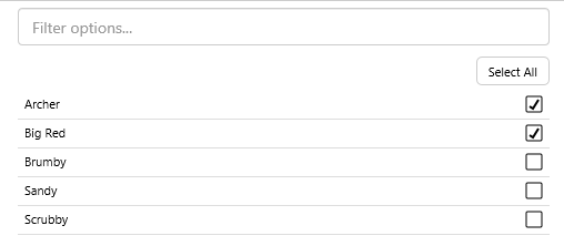
The Selection List in Display Mode
The Selection List provides an easy interface for the user to make selections.
|
|
Tutorial
If you're unfamiliar with the process of building pages, read the article Building an Explorer Page.
In this tutorial, we'll add a Selection List and a Pie Chart.
There are three steps in the tutorial:
- Step 1. Prepare the new tutorial page.
- Step 2. Add and configure a selection list.
- Step 3. Add and configure a pie chart.
Step 1. Prepare the Tutorial Page
Step 2. Add and Configure a Selection List
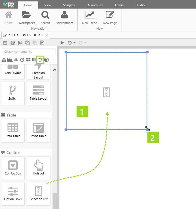
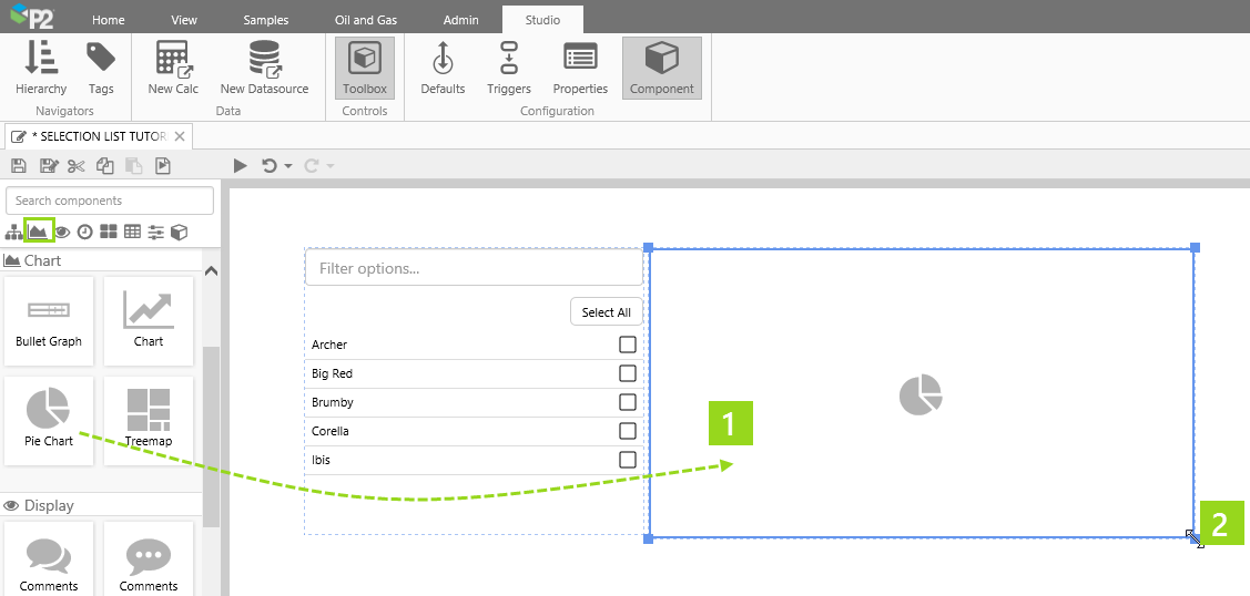
1. Drag and drop a Selection List component onto the precision layout. The Selection List is in the Control  group.
2. Click and drag the borders to resize.
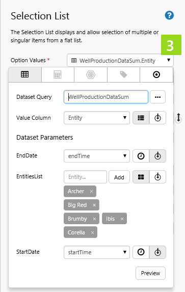
3. Use the Data Selector to select a dataset query for the Option Values, using Dataset Data. When the dataset has parameters, select Entity as the Value Column.
- Dataset Query: WellProductionDataSum
- Dataset Parameters:
- EndDate: Select the Page Default variable, endTime.
- EntitiesList: Add Archer, Big Red, Brumby, Ibis, Corella as fixed entity values.
- StartDate: Select the Page Default variable, startTime.
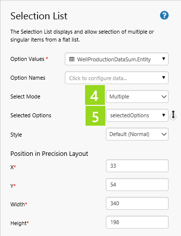
4. Select Multiple from the Select Mode drop-down list.
5. Select selectedOptions from the Selected Options drop-down list.
Step 3. Add and Configure a Pie Chart
In this step we're adding a pie chart which uses the selected options from the selection list.
1. Drag and drop a Pie Chart component onto the precision layout. The Pie Chart is in the Chart  group.
2. Click and drag the borders to resize.
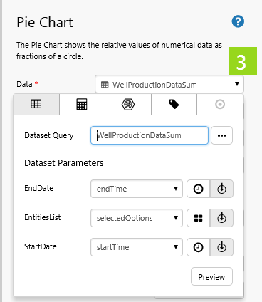
3. Use the Data Selector to select a dataset query for the Option Values, using Dataset Data.
- Dataset Query: WellProductionDataSum
- Dataset Parameters:
- EndDate: Select the Page Default variable, endTime.
- EntitiesList: Select selectedOptions from the drop-down list.
- StartDate: Select the Page Default variable, startTime.
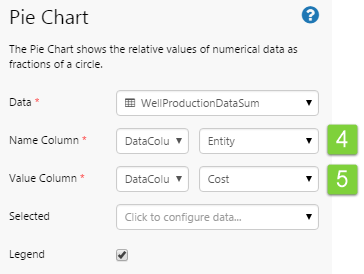
4. Select DataColumn and Entity from the two Name Column drop-down lists, respectively.
5. Select DataColumn and CostActualSum from the two Value Column drop-down lists, respectively.
Try Out the New Component
- Click the Preview
 button on the Studio toolbar to see what your page will look like in run-time.
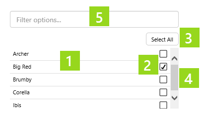
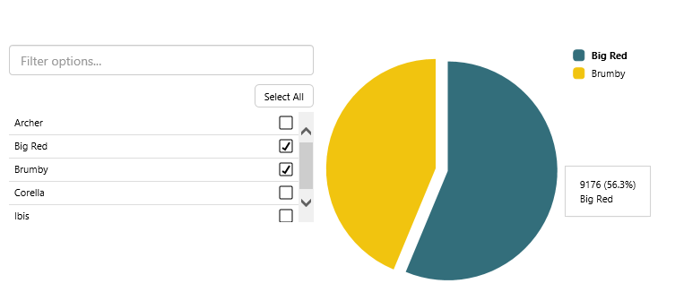
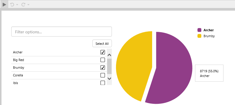
 - Select two of the items from the Selection List (Archer and Brumby).
Note: The pie chart shows data for Archer and Brumby. This is because its dataset query is using selectedOptions variable as its EntitiesList parameter, and the Selection List is setting the selectedOptions variable as its Selected Options property.
- Try selecting different items from the Selection List, to see how this affects the Pie Chart.
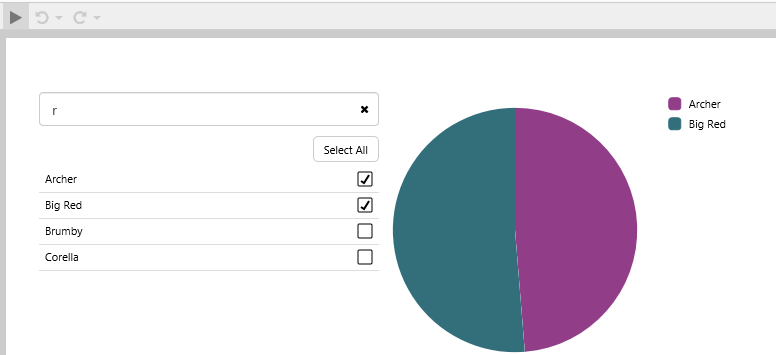
Now type a letter ('r') into the Filter options box, and note how the list is limited to the filter results (in this example, Option Values that contain the letter 'r').
Release History
- Selection List 4.4.2 (this release)
- The Multi Select List was renamed to Selection List.
- Multi Select List 4.4.0
- Multi Select List 4.3.2