ON THIS PAGE:
The Timeline report shows a timeline for the events raised against the entities of the reported asset.
In the Asset Report, you can filter the events using Time Selection, Category, and Monitor Name.
The report asset events are limited by the filtering options. You can further limit the report asset events by adjusting the time slider. The time slider works with the time selection.
- Click the Timeline tab in the Events pane to view the Timeline.
- Use the time slider and other controls to refine what is shown on the graph.
- Click and drag the report hairline to zoom in and further refine what is shown on the graph.
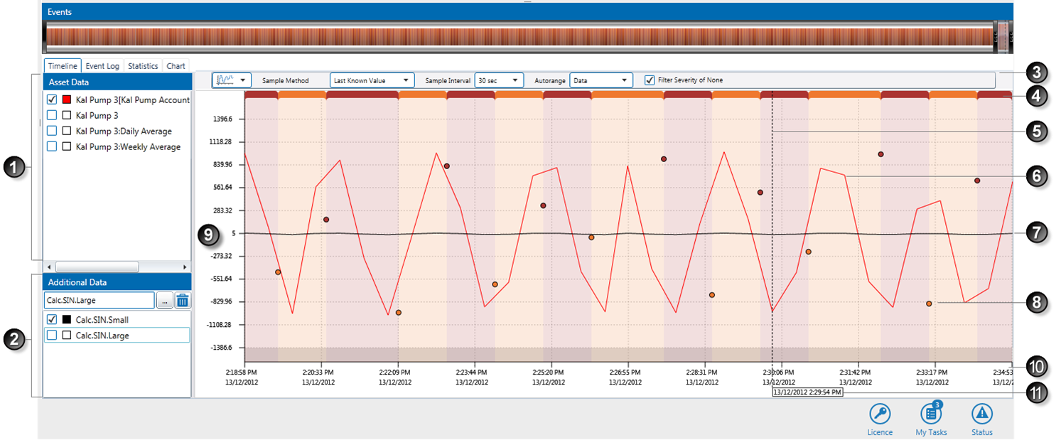
The timeline report shows the event data for the asset, over a period of time. Events are displayed on the graph as circles, each one rendered in its severity colour.
In addition to the events, the asset data can also be displayed on the graph.
The important features of the Timeline Report are:
| Feature name | Applies to: | What it's useful for | |
|
|
Asset Data |
Asset Data |
The test process input entity is automatically selected here. For attributes: all other attributes of the source entity asset, as well as the source asset itself, can be selected here. Select the check box for the entity or attribute. A colour is assigned and displayed in the corresponding colour key box For secondary template attributes it is explicit, for example: If the asset is a tag, this is displayed here. |
|
|
Additional Data |
All Data on the Graph |
Select any additional data (irrespective of the Asset Data in this report) using the Server Browser. Add tags, attributes or attribute values, as shown in the following section. A colour is assigned and displayed on the graph in the colour of the corresponding colour key box |
|
|
Report Presentation |
Asset Data |
|
|
|
Event Severity |
Event Data |
This is a linear representation of event severity and duration over the full timeline of the graph. The colouring represents the severity, and the width of each portion represents the duration. Note: this is the maximum severity over the period. |
|
|
Report Hairline |
All Data on the Graph |
Move the report hairline to get an exact time for any point in the timeline. To zoom in to a segment of the period, click and drag the hairline. |
|
|
Asset Data Plot |
Asset Data |
Entities, attributes, or attribute values that are selected in the Asset Data and Additional Data selection are plotted on the graph, in their respective colours (as shown in the colour keys). |
|
|
Additional Data Plot |
All Data on the Graph |
Selected assets from the additional data list are plotted on the graph, in their respective colours (as shown in the colour keys). |
|
|
Event |
Event Data |
Every event within the selected report period is displayed on the graph. Click an event |
|
|
Value Axis |
All Data on the Graph |
These mark the different values reached by event data and asset data. The range is automatically generated, to cover the full scope of either event data or asset data, depending on which auto-range (see notes above) is selected. |
|
|
Time Axis |
All Data on the Graph |
The timeline, for the full duration of the report period, divided into the time intervals specified in Sample Interval. |
|
|
Report Hairline Date and Time Label |
All Data on the Graph |
The exact date and time on the graph at the point of the hairline. |
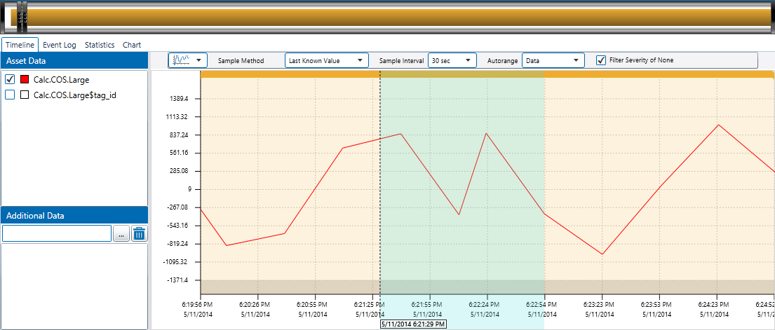
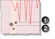
When you click and drag a hairline and then release, you can zoom in on a specific section of the graph to view more detail, as shown below. To zoom out again, click Refresh or Refresh to Now on the tab header bar.
Rotate the mouse wheel to scroll over a trend. This moves the time slider. Scroll down to move the time slider backwards, and up to move the time slider forwards.
Opening a Timeline for an Event
In the events grid, every time you click the View Asset Report ![]() icon, a new asset report opens for the event. This report focuses on the event you have selected, with the Event, Info and Comment screen already open for that event.
icon, a new asset report opens for the event. This report focuses on the event you have selected, with the Event, Info and Comment screen already open for that event.
For example, if you click on the view asset report icon for the selected row:
The Event, Info and Comment screen appears in the timeline report for this event:
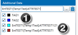
Additional Data
As well as the event data, you can include additional, non-related data. This can be tags, attributes, or attribute values.
 |
|
Adding a Tag
1. In the Additional Data panel, type a valid Tag Name in the edit box.
or
Click the ellipsis ![]() button next to the edit box and select a Tag
button next to the edit box and select a Tag ![]() .
.
2. Click in the Additional Data text box, and press Enter. The tag is added to the list of additional data.
3. Select the check box to the left of the item, to plot it on the graph, or clear the check box to remove it from the graph.
Adding an Attribute or Attribute Value
1. Select an attribute or attribute value.
- In the Additional Data panel, type a valid Entity Name in the edit box.
- Click the ellipsis
 button next to the edit box and select an attribute or attribute value from the Attribute Picker.
or
- Click the ellipsis
 button next to the edit box and select an Entity
  .
.
The Attribute Picker opens for the selected entity.
2. Select an attribute or attribute value.
3. Click in the Additional Data text box, and press Enter.
The attribute or attribute value is added to the list of additional data.
4. Select the check box to the left of the item, to plot it on the graph, or clear the check box to remove it from the graph.
Note: To remove additional data from the graph, click on the item in the list and click the remove button.
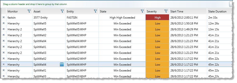
Timeline Events
The different events on the Timeline graph are each represented as a circle coloured in the correlating event severity colour. Events that have comments are depicted with a small diamond background.
For example:
|
|
|
Note: Asset lines for events with a confidence lower than 100 appear faded; the lower the confidence, the more faded the asset line appears.
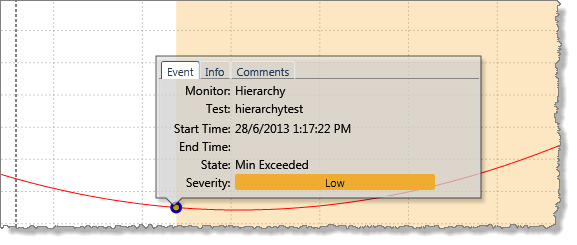
To view timeline event details, information and comments, or to add event comments:
- Click on an event in the graph.
A small event screen is displayed, with three tabs: the Event tab, the Info tab, and the Comments tab.
Event tab: This tab displays general information relating to the event.
Monitor: The name of a monitor containing the test that raised this event.
Test: The test that raised this event.
Start Time: The date and time (to the second) that the event began.
End Time: The date and time (to the second) that the event ended.
State: The state that was reached to cause the event.
Severity: The state severity.
Info tab: This tab shows the state of the test entity at the time that the event was reached. Use the scroll bar located on the right to see the full list.
Original State: The state that the test entity reached to cause the event. This row is only shown if there is a state override in the state configuration of the test.
Value: The value of the test entity.
Confidence: The confidence value of the test entity.
Limit Values: The values of the different process limits as set up in the test. Depending on the process used, these could be any of the following:
- High Limit: The value of high limit at the time of the event.
- High High Limit: The value of high high limit at the time of the event.
- Min: The value of min at the time of the event.
- Max: The value of max at the time of the event.
- And so on. The value may be a fixed value, or an entity or attribute value, depending on how the limits are defined in the test process.
Auxiliary Data: If there is auxiliary data for the test, this appears in the Info tab.
- [Token 1]: Auxiliary Data (1) value
- [Token 2]: Auxiliary Data (2) value
- Etc.
State Reason: If the state configuration for this event’s state has a State Reason, this is saved with the event and displayed here.
Potential impact: If the state configuration for this event’s state has a Potential Impact, this is saved with the event and displayed here.
Recommended Action: If the state configuration for this event’s state has a Recommended Action, this is saved with the event and displayed here.
Comments tab: This is a list of all comments that have been added for this event. The most recent comment is at the top of the list. Use the scroll bar located on the right, to see the full list of comments. Each comment has the following:
- Date and time: The date and time that the comment was added.
- User name: The user name of the user who added the comment.
- Comment: The comment that was added.
To Add an Event Comment
In addition to any comments that already exist for this event, you can add new comments.
- Click on the comments tab, and add event comments.
To Close the Timeline Events Screen
- Click on any part of the graph to close the events screen.
Cases on the Timeline
If Case Management is enabled, cases relating to events appear on the Event Timeline, on the X Axis directly below an event.
- To open the Case Info panel, click the case
 icon.
icon.
The Case Panel opens, showing the following information.
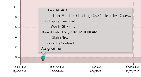
Case Id: A unique number identifying the case.
Title: The case’s title. This is defined in Sentinel, but can be edited in Explorer.
Category: When a case is raised in Sentinel, it is raised in a form with the same category as the monitor whose test outcome raised the case.
Asset: The asset is the subject of a case. This matches the subject of the current asset report.
Raised Date: The same date and time that the event was raised.
State: This refers to the case’s status. When a case is raised, its status is New. Cases are manually progressed through various statuses in Explorer. Possible statuses are New, Investigating, Confirmed, Closed, and Rejected, and Deprecated.
Raised By: The system that raised the case. For Sentinel cases, this is the display name of the Sentinel Super User.
Assigned To: When a case is raised, it is unassigned.