An Explorer chart is made of a series of data points. Select the series depending on how you want to display your data. You can have more than one series, and you can also combine different types of series in your chart.
The different series are layered on the chart according to list order, with top of the list in the background; or for a series of bars, left to right in order of the list.
Types of Series
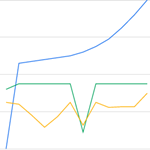
| Line Series:
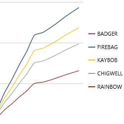
The Line series plots your data in a single line. You can combine this with other lines series (as shown), or with different types of series, such as bar, dot, etc. |
 |
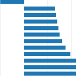
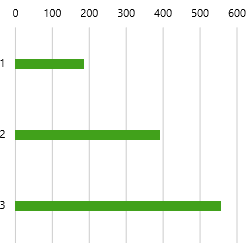
Bar Series:
The Bar series has rectangular bars (shown horizontally or vertically), where the length of each bar is proportional to its value. |
 |
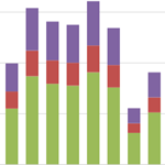
| Stacked Bar Series:
The Stacked Bar series has one or more series containing bar charts which stack vertically to form single bars. This is useful when you want to show parts of a whole. |
 |
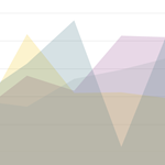
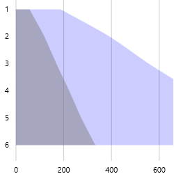
Area Series:
The Area series is a line series with the area below the line filled in with a colour. If using more than one area series, it can be helpful to adjust the opacity (as shown in this example). |
 |
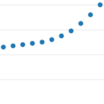
| Dot Series:
The dot series displays each point as a dot, and is typically used to highlight statistical distributions. |
 |
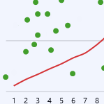
Combined Series:
Charts that combine different series are useful for showing related information in different ways. |
 |
Examples
Here are some of the effects you can achieve by changing the series properties; note that some properties are specific to the series type.
Area Chart
|
Changing the Opacity on two Area series:
|
Bar Chart
|
A narrower Bar Size (25) on a Bar series:
|
Filled-in Bar Size (Fill) on a Bar series:
|
The chart in the screenshots below demonstrate how the order of the different series affects the chart appearance.
|
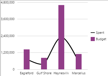
The line series appears behind the bar series, because it is listed first in the component editor: |
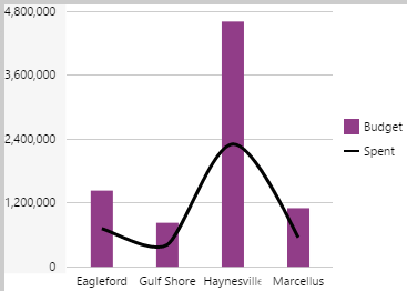
The bar series appears behind the line series, because it is listed first in the component editor: |
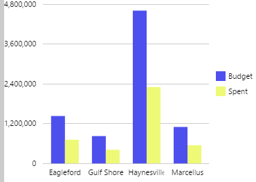
The 'Budget' bar series appears before the 'Spent' bar series, because it is listed first in the component editor: |
|
|
|
|
Line Chart
|
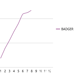
This is a single Line series. The lines are split using the Name Column:
|
This single Line series displays just one of the entities. Data is filtered using the Filter Column and Filter Value:
|
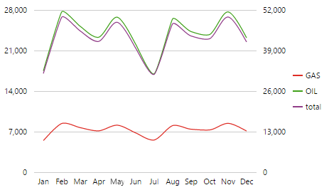
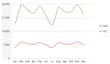
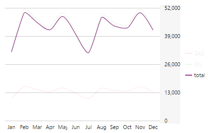
The chart in the screenshots below has four Line series, with TOTAL using the right Y Axis, and GAS, OIL and NGL on the Left Y Axis.
|
All lines appear on the chart: |
When the user clicks or hovers on the Right Y axis, only the left-axis and the line series using this axis are displayed:
|
When the user clicks or hovers on the Right Y axis, only the right axis and the line series using this axis are displayed:
|
|
|
|
|
Scatter Chart
|
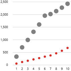
Two Dot series; each has its own Colour and its own Radius (for the dot size):
|
There are many options for configuring your series; try these out once you have set up a chart.