ON THIS PAGE:
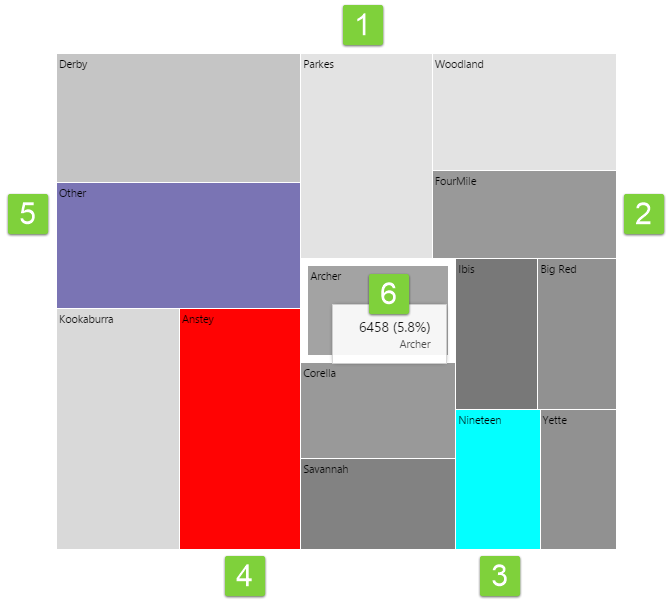
The Treemap shows relative values of numeric data as rectangles of different sizes, with an additional dimension represented by colour coding. So the size of the rectangular regions represent one dimension (e.g. oil produced) while the colours represent another dimension (e.g. water produced). Here is how to interpret the Treemap.
Note that the colours below represent the default out-of-the-box colours for the Treemap. These may change if your Explorer Administrator has configured something different.
Features of a Treemap
|
1. Light Grey: Regions of light grey mean that the value of the data that determines colour, is approaching the minimum value specified in the configuration. |
4. Red: Regions with a red colour mean that the value of the data that determines colour, is lower than the minimum value specified in the configuration. |
|
2. Dark Grey: Regions of dark grey mean that the value of the data that determines colour, is approaching the maximum value specified in the configuration. |
5. Purple: If regions have been aggregated or combined, they are represented by a purple colour. |
|
3. Cyan: Regions with a cyan colour mean that the value of the data that determines colour, is higher than the maximum value specified in the configuration. |
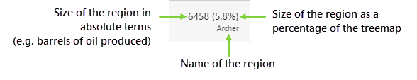
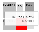
6. Tooltip: Hover over a region of the Treemap to see a tooltip. The tooltip displays the value of the size, and the percentage of the total treemap.
|
Hover and Selection
You can hover over a region to see the tooltip.
If configured, clicking on a region can also update other elements on the page.