Overview
The Box Plot (sometimes known as the Box and Whiskers Plot) is used to show the distribution of a set of data, using a Median and Quartiles.
 |
 |
 |
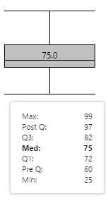
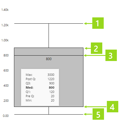
| The lines at the top and bottom represent Post Q and Pre Q respectively. The grey box represents the distribution between Q1 (bottom) and Q3 (top), with the median line and value shown in the centre of the box. | Hover over the box plot to see actual values. | This box plot is configured to show the minimum and maximum values (used for scalability). |
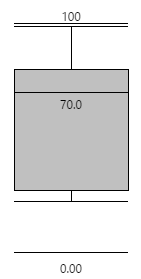
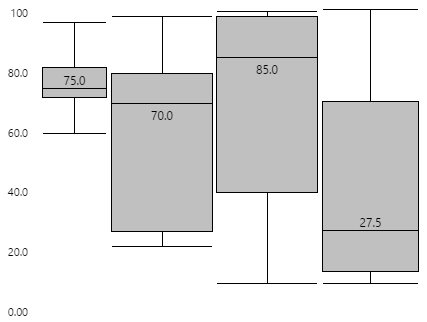
If several box plots are grouped together, using the same scale, the relative distribution patterns between similar sets of data becomes clear. Note: The box plot on the left has been configured to show a scale between the minimum and maximum display values.
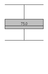
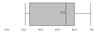
The box plot can be horizontal (as shown above) or vertical (as shown below), depending on its configuration:
Reading the Box Plot
Hover over the box plot to see values shown in the tooltip, as described below.
Note: Only some of the tooltip values are displayed on the box plot.
Box Plot Values
Some of the box plot values are visualised in the size of the rectangle, and the spaces between the different lines. Actual values are also listed in the tooltip.
 |
|
Calculations
The Box Plot data is numerical. Data is sorted from smallest to largest, to calculate the statistics represented by the box plot.
| Median | The median is the value in the middle of the sorted data. If there are two middle values (from an even number of data points), the median is the average of those two middle numbers. |
| Q1 | The set of numbers below the median is used to calculate Q1. Q1 is the value in the middle of this set. If there are two middle values (from an even number of data points), Q1 is the average of those two middle numbers. |
| Q2 | The set of numbers above the median is used to calculate Q3. Q3 is the value in the middle of this set. If there are two middle values (from an even number of data points), Q3 is the average of those two middle numbers. |
| Interquartile Range | This is the range between Q1 and Q3 (the value is Q3 - Q1). |
| Outlier | An outlier is any data point that is at least 1.5 times the interquartile range, beyond either Q1 or Q3. So an outlier can be any data point greater than (Q3 - Q1) * 1.5 + Q3, or any data point less than Q1 - (Q3 - Q1) * 1.5. |
Example 1
Here is an example of data and how it is represented in the box plot.
A set of numerical data is retrieved from a dataset query, or list of fixed or variable values within Explorer. For example, the number of truckloads delivered within a single day, at a given site, is displayed in a box plot:
This is how the data is processed to give the key values:
| Unsorted Data | Unsorted data from the database | |
| Sorted Data | This is how the data looks, sorted | |
| Max | The maximum value, in the sorted set. | |
| Post Q | The value of the highest data point before any 'high-end' outliers. | |
| Q3 | The middle of the upper half of data, in the sorted set | |
| Med | The median is calculated as the average of the two middle values = 27 | |
| Q1 | The middle value of the lower half of data, in the sorted set | |
| Pre Q | The value of the first data point after any 'low-end' outliers. | |
| Min | The minimum value in the sorted set |
Example 2
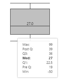
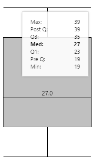
Here is an example of data with outliers.
The same set of data from the above example now has two extra pieces of data: 99 and -50. These values are the max and min, respectively, but are also outliers (each one is more than 1.5 times the interquartile range - from Q1 and Q3, respectively).
In the box plot, 99 is shown as the Max, and -50 is shown as the Min. Post Q is still 39 (the value of the last data point before any 'high-end' outliers), while Pre Q is 19 (the value of the first data point after any 'low-end' outliers).