The Chart report shows a chart for the events raised against the entities of the reported asset.
In the Asset Report, you can filter the events using Time Selection, Category, and Monitor Name.
The report asset events are limited by the filtering options. You can further limit the report asset events by adjusting the time slider. The time slider works with the time selection.
- Click the Chart tab in the Events pane to view the Chart report.
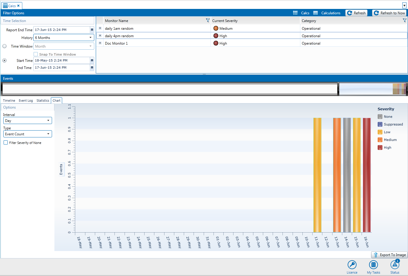
The Chart report displays a stacked bar graph showing the events of each severity type for the asset during the selected time window, with the colours of the stacked bar corresponding to the severity of the event.
You can manipulate the graph by changing the following:
Interval: The options available in the Interval drop-down list depend on the selected time window. This function offers the facility to change the sample interval (displayed on the x-axis) for increased granularity of results. Example intervals are Hour and 12 hours.
Type: Change the way the graph displays the event severities. Note that the chart displays all the results for the asset. Therefore if the asset is monitored in several monitors then the result is multiplied by the number of monitors.
Event Count: The number of times the severity occurs for the asset during each time interval.
Event Time: The total amount of time the severity occurs for the asset during each time interval.
Filter Severity of None: Select this check box if you do not want to display severities of None.
Export To Image: Export the chart to an image file.