ON THIS PAGE:
Overview
Explorer Charts can be used to represent continuous data or discrete data.
Discrete Charts show chunks of data, across discrete X Axis values, using the String data type to show values (for example: physical locations, time periods such as days or months, or products types).
Continuous Charts show data over X Axis points that can be Time or Number data types.
Discrete Chart
You can use any type of series for a discrete chart: line, bar, stacked bar, area or dot.
Features of a discrete chart:
- Data retains the sort order from its dataset.
- Discrete charts have a tooltip option (selected by default).
- Discrete charts can be configured to drive a variable (when a user clicks an item on the X Axis).
Continuous Chart
A continuous chart is ideal for showing data trends, such as time-series data, or numeric data. Recommended series are line or area, as these incorporate a continuous line.
Features of a continuous chart:
- Data is ordered numerically (from lowest to highest) for a continuous chart that uses a Numeric X Axis.
- Data is ordered by date and time (from earliest to latest) for a continuous chart that uses a Time X Axis.
- Additional data points are interpolated, for a smooth curve or line. The number of data points depends on the sample interval (for example, 3600 seconds), and the method of interpolation depends on the sample method (for example, Average). Interpolation options are available for line and area charts.
- Continuous charts do not have a tooltip option.
- Continuous charts can be configured to have a Range Selector and also one or more Hairlines.
Tutorials
The following short tutorials demonstrate how to set up the two different types of chart. Note that in each case, the data used is appropriate to the type of chart.
Tutorial 1: Discrete Chart
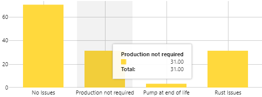
In this tutorial, we are using dataset data, to show in a discrete chart. We'll display the data in a Bar Series.
1. Create a new page in Studio, and drag a Bar Chart component onto the page (this is in the Chart group in the toolbox).
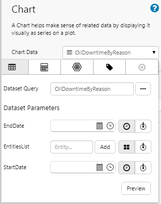
2. Assign a dataset to the chart's Data property. In our example, we use the OilDowntimeByReason dataset query. Keep the Dataset Parameters blank (these have default values in the dataset query, in IFS OI Server Management).
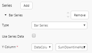
3. Under Series, click Bar Series to configure the bar series.
- Select SumDowntimeHours as the (DataColumn) Y Column.
- Click Bar Series again to close this section.
4. Under Axes, click X Axis to configure it.
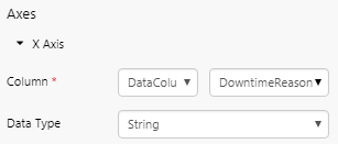
- Select DowntimeReason as the (DataColumn) Column.
- Select String as the Data Type. Note: This is what makes the chart discrete.
- Click X Axis again to close this section.
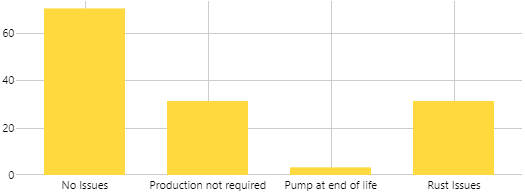
That's it - you now have a discrete chart. This is what it looks like when you click the Preview ![]() button on the Studio toolbar.
button on the Studio toolbar.
Now configure the chart to have a tooltip.
5. Under Other, select the Tooltip check box.
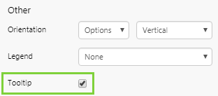
In preview mode, click the chart to show the tooltip:
Tutorial 2: Continuous Chart
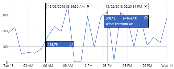
In this tutorial, we are using time series data from a tag, to show in a continuous chart. We'll display the data in a Line Series.
1. Drag a Line Chart component onto the page (this is in the Chart group in the toolbox).
2. Assign a tag to the chart's Data property. In our example, we use the WindDirectionCalc tag. Keep the other Data property defaults for the tag.
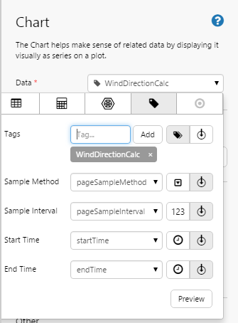
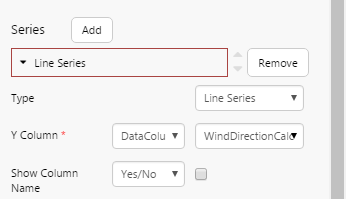
3. Under Series, click Line Series to configure the line series.
- Select WindDirectionCalc as the (DataColumn) Y Column.
- Click Line Series again to close this section.
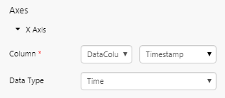
4. Under Axes, click X Axis to configure it.
- Select Timestamp as the (DataColumn) Column.
- Select Time as the Data Type. Note: Continuous charts have a Time or Number data type on the X axis.
- Click X Axis again to close this section.
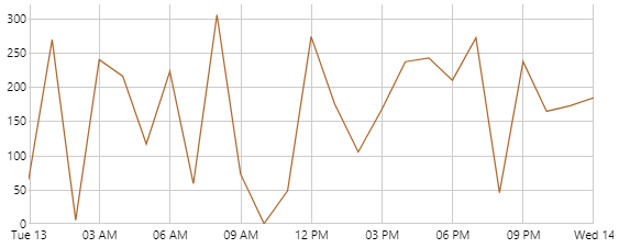
That's it - you now have a continuous chart. This is what it looks like when you click the Preview ![]() button on the Studio toolbar.
button on the Studio toolbar.
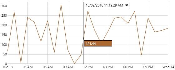
Now configure the chart to have a hairline.
5. Under Other, select Single for the Hairline Mode.
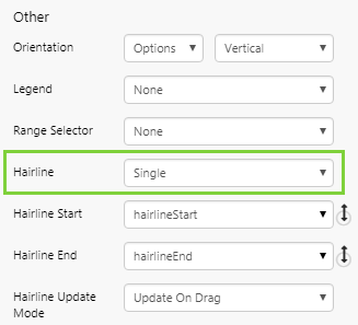
In preview mode, click the chart to show the hairline with its label:
Release History
- Discrete Versus Continuous Charts 4.5.5 (this release)
- Tooltip and Hairline formats have changed
- Hairline options have changed
- Discrete Versus Continuous Charts 4.5.4