ON THIS PAGE:
Overview
The IFS OI Explorer process controls are four separate shapes - each with the purpose of displaying particular types of measurements against defined limits. The shapes draw attention to abnormalities in operational process with selective use of colour to attract the operator’s attention.
Shaped for Purpose
- Gauge: display measurements of rate or speed
- Level Meter: display measurements of level or height
- Pressure Meter: display measurements of pressure
- Temperature Meter: display measurements of temperature
Dynamic Displays
The process controls work well when the page is periodically refreshed by a Current Date/Time Toggle or some kind of Time Picker, so that the user can monitor the measured attribute through the dynamic change of the control's appearance, as time-sensitive data is refreshed.
Common Usage
Often the process control displays the attribute (a measurement) of a selected entity, where the user can select which entity to monitor, from a Hierarchy on the page.
Process controls may also appear on process mimics, allowing the user to monitor a whole series of entity attributes in a particular physical location.
Alarm Indicators ![]()
The process control shows an alarm if the measured value exceeds defined limits; these have a severity of Primary, Secondary or Tertiary. As the measured data changes, the process control dynamically updates to show this value changing, as shown in the video below:
Data Indicators ![]()
The process control displays an icon for low confidence data, or for no data.
Access to Tag or Attributes Trend, Point Detail and Write Option
Right-click on any of these components to open the menu which has options for the component's actual value: to Open Trend, Open Detail, Write Value (for writeable tags). A component using an ad hoc calculation for its actual value has a menu item for Open Trend.
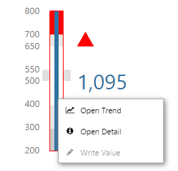
Right-click on a Level Meter
Features in Common
The process controls all look similar, and behave in a similar manner. Their main difference is what they represent. For example, a temperature meter is used for displaying a temperature measurement against temperature limits, whereas a level meter is used for a level measurement against level limits.
You can immediately identify the type of measurement by process control's general appearance.
| Gauge | Level Meter | Pressure Meter | Temperature Meter |
| The gauge's appearance is characterised by its shape, which is like a speedometer's, with a needle representing the measured value. | The level meter's appearance is characterised by the measured value's verticle line in the centre of the level meter, representing a level. | The pressure meter's appearance is characterised by a small ball, which is suspended at the measured value's position. | The temperature meter's appearance is characterised by its thermometer shape, with a thermometer's mercury level representing the measured value. |
 |
 |
 |
 |
Features Overview
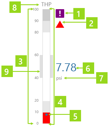
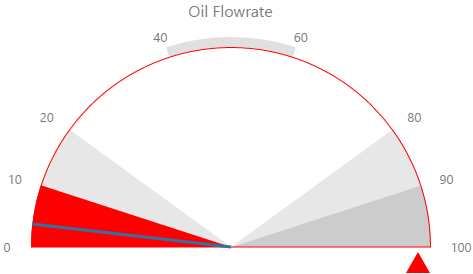
This example of a pressure meter highlights the features of all of the process controls.
|
|
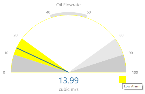
1. Data Indicator: In this example, the measured data's confidence is lower than the configured confidence threshold for the process control - hence, the Low Confidence Data Indicator is displayed. 2. Alarm Indicator: This particular alarm indicator is a triangle, because the measured data is in the Low Low band. 3. Limit Values: The values for Minimum, Maximum and the different limits can be seen when you hover over the process control (if configured to do so). 4. Bands: Background colours mark the different bands (segments, for a gauge) between the thresholds. High High at the top (right, for a gauge), matches Low Low at the bottom (left, for a gauge). High matches Low, and in the style used here, Outside Target matches the Target band. As shown in this example, the band (Low Low) containing the Measured Value is coloured to match the Alarm Indicator. 5. The measured value position: The measured value is positioned within its band, according to its value. 6. Measured Value: The measured value, with configured decimal points. 7. Units: The units qualify the measured value (examples: Meters, psi, CM, Litres, Cubic m/sec, Degrees C). 8. Label: The label describes the attribute that is being measured (examples: THT, THP, Oil Flowrate). 9. Target Border: The target border surrounds the target band, and is coloured in grey, unless the measured value is in the Outside Target band, when it takes on the Outside Target colour. |
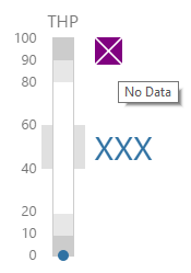
Data Indicator
The Data Indicator is a symbol that appears alongside the process control if there is either Low Confidence Data or No Data, for the measured value.
The data indicator appears in a square background, as a cross ![]() if there is No Data, or as an exclamation mark
if there is No Data, or as an exclamation mark ![]() if there is Low Confidence Data.
if there is Low Confidence Data.
The data indicator's size, colours and positioning may vary, depending on the style used.
How to Interpret the Data Indicator indicator
Read the Tooltip: Hover over the data indicator to see the tooltip.
Sometimes there is no data to measure; for example, if a gauge is configured to display the actual flowrate measurement of the selected entity, and this attribute value is missing from the selected entity.
If that is the case, the data indicator shows the No Data symbol, and three Xs mark the place where the value would normally appear.
If the measured data's confidence is lower than the process control's defined confidence threshold, the data indicator shows the Low Confidence symbol. Data confidence threshold is measured as a percentage.
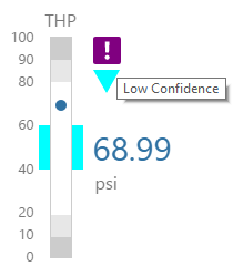
Note: The Confidence Threshold Data indicator may be absent, as this is a configurable setting in design.
Alarm Indicator
The Alarm Indicator is a coloured symbol representing the current state of the measured value.
How to Interpret the Alarm Indicator
The alarm indicator's size, colour and position may vary, depending on the style used. There are three symbols that an alarm indicator uses, to indicate the severity of the measured value's alarm state.
The alarm indicator's symbol depends on what band the measured value falls into. From highest to lowest bands, here is the key:
1. Interpret Colour and Shape: The colour and shape are immediate indicators of whether the alarm is Primary, Secondary or Tertiary.
| Measured Value Positioned in Band or Segment | Alarm Indicator | Symbol | Tooltip | Severity | ||
| High High | Red Triangle |
|
High High Alarm | Tertiary (colour may vary according to style). | ||
| High | Yellow Square |
|
High Alarm | Secondary (colour may vary according to style). | ||
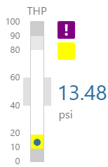
| Outside Target | Blue Triangle |
|
Outside Target | Primary (colour may vary according to style). | ||
| Target | (No Indicator) |
|
- | - | ||
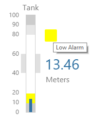
| Low | Yellow Square |
|
Low Alarm | Secondary (colour may vary according to style). | ||
| Low Low | Red Triangle |
|
Low Low Alarm | Tertiary (colour may vary according to style). |
Note: The Alarm Indicator may be absent, as this is a configurable setting in design.
2. Read the Tooltip: Hover over the alarm indicator to see the tooltip.
Limit Values and Bands/Segments
The process control limits may vary as you select different entities or times, or they may be fixed values. This depends on how the process control is configured.
How to Read the Limits
Limits range from minimum to maximum (bottom to top for the meters, and left to right for the gauge), marking out the different bands or segments: Low Low, Low, Outside Target, Target, Outside Target, High, High High.
Hover over the control. Limits appear to the left of the meter controls, or across the arc of the gauge control.
Note: The limit values may be absent, as their visibility is a configurable setting in design.
Right-click Menu
Right-click on any of the process components, to open the menu for the measured value. Depending on what data the measured value has been configured to display, when you right-click the component, a variety of menu options will be presented.
| Menu option | Displayed for |
| Open Trend | Time series data. Opens a trend containing a trace of the data. |
| Open Detail | Attribute value or tag. Opens the Point Detail page of the data point. |
| Write Value | Attribute value or tag, if the datasource allows writing to the database. Opens the Enter value dialog, where you can change the value of the data point. |
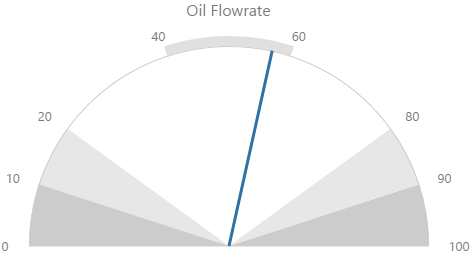
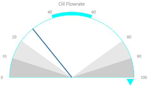
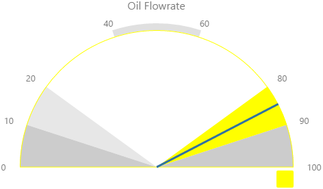
Gauge
The gauge shows a numeric value as a needle in relation to target areas. Its appearance changes when limits/alarm thresholds are exceeded.
How to Read the Gauge
Note: Your Gauge may look different from those in the examples below, because of styles used.
- Hover over the gauge to see the limit values.
- The alarm indicators
 highlight where measured data is too far off target.
 - The target area is marked by an extra band (between 40 and 60 in the screenshot above).
- The data indicator appears if there is no data
 or if the data's confidence is too low
  (below the configured confidence threshold).
 - Observe how the needle moves across the different segments, as the measured value changes in relation to the limit values.
- Note how the segment containing the measured value is coloured in the alarm's colour.
Examples
Here are some examples of how the gauge background colours change with the different alarm states. Note how the gauge's secondary and tertiary background colours change to the secondary and tertiary alarm colours, respectively. During a primary alarm state, the target area's envelope band changes to the primary alarm colour.
| No Alarm | Primary Alarm |
 |
 |
|
Secondary Alarm
|
Tertiary Alarm
|
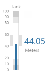
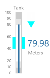
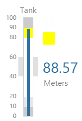
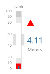
Level Meter
The Level Meter is used for displaying level measurements against configurable limits. Its appearance changes when limits/alarm thresholds are exceeded.
How to Read the Level Meter
Note: Your Level Meter may look different from those in the examples below, because of styles used.
- Hover over the level meter to see the limit values.
- The alarm indicators highlight where measured data is too far off target.
- The target area is marked by an extra band (between 40 and 60 in the screenshot above).
- The data indicator appears if there is no data or if the data's confidence is too low (below the configured confidence threshold).
- Observe how the level moves up the different bands, as the measured value changes in relation to the limit values.
- Note how the band containing the measured value is coloured in the alarm's colour.
Examples
Here are some examples of how the level meter's background colours change with the different alarm states. Note how the level meter's secondary and tertiary background colours change to the secondary and tertiary alarm colours, respectively. During a primary alarm state, the target area's envelope band changes to the primary alarm colour.
| No Alarm | Primary Alarm | Secondary Alarm | Tertiary Alarm |
 |
 |
 |
 |
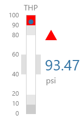
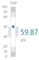
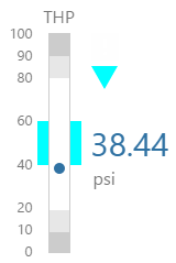
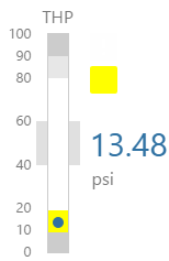
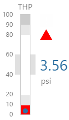
Pressure Meter
The Pressure Meter is used for displaying pressure measurements against configurable limits. Its appearance changes when limits/alarm thresholds are exceeded.
How to Read the Pressure Meter
Note: Your Pressure Meter may look different from those in the examples below, because of styles used.
- Hover over the pressure meter to see the limit values.
- The alarm indicators highlight where measured data is too far off target.
- The target area is marked by an extra band (between 40 and 60 in the screenshot above).
- The data indicator appears if there is no data or if the data's confidence is too low (below the configured confidence threshold).
- Observe how the level moves up the different bands, as the measured value changes in relation to the limit values.
- Note how the band containing the measured value is coloured in the alarm's colour.
Examples
Here are some examples of how the meter background colours change with the different alarm states. Note how the pressure meter's secondary and tertiary background colours change to the secondary and tertiary alarm colours, respectively. During a primary alarm state, the target area's envelope band changes to the primary alarm colour.
| No Alarm | Primary Alarm | Secondary Alarm | Tertiary Alarm |
 |
 |
 |
 |
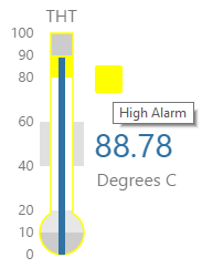
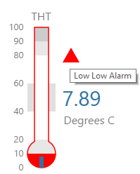
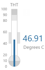
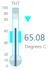
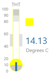
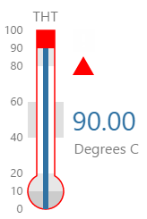
Temperature Meter
The Temperature Meter is used for displaying temperature measurements against configurable limits. Its appearance changes when limits/alarm thresholds are exceeded.
How to Read the Temperature Meter
Note: Your Temperature Meter may look different from those in the examples below, because of styles used.
- Hover over the temperature meter to see the limit values.
- The alarm indicators highlight where measured data is too far off target.
- The target area is marked by an extra band (between 40 and 60 in the screenshot above).
- The data indicator appears if there is no data or if the data's confidence is too low (below the configured confidence threshold).
- Observe how the level moves up the different bands, as the measured value changes in relation to the limit values.
- Note how the band containing the measured value is coloured in the alarm's colour.
Examples
Here are some examples of how the meter background colours change with the different alarm states. Note how the temperature meter's secondary and tertiary background colours change to the secondary and tertiary alarm colours, respectively. During a primary alarm state, the target area's envelope band changes to the primary alarm colour.
| No Alarm | Primary Alarm | Secondary Alarm | Tertiary Alarm |
 |
 |
 |
 |
Release History
- Using the Process Controls 4.4.6 (this release)
- The component now has a menu for options to view details, view a trend, or write to a tag.
- Using the Process Controls 4.4.1