ON THIS PAGE:
This article describes the styling properties of each component in the Hierarchy  group in IFS OI Explorer Studio. For an overview of how styling works, see Overview of Styles in IFS OI Explorer.
Breadcrumb
The screenshot below shows the Breadcrumb in design mode (which is indicative of display mode).
What You Can Change
With the Breadcrumb, you can change the styles relating to font and alignment. As the breadcrumb contains links, the middle nodes will always show the inherited blue hyperlink colour (#67809F).
1. Base Style: Style the text that appears in the list.
- Font Size
- Font Family
- Font Colour
- Font Weight
- Font Alignment
- Underline
- Text Case
2. Alignment: Set the alignment of the breadcrumb within the cell and the offsets for padding.
- Alignment
- X Offset
- Y Offset
Example: Changing the Breadcrumb Alignment
| Custom Style in Design Mode |
 |
| Custom Style Properties | 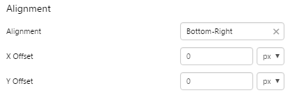 |
Example: Changing the Breadcrumb Padding
| Custom Style in Design Mode |
 |
| Custom Style Properties | 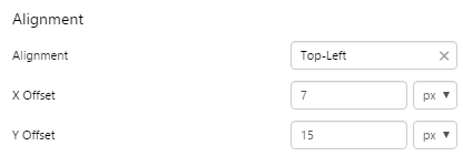 |
Example: Changing the Breadcrumb Font
| Custom Style in Design Mode |
 |
| Custom Style Properties | 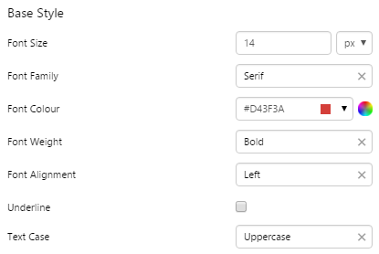 |
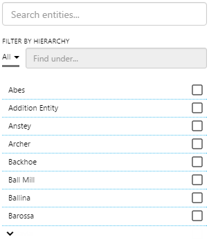
Entity Selector
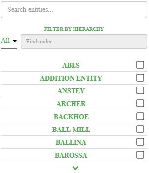
The screenshot below shows the Entity Selector in display mode.
 |
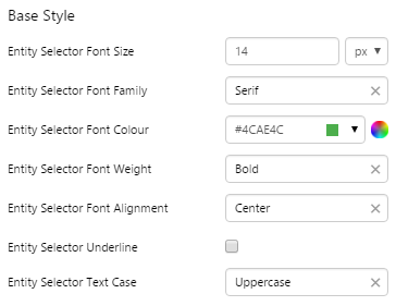
What You Can Change With the Entity Selector, you can change the styles relating to the text, and the line that separates each entity. The check boxes, search boxes, and drop-down list will remain the inherited grey colour (#737373). 1. Base Style: Style the text that appears in the list.
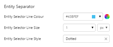
2. Entity Separator: Style the line that separates the text.
|
Examples
| Custom Style in Display Mode | Custom Style Properties |
|
EXAMPLE: Changing the text in the entity list and filter
|
|
|
EXAMPLE: Changing the separator lines in the entity list
|
|
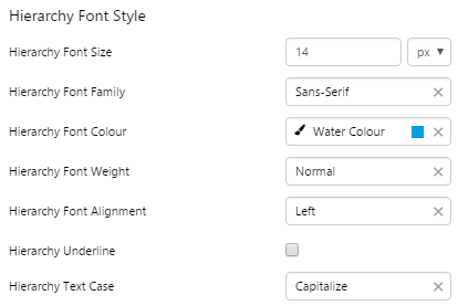
Hierarchy
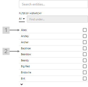
The screenshot below shows the Hierarchy in display mode.
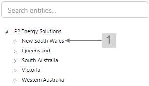 |
What You Can Change With the Hierarchy you can change the styles relating to the text in the tree list. The filter will remain the inherited grey colour. 1. Hierarchy Font Style: Style the text that appears in the list.
|
Examples
| Custom Style in Display Mode | Custom Style Properties |
|
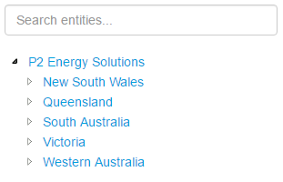
EXAMPLE: Changing the text in the tree list
|
|
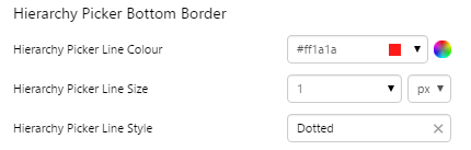
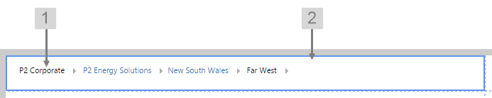
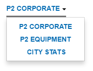
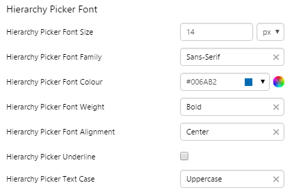
Hierarchy Picker
The screenshot below shows the Hierarchy Picker in design mode.
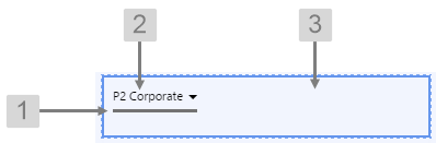 |
What You Can Change With the Hierarchy Picker you can change the styles relating to the text, alignment, and the line below the drop-down list. The drop-down arrow will remain the inherited dark grey colour. 1. Hierarchy Picker Bottom Border: Style the line below the drop-down list.
2. Hierarchy Picker Font: Style the text that appears in the list.
3. Alignment: Set the alignment of the Hierarchy Picker within the cell and the offsets for padding.
|
Examples
| Custom Style in Display Mode | Custom Style Properties |
|
EXAMPLE: Changing the text
|
|
|
EXAMPLE: Changing the Border of the drop-down list
|
|