ON THIS PAGE:
Sometimes, the built-in styles for components in P2 Explorer may not meet your organisation's needs. P2 Explorer therefore provides a way for you to modify some aspects of their appearance. The P2 Explorer mechanism for styling components uses a subset of CSS, presented in a user-friendly manner.
Note: Only users who have been assigned the application role of Style Administrator are able to create, modify, and delete styles in P2 Explorer.
 A component's appearance is determined by its style settings. The exact style settings vary from component to component, but may include things like colour, font size, line width, etc. When you configure a component, you have the option of choosing from various predefined styles via the Style field.
These predefined styles are created on the Style Settings page, which you can get to by clicking the Styles  button on the Admin ribbon.
The Admin tab in P2 Explorer provides 2 functions related to styling:
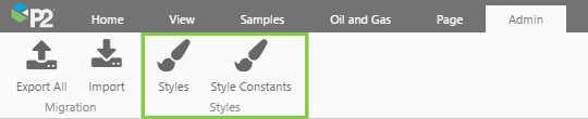
- Styles: The Styles button opens the Style Settings page, which allows you to create and modify styles for each component.
- Style Constants: The Style Constants page allows you to create and modify constants for various style elements. E.g. You can specify a specific shade of red that is to be used whenever you want to style something in red.
How to Create Style Constants
Style constants provide a way to set a common style property across multiple components, and can be used in place of style properties. They allow you to change a common style in one place rather than across many styles.
Creating semantic style constants makes it easier to create different styles for various components, and to more easily change a style across the board for all components using that style. E.g. You can specify a style constant for a standard font. You can use that style constant in all style settings for all components, and then if you decide to change the standard font in the style constant, that change will be replicated through all the styles without you having to do anything else.
To set a style constant:
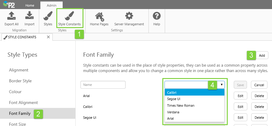
1. In the Admin tab of the Explorer ribbon, click Style Constants.
2. From the list on the left, click the Style Type you want to modify.
Style Types are categories of style that are used in the style settings. E.g. Colour can be used to set standard colours for styles such as Font Colour, Background Colour, Border Colour, etc.
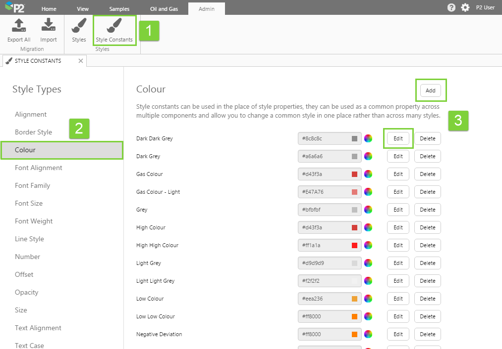
3. Click the Add button to create a new style constant, or click the Edit button next to one of the existing style constants to modify it.
Here is the list of Style Types and what they affect:
| Style Type | What it is | Used by style settings that... |
| Alignment | Drop-down list with options for vertical and horizontal alignment. | Control where an element is positioned inside a cell. In the style settings, this is part of the Alignment property group. |
| Border Style Line Style |
Drop-down list allowing a solid, dashed, or dotted line. | Determine the style of a line. E.g. A border or target line. |
| Colour | Hexadecimal value of a colour. Or click the colour picker icon to choose a colour. | Used by any style setting associated with colour. |
| Font Alignment Text Alignment |
Drop-down list with options for horizontal alignment. | Control the horizontal alignment of some text. |
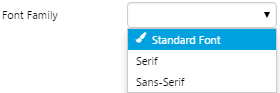
| Font Family | Drop-down list with options for the font family. | Control the font name of some text. |
| Font Size | A number in either pixels or points. Must be a positive whole number. | Control the size of some text. |
| Font Weight | Drop-down list to choose either normal or bold. | Control how thick the text should appear. |
| Number | A positive whole number. | Used by style settings that require a numerical value. E.g. Opacity, Data Indicator size |
| Offset | A number in either pixels or points. Must be a positive whole number. | Control the position of an element in its container (e.g. grid cell), relative to its normal position. The normal position of an element is determined by its alignment (e.g. top-left). An X offset is the distance from the left, while a Y offset is the distance from the top. |
| Opacity | A number between 0 and 1, where 0 means fully transparent and 1 means fully opaque. | Control the transparency of an element. |
| Size | A number in either pixels or points. Must be a positive whole number. | Control the size of an element. |
| Text Case Text Transform |
Drop-down list with options for uppercase, lowercase, or capitalized text. | Control the capitalisation of some text. |
Fonts Available for the Font Family Style Constants
Explorer has five font families to choose from. These are:
- Arial
- Calibri
- Segoe UI (replaces Sans-Serif)
- Times New Roman (replaces Serif)
- Verdana
How to Style a Component
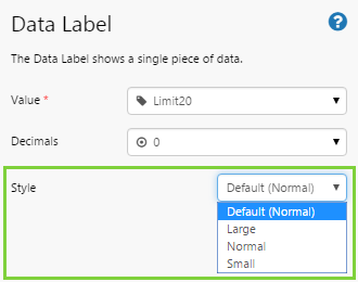
When you configure a component in Studio, the page designer has the option of choosing from various predefined styles via the Style field (see screenshot below).
These styles are created using style settings. Here we describe how to create these styles.
1. In the Admin tab of the Explorer ribbon, click Styles.
2. From the list on the left, click the component for which you want to add a new style or modify an existing style.
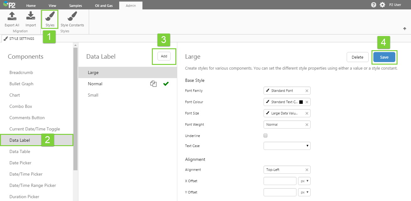
3. In the middle panel, click on one of the existing styles to modify it, or create a new style. You can create a new style by:
- Clicking the Add button (best for starting from scratch), or
- Click the Duplicate
 icon to copy an existing style and make minor modifications. Note that after clicking Duplicate, the focus will remain on the original style, you will need to click the duplicate copy to modify it.
4. In the panel on the right, make your changes and then click the Save button. Note that any style property that is left blank will inherit its style from the built-in property.
When naming your style, try to standardise on a naming convention to make it easier for page designers to choose the appropriate style. E.g. You might choose to prefix the styles with a theme name.
To make a style the default style for the component, click the check  icon next to the style name in the middle panel. This style will automatically be applied to new components by default, unless the page designer chooses a different style during page configuration.
Things to Look Out For
When styling a component, you will be presented with a list of properties that you will be able to modify. Note that for some components, you will not be able to style every single aspect of that component.
See the following section "List of Components" for tips on styling individual components.
You will usually have the option of choosing from a list of pre-defined values or manually typing in a value. When choosing from a list of values, the Style Constants that have been defined for that property type are shown at the top of the list and are indicated by the paintbrush icon.
List of Components
Browse through the component grouping pages to find specific styling information on individual components:
- Charts
- Bullet Graph
- Chart
- Embedded Trend
- Histogram
- Performance Curve
- Treemap
- Displays
- Comments Button
- Data Label
- Gauge
- Hyperlink
- Info Button
- Level Meter
- Meter
- Pressure Meter
- Simple Line
- Status Indicator
- Status Tile
- Tank
- Target Bar
- Target Label
- Target Variance Bar
- Temperature Meter
- Text Label
- Wind Vane
- Tables
- Data Table
- Paging Control
- Pivot Table
- Time
- Current Date/Time Toggle
- Date Picker
- Date/Time Picker
- Date/Time Range Picker
- Duration Picker
- Month Picker
- Controls
- Action Button
- Combo Box
- Hotspot
- Option Links
- Selection List
- Text Input
- Hierarchies
- Breadcrumb
- Entity Selector
- Hierarchy
- Hierarchy Picker
- Layouts
- Grid Layout
- Precision Layout
- Table Layout
Style Overrides
In Studio, several of the components allow changes to the style's alignment. See how this is done for a Status Indicator:
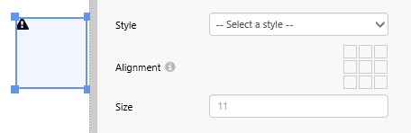 |
| Here the Status Indicator does not have a selected style. |
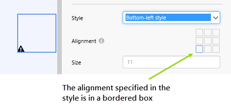 |
| Here the Status Indicator has a style with a bottom-left alignment. |
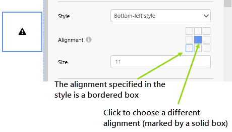 |
| Here the Status Indicator alignment has been overriden (click on a box to do this). |
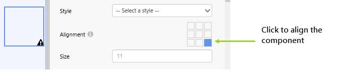 |
| You can also align an unstyled Status Indicator, as shown here. |
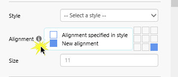 |
| Click the information icon if you are unsure to see the key for style alignment, and new alignment. |
Components in which the visual portion does not stretch to fill a grid cell allow for alignment within Studio, including:
- Breadcrumb
- Combo Box
- Comments Button
- Current Data/Time Toggle
- Date Picker
- Date/Time Picker
- Date/Time Range Picker
- Duration Picker
- Data Label
- Hierarchy Picker
- Hyperlink
- Month Picker
- Options Links
- Status Indicator
- Target Label
- Text Label
Some of the components also allow for size override, including the Status Indicator (pictured above).