ON THIS PAGE:
Overview
The Info Button is a component that a page designer can position alongside a specific component (such as a chart) or section of the page, so that a user can associate Knowledge Management with that component or section.
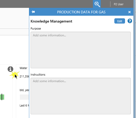
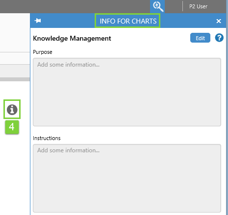
When a user clicks the configured Info Button in Display Mode, the Explore panel opens to show Knowledge Management relating to that chart, or area of the page. This initially holds no information (Add some information...).
 |
| The Knowledege Management appears in the Explore panel |
A user can read or edit the Knowledge Management fields. The standard fields are:
- Purpose: What this area or specific component is intended for.
- Instructions: Any special instructions applicable to this area of the page.
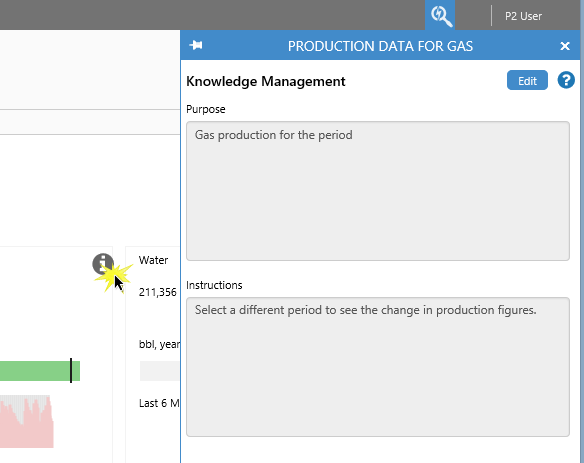 |
| Here the Knowledge Management fields have already been captured by a user |
Pages can have several info buttons, each with Knowledge Management designed to be relevant to its physical or conceptual area on the page.
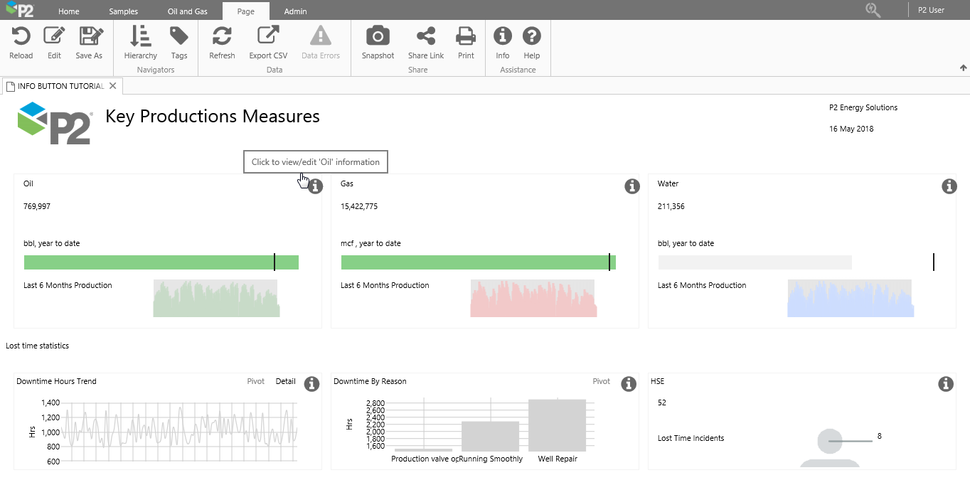 |
| This page has six Info Buttons, each one for describing its separate area |
Context Key
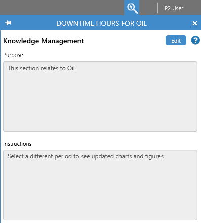
Each Info Button on a page has a context key. Where Info Buttons on a single page use the same context key, the Knowledge Management is shared between them.
In the example below, two Info Button components on the same page share the same Context Key (Oil) which means they share their Knowledge Management.
 |
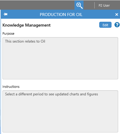 |
| Knowledge Management for Info Button "Downtime Hours for Oil" | Knowledge Management for Info Button "Production for Oil" |
When you hover over an Info Button in Display Mode, the context key appears in the tooltip: "Click to view/edit '[context key]' information".
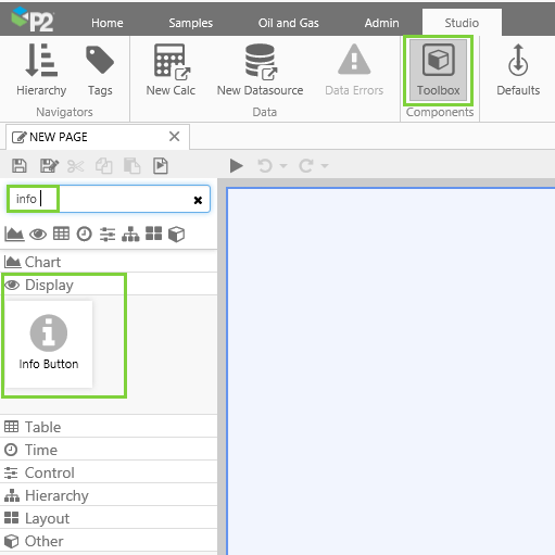
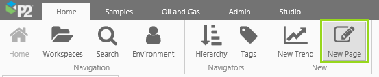
Finding the Component
The Info Button is in the Display  group of the Components Toolbox.
Quick Start
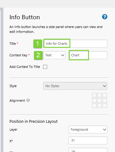
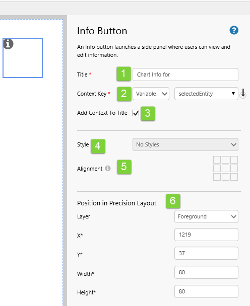
You can very quickly configure an Info Button, by giving it a Title, and a fixed text Context Key.
In the Info Button component editor, assign a value to these two fields.
1. In the Title text box, type Info for Charts.
2. In the Context Key text box, type Chart.
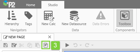
3. Click Finish and Open on the Studio toolbar.
4. In Display Mode, click the Info Button. The Knowledge Management appears in the Explore panel, with the Title: "Info for Charts".
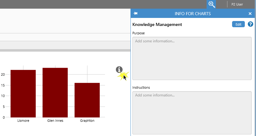
Usually, your info button would be positioned next to the component it is describing, like this:
Configuration
The following diagram shows a configured Info Button component:
|
|
Tutorial: Info Button for Selected Entity
If you're unfamiliar with the process of building pages, read the article Building an Explorer Page.
In this tutorial, we'll add an Info Button and an Entity Selector. We'll configure the Info Button to use a variable Context Key (selectedEntity) which the user can change by selecting from the Entity Selector. We'll also set a default value for selectedEntity.
At the end of the tutorial, your page should look something like this:
Let’s go through this process, step-by-step.
Step 1. Prepare a Studio Page
Before you start, click the New Page button on the Home tab of the ribbon. Choose the Precision layout.
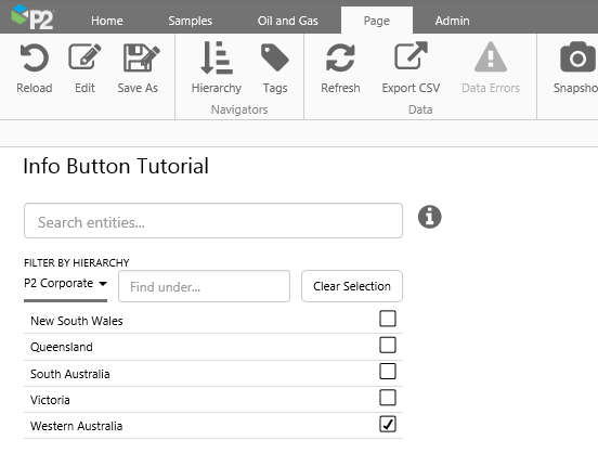
Step 2. Add and Configure an Entity Selector
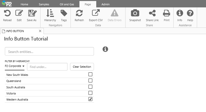
In this step, we want to configure an Entity Selector that will allow the user to select a Business Unit from the P2 Corporate hierarchy. We will use the Basic configuration for this.
Drag and drop the Entity Selector component onto the top left side of the page. The Entity Selector is in the Hierarchy  group.
Click the Basic button, and configure the fields as follows:
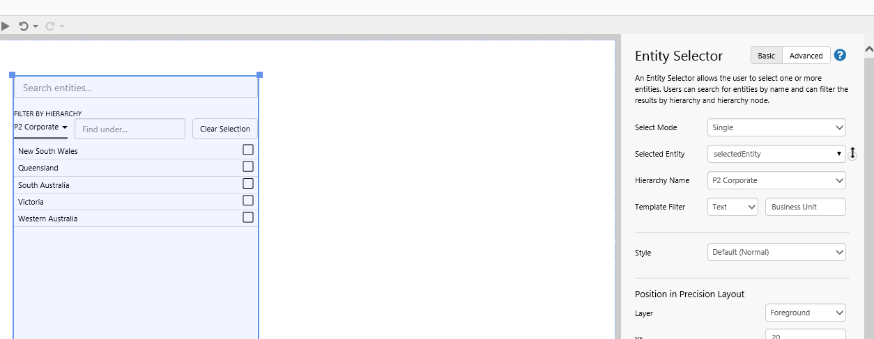
| Select Mode | Single | Allow the user to select only one entity at a time. |
| Selected Entity | selectedEntity | When a user selects an entity, this variable gets updated. |
| Hierarchy Name | P2 Corporate | Only entities from this hierarchy are displayed. |
| Template Filter | (Text) Business Unit | Only entities that have this template are displayed. |
Step 3. Set the Default Values
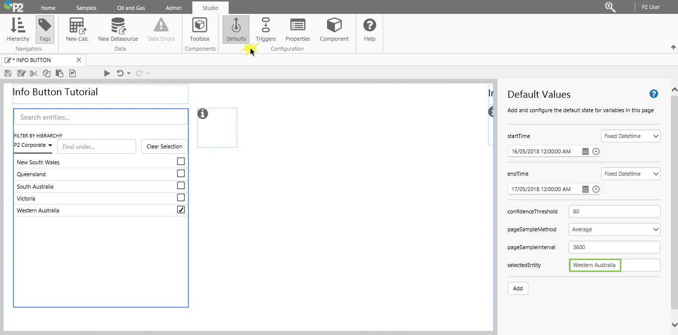
If you don't set any default values, the Entity Selector will not have an entity selected when the page is first loaded. We can set the initial selected entity here.
We are going to set a default for the selectedEntity variable.
- Click the Default Values
 button on the Studio toolbar.
 - For the selectedEntity variable, update it to specify Western Australia.
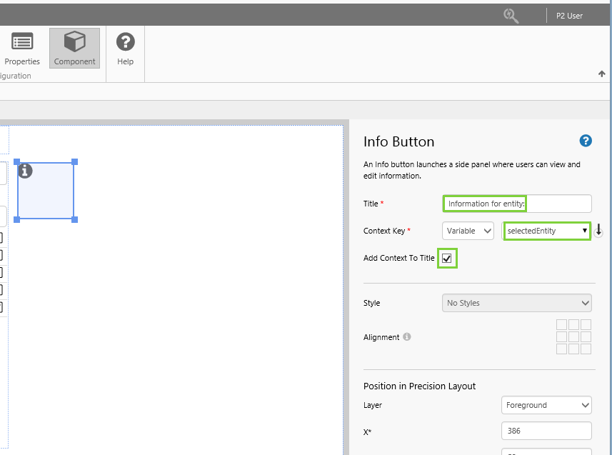
Step 4. Add and Configure an Info Button
We're going to add an Info Button, and configure it to use the selected entity as its Context Key.
Drag and drop the Info Button component just to the right of the Entity Selector. The Info Button is in the Display group.
The positioning of the Info Button is important, as the user needs to know what area of the page it relates to.
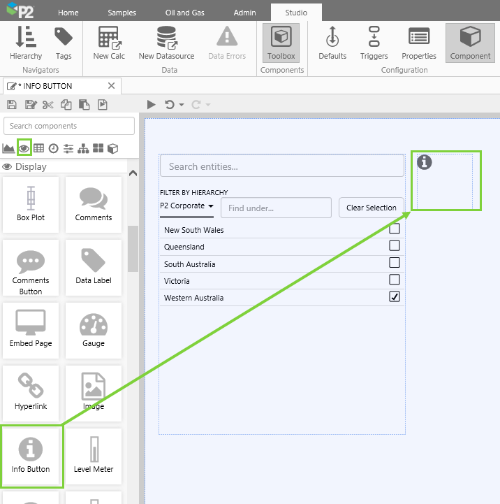
Configure it as follows:
| Title | Information for entity: | This forms the main title for the Explore panel's header when the Info Button is clicked. |
| Context Key | (Variable) selectedEntity | This will update when the user selects an entity. |
| Add Context To Title | Select this | The context key will be appended to the title. |
Step 5. All done!
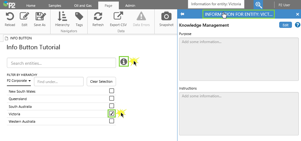
Congratulations! You now have a an Info Button that can hold Knowledge Management for any entity that the user selects.
- Click the preview
 button on the Studio toolbar to see what your page will look like in display mode.
 - Choose an entity, then click the Info Button. Note how the title contains the entity name. Now add text into the Knowledge Management fields, and save.
 Remember to save your page!