ON THIS PAGE:
Overview
The Default Values panel sets the context of a page when it is opened in Display Mode, by supplying the initial values to the page's variables. It also sets the start and end times that are used on your page by various components.
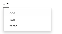
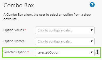
For example, a Combo Box should have a default value assigned to its Selected Option variable, otherwise there is no selection when the page opens, and the user has to select something before any data is shown.
| Examples of components without a default value: | Examples of components with a default value: |
 |
 |
 |
 |
 |
 |
Some variables come standard with all pages; others need to be added, as required.
Default values can also be used for dataset parameter variables when a dataset is chosen for a component's data. This ensures that the component displays a useful value as soon as a page is opened. For example, on page open, a dataset query runs where 'Oil' is the default value for the selectedProduct variable, which is used as a parameter for the dataset query.
Default Values Panel
The Default Values panel is where you configure the default values for page variables. You can access the Default Values panel from the Studio tab of the Explorer ribbon.
To open the Default Values panel, click the Defaults button on the Configuration tab group.
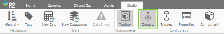
The Default Values panel contains two main sections:
- Standard page variables: these can be updated but not removed
- An 'Add' button allows you to add custom page variables of various types

Later we will explore options for updating the Standard page variables, and how to add a custom page variable.
To close the Default Values panel click any button on the Configuration tab group.
Trend Default Values
Trends also have default variable values, but these have been predefined and cannot be changed when you save a new trend. If you open a trend through a URL or using one of the links from a page (using hyperlink, hotspot, status tiles, or charts), you can override the default values.
Overriding Default Values
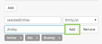
If you open a page or trend from another Explorer page using hyperlinks, hotspots, status tiles, or charts with an x-axis Link Action, you can pass values from the calling page, using Variable Mapping. If a standard page variable default is mapped in this way, its value is overridden. For example, if you have page with a default selected entity of Archer, you can open the same page via a hyperlink or URL, assigning that page's selected entity, Ibis.
In a similar way, if you open a page via a URL, you can override the page's default values by setting your own variables in the URL.
Variables are also updated and default values are overridden when users begin to interact with controls on a page or trend.
Defaults with Relative Values
Some default variables, such as startTime and endTime, have values that vary relative to the time when you open the page, for example an endTime of 'yesterday', or a startTime that is always five days before the endTime. These settings, and others, are described in startTime and endTime below.
Standard Page Variables
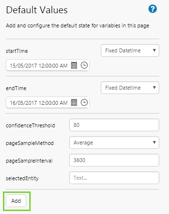
When you add a new page, several page variables (with a Variable Name, Default Value, and sometimes Type) are inserted in the Default Values panel. These cannot be removed.
| Variable Name | Default Value | Type |
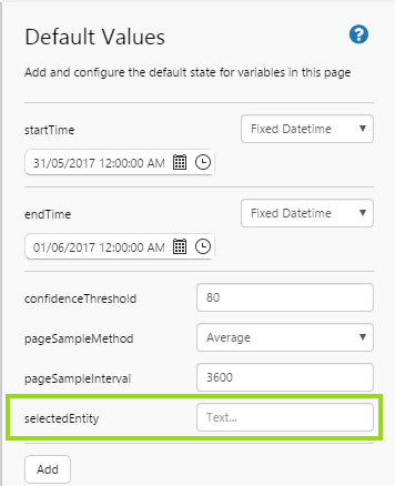
| startTime | the start (12:00 AM) of the day you create the page | Fixed Datetime |
| endTime | the start (12:00 AM) of the day after you create the page | Fixed Datetime |
| confidenceThreshhold | 80 | |
| pageSampleMethod | Average | |
| pageSampleInterval | 3600 | |
| selectedEntity | - |
Note that selectedEntity does not come with a default value.
The standard page default values (with the exception of the selectedEntity default) start out the same for all pages, bringing a measure of uniformity across different pages. Note that if you change a default value for any of the standard page variables, you lose this consistency across pages.
The standard default variables are used by many components. When you add a new component to the page, some of its properties have variables already assigned to them.
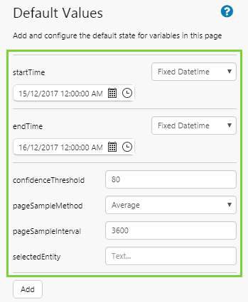
For example, when you drop an attribute onto a page, this uses a data label component, whose Sample Method, Sample Interval and Time properties use the default variables of pageSampleMethod, pageSampleInterval and endTime, respectively.
Similarly, when you configure a chart to use tag data, the default variables pageSampleMethod, pageSampleInterval, startTime, and endTime are applied.
| Example 1: Sample Method, Sample Interval and End Time for a data label's attribute. | Example 2: Sample Method, Sample Interval, Start Time and End Time for a chart's tag data. |
 |
 |
startTime and endTime
Setting the start time and end time defaults for your page determines the data collection periods when the page is opened, and also how date/time controls will operate.
The endTime default variable is applied to the End Time of any time series data added to the page. You can also use this variable for a dataset query parameter of type Datetime.
Similarly, startTime is applied to the Start Time (where there is a time range) of any time series data added to the page, or for dataset query parameters.
The date/time components are preconfigured to use startTime and endTime (where applicable).
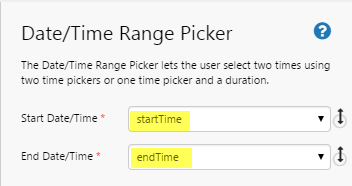
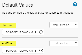
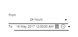
Example: The Date Time Range Picker uses startTime and endTime from the page default values.
| The Date/Time Range Picker is preconfigured to use the startTime and endTime page defaults. | The page defaults for startTime and endTime, as they appear for a new page. | In Display Mode, the Date/Time Range Picker shows the startTime (From) and the endTime (To). |
 |
 |
 |
There are various ways to set the date and time for startTime and endTime:
Fixed Datetime
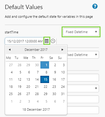
When you create a new page, the default for startTime is 12:00:00 AM of the current date, and the default for endTime is 24 hours later.
Both of them are a Fixed Datetime data type, which means that this specific data and time is always the start time and end time every time the page is reloaded.
To change the date or time, select a new date and time using the DateTime Picker  .
.
Changing the Fixed Datetime for startTime:
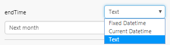
Text
You can also use a Text data type to set the startTime and endTime. Choosing the 'Text' option allows you to set the time using English phrases. You can set a time relative to the current date and time (e.g. ‘Yesterday’), or use fixed date times (e.g. ‘start of 2016’).
Here are some of the ways you can use a Text data type:
- now
- today
- yesterday
- next week
- last year
- the 15th
- next Tuesday
- 3pm Wednesday
- in 30 minutes
- five years ago
- yesterday at 4pm
- an hour ago
- an hour from now
- 6:30pm in three days
- the 4th of July
- next week Thursday
- the end of February
- two weeks from today
- the end of next week
- next Saturday at 10am
- the first day of 2013
- four days after Monday
- March 15th of last year
- two days after tomorrow
- the last day of February
- Sunday, January 15th 2012
- the beginning of this month
- the 2nd Tuesday of November
- 5-2002
- 8/25/1978
- 8-25-1978
- 8.25.1978
- 2012-12-31
- 2016-Mar-18
- 22 August
- April 2012
- June 3rd, 2005
- 1 Dec. 2016
- 17760523T024508+0830
- 1997-07-16T19:20:30+01:00
- 08-25-1978 11:42:32.488am
- Wed, 03 Jul 2008 08:00:00 EST
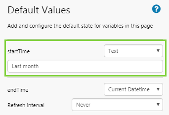
To set an end time as text, click Defaults  on the Studio ribbon tab to open the Default Values panel. Select an endTime of Text, then type in a date string, such as ‘yesterday’, ‘last week’ (a week ago), ‘next month’ (a month from now).
The same applies for setting a start time to text. Select a startTime of Text, then type in a date string, such as ‘yesterday’, ‘last week’ (a week ago), ‘end of 2017’.
| Setting a startTime relative to the current time: | Setting an endTime relative to the current time: |
 |
 |
Relative Datetime
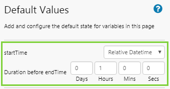
A page can be configured to have a set interval between its start time and end time, e.g. 24 hours or one week. This is useful if you want to view a weekly report, for example. Every time the endTime variable updates (whether through a control such as a Date/Time Picker, or when the page refreshes), the startTime updates to maintain the relative datetime interval. You therefore need to specify the interval on the startTime variable.
To set the startTime relative to the endTime, click Defaults on the Studio ribbon tab to open the Default Values panel. Select a startTime of Relative Datetime, then capture the duration in the Duration before endTime edit boxes.
Current Datetime (Page Refresh)
Your page can be configured to refresh automatically. This is done on the endTime variable. The refresh interval can be anything from one minute to 12 hours, depending on the configuration in Design Mode.
To set an automatic refresh for the page, click Defaults on the Studio ribbon tab to open the Default Values panel. Select an endTime of Current Datetime, then select a Refresh interval from the drop-down list.

confidenceThreshold
This is typically used as the Confidence Threshold variable for meters that have a confidence threshold, such as the Gauge, Pressure Meter, Temperature Meter, and Level Meter.
Example: Here the measured data's confidence, which is returned with the data, is lower than the gauge's defined confidence threshold, so the data indicator shows the Low Confidence symbol.
Note: Data confidence threshold is measured as a percentage, so it must be a value between 1 and 100.

pageSampleMethod
This is applied to the Sample Method of any time series data added to the page. This is the method (e.g. average) that IFS OI Server uses to collect the data. You can select any of these from the drop-down list:
- Raw
- Average
- LinearInterpolate
- LastKnownValue
pageSampleInterval
This is applied to the Sample Interval of any time series data added to the page. This is the interval (e.g. 1 week) that IFS OI Server uses to collect the trend data. The values here are measured in seconds.
For a new page, this is set to 3600 (i.e. 1 hour). You can update this by typing in a new number e.g. 21600.
These are the values (in seconds) that you can use:
| Seconds | Corresponds to this Sample Interval |
| 1 | 1 second |
| 10 | 10 seconds |
| 30 | 30 seconds |
| 60 | 1 minute |
| 300 | 5 minutes |
| 600 | 10 minutes |
| 1800 | 30 minutes |
| 3600 | 1 hour |
| 21600 | 6 hours |
| 43200 | 12 hours |
| 86400 | 1 day |
| 604800 | 1 week |
| 1209600 | 2 weeks |
| 2419200 | 4 weeks |
selectedEntity
The selectedEntity variable, although a standard default variable, does not have a default value initially assigned — the page designer must specify it. Usually this is done by typing in an entity name. However, the first time you drag an attribute or attribute value onto the page, the entity for that attribute is inserted here as the default value.
Using the selectedEntity variable ensures your page can change context, for example if it's a page that you open from the Table of Contents ribbon tab.
When adding an attribute value to a page, press Ctrl and then Click and Drag the attribute value onto the page or component property. This assigns the selectedEntity variable, rather than the currently selected entity on the hierarchy navigator.
Demo - Setting the variable for the selectedEntity value
1. The default value for a new Explorer page is undefined.
2. Click and drag an attribute from a selected entity (TWell 1), and drag it onto the page.

3. The selectedEntity value is assigned the value of this first entity used on the page: TWell 1.

Note: Check where the defaults are already being used, before editing or deleting them.
Adding a Default Value
This section explains how to set up the default value for a page variable in two steps. For more detailed instructions, jump to the Tutorial.
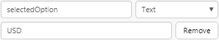
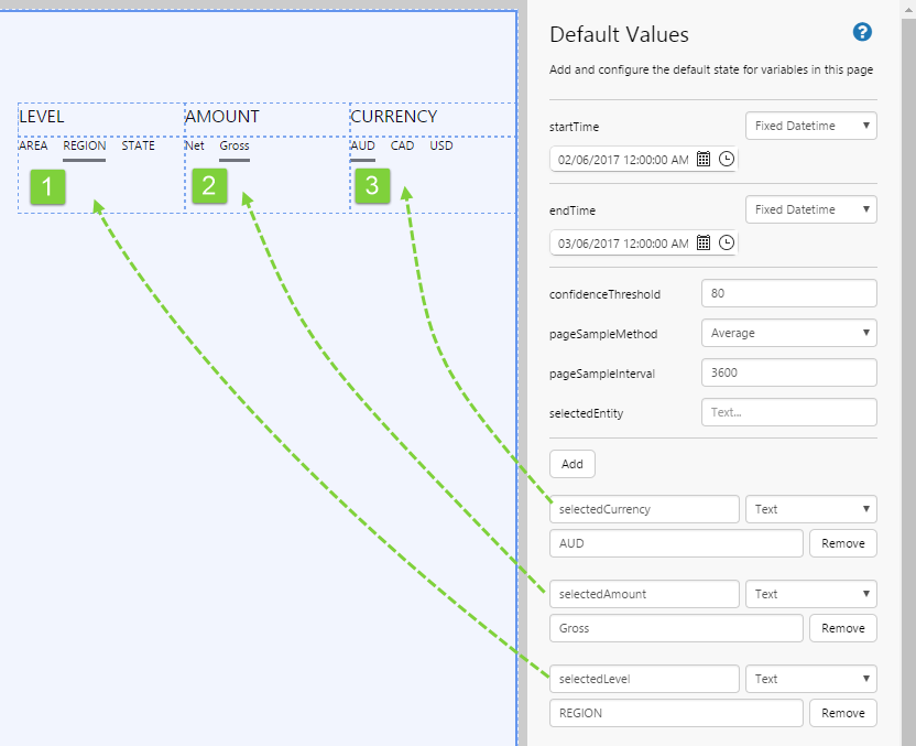
Before adding a default value for a custom variable, find out what variables you have on the page, or plan which variables you are going to use for components on the page. Then assign each of these a default value. You need to match the variable name and type (e.g. Text), and the associated value should come from a set of options for that variable (e.g. Choose 'USD' for variable selectedCurrency).
1. First, open the Default Values panel from the Studio ribbon tab.
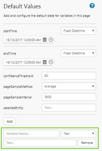
2. Click the Add button, located below the standard page variables.

3. A new custom variable is added, ready for you to define. You need to define a variable name and variable type, and optionally the default value.
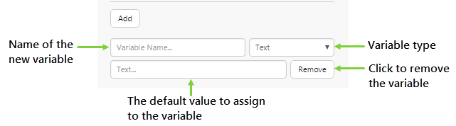
Variable Name
You can either name your new variable to match a variable already used in a component, or you can give it a completely new name.
For example, the combo box component has the variable selectedOption set for its Selected Option property. You can add a new default called selectedOption to match this and give the component its initial value. Alternatively (and especially if you are using more than one combo box on your page), you can give the default a new name (such as selectedCurrency, and then update the combo box to use that for its Selected Option.)
Variable Type
The table below contains the different variable types you can use for default variables. The type you specify here determines what default value you can assign. E.g. You cannot enter text for a Number variable type.
| Type | Definition and Example Value | Usage Example |
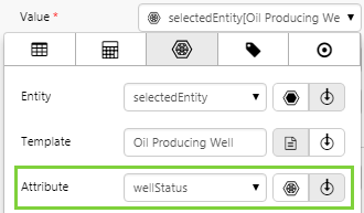
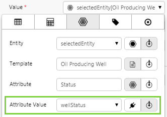
| Attribute | An entity-attribute pair, as defined in IFS OI Server using valid syntax, and enclosed in curly brackets { }. Example:
{Archer[Oil Producing Well]:Status} |
In the Data Selector, when using a variable to define an attribute.
|
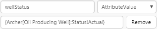
| AttributeValue | A list of entity-attribute value pairs, as defined in IFS OI Server using valid syntax, and enclosed in curly brackets { }. Example: {Archer[Oil Producing Well]:Status!Actual} |
In the Data Selector, when using a variable to define an attribute value. You can use this type when you see this icon in the Data Selector: 
|
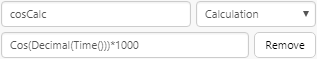
| Calculation | A syntactically valid calculation expression that can be parsed by the Calculation Engine. If specifying the name of a a saved calculation, it must be enclosed in curly brackets { }. Example:
|
In the Data Selector, when using a variable to define a calculation. You can use this type when you see this icon in the Data Selector:  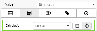 |
| CalculationList | A list of syntactically valid calculation expression that can be parsed by the Calculation Engine. If specifying the name of a a saved calculation, it must be enclosed in curly brackets { }. Example:
|
In the Data Selector, when using a variable to define calculations for a Data Table component. You can use this type when you see this icon in the Data Selector:  |
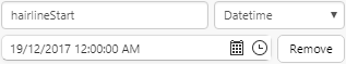
| Datetime | A date/time value in UTC format. Example:
|
The Hairline Start or Hairline End of a continuous chart or embedded trend component. You can use this type when you see this icon in the Data Selector:   |
| Entity | The name of an entity in IFS OI Server. Example:
|
In the Data Selector, when using a variable to define an entity. You can use this type when you see this icon in the Data Selector:  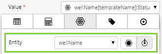 |
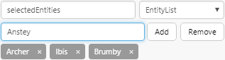
| EntityList | A list of entity names in IFS OI Server. Example:
|
The Selected Entities of a Hierarchy component (using Multiple Select Mode). You can use this type when you see this icon in the Data Selector: 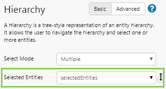 |
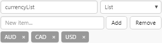
| List | A list of text values. Example:
|
The Option Values for a Combo Box component. You can use this type when you see this icon in the Data Selector:  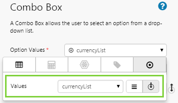 |
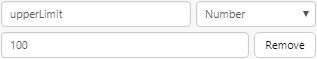
| Number | A valid numeric value. Can be integer or decimal. Example:
|
In the Data Selector, when using a variable to define a numeric value. You can use this type when you see this icon in the Data Selector:  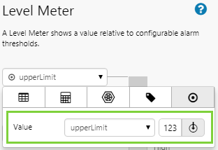 |
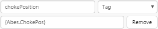
| Tag | A tag as defined in IFS OI Server, enclosed in curly brackets { }. Example:
|
In the Data Selector, when using a variable to define a tag. You can use this type when you see this icon in the Data Selector:  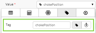 |
| TagList | A list of tags as defined in IFS OI Server, with each tag enclosed in curly brackets { }. Example:
|
In the Data Selector, when using a variable to define a list of tags. You can use this type when you see this icon in the Data Selector:  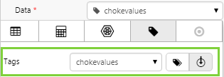 |
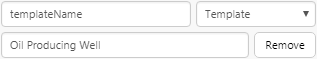
| Template | The name of a template, as defined in IFS OI Server. Example:
|
In the Data Selector, when using a variable to define a template. You can use this type when you see this icon in the Data Selector:  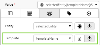 |
| Text | An alphanumeric text value. Example:
|
The Selected Option for a Combo Box component. You can use this type when you see this icon in the Data Selector:  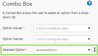 |
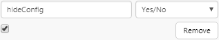
| Yes/No | Select the check box to indicate Yes; clear the check box to indicate No. Example:
|
The Hide Config Panel of a Pivot Table component. You can use this type when you see this icon in the Data Selector:  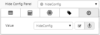 |


List Types
Most default values require you to enter a single value, however for list types, you can enter multiple values. E.g. EntityList. When entering these, either press the Enter key or click the Add button after entering each value.
Example
Here, we have added default values for the respective Selected Option property of three different Option Link components (see the Tutorial for how this is configured).
This is what the Option Links components look like in Design Mode.
|
|
|
|
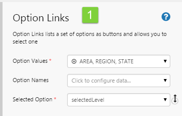

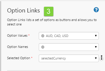
Notice how the selection option value in each case matches one of the items from the Option Values for the component.
Tutorial: Defaults for Option Links
In this tutorial, we're going to add an Option Links component, and then set a Default Value (list) for its Option Values, as well as a Default Value (text) for its Selected Option.
Before you start the tutorial, prepare a page in Studio.
Step 1. Add Default Values
1. Open the Default Values panel: Click the Defaults button on the Configuration tab group of the Studio ribbon, to open the Default Values panel.
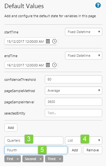
Add a new default value: We're going to add a list of yearly quarters: First, Second, Third and Fourth and call this default Quarters.
2. On the Default Values panel, click the Add button below the Page Defaults.
A new default is added.
3. Type Quarters in the Variable Name edit box.
4. Select List from the Data Type drop-down list.
5. Add the following values into the Default Value text box, clicking Add or pressing the Enter key after each addition: First, Second, Third, Fourth.
Add the next default: Now we're going to add a text value for the selected quarter: Third, and call this default selectedQuarter. This will be the Selected Option for the Option Links component.
6. Click the Add button again.
A new default is added.
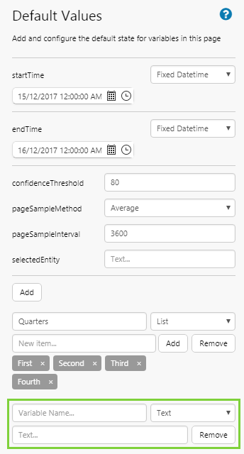
7. Type selectedQuarter in the Variable Name edit box.
8. Keep the Text selection in the Data Type drop-down list.
9. Type Third into the Default Value text box.

Step 2. Add and Configure Option Links
1. Drag an Option Links component onto a grid cell.
2. Click the Option Values edit box to open its data selector.
3. Click the Variables button in the data selector.
4. Select Quarters from the drop-down list.
Note: Because the Quarters variable is defined as a List data type, this is a suitable value for Option Values.

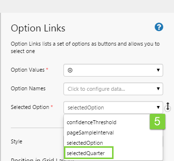
5. Click the Selection Option drop-down list and select selectedQuarter from the drop-down list.
Note: Because selectedQuarter variable is defined as a Text data type, this is a suitable value for Selected Option.
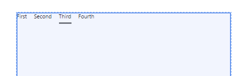
The Option Links now has two defaults:

This is how your Option Links should look in Studio. You've set this up entirely using default values.
Release History
- Default Values 4.5.4 (this release)
- The startTime format has changed from minutes to duration, when it the Relative Datetime option is used
- startTime is now listed first
- Default Values 4.5.0
- Defaults are logically grouped
- Standard page variables no longer editable
- Changes to startTime and endTime variables
- Default Values 4.4.2
- Introduced Calculation and CalculationList as new data types that can be assigned to default values