ON THIS PAGE:
P2 Explorer 4.4 reinvents P2 Explorer into a prime data visualization tool. It uses new technologies to support cross-browser compatibility and new, sleeker visualizations. Content is key, allowing you to zoom in on and diagnose problem areas, so they can be addressed quickly and effectively.
In P2 Explorer 4.4, elements on a page can interact with other elements on the same page to drive dynamic, information-rich displays, while cross-referencing of data enables further comparison and analysis of related information. An approvals process also allows anyone to submit their own displays for publishing to a wider audience within the organisation.
What sets this version apart from previous releases is the focus on usability. The new data selector makes data-driven pages easier to design, and a set of predefined styles for selected components significantly improves the ability to customise displays.
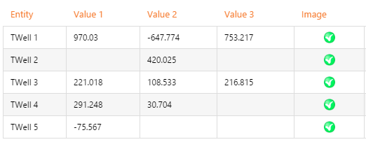
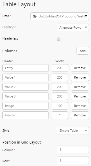
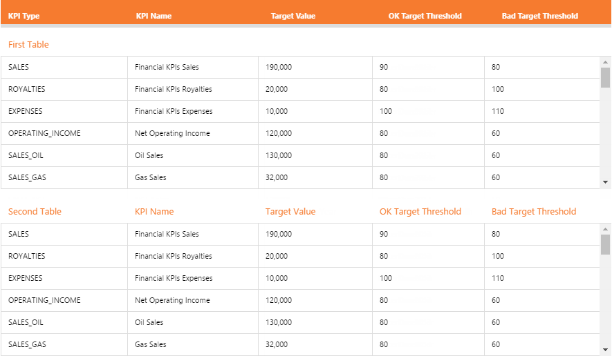
Table Layout
The Table Layout is new component that arranges your data in a tabular format. You only need to configure the first row on the table and that will be repeated across each row in your data set.
The Table Layout content isn’t just restricted to data – you can add a component to the table, including images and charts!
This layout is very intensive on your web browser, so we recommend that you limit the number of rows you use in this control, and that you only use one of these per page for maximum performance.
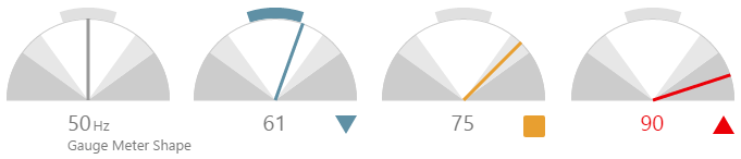
New Shapes
P2 Explorer 4.4.1 introduces more of our process control shape components.
Gauge
The new Gauge shape is similar to the Meter in that it shows a numeric value as a needle in relation to target areas. However the shape draws attention to abnormalities in operational process with selective use of colour to attract the operator’s attention.
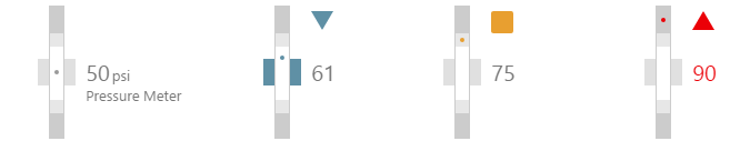
Pressure Meter
The new Pressure Meter shape is similar to the Level Meter in that it provides a way of viewing a single point of numeric data with configurable alarm thresholds. However the shape uses a dot instead of a line to indicate levels.
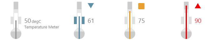
Temperature Meter
The new Temperature Meter shape is similar to the Level Meter in that it provides a way of viewing a single point of numeric data with configurable alarm thresholds. However the shape has been designed to look like a traditional thermometer, with a bulb at the end.
Simple Line
The Simple Line shape allows page designers to add lines on a page, and select from different orientations.
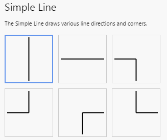
When used in conjunction with images and other components, this shape allows you to easily create rich, schematic-style pages.
Studio Enhancements
Ribbon
The Studio tab on the ribbon has some new additions.
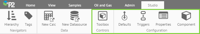
- The page properties and page defaults have been moved from the toolbar into the ribbon.
- The ribbon now contains toggle buttons for hiding the component toolbox and component editor.
- The ribbon also contains a new button for Triggers, which opens a panel displaying further behaviours that users can take to cause a change on that page.
Component Editor Element Positioning
Component editors now have additional options that allow page designers to reposition elements by typing in values.
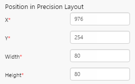
For the Precision Layout, component position can be specified using X and Y coordinates. You can also specify the exact height and width of the component.
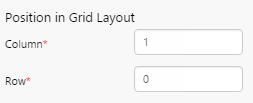
For components in a Grid Layout, you can specify the column and row. The top left cell is specified as Column 0, Row 0.
Arrow Keys
Page designers are now able to use arrow keys to move components on the canvas.
Component Enhancements
Chart
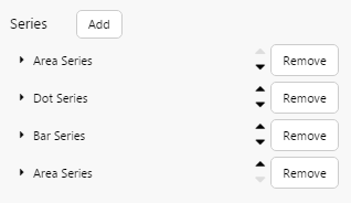
When you have multiple series on a chart, you can now reorder them using up/down arrows in the component editor.
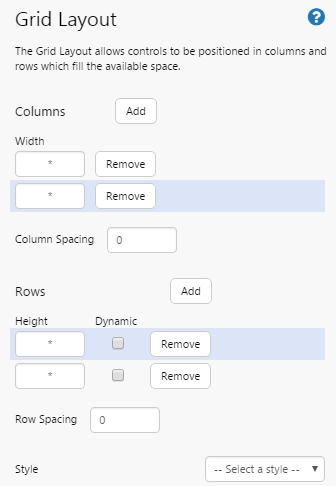
Grid Layout
The Grid Layout now allows you to dynamically resize rows. This has the effect of increasing the vertical page size with one scrollbar, instead of scrollbars being activated for each row. This is particularly useful when using multiple tables on a page where you want them displayed without scrollbars. Using dynamic rows will affect the layouts of some controls, so it's recommended that they are used for simple grids with tables, as shown below.
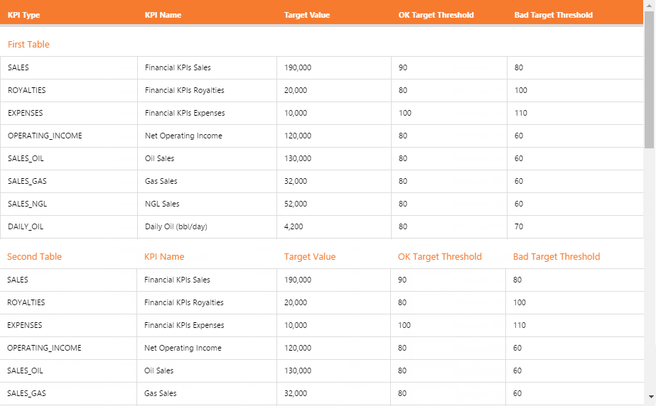
With dynamic rows selected
Without dynamic rows
The Grid Layout also now highlights the selected row and column.
Trend Enhancements
Additional variable parameters are available for trend URLs, used in the same way as the variable tags. These are:
- selectedEntities
- templates
- attributes
- attributeValues