ON THIS PAGE:
P2 Explorer 4.6.0 consolidates what was previously three installers into one. It also combines the three separate databases of P2 Server, P2 Explorer, and P2 Security into a single database.
This release introduces the concept of the Info Zone – an area on the right side of the Explorer screen which displays context-sensitive information in a new Explore panel. This takes the concept of the “Table of Contents” in previous releases of Explorer, to the next level. For this release, comments and display information will appear in this zone, with more to come in future releases.
Release 4.6.0 also introduces a more intuitive security interface for assigning roles and permissions, Zoom Mode in the Trend, an updated commentary infrastructure and styling, and a new Knowledge Management component that allows users to capture information about the page or component in the Explore panel.
Easier Security
P2 Security, P2 Server, and P2 Explorer are now a single installation with 3 modules. Along with this unification, we have integrated most of the security administration functions into P2 Server Management. Additionally, administrators are now able to secure a workspace directly within P2 Explorer workspaces. This addresses customer request SF 365729.
In Server Management, a new security section has been added. This allows administrators to administer users and roles and assign privileges at a resource level, as needed.
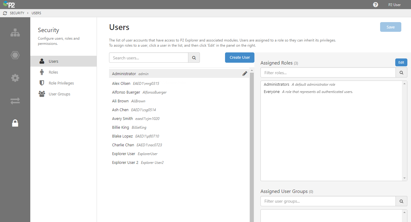
Security administrators can assign privileges which cascade logically. For example, assigning Admin privileges to the Server module means that the user will have view, write, edit, and delete privileges on all of Server, but not necessarily all of Explorer.
 |
The privilege has not been assigned, so default privileges will apply. |
 |
The privilege is granted. |
 |
The privilege is granted because it was inherited by a higher level privilege. |
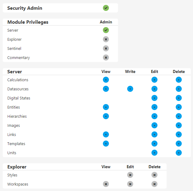
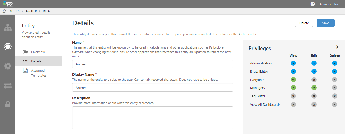
Securing objects has also been made much simpler. In P2 Server Management, objects that can be secured (such as entities) now shows the privileges matrix on the right, to users with Security Admin privileges. To apply granular security to an object, click the dots to assign privileges as needed.
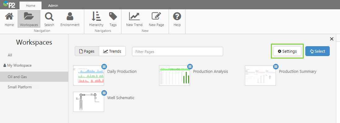
Securing workspaces in Explorer is now easier than ever, and is done directly in Explorer. Simply choose the workspace and then click the Settings button. Click the dots to assign privileges as needed.
P2 Explorer now also employs a single sign out procedure – when a user signs out of one module, they are signed out of all modules. For example, if someone signs out of Server Management, their Explorer session will also be signed out even if they have multiple browser tabs open.
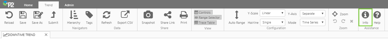
Header and Ribbon Changes
Minor changes have been made to the Explorer header and ribbon, to make way for the Info Zone section, on the right side of the screen.
In previous releases, the grey header showed the following icons on the right.
In this release, the icons have been moved and we now see the Explore  icon:
icon:
The changes reflect the new Info Zone section, and the functions surfaced through the old Settings icon have been moved to the Admin tab:
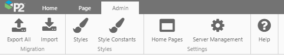
The Admin tab now has a new Settings group which contains access to the Home Pages assignment and the link to Server Management.
The Help icon is now available in all ribbon tabs, providing you with even better contextual help.
Info Zone - Explore
The new Info Zone header shows an icon for the Explore panel, with room for further icons to come:
The Explore icon is located to the left of the user name, and is enabled when you are able to explore information about a display or object in Explorer. When the icon is enabled (it is inactive on first load), you can click it to open the Explore Panel and see information about the last thing that you viewed before it was closed.
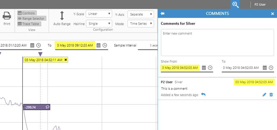
Comments
When opening comments from the trend or from a comments button on a page, the comments window now opens in the Explore panel. Styling has been refined, and this release introduces two enhancements:
Edit: In previous versions, users could only edit their own entries. In this release, Edit is a privilege that can be granted to users via a role. This privilege allows users with that role to edit any comment in the system, regardless of who originally wrote the comment.
Delete: In this release, Delete is a privilege that can be granted to users via a role. This privilege allows users with that role to delete any comment in the system, regardless of who originally wrote the comment.
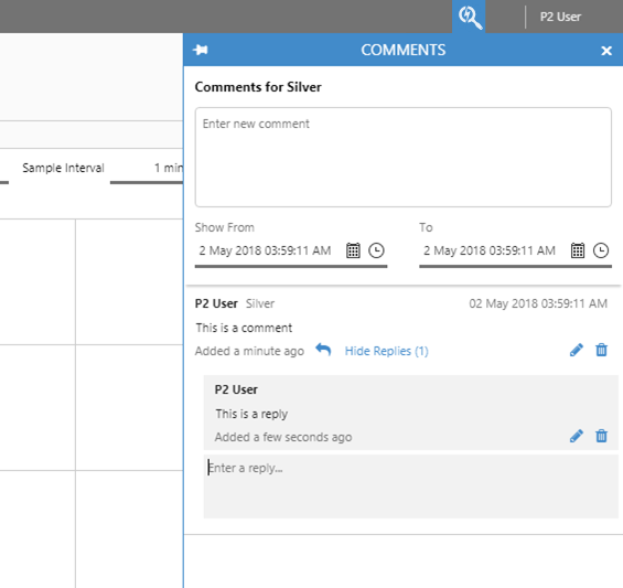
In previous releases, comments applied to a period of time and had a start date and end date. Customer feedback indicated that this was confusing for users.
In this release, comments apply only to a point in time, and use the end time of a period as the comment’s timestamp.
The timestamp for existing comments will change to be the end time of the period.
Knowledge Management
This release introduces basic knowledge capture for pages and trends, indicated by an info  icon on a page or trend. When clicked, the Explore panel opens and shows information relevant to the page or trend.
This information is visible to all users who are able to view the page or trend. Users will also be able to edit the information and save it. Explorer will retain a history of all edits, including the date/time and the user who edited it, however this history will not be visible in this release.
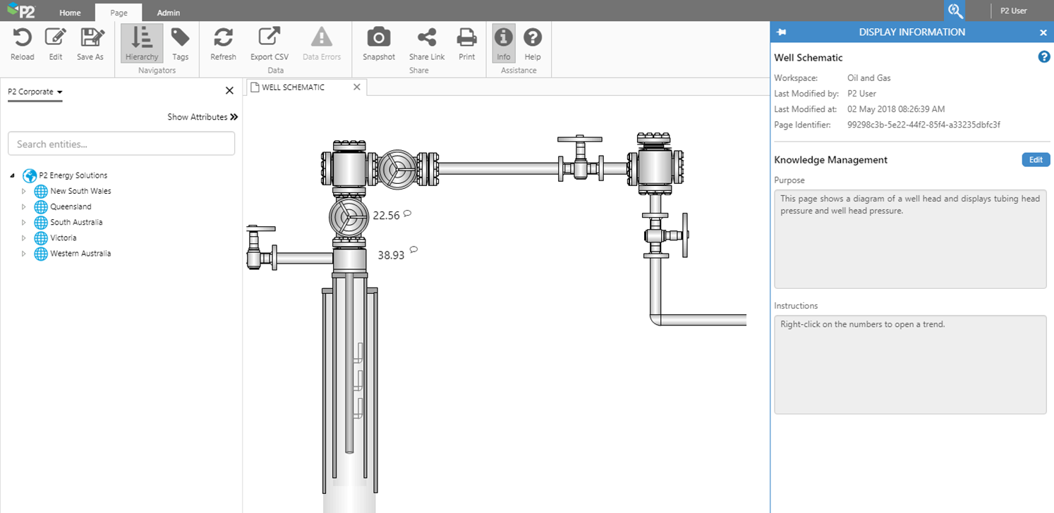
Display Information from the Ribbon
In the Page and Trend tabs of the Explorer ribbon, a new info icon has been added. Clicking this icon opens the Explore panel, which contains display information for the page or trend.
The Explore panel contains two sections: the Summary (at the top of the panel) and Knowledge Management.
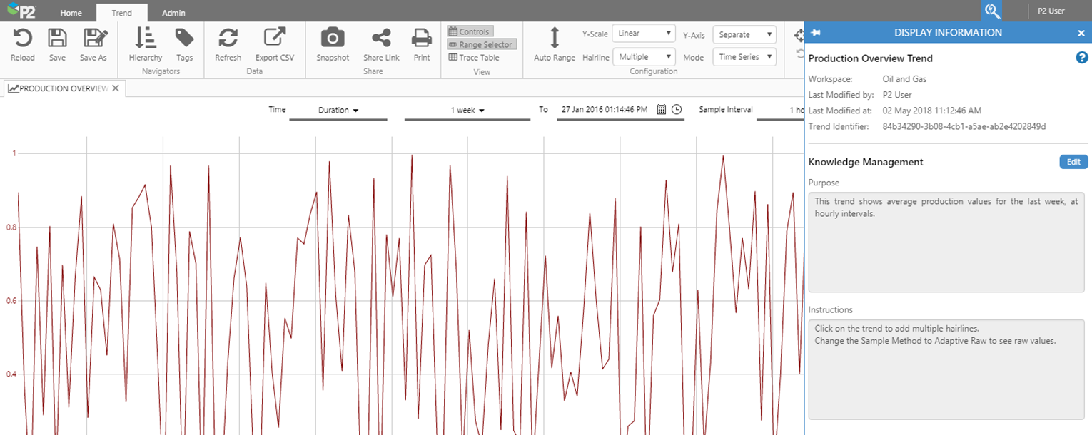
The Summary replaces the Properties dialog box, previously available by clicking the Properties  button on the ribbon.
The Knowledge Management section is the editable section for capturing knowledge about this page or trend. The default configuration has two sections that can be edited:
- Purpose: This is designed to capture what information the page or trend is trying to convey.
- Instructions: Special instructions for how to use the components on this page or trend.
The number of these sections, and the names of them can be configured globally, allowing it to be customized for each installation.
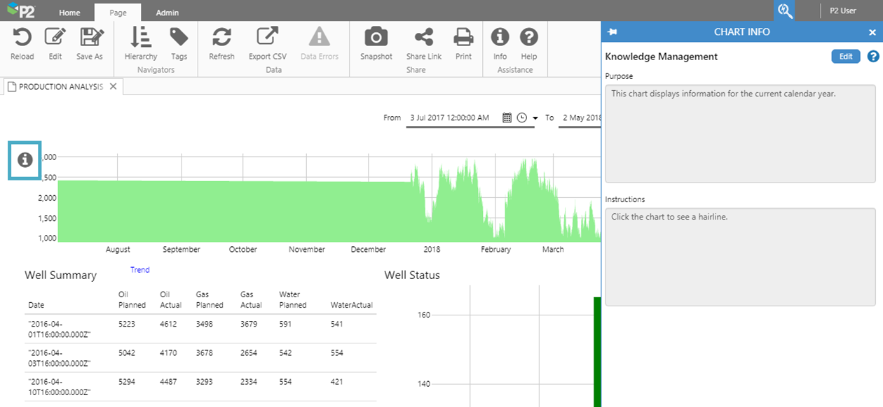
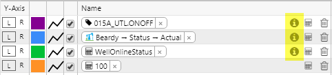
Info Button Component
The Info Button is a component that a page designer can place on a page, and is associated with a specific area of the screen. When someone clicks the button, the Explore panel opens to show Knowledge Management for that area – this shows the exact same fields as the Knowledge Management section of Display Information from the ribbon (see above). This means that pages can be designed with several info buttons on a page, each one showing different sets of information.
For example, on a page with several charts, an info button can be added for each chart, with each button containing information for the associated chart.
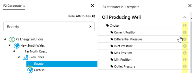
Configuring the component in Studio:
In Explorer Studio, the Info Button component is part of the Display group. When added to a page, the designer can configure the following fields:
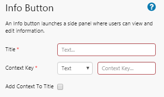
Title: The name that should appear in the header of the Explore Panel. We recommend that this reflects the heading for that section of the page.
Context Key: An identifier assigned to this particular object and its related information. If you want multiple buttons to display the same set of information, then use the same context key for all of the buttons.
Add Context To Title: Optionally, the Context Key can be appended to the title for display in the Explore Panel header.
Trend Zoom
This release introduces the ever-useful zoom feature to the Explorer Trend. The zoom function allows you to view a close-up of the data in a selected area of the trace window.
While zoom is enabled, the default behaviour of clicking in the trace window changes from adding a hairline, to selecting ("rubber-band") a rectangular portion of the trace window that contains data on which you want to focus.
The zoom feature has undo and redo, so you can revert zoom levels. When zoom is enabled, all configuration options, other than Auto Range, are turned off. Hairlines added before zoom is enabled will remain on the trend.
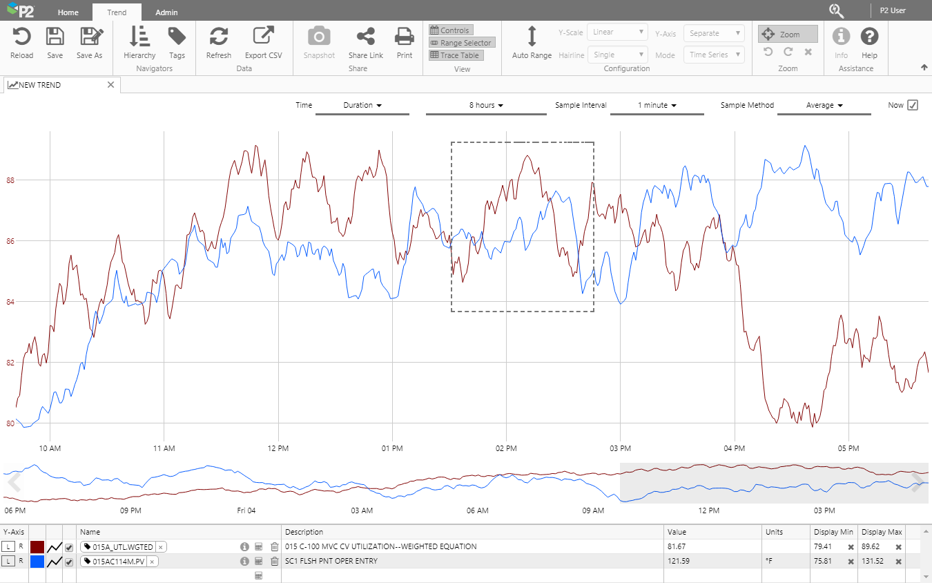
When you zoom, the timebase and sample intervals are updated automatically to reflect the new trace extents and to always show more granular data the more you zoom in.
Note that zoom is only available in the full trend, and not in the embedded trend.
Point Details from Trend
In this release, an info icon has been added to the trace table of a trend, which opens the Point Details of the tag or attribute you are looking at, in a new tab. Point Details allow you to view additional information about the tag or attribute.
The info icon only appears for saved tags and attributes, and is located next to the ad-hoc calc icon in the Name column of the trace table.
Point Details from Attributes Panel
In previous releases, you would have to press Ctrl+Click from the Hierarchy Navigator to open the Point Details for an attribute. Point Details allow you to view additional information about the attribute.
In this release, an info icon has been added to the Hierarchy Navigator, which you can now click to open the Point Details without having to remember the shortcut. This is consistent with opening Point Details from the Tags Navigator.
Workspaces
In previous releases, pages within a workspace were ordered with the most recently modified page listed last. Customer feedback indicated that users found this confusing, so in this release pages are ordered alphabetically.
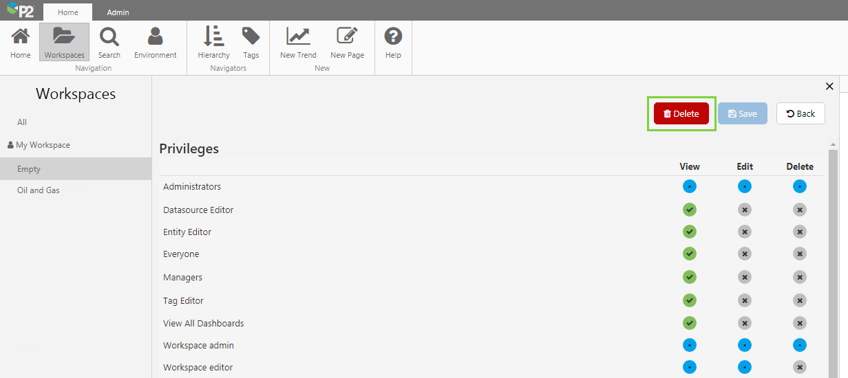
Also in previous releases, workspaces that did not contain any displays were automatically deleted. In this release, empty workspaces must be manually deleted.
When a workspace is empty, clicking the Settings button now displays a Delete button.
Hairline Timestamp
The timestamp displayed on hairlines for charts and trends has changed. This is now consistent with timestamps displayed in the trend controls and comments.