A Sparkline is a small Chart component without gridlines, often used to show data trends amidst text (in a table) or alongside images, labels and lines in a process mimic or schematic.
In Explorer, you can add a sparkline as part of a process mimic or schematic, or you can add it to a Table Layout to trend related data in a table.
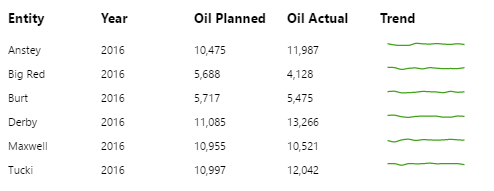
Each sparkline on a Precision or Grid Layout is individually configured, whereas the sparkline on a Table Layout is a single, configured chart that is repeated over the rows of the Table Layout. In a Table Layout, the sparkline uses contextual data from the Table Layout's dataset so that each sparkline represents data for its row.
|
Sparklines on a Schematic:
|
Sparklines on a Table Layout:
|

Configuring a Sparkline
You need to first configure a chart to use data, ideally one that has values over time (hours, weeks, months of a year, or similar periodic data) as your sparkline represents a trend. Refer to the Charts tutorial for detailed instructions.
When you have the chart set up, you need to configure it to look like a sparkline.
|
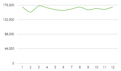
Typical Line Chart
|
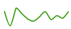
Line Chart Configured as a Sparkline
|
Once you have configured a Line Chart, follow the steps below to turn it into a sparkline.
Series options:
- Click Line Series to expand this in the editor.
- Y Column: Select DataColumn in the first drop-down list, and choose the column you want to trend (e.g. OilActualSum) in the second.
- Choose a colour for the series (Colour or Colour Matcher).
- Make the line slightly thicker (Thickness).
- Click Line Series again to collapse it in the editor.
X Axis options:
- Click X Axis to expand this in the editor.
- Column: Select DataColumn in the first drop-down list, and choose the time period column (e.g. Month) in the second.
Hide the X Axis and Gridlines:
- Still in the X Axis section, clear the Visible checkbox.
- Clear the Enable Gridlines checkbox.
- Click X Axis again to collapse it in the editor.
Y Axis options:
Hide the Y Axis and Gridlines:
- Click Left Y Axis to expand this in the editor.
- Clear the Visible checkbox.
- Clear the Enable Gridlines checkbox.
Set the Min and Max:
- Still in the Y Axis section, add a minimum (Min) and maximum (Max) value (if you know what this is, based on your dataset). This could be a fixed number or a data column.
- Click the Left Y Axis again to collapse it in the editor.
Other options:
Hide the Legend and Tooltips (disabled by default).
- Clear the Legend checkbox.
- Clear the Tooltip checkbox.
Adding a Sparkline to a Table Layout
These steps provide an outline only. Please read the individual help topics if you require more detail: Table Layout, Charts.
Follow the steps below to configure a sparkline in a Table Layout.
Step 1: Add Table Layout
1. Drop a Table Layout component onto your page.
2. Configure it to use a dataset query.
3. Add an extra column to the Table Layout, to be used for the sparkline. Give it a header.
Step 2: Add a Chart to the Table Layout
1. Drop a Chart component onto the new column on your Table Layout.
2. Configure it to use a dataset query.
Note: The dataset should contain periodic data for each entity that can be found in the Table Layout's Data. For example, if the Table Layout's data has five entities, the Chart's dataset should have the same five entities, each with 12 rows of data (for 12 months).
Step 3: Configure Chart as a Sparkline
Follow the steps for configuring a sparkline (shown above), with the following difference:
When configuring the Line Series, configure the Filter Column and Filter Value to filter for the related row, using Context data from the Table Layout's data.
Step 4: Style the Table Layout
If you have a table style with wide rows, apply this style to fit the Sparkline.