ON THIS PAGE:
Overview
The Table Layout provides an easy way of creating interactive "templated pages", allowing you to model the whole company on a single page.
It arranges data and components in a tabular format. You specify the type of data and component you want in each column, and the table is automatically created. The table layout allows you to specify a main source of data for the table, and also use data from other sources as required.
You would use a table layout when:
- You have already set up some datasets and you want to make them interactive.
- You have a list of items to display from a hierarchy, and want to display an item's children in the table — useful for time series data within an asset model.
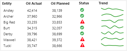
| Examples of components you can add to a table layout: | Example of a table layout that includes a status indicator and sparkline: |
|
|
Below is an example of a configured table layout, in design mode:
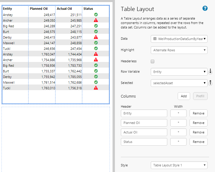
| Data: | The Table Layout's data determines the rows and the contextual data. When you assign this data, the first five columns (or fewer, if the dataset has fewer columns) are added automatically. See The Table Layout's Data. |
| Highlight: | Allows you to show a different background colour on alternating rows or columns, or for selected columns. Note that the Style Administrator must have specified an Alternate Background Colour for this work. See Highlight Rows or Columns. |
| Headerless: | Select this option to hide the header row. See Hide Header Row. |
| Row Variable: | When a user clicks on a row, the data from this column is published to a variable. This is usually used in conjunction with the Selected variable. |
| Selected: | The variable that is published when the user clicks on a row. This is usually used in conjunction with the Row Variable column (see Tutorial 5). |
| Columns: | The columns you want to display in the layout. You can update the header and width for these. See Configure Columns. |
| Style: | The style to apply to the Table Layout. If you are a Style Administrator, you can add a new Table Layout style. See Styling. |
Note: You can use a Paging Control with a Table Layout, if you use a dataset that has paging enabled.
Basics of the Table Layout
If you're unfamiliar with the process of building pages, read the article Building an Explorer Page.
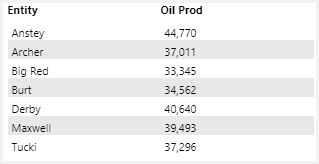
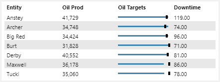
The easiest way to get started with a table layout is to create a table which is automatically populated with data. The next few steps will show you how to create a simple table that looks like this:
Step 1. Prepare a Studio Page
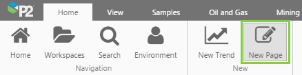
Before you start, click the New Page button on the Home tab of the ribbon. Choose the Grid layout.
- For this exercise, keep the 4 grid cells.
Step 2. Add the Table Layout
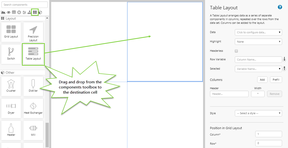
Drag and drop the Table Layout component onto a grid cell. The Table Layout is in the Layout  group.
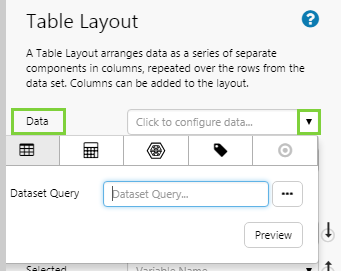
Step 3. Add Data to the Table Layout
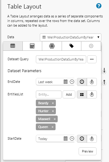
This is the crucial step that will establish the basis of your table. After you select the data and configure any parameters or options, it is available to be used anywhere in the table. For this example, configure the Table Layout data as follows:
| Dataset Query | WellProductionDataSumByYear | This contains the columns and data that the table layout will use |
| EndDate | Last week | This sets the end of the reporting period |
| EntitiesList | Beardy, Hunter, Maxwell, Queen | These are the entities being reported on |
| StartDate | Today | This sets the beginning of the reporting period |
Click the Preview button - this will show you all the columns available.
Remember this table - this forms the basis of your contextual data. Take particular note of the column names - as you progress to more advanced use of the table layout, these will become available in other components via the table layout context.
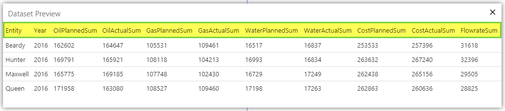
Take note also of the rows - the rows in this preview are exactly the rows you will initially see in your table layout. The rows are determined by the data you specify here - in this case, the entities you have specified. You can change the rows by making your table interactive.
Notice that we have hard-coded the dataset parameters here. This is not usually good practice as it doesn't allow you much interactivity on your pages, so let's quickly go and change these to variables, as per the following screenshot:
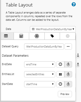
Note also that because you have set all the dataset parameters as variables, you now need to check that your default variables are suitable.
Step 4. Default Values
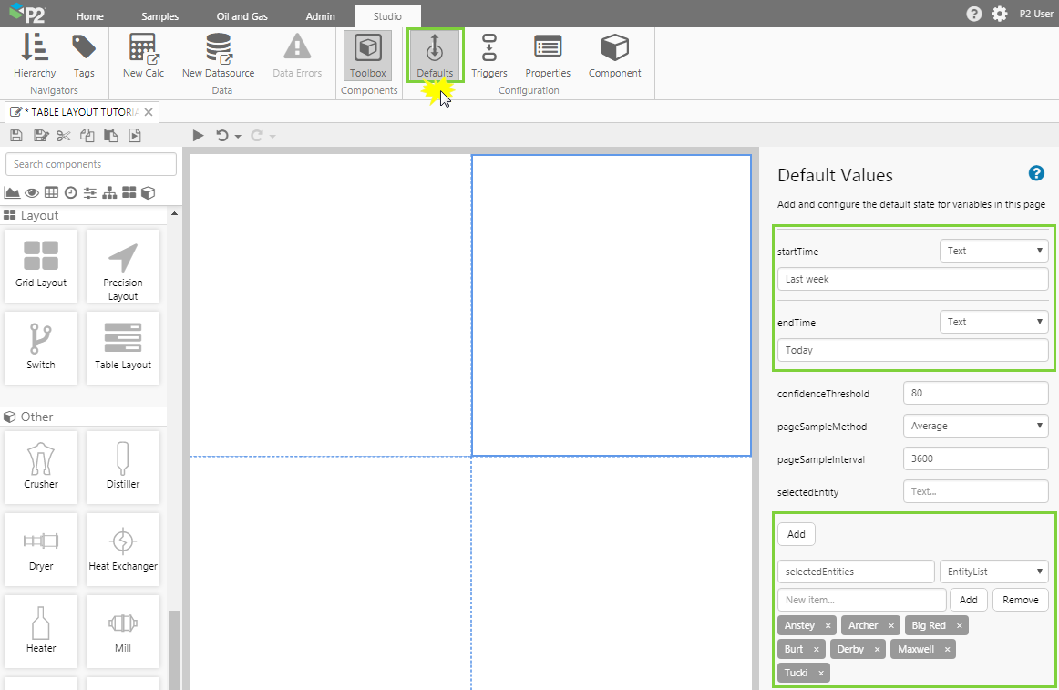
Click Defaults on the Studio tab of the Explorer Ribbon. Let's say you want the reporting period to be for the last week, so update the following default values:
| Variable | Type | Value |
| startTime | Text | Last week |
| endTime | Text | Today |
Click the Add button and add the following variable, to specify the entities you are interested in. Later, we'll see how you can make this interactive by using an Entity Selector component to drive your selected entities.
| Variable | Type | Value |
| selectedEntities | EntityList | Anstey, Archer, Big Red, Burt, Derby, Maxwell, Tucki |
Step 5. Add columns to the table
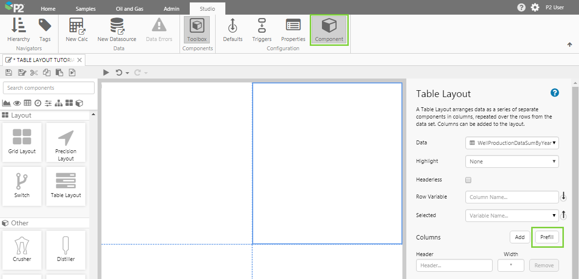
In this step, use the Prefill function to add all the columns to the table, and then in the next step you can remove the ones you don't want. This is the easiest way to get your table data into the layout.
- In the ribbon, click the Component option to return to the Table Layout editor.
- Click the Prefill button.
Each column in the table layout contains a component. When you prefill the columns, the table layout is actually adding a Text Label to each column, and the layout automatically configures these text labels with data for you. As you progress to more advanced use, you can add new columns and place different components in them, such as a Status Indicator. These can still be configured to use the table layout's data, or even other related data.
Step 6. Remove unwanted columns
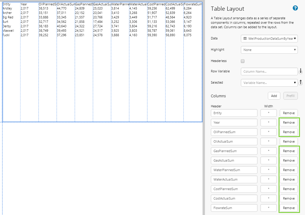
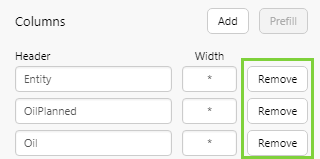
In this step, you want to remove all the columns except for Entity and OilActualSum.
- Click the Remove button next to each column you want to remove.
Step 7. Style the Table Layout
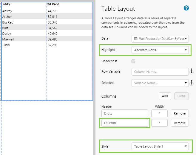
In this step, you'll make some cosmetic adjustments to the Table Layout.
- Highlight: Select Alternate Rows
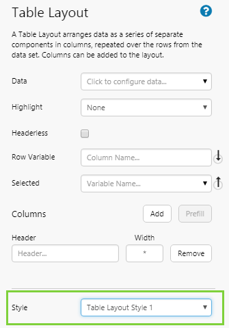
- Style: Choose Table Layout Style 1
Note: These styles are included in the sample data; styles may vary at your site. For example, your styles may contain borders around each row to present a classic grid style. If you are a Style Administrator, you can add a new Table Layout style.
Now let's rename one of the column headers.
- Find the OilActualSum column, and type over the header name with 'Oil Prod'.
Step 8. All done!
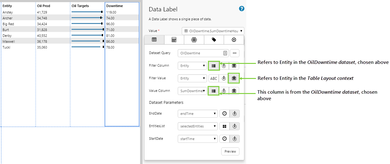
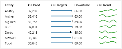
Congratulations! You now have a Table Layout that shows you the oil production for specified entities.
- Click the preview
 button on the Studio toolbar to see what your page will look like in display mode.
 Remember to save your page!
Tutorials - Interactive Datasets
The following tutorials demonstrate how to enhance a table layout by making it interactive and using different components.
At the end of these tutorials, your page should look something like this:
Tutorial 1: Interactive Entity Selection
In this tutorial, you'll add an Entity Selector to the page, to enable users to specify the entities in the table. This tutorial carries on from Basics of the Table Layout.
Step 1. Add an Entity Selector
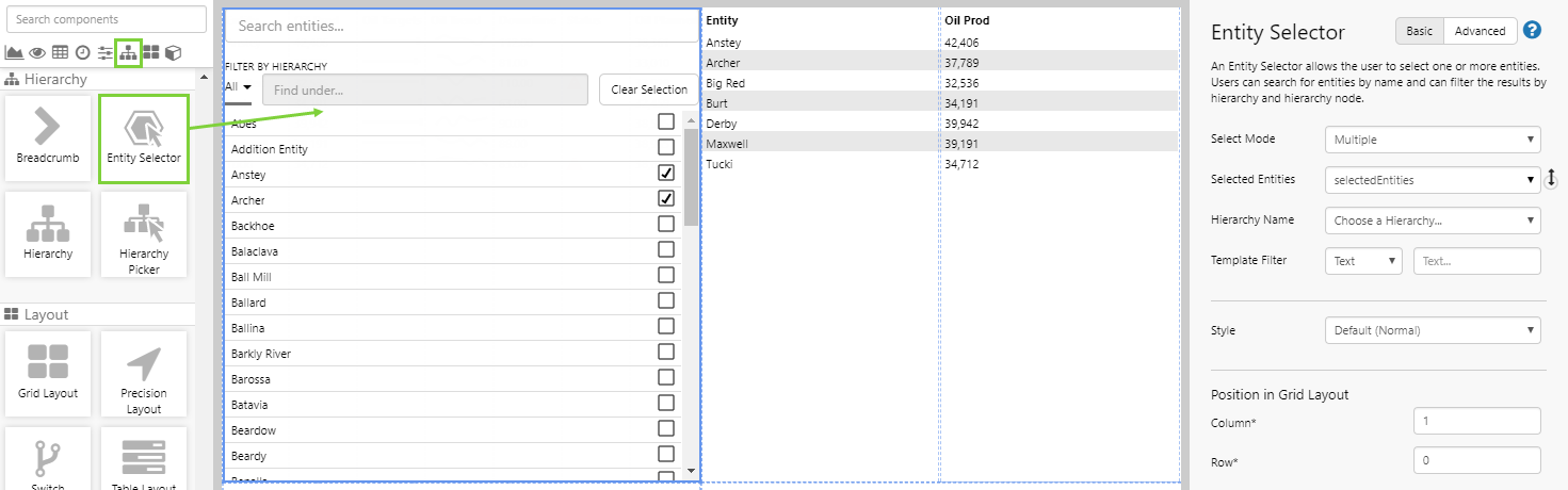
Drag and drop an Entity Selector onto a grid cell on the same page as the table layout. The Entity Selector is in the Hierarchy  group.
Step 2. Configure the Entity Selector
Notice how the Anstey and Archer entities are already selected. This is because they have been added as page defaults for the selectedEntities variable, and the Entity Selector makes use of this variable by default.
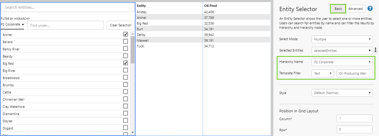
Stay in Basic Mode and configure the entity selector to only show entities that are oil wells. There are 2 settings to configure:
- Hierarchy Name: The drop-down list recognises the hierarchies set up in IFS OI Server. Choose the hierarchy from the drop-down list, in this case P2 Corporate.
- Template Filter: Oil wells in the hierarchy use the Oil Producing Well template, so type this in to the text box.
Step 3. View the Page
Click the Finish and Open  button on the Studio toolbar to view the page.
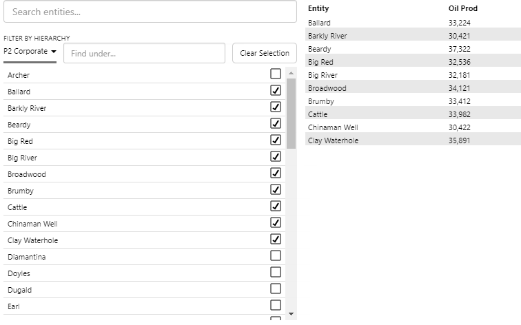
- Click different entities in the entity selector and note how the rows in the table layout are updated.
Tutorial 2: New Component
One of the biggest advantages of the table layout is the ability to show visualisations in a column, such as a Status Indicator or Bullet Graph. In this tutorial, you'll add a new column that contains a Bullet Graph. This tutorial carries on from Basics of the Table Layout.
Step 1. Select the Table Layout
- Switch back to design mode in Studio.
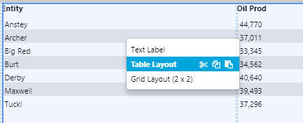
If you click on the cell containing the table layout, you'll notice that the component editor doesn't show the table layout options - instead it shows options for a text label. This is because the table layout columns actually contain components which display the layout's data. Prefilled columns are always added as text labels, which is why clicking on either of the table layout columns shows you the text label editor. To select the table layout itself, right-click and choose it from the shortcut menu.
- Right-click on the cell containing the table layout, and choose Table Layout from the menu.
Step 2. Add a new column to the Table Layout
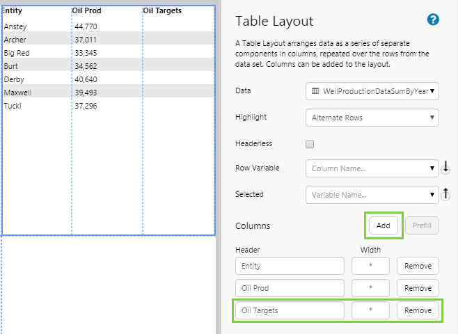
In the Table Layout editor:
- Click Add to add a new column.
- For the new column, type Oil Targets as the column Header.
You will see the table preview update with the new column name.
Step 3. Add a Bullet Graph
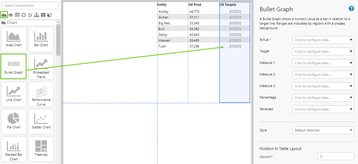
Drag and drop a Bullet Graph onto the Oil Targets column in the Table Layout. The Bullet Graph is in the Chart  group.
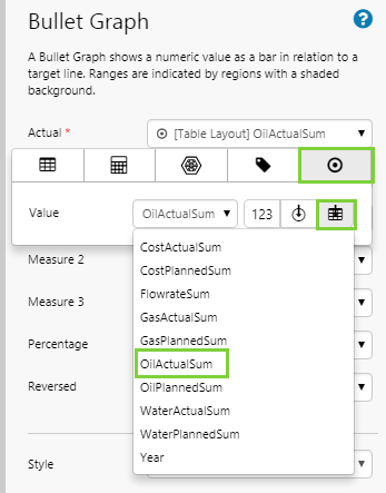
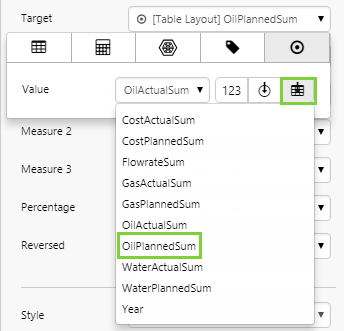
Step 4. Configure the Bullet Graph
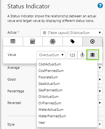
In this step, you will configure the Bullet Graph to compare the actual production with planned production for the entity. Both of these values are available from the Table Layout's data.
Note: Because the Bullet Graph is in a Table Layout column, the Data Selector shows a button for the Table Layout Context  for the Value property. This indicates that you can use the same data that you added for the Table Layout, back in Basics of the Table Layout. Remember the dataset preview? These are the same columns that you will see every time you use the table layout context.
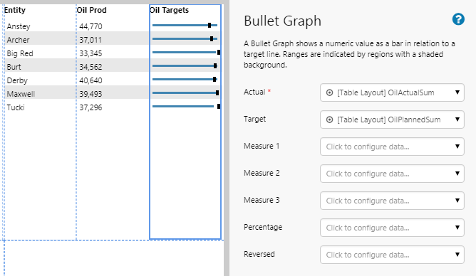
- Click the Table Layout Context icon, and then select the relevant column from the drop-down list, as shown below:
| Actual | Target | |
| Value |
OilActualSum
|
OilPlannedSum
|
Step 5. Preview the Page
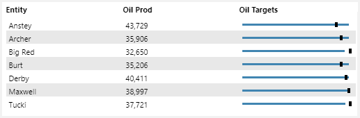
- Click the Preview button on the Studio toolbar to see what your page will look like in display mode.
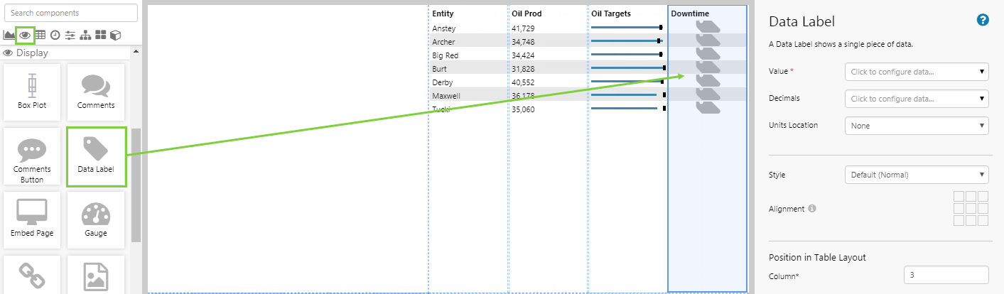
Tutorial 3: Show Different Data
In this tutorial, we'll add a new column that contains a Data Label, which shows the downtime data for the entities, from a different dataset. This tutorial carries on from Tutorial 2.
Step 1. Select the Table Layout
- Switch back to design mode in Studio.
- Right-click on the cell containing the table layout, and choose Table Layout from the menu.
Step 2. Add a new column to the Table Layout
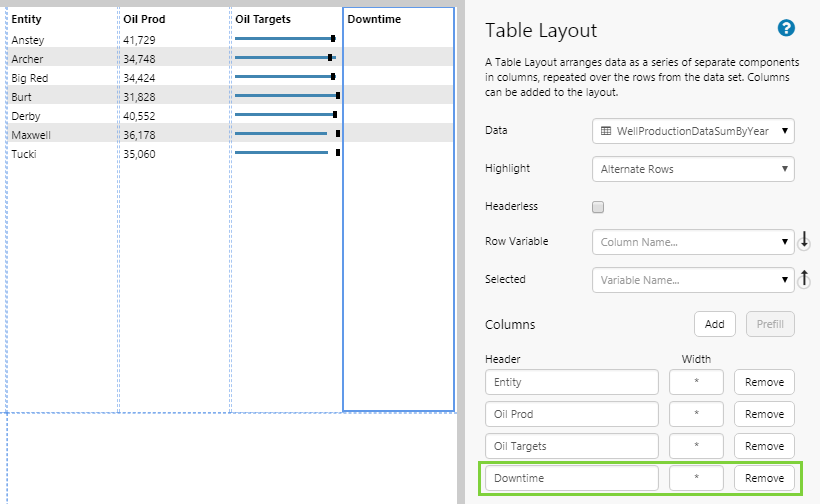
In the Table Layout editor:
- Click Add to add a new column.
- For the new column, type Downtime as the column Header.
You will see the table preview update with the new column name.
Step 3. Add a Data Label
Drag and drop a Data Label onto the Downtime column in the Table Layout. The Data Label is in the Display  group.
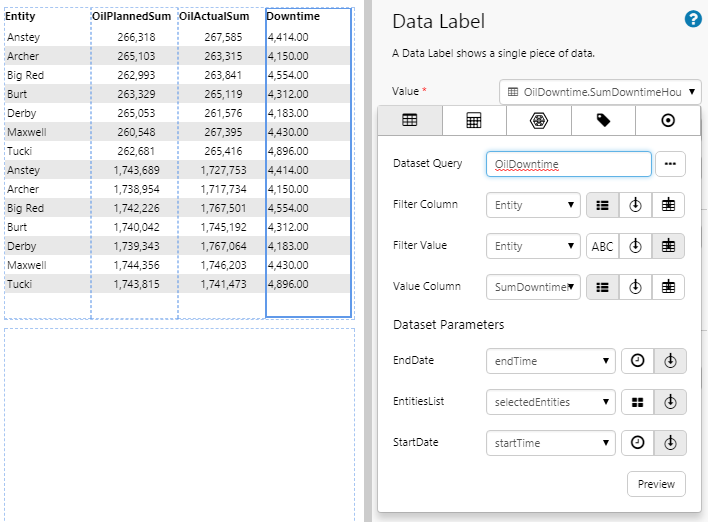
Step 4. Configure the Data Label
In this step, configure the Data Label to show the downtime for the entity. The downtime data is derived from a different dataset, however it is still linked to the Table Layout's data via the Entity field.
Because the Data Label is in a Table Layout column, the Data Selector shows a button for Table Layout Context for various properties. This is how you can link corresponding columns between the Dataset Query chosen here for the Data Label, and the dataset chosen for the Table Layout Context. It is important to specify Filter Column and Filter Value correctly.
- Filter Column refers to the column in the dataset for the Data Label.
- Filter Value refers to the column in the Table Layout Context.
Both columns must contain data that matches, such as entities.
- Click the Data Selector for the Value property, and then select the Dataset
 tab. Configure the properties as shown below:
| Dataset Query | OilDowntime | Use this query from the Oil and Gas datasource, instead of the Table Layout's data. |
| Filter Column | (List  ) Entity ) Entity |
We are filtering the rows according to the Entity column from this dataset. |
| Filter Value | (Table Layout Context ) Entity |
This is the context that links the entities in this dataset with the entities in the Table Layout's dataset. |
| Value Column | (List ) SumDowntimeHours |
We are getting the values from this column, according to the row specified in the Filter Column. |
| EndDate | (Variable) endTime | |
| EntitiesList | (Variable) selectedEntities | |
| StartDate | (Variable) startTime |
Step 5. Preview the Page
- Click the Preview button on the Studio toolbar to see what your page will look like in display mode.
Tutorial 4: Row Variables
In this tutorial, we'll add a new variable to show the Planned Oil for the selected row. This tutorial carries on from Tutorial 3.
Step 1. Add a Default Value
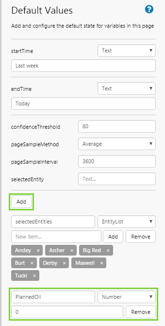
Click Defaults on the Explorer Ribbon, and then add a new default value, as follows:
| Variable | Type | Value |
| PlannedOil | Number | 0 |
Step 2. Select the Table Layout
- Switch back to design mode in Studio.
- Right-click on the cell containing the table layout, and choose Table Layout from the menu.
Step 3. Update the Table Layout
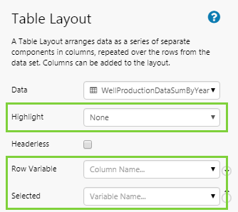
Update the properties as follows:
- Highlight: Choose None.
- Row Variable: Select OilPlannedSum from the drop-down list. This is one of the columns from the Table Layout dataset.
- Selected: Select PlannedOil from the drop-down list. This is the variable you just added as a default value.
Step 4. Add and Configure a Text Label
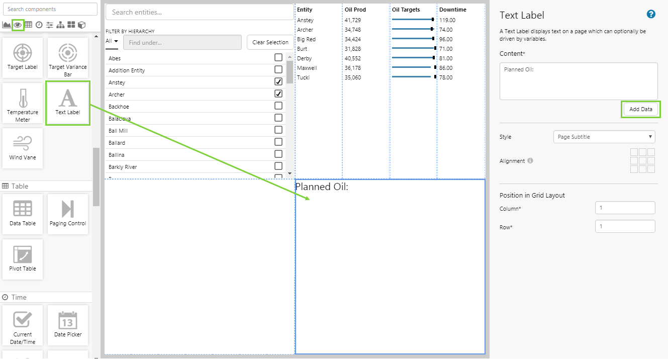
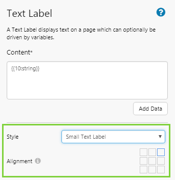
- Drag and drop a Text Label onto the grid cell next to the Table Layout. The Text Label is in the Display group.
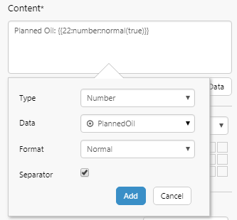
- In the Content box, add following text: Planned Oil:
- Click the Add Data button, complete the following fields, and then click Add to add the data:
- Type: Number
- Data: (Variable) PlannedOil
Step 5. Preview the Page
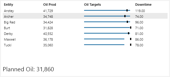
- Click the Preview button on the Studio toolbar to see what your page will look like in run-time.
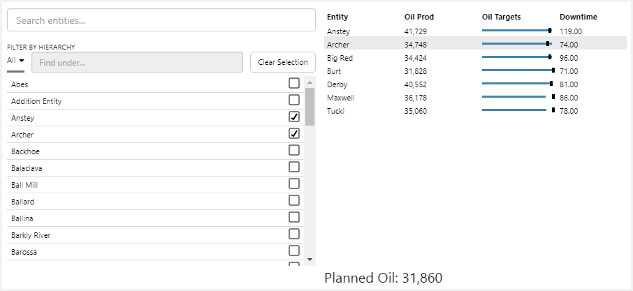
- Click on the row that contains entity 'Archer'. See how the Planned Oil amount updates in the text label. Now click on another entity and see how the Planned Oil changes for that entity.
Tutorials - Hierarchy Attributes
The following tutorials demonstrate how to dynamically update a table layout from a hierarchy that uses time series data, by displaying the children of a selected entity. This scenario takes full advantage of an asset model setup, and enables you to construct tables that allow you to drill down and determine the cause of a problem. For this scenario, we make use of the Hierarchy Query Trigger to show us only the entities with an Oil Producing Well Template.
At the end of these tutorials, your page should look something like this:
Background
This scenario requires entities in the hierarchy to be correctly set up with templates and attribute values. This is usually done by an administrator. Here's what you need to know about how our example is set up:
- All entities in the hierarchy must have the Oil Producing Well assigned. However, it does not need to be the primary template.
- Typically, entities at the deepest level of the hierarchy would have Oil Producing Well as the primary template (e.g. Beardy, Cornish, Hunter).
- Other entities higher up in the hierarchy would have primary templates such as Region or Area. These entities must have Oil Producing Well as a secondary template.
- In this example, we are interested in the Status!Actual attribute value on the Oil Producing Well template. All entities must have a value for this attribute value.
- Entities with Oil Producing Well as their primary template will usually collect this value from a tag assignment.
- Entities with Oil Producing Well as their secondary template will use this calculation to determine the value:
DDSum(DDGet("P2 Corporate", 1, entity, ":Status","","Oil Producing Well"))
The calculation assumes that entities that are online have a status of 0, and entities that are offline have a status of 1. This means two things:- If the sum of statuses along a branch is greater than 1, then at least one well on that branch is offline.
- If offline wells all have a value of 1, we can use the calculation to determine the number of offline wells along a particular branch.
Tutorial 5: Hierarchy Query
In this tutorial, we'll set the scene for how we want to table to behave, by applying a trigger and setting the page defaults.
Step 1. Prepare a Studio Page
Before you start, click the New Page button on the Home tab of the ribbon. Choose the Grid layout, and keep the 4 grid cells.
Step 2. Hierarchy Query Trigger
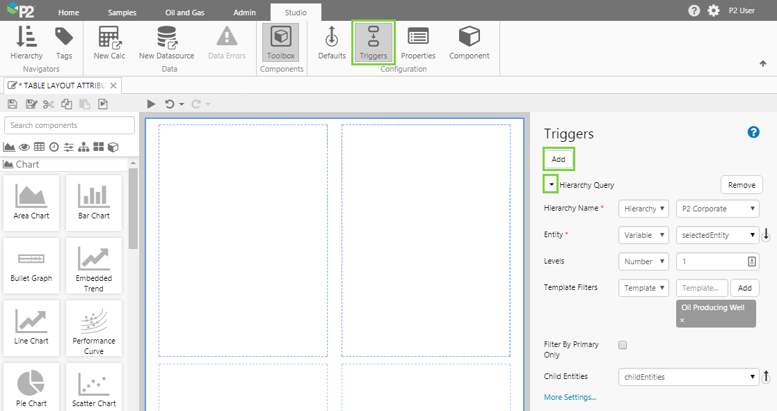
In the Studio ribbon, click the Triggers  button.
In the Triggers panel on the right, click the Add button and expand the Hierarchy Query trigger.
Step 3. Configure the Hierarchy Query
The Hierarchy Query generates a list of child entities from a selected entity in a hierarchy. There are 5 important fields to fill out here:
| Hierarchy Name | P2 Corporate | The name of the hierarchy containing the entities of interest. |
| Entity | selectedEntity | This variable contains the name of the entity that the user will be clicking on. We recommend using the default, selectedEntity. |
| Levels | 1 | The number of levels to fetch entities from. A level of 1 means that when the user clicks an entity, the trigger will return the immediate children of the clicked entity. |
| Template Filters | Oil Producing Well | Restrict the returned entities to only show those containing the Oil Producing Well template. The template may be a primary or a secondary template, but it must be applied to the entities in order for them to be fetched. |
| Child Entities | childEntities | The variable containing the list of child entities returned by the trigger, when the user clicks an entity. We recommend using the default, childEntities. |
Step 4. Default Values
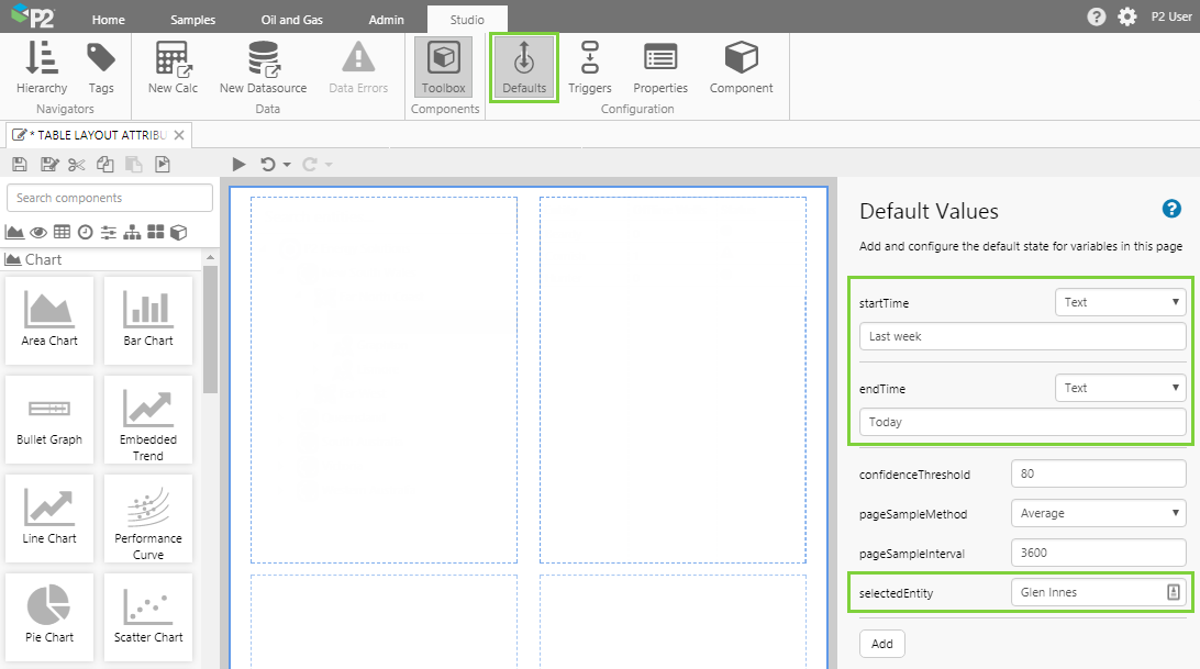
Set the default values for the reporting period and selected entity:
| startTime | Last week | This sets the beginning of the reporting period |
| endTime | Today | This sets the end of the reporting period |
| selectedEntity | Glen Innes | When the page is loaded, this sets Glen Innes as the clicked entity, so the user sees data for Glen Innes first. |
Tutorial 6: Configure Page
In this tutorial, we take advantage of the Hierarchy Query Trigger to allow a hierarchy to drive the entities displayed in the Table Layout. We also make the Table Layout interactive, so that when the users clicks an entity in the table, they can drill down the hierarchy to see more data.
Step 1. Add and Configure a Hierarchy
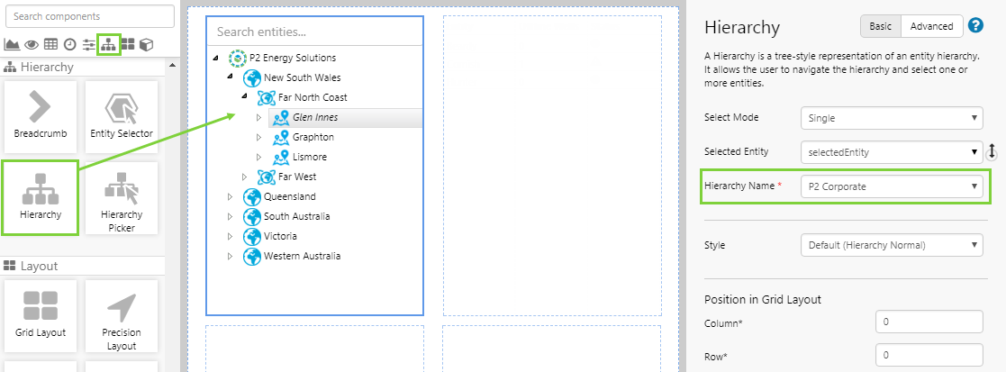
Drag and drop a Hierarchy to a grid cell. The Hierarchy is in the Hierarchy group.
The only thing you need to configure here is the name of the hierarchy - this should be the same as the one you specified in the Trigger, in the previous step.
Hierarchy Name: P2 Corporate
Note the use of the default selectedEntity variable here too. This must also match the selected entity variable used in the Trigger.
Step 2. Add the Table Layout and Configure its Data
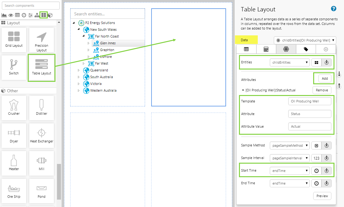
Drag and drop the Table Layout component onto a grid cell. The Table Layout is in the Layout group.
For this table, we want to display the attributes of entities in the hierarchy. The configuration is as follows:
| Entities | (Variable  ) childEntities ) childEntities |
We want to display the children of the selected entity in the table. This is provided by the Hierarchy Query Trigger so if you have not already set this, you will not see any data. |
| Attributes | Add | Click the Add button to add an attribute. If you add more than one attribute, the table layout will give you a separate column for each attribute. |
| Template | Oil Producing Well | The template containing the attribute we are interested in. |
| Attribute | Status | The attribute we are interested in. |
| Attribute Value | Actual | The attribute value containing the data to be displayed in the table. |
| Start Time | (Variable ) endTime |
When using time series data, it is important to make the start and end times the same, otherwise the table will display entities repeated on each row for each timestamp in the reporting period. This will make the page sluggish, and is not what you usually want to see. In this example, we have set endTime as 'Today' in the Default Values, so by setting the startTime to be the same as the endTime, we will see today's data only. |
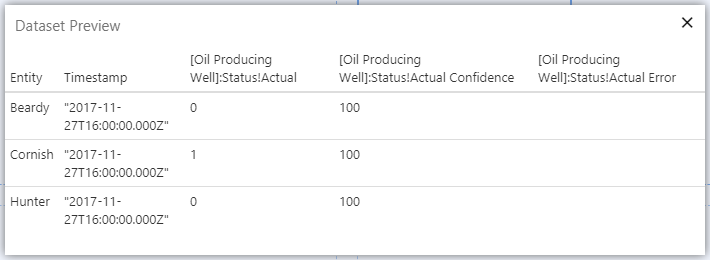
Click the Preview button to see the columns available in your table layout. Note that Confidence and Error are metadata columns for all timeseries data. You will not usually want to see these in a table layout, so they will not be available for selection.
Step 3. Prefill Table Layout Columns
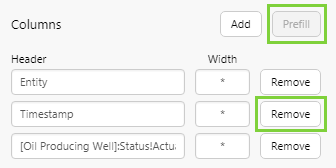
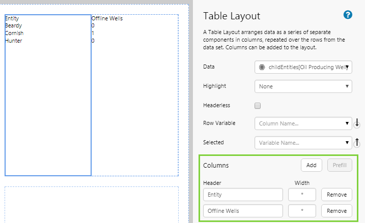
Click the Prefill button to add columns to the table. Notice that these are the first 3 columns from the Dataset Preview.
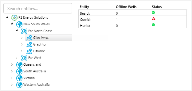
Now remove the Timestamp column, because we are not interested in that, and rename the [Oil Producing Well]:Status!Actual column to: Offline Wells.
Your table layout should now look like this:
Step 4. Add a New Column and Status Indicator to the Table Layout
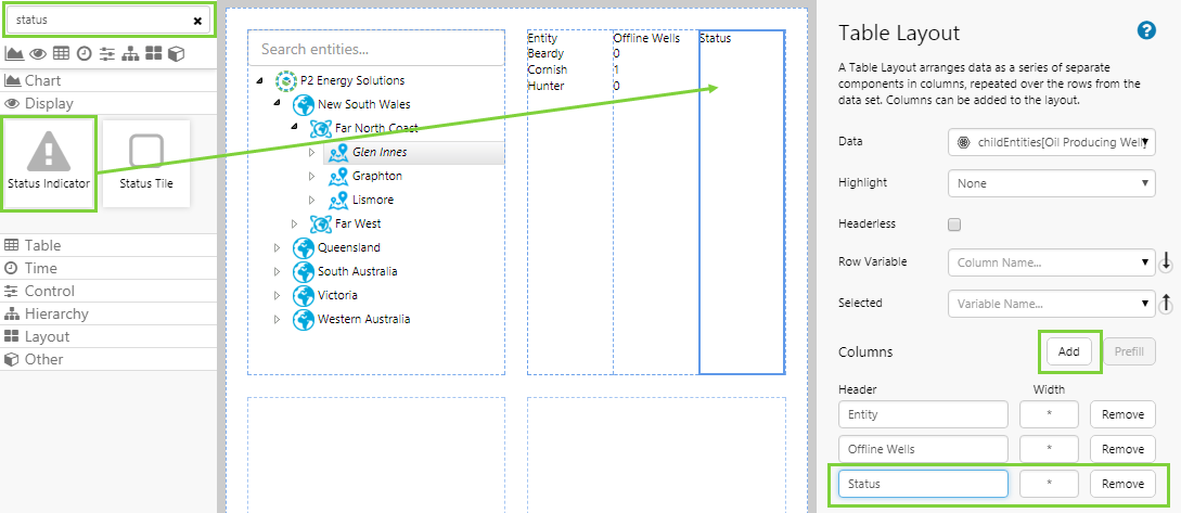
- In the Table Layout, click Add to add a new column.
- Give the new column a name of: Status.
- In the component toolbox, drag and drop a Status Indicator into the new Status column.
Step 5. Configure the Status Indicator
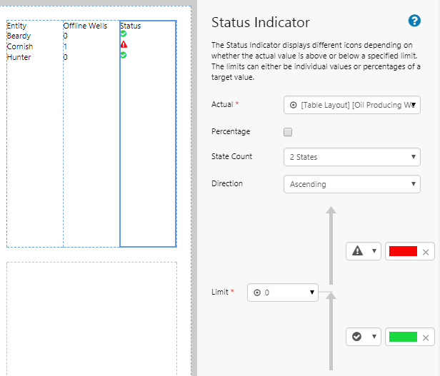
When you add the Status Indicator, that column becomes active and you will see its editor. Configure the Status Indicator as follows:
| Actual | (Table Layout Context ) [Oil Producing Well]:Status!Actual |
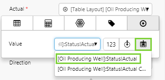 This is the context that links the entities in this component's data with the entities in the Table Layout's data. Here we are specifying that we want to use the same attribute value to drive the status indicator. This is the context that links the entities in this component's data with the entities in the Table Layout's data. Here we are specifying that we want to use the same attribute value to drive the status indicator. |
| State Count | 2 States | |
| Direction | Ascending | |
| Limit | 0 | Specify a limit of 0. This means that values up to and including 0 will be considered below the limit, and values greater than 0 will be above the limit. Select the icons and colours you want for indicating these limits. In this example, values above 0 reflect that a well is offline, so it's appropriate to use a warning icon and colour for this. Values below 0 reflect an online well, which is a good status. |
Step 6. Table Layout Interactivity and Appearance
Right-click on the Table Layout and select it from the menu. We will finish setting the interactivity and appearance here in the Table Layout editor.
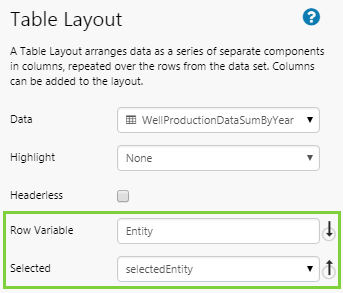
To enable users to interact with the table layout, we need to assign a variable when a row is clicked. The relevant settings are:
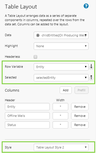
| Row Variable | Entity | When the user clicks a row, the Entity column is used to obtain the value for the Selected variable. |
| Selected | selectedEntity | We use selectedEntity, which we have already defined. When a user clicks a row, this is updated with the name of the entity that was clicked. |
Finally, assign a style to the table layout.
Step 7. Finish and Open the Page
- Click the Finish and Open button on the Studio toolbar to see what your page will look like in display mode.
- Click different entities in the hierarchy, and observe what happens in the table.
- Click an entity in the table, and observe what happens (both the table and hierarchy will update). Note: Clicking a child entity at the deepest level in the hierarchy will result in the table appearing blank, because the selected entities has no child entities of its own.
Tutorial - Other Components
Tutorial 7: Sparkline
In this tutorial, we'll add a column that contains a sparkline to a table layout. The sparkline we'll configure is a Line Chart component without labels, gridlines, a legend, or tooltips. This tutorial carries on from Tutorial 4.
Step 1. Select the Table Layout
- Open the page from Tutorial 4, and switch back to design mode in Studio.
- Right-click on the cell containing the table layout, and choose Table Layout from the menu.
Step 2. Add a new column to the Table Layout
In the Table Layout editor:
- Click Add to add a new column.
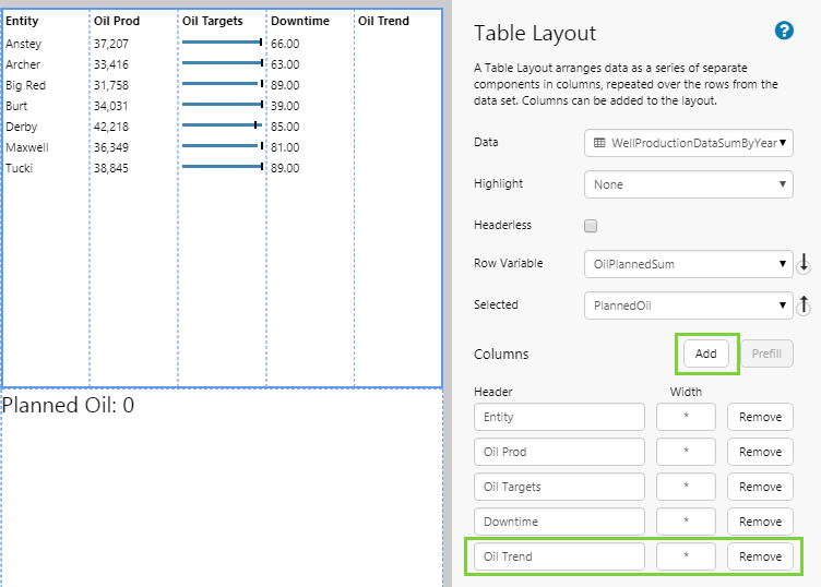
- For the new column, type Oil Trend as the column Header.
You will see the table preview update with the new column name.
Step 3. Add a Line Chart
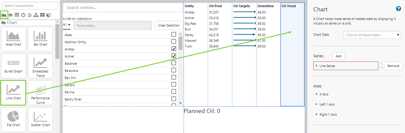
- Drag and drop a Line Chart component onto the Oil Trend column in the Table Layout. The Line Chart is in the Chart group.
Step 4. Configure the Chart data
In this step, we'll configure the chart to use its own data for each entity in the table layout.
- Click the Line Chart component to configure it.
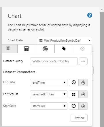
- Open the Chart Data Data Selector and add a dataset query. Configure it as follows:
| Dataset Query | WellProductionSumbyDay | This is from the Oil and Gas Data datasource |
| EndDate | (Variable ) endTime |
This uses the Page Default variable for endTime |
| EntitiesList | (Variable ) selectedEntities |
This uses the Default variable that you added in Tutorial 1 |
| StartDate | (Variable ) startTime |
This uses the Page Default variable for startTime |
Note: These are the same parameters used for the Table Layout data's dataset query, keeping the two in sync. The dataset queries themselves are also similar, and access the same data; the difference is that the chart's query divides the results into separate days, which is better suited to showing a sparkline trend.
Step 5. Configure the Line Series
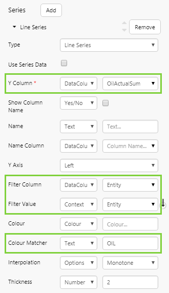
Click to open the Line Series. Configure the following properties:
| Y Column | (DataColumn) OilActualSum | |
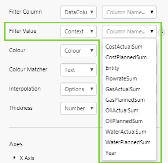
| Filter Column | (DataColumn) Entity | |
| Filter Value | (Context) Entity | The Context option is available to all of the chart's properties, because it is in a Table Layout column. When you select context data, Explorer uses the selected Y Column for the current row. |
| Colour Matcher | OIL | This colours the line in green. |
Step 6. Configure the X Axis
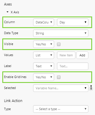
Click to open the X Axis. Configure the following properties:
| Column | (DataColumn) Day | This column is from the dataset specified in the Chart Data property. |
| Visible | No | Clear the check box, so that the y values do not appear along the x-axis. |
| Enable Gridlines | No | Clear the check box. |
Step 7. Configure the Left Y Axis and Other Options
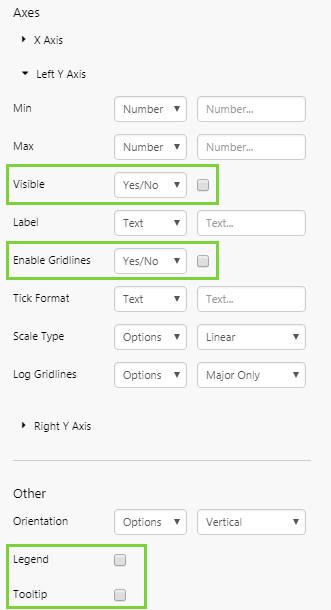
Click to open the Left Y Axis. Configure the following properties:
| Visible | No | Clear the check box, so that the y values do not appear along the y-axis. |
| Enable Gridlines | No | Clear the check box. |
Configure the following Other properties:
| Legend | No | The check box should be cleared by default. |
| Tooltip | No | Clear the check box. |
Step 8. Preview the Page
- Click the Preview button on the Studio toolbar to see what your page will look like in display mode.
Understanding the Table Layout
When using a table layout, you configure the data you want to display in the table, and how you want to display it. First, you set up the table layout and initial data, and then you configure the data in the individual columns. This is described in the following sections.
Selecting the Table Layout
When configuring a Table Layout, you will probably want to toggle between configuring the table layout itself and configuring a component in a column.
When you click on a configured table layout in Studio, you will notice that you have actually clicked on the column, as it is highlighted in blue and the column's component editor appears on the right:
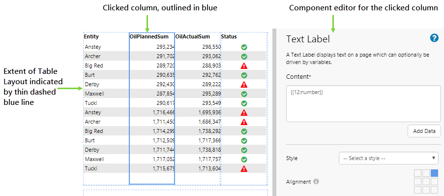
If you want to select the component editor for the Table Layout, you will need to either click an empty column, or use the right-click menu.
1. Right-click on the Table Layout to open the menu.
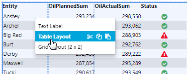
2. Click the Table Layout item, which is second on the menu. Note that the first item in the menu is the column you have clicked on.
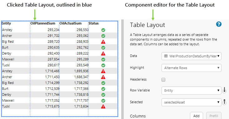
Now that you have selected the Table Layout, you can configure it, move it, and resize it.
Setting Up Columns
There are 2 aspects to setting up columns: configuring the columns displayed by the table layout, and configuring what goes into the columns.
Table Layout Columns
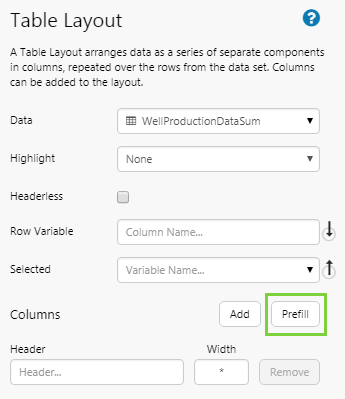
The Columns section in the table layout editor allows you to add and remove columns, change the header names and widths of the columns, and prefill table data in the columns. You can use the following functions:
Prefill: Adds all columns in the table layout's set of data, as shown in the data Preview.
Add: Adds a new blank column to the table layout, into which you can drag a component.
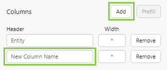
The new column will appear in the design preview as follows:
Once you have added columns to the table layout, the following options are available for each column:
Remove: Removes the corresponding column from the table layout.
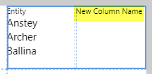
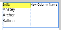
Header: The name of the column header. You can change the name by typing over an existing name. For prefilled columns, the data will remain the same but the name of the header will change. Example:
| Header: Entity | Header: Asset |
 |
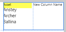 |
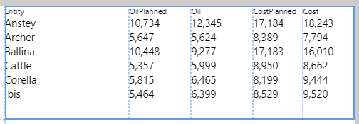
Width: Each newly added column has an asterisk * as its default width. Rules for column width follow the same rules as used in the Grid Layout: an asterisk (*) indicates a proportional width, a number indicates a fixed width in pixels. You can also have a mix of proportional and fixed width columns. Example:
| Specified width of columns: | Appearance of corresponding table layout column widths: |
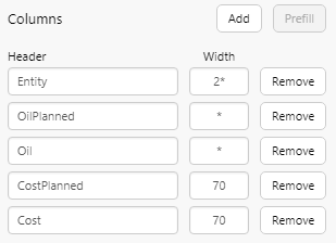 |
 |
Components in Columns
The columns in a table layout contain components. There is one component per column, with its data repeated in each row.
Columns that are added using the Prefill button contain a Text Label component. You can also add a different component to a column instead of a text label - in the image below, the extra column (column 3) contains a Status Indicator component. Components can be configured to use the data from the table layout, or to use a different set of data.
To configure a component in a column, click the column and then configure the component as you normally would, depending on the options available for that component.
You can style individual columns by applying a style to the component in the column - e.g. you might want to right-align columns containing a number. You can also reorder the columns by changing the Position in Table Layout property. The first column on the left is column 0 (zero). Note that you can only move a column to another empty column.
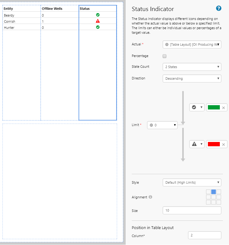
Table Data
Adding data to the Table Layout enables that data to be easily used in components within the table layout. The number of rows depends on the set of data: if the data has ten rows, the Table Layout will have ten rows, and so on.
To add data, use the Data Selector.
The Table Layout has been designed to use tabular data, however other forms of data (such as ad hoc calculations and tags) can be used. The two most common types of data used in a Table Layout are dataset queries and attributes.
|
|
|
 Dataset Query example:
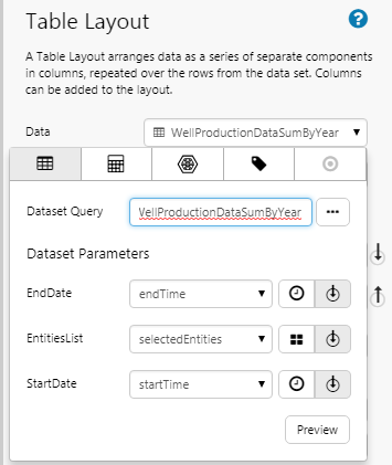
 Attributes example:
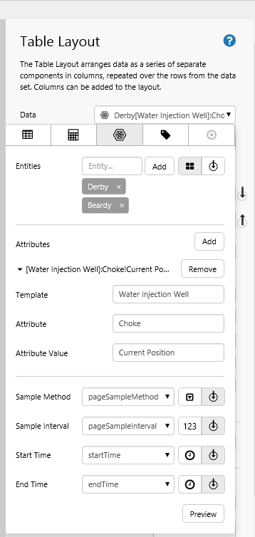
Previewing your data shows you the columns that will be available for use in the table layout and other components added to the table layout's columns.
Component Data
Components in a table layout can either use the Table layout's data or its own independent data.
Using Table Data
When you configure a component in one of the Table Layout's columns, you can select any of the Table Layout's data columns of the relevant type (e.g. text, number etc). The data that gets used is contextual for the row.
Table Layout data can be identified by the table layout context icon, in the Data Selector options. E.g. The Status Indicator shown below is contained in a Table Layout, so its Value property can be configured to use a data column from the Table Layout.
Some components, such as the Chart, will show an additional Context option in Filter Value fields. This is only available when the component is placed in a Table Layout, and enables you to select a column from the Table Layout for this value. For details on how to do this, see Tutorial 7.
Using Different Data
You can configure a component in a Table Layout to show different data from that in the rest of the table layout. This is best done when the other set of data has some commonalities with the table layout's data. E.g. Both sets of data refer to the same entities.
In the example below, the Downtime column sources data from a different query (OilDowntime) to the table layout's data (WellProductionDataSum). The two sets of data are connected via the Entity column which is present in both sources of data. For details on how to do this, see Tutorial 3.
Interactive Variables
You can configure a Table Layout's data column to update a variable, which can be used to make the table layout and other components interactive. To do this, the Table Layout provides two properties: Row Variable and Selected.
Row Variable: The name of the column that contains the data item of interest when a user clicks on a row. The columns are available in a drop-down list, and are obtained from the table layout's configured data. This data is published to the Selected variable.
Selected: The variable that is published when the user clicks on a row. This variable contains the data from the column specified by Row Variable. E.g. It may contain the name of an entity.
This variable must be added to the Default Values panel, with the appropriate data type. E.g. If this is to contain an entity, then it would be a text variable.
You can add any other component that accepts a variable, to display the content of the row that a users clicks in the table layout. E.g. A Data Label which displays the selectedEntity variable.
Appearance
You can change the appearance of the table layout in several ways.
Styles
There are two levels of styling you can apply: the style for the table layout itself, and the styles for its components.
Table Layout style
When you select a style for the Table Layout, this will control the colour and size of the table and its rows, columns, borders, and header text. These styles are created by a Style Administrator for the Table Layout component. If you are a Style Administrator, you can add a new Table Layout style.
Component Style
Clicking on each of the column components allows you to select a style for each component, including any style overrides available for that component (e.g. Alignment). These styles are created by a Style Administrator for the component (e.g. Text Label).
Highlight Rows or Columns
If you use a table layout style that contains a highlight colour, you can choose to highlight the table's columns or rows. The non-highlighted rows or columns will assume the table background colour.
Highlight: The Highlight drop-down list has the following options:
- Alternate Rows: Highlight alternating rows in a different colour, from the second row onwards. This does not include the row containing the header.
- Alternate Columns: Highlight alternating columns in a different colour, from the second column onwards.
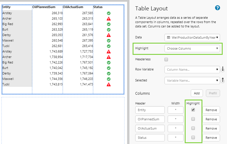
- Choose Columns: Choose the columns that you want to highlight. If this option is selected, a check box will be available next to each column. Select the check box to enable highlighting for that column.
To clear highlighting, select None from the Highlight drop-down list.
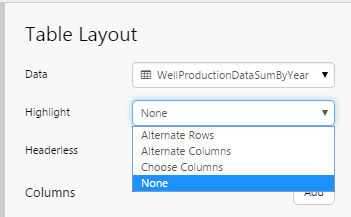
Table Layout with Alternate Rows highlighted:
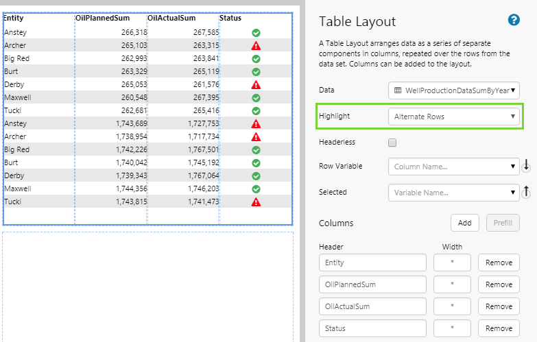
Table Layout with Alternate Columns highlighted:
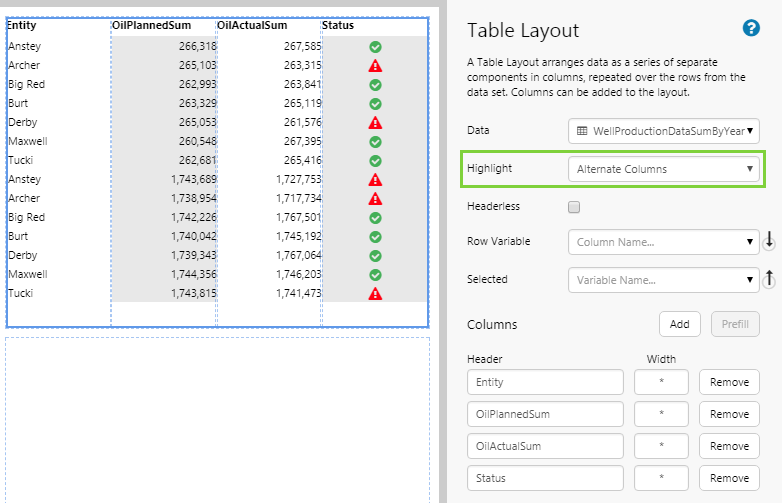
Table Layout with selected columns (Choose Columns option) highlighted:
Hide Header Row
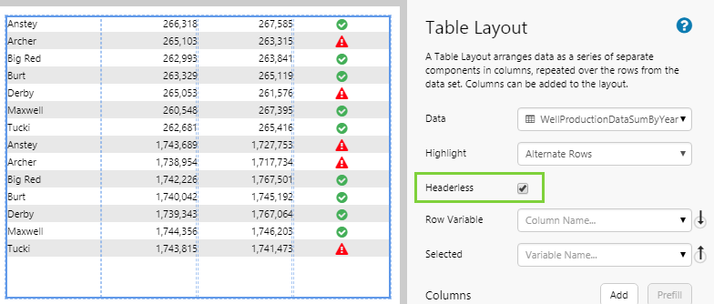
To hide the row containing the column headers, select the Headerless check box.
Release History
- Table Layout 4.5.4 (this release)
- Added a new Prefill button to automatically add all data columns to the layout.
- First 5 columns of data are no longer automatically added.
- Table Layout 4.5.3
- If the table layout's data has tags or calculations that have a digital state set assigned, the matching digital state pair's Name appears instead of the Value if there is a match, in text labels or data labels on the table layout's columns.
- Table Layout 4.5.0
- Optional configuration for updating a page variable with any nominated column from the table layout’s dataset.
- Table Layout 4.4.1