You can put together a chart in a few minutes. The prerequisite is having a source data control.
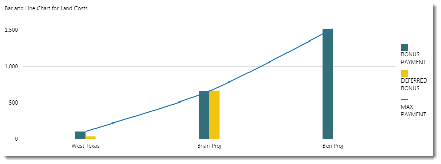
An Explorer chart is made of series. Select the series depending on how you want to display your data. You can have a combination of series types in your chart, as shown in this example screenshot.
| Line Series: | The line series plots your data in a line. | Line Chart help |
| Bar Series: | A chart with rectangular bars, where the length of each bar is proportional to its value. | Bar Chart help |
| Stacked Bar Series: | This chart has one or more series containing bar charts which stack vertically to form single bars. | Stacked Bar Chart help |
| Area Series: | The area chart is a line chart with the area below the line filled in with a colour. | Area Chart help |
| Dot Series: | This chart displays each point as a dot, and is typically used to highlight statistical distributions. | Dot Chart help |