ON THIS PAGE:
Overview
Grid-based layouts are one of the easiest ways to get started in designing a page. A grid-based layout provides the basis for a balanced design, and is also easy to visualise.
In Explorer, you can lay out the elements of your page as if you were putting one element in each cell, just like you would in Excel®. It's a simple concept, but you can achieve some complex layouts.
The following diagram shows the standard basic grid layout with 2 columns and 2 rows:
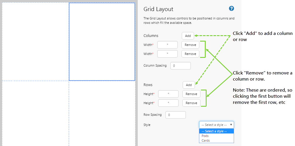
| Width: | The width of the column in pixels. You should only enter a number. Type * to allow the browser to automatically adjust the width of the column. |
| Column spacing: | The amount of spacing or padding between each column, in pixels. You should only enter a number. The default is no spacing, which means that the elements may butt up against each other. |
| Height: | The height of the row in pixels. You should only enter a number. Type * to allow the browser to automatically adjust the height of the row. |
| Row spacing: | The amount of spacing or padding between each row, in pixels. You should only enter a number. The default is no spacing, which means that the elements may butt up against each other. |
| Style | The style you want to apply to the grid layout. |
Types of Grid Layouts
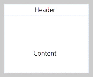
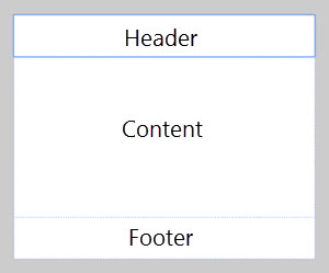
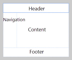
Here are some simple examples of grid-based page design:
 |
 |
 |
In Explorer, you can achieve some complex layouts when you add a grid layout inside another grid layout - which is how you effectively "split" cells.
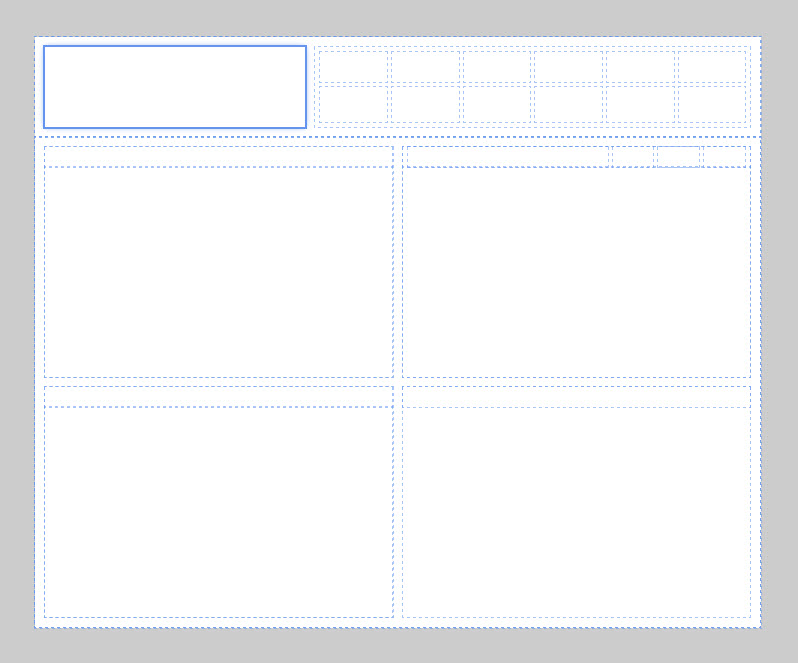
Let's look at the following dashboard. It's a bit more complicated than the above examples, and makes use of embedding grids inside another grid.
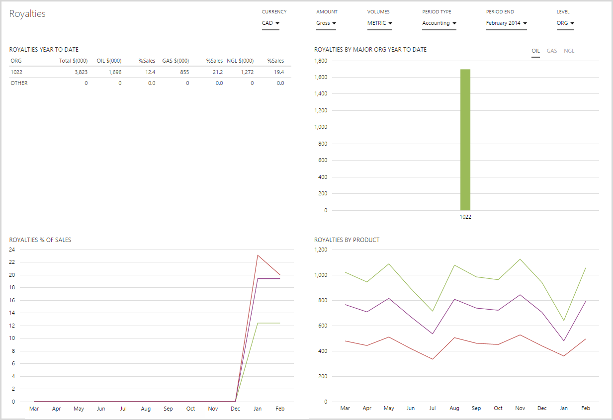
We're going to break this down into what the grid layout looks like, and then we'll show you how to construct it in the step by step tutorial below.
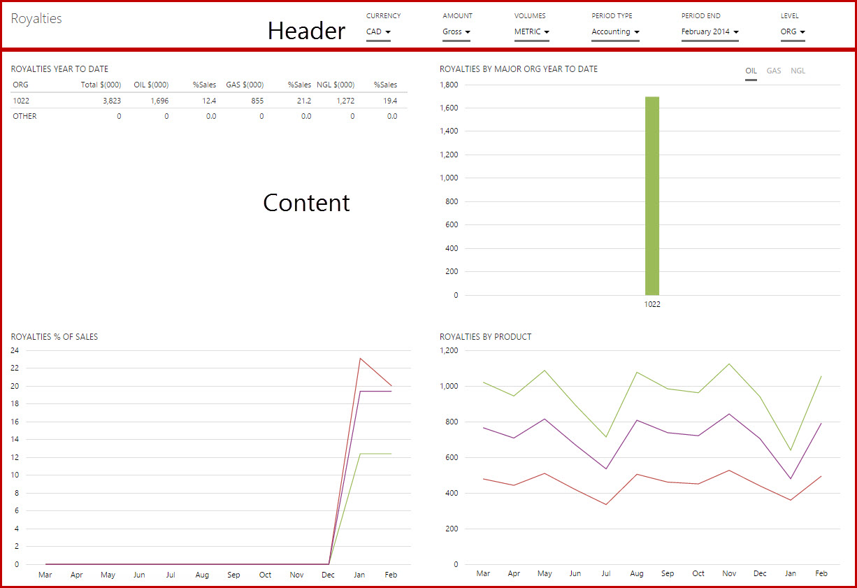
The image below left (Breakdown #1) shows you that this dashboard actually follows the first simple structure shown in the layout examples above.
 |
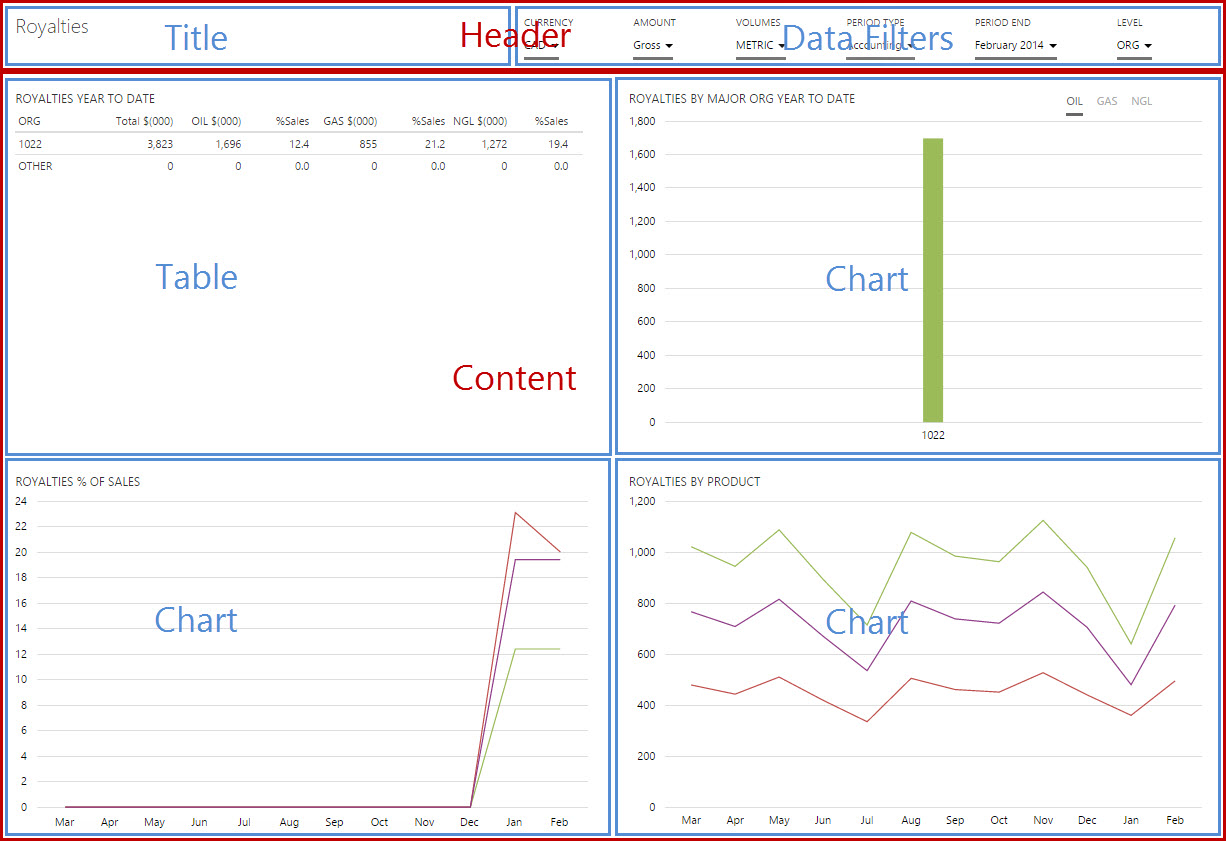 |
| Dashboard - Breakdown #1 | Dashboard - Breakdown #2 |
Breakdown #2 (above right) shows how the Header and Content sections are then further broken down. The Header cell is divided into 2 further cells, and the Content cell is divided into 4 further cells. In fact, Breakdown #2 has a grid layout inserted into the header cell, and another grid layout inserted into the content cell!
We're going to look at how to recreate this dashboard in the tutorial below, step-by-step.
Grid Styles
The Grid layout comes with 2 different styles, which affect the overall look of the page:
"Cards" style
The Cards style has a clean, minimalist look with a white background.
"Pods" style
The Pods style uses a pale grey page background, with each cell having a white background. It's useful when you want each cell to be distinct from the other cells.
Width and Height
The width of columns and height of rows can be specified in 3 ways:
- Fixed width/height in pixels. To do this, just type a number into the field.
- Proportional. This is indicated by using *.
- A mix of fixed width/height and proportional width/height.
When using proportional sizing, the size is determined as a proportion of the available space. The space is divided into equal portions and a factor is applied to determine how much of that space should be taken by a cell.
The following examples show how the proportions are calculated, using a column as the example. The same applies for rows.
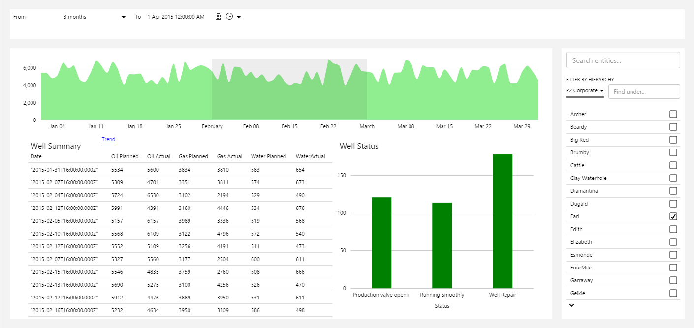
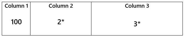
Example 1. Column 1 has a fixed width of 100px, Column 2 takes up the remaining space. When the page is resized, it is the width of Column 2 that scales, whereas Column 1 stays fixed at 100px.
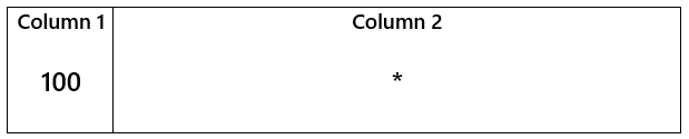
Example 2. Column 1 has a fixed width of 100px. The remaining space is equally distributed between columns 2 and 3. When the page is resized, Column 1 stays fixed at 100px and columns 2 and 3 are scaled evenly.
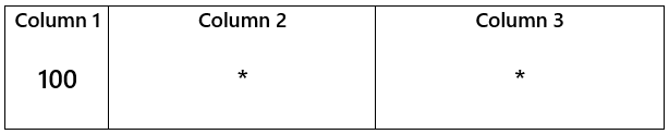
Example 3. Column 1 has a fixed width of 100px. The remaining space is distributed between columns 2 and 3 in the specified proportion. The easiest way to figure out the proportion is by using fractions. When the page is resized, Column 1 stays fixed at 100px and columns 2 and 3 are scaled with their respective proportions intact.
Example 3a: The remaining space is divided into 3. Column 2 takes 1/3, column 3 takes 2/3. When the page is resized, Column 2 still takes 1/3 and Column 3 still takes 2/3 of the remaining space.
Example 3b: The remaining space is divided into 5. Column 2 takes 2/5, Column 3 takes 3/5. When the page is resized, Column 2 still takes 2/5 and Column 3 still takes 3/5 of the remaining space.
Things To Know
Here are some other useful things to know about layouts in general, and the Grid layout in particular:
- Grid layouts allow you to design a more responsive page which can be viewed nicely on a range of screen sizes, and will resize to take up the available space of the screen. This is due to the use of the *, which automatically resizes a cell according to the screen size.
- You can mix layouts - you can insert a precision layout into a grid cell, and vice versa. This is useful when you want to create a complex schematic but still retain some element of resizability.
- You can move the contents of a grid cell by dragging and dropping it to another grid cell. Say you have a table in the top left cell, and you want to move it to the top right cell. You can just drag and drop it to the other cell without the table losing any of its settings. If the cell you are moving contains multiple components, say another grid with embedded components, then ALL of those components in that cell will move as a 'set'.
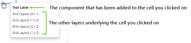
- As grids can be embedded inside other grids, multiple 'layers' can arise and you need to be able to select which layer you want to configure. You can do this easily by right-clicking on the cell, and choosing the layer you are interested in. Alternatively, you can click on an empty cell or the padded area outside a grid cell (if you have cell padding) to go directly to that grid layout. You can see how the layers accumulate by working through the tutorial below.
Tutorial: Creating a Grid Layout for a Dashboard
In this tutorial, we'll show you how to use the grid layout to design the above dashboard.
Step 1. Prepare a Studio Page
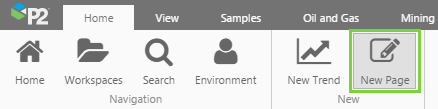
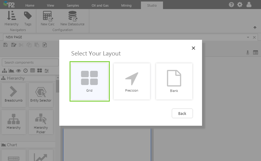
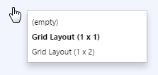
Before you start, click the New Page button on the Home tab of the ribbon. Choose the Grid layout.
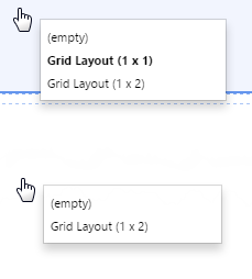
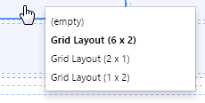
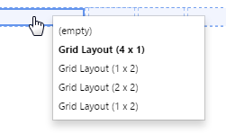
Before we move on, let's see how the grid layers start off. Right-click on any grid cell.
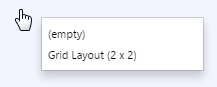
The shortcut menu shows you the layer stack. The current cell has no components added to it, so it appears as (empty).
After this, you can see that the only layer available is the 2x2 grid, which is what we've just added.
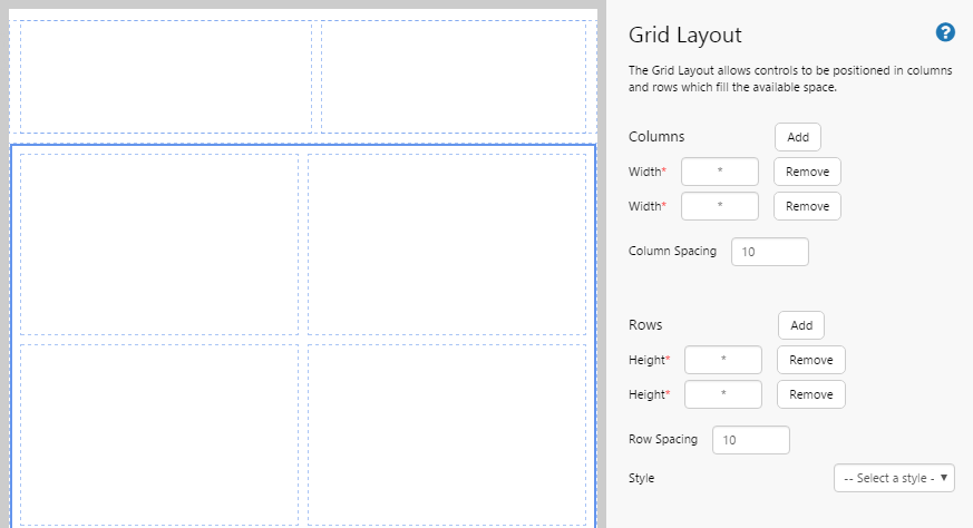
Step 2. Adjust rows and columns to create header and content areas
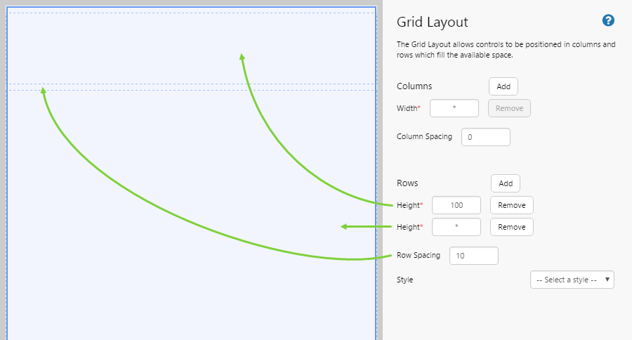
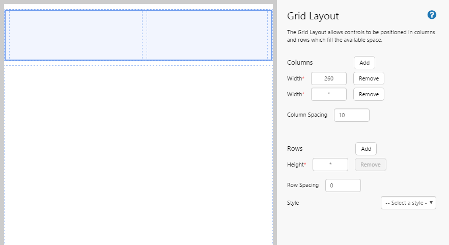
- This layout has only one column, so we need to remove one of them. Click the "Remove" button for one of the columns.
- We have the 2 rows we need for the header and the content.
- We want the header to be shorter than the content area, 100px is a good height. Set the first row to 100.
- We also want to add a bit of spacing between the rows so the page doesn't end up looking cramped. 10px is a good amount for padding. Set the Row Spacing to 10.
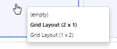
Before we move on, let's see what effect this has had on our layers. Right-click on any grid cell.
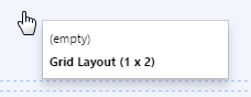
Notice that the grid has changed to a 1x2 grid (one column, two rows).
Step 3. Add another grid layout into the header area
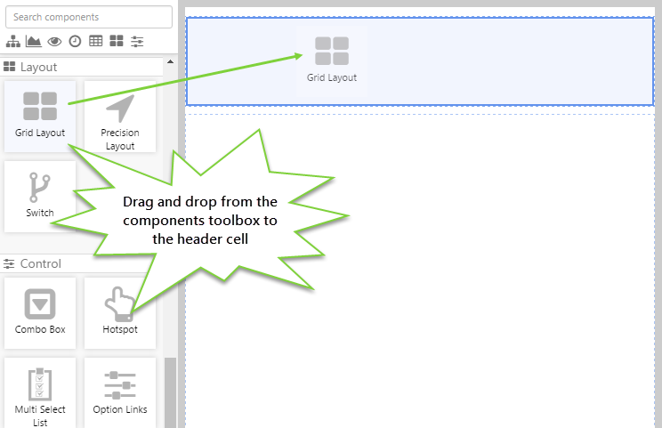
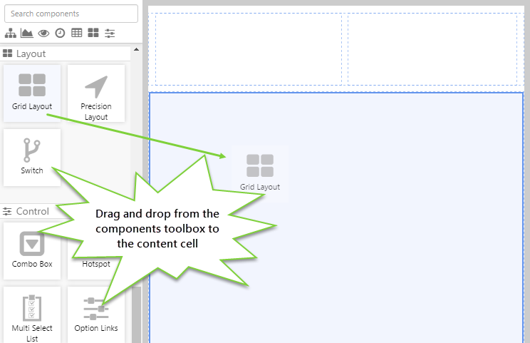
Let's embed another grid layout into the header area.
- Click in the top row.
- Drag and drop the Grid Layout from the components toolbox on the left. The Grid Layout is in the Layout
 group.
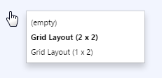
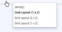
Let's see what effect this has had on our layers. First, right-click on the top row, and then right-click on the second row.
Notice that the top row now has 2 layers: the original 1x2 grid, and the new 1x1 grid (new grids always start off as 1x1).
The second row, however, only contains the original 1x2 grid.
Step 4. Add rows and columns to the header area
- We want to divide the header area into two columns.
- The left column will contain the page title, and the other will contain the data filters.
- Give the first column a width of 260, because the title text shouldn't take up much space.
- Add a column spacing of 10 so it doesn't look cramped.
Right-clicking on the top row now shows that the new grid has been modified to a 2x1 grid.
Step 5. Add another grid layout into the content area
Let's embed another grid layout into the content area.
- Click in the 2nd row.
- Drag and drop the Grid Layout from the components toolbox on the left.
Right-click on the content area, and notice that a new 1x1 grid has been added.
Step 6. Add rows and columns to the content area
- We want to divide the content area into 4, so lets add 2 rows and 2 columns.
- Leave the height and width a * so that the layout will resize nicely when the browser resizes.
- However, let's add a spacing of 10 to both rows and columns, to avoid any cramping.
Right-click, and notice that the grid is now a 2x2 grid.
Step 7. Add a grid layout to the right header cell and format it
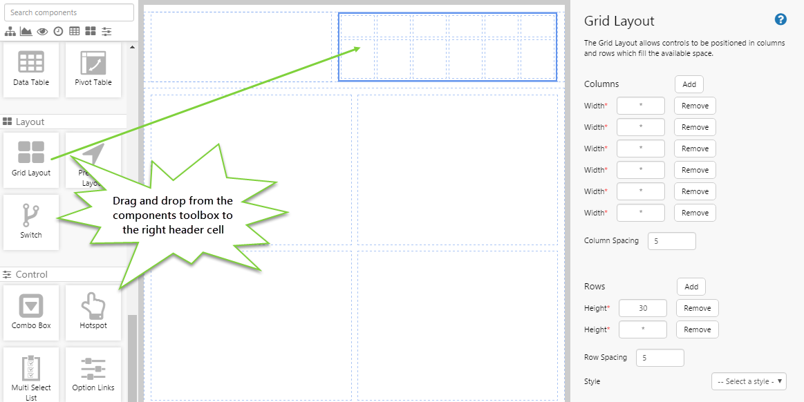
Let's finish laying out the header.
- In the left cell of the header we just want to add the title, so there's no further splitting required.
- However, in the right cell we want to add a number of controls, and each one will have a label above it.
- So we need to divide this cell into 6 columns (one for each control) and 2 rows (so we can add labels for each control).
- Make the top row 30 high, because the labels won't be big, and leave the rest of the heights and widths as *.
- Finally, set the Column Spacing and Row Spacing at 5, to avoid cramping.
Right-click on one of the new cells and notice the new 6x2 layer you just added. Notice also that the active layer is in bold.
Step 8. Add a grid layout to each of the content cells and format them the same
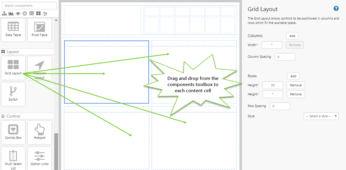
In each content cell, we want to add a chart and a title for the chart, so they will all be formatted in the same way. You will need to do this one by one. For each content cell:
- Add a grid layout.
- Add a row, and give that row a height of 20.
- There's no need to add any spacing if you don't want to.
Do the same for the remaining content cells. Right-click and observe the layers.
Step 9. Refine the top right content cell
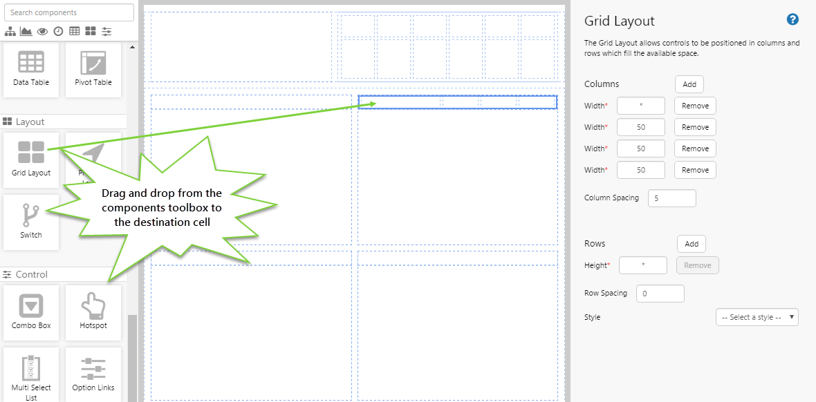
We're nearly done, but you might have noticed in the original dashboard picture, the top right chart actually has some other links to the right of the title (Oil, Gas, NGL). Let's just quickly create a layout for those links.
- Add a grid layout to the top right content cell.
- Add 4 columns.
- We want the 3 columns on the right to all be the same width, and as the links will only be short, so let's set the width to 50 .
- We also want the links to be nicely spaced out, so let's set a column spacing of 5.
Right-click and observe the layers.
Step 10. All done!
Congratulations! You now have a nice grid layout for your page. All you need to do is add the components and your page will be ready to use.
 Don't forget to save your page!