The Histogram component allows page designers to plot sets of normalized data and generate a bell curve. The component also provides a range of statistical features in a separate panel, which can be hidden if required.
Features of the Histogram
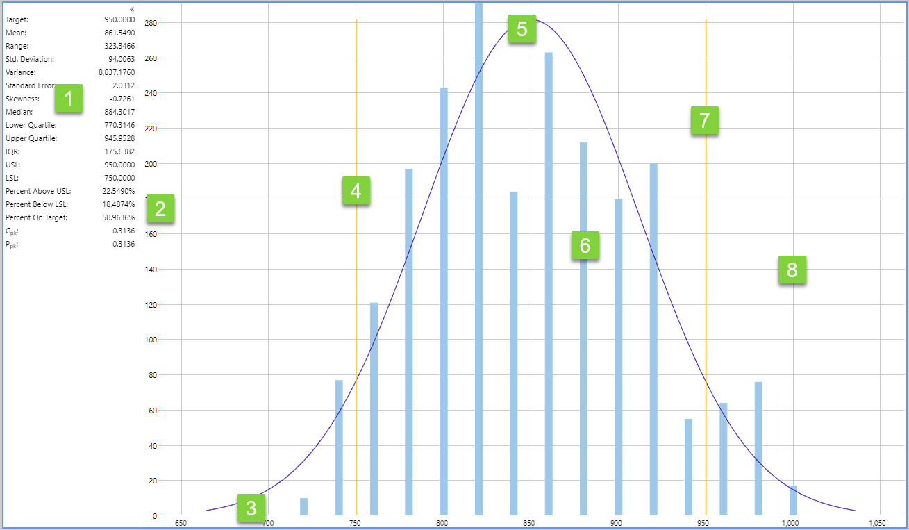
| 1. Statistics panel
A range of statistical values about the data including Mean, Range, Standard Deviation, Variance and Standard Error. The panel can be hidden. |
5. Bell curve:
The bell curve can give an indication of how well the data fits a normal distribution curve. |
| 2. Y-axis:
The y-axis represents the frequency count. |
6. Chart data:
Each vertical bar in the histogram represents a data range, or bucket of data. |
| 3. X-axis:
The x-axis represents the variable being measured, in this case what was selected in the Value Column in the page configuration. |
7. Upper specification limit:
The upper limit of the optimal data range. |
| 4. Lower specification limit:
The lower limit of the optimal data range. |
8. Gridlines:
Gridlines make it easier to estimate values. |