This article applies to versions 4.4.6 and later of IFS OI Explorer. See Release History for more.
Overview
IFS OI Explorer pages have several statistical components for better data visualisation. Three of these that involve targets are:
Target Label:
A label showing an actual value versus its percentage of a target value.
Target Bar:
A horizontal bar chart showing actual versus target.
Target Variance Bar:
A horizontal bar chart showing actual, variance percent and target.
Hover
When you hover over a target label, target bar, or target variance bar, a tooltip appears showing further details. See the following sections for further details.
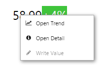
Right-click
Depending on what the component's actual value has been configured to display, when you right-click the component, a variety of menu options will be presented.
Attribute value or tag, if the datasource allows writing to the database. Opens the Enter value dialog, where you can change the value of the data point.
Right-click menu options on a target label
Note that the right-click menu is only available if the actual value uses a tag, an attribute value, or an ad hoc calculation.
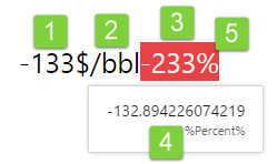
Target Label
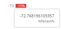
The target label shows an actual value, as well as this value as a percentage of the target.
Watch this video. Hover over the value to see what it represents, and hover over the percentage to see the target value and what it represents.
Features of the target label:
1. Actual Value:
This is the numerical actual value.
2. Units of measure:
Units of measure can be configured to appear on the target label.
3. Percentage:
Actual value as a percentage of the target. Hover over the percentage to see the target value and what it represents (for example, 'oil target').
The percentage is preceded by a plus (+) or a minus (-) sign, depending on whether the actual value is above or below the target value.
4. Tool-tip showing actual:
Hover over the actual value to see what it represents (%Percent%', in this example).
5. Percentage Background:
The background is red if the percentage of target is an undesirable outcome. In this example, %Percent% is under target which is an undesirable outcome. For a label representing water, actual values above target would be undesirable; in that case, the label would be configured to show a red background for positive percentage figures.
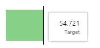
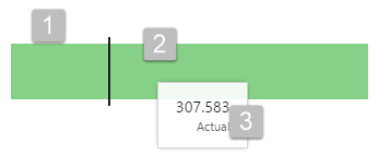
Target Bar
The target bar shows you at a glance how an actual value is performing against its target.
Features of the target bar:
1. Actual Value Bar:
The horizontal bar shows the actual value. Hover over the bar to see its value in numerical format.
This bar is green for 'desirable' outcomes, and grey for 'undesirable' outcomes; in some cases, an actual exceeding a target is seen as 'desirable'; in other cases it is preferable to come below the target (for example, where the target represents a budget). The target bar is configured, accordingly.
Note that the colours are part of the bar style, and may vary from this example.
2. Target Line:
The vertical line shows the target value, positioned on the bar in relation to the actual value.
You can see straight away that the target is about a third of the actual. The grey or red is a lighter shade as it tends towards a lower percentage. Hover over the target line to see its value in numerical format.
3. Tool-tip showing Actual:
Hover over the actual bar to see its numerical value. The target bar has a similar tool-tip.
Watch this video to see what additional information is available when you hover over the horizontal bar (actual) or over the vertical line (target). Labels on the left are separate components.
Here, water is over target; this is shown as an undesirable outcome (a grey bar).
In this video, note how the targets are the same, giving you a like-for-like comparison between the three wells (labels on the left are separate components).
Here, the first two wells are under target; this is shown as an undesirable outcome (a grey bar).
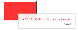
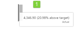
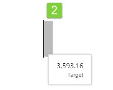
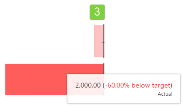
Target Variance Bar
The target variance bar is a horizontal bar chart showing actual, variance percent and target.
Features of the target variance bar:
1. Percentage Variance Bar:
This bar is red for an 'undesirable' percentage variance, and grey for a 'desirable' percentage variance.
Hover over the percentage variance bar to see the actual numerical value, as well as the value as a percentage of the target value.
2. Target Line:
Hover over the vertical target line, so see the target numerical value.
3. Two Target Variance Bars:
These target bars are vertically aligned along the separate target lines. Because the bars are measured as a percentage, the two can be visually compared. Note how the red is a lighter shade when it is closer to the target.
In this video, two separate target variance bars have their separate targets vertically aligned, so that their variances can be visually compared, like-for-like. Because the target variance is expressed as a percentage, two or more target variance bars can easily be compared. Watch how the values are displayed when you hover over the horizontal bars, and the vertical targets lines.
Release History
New in this release (4.4.6):
The component now has a menu for options to view details, view a trend, or write to a tag.