ON THIS PAGE:
Overview
P2 Explorer pages have several statistical components for better data visualisation. Three of these that involve targets are:
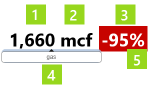
| Target Label: | A label showing an actual value versus its percentage of a target value. |
|
| Target Bar: | A horizontal bar chart showing actual versus target. |
|
| Target Variance Bar: | A horizontal bar chart showing actual, variance percent and target. |
|
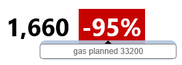
The target label, target bar, and target variance bar show performance statistics at a glance, with further detail available when you hover over them.
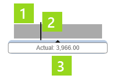
Target Label
The target label shows an actual value, as well as this value as a percentage of the target.
Watch the video below: Hover over the value to see what it represents, and hover over the percentage to see the target value and what it represents.
Features of the target label:
|
|
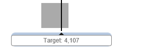
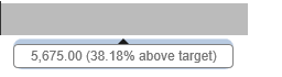
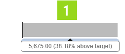
Target Bar
The target bar shows you at a glance how an actual value is performing against its target.
Features of the target bar:
|
|
Watch the video below to see what additional information is available when you hover over the horizontal bar (actual) or over the vertical line (target). Labels on the left are separate components.
Here, water is over target; this is shown as an undesirable outcome (a red bar).
In this video, note how the targets are the same, giving you a like-for-like comparison between the three wells (labels on the left are separate components).
Here, the first two wells are under target; this is shown as an undesirable outcome (a red bar).
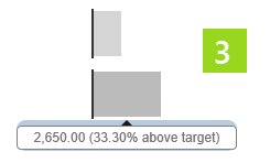
Target Variance Bar
The target variance bar is a horizontal bar chart showing actual, variance percent and target.
Features of the target variance bar:
| 1. Percentage Variance Bar:
This bar is red for an 'undesirable' percentage variance, and grey for a 'desirable' percentage variance. The grey or red is a lighter shade as it tends towards a lower percentage. Hover over the percentage variance bar to see the actual numerical value, as well as the value as a percentage of the target value. |
 |
| 2. Target Line:
Hover over the vertical target line, so see the target numerical value. |
 |
| 3. Two Target Variance Bars:
These target bars are vertically aligned along the separate target lines. Because the bars are measured as a percentage, the two can be visually compared. Note how the grey is a lighter shade when it is closer to the target. |
 |
Watch the video below: In this video, two separate target variance bars (each with its own label) have their separate targets vertically aligned, so that their variances can be visually compared, like-for-like. Because the target variance is expressed as a percentage, two or more target variance bars can easily be compared. Watch how the values are displayed when you hover over the horizontal bars, and the vertical targets lines.