ON THIS PAGE:
Overview
The bar chart displays values in rectangular bars, where the length of each bar is proportional to its value. The following diagram shows the a bar chart control in design mode:
(See separate topics for: Line Chart, Stacked Bar Chart, Area Chart and Dot Chart.)

The chart has three mandatory selections (marked with an asterisk *) that have not been preconfigured: Source Data, at least one Series (define the Y Column), and the X Axis (define the Column). You’ll need to fill these in yourself.
| Source Data: | This is a mandatory selection. Your chart data comes from this source data. | ||||||||||||||||||||
| Series: | Your chart needs at least one series. Click Add for new series, or Remove to remove a series. | ||||||||||||||||||||
| The chart definitions here cover the elements of a Bar Series. Other types are Line Series, Stacked Bar Series, Area Series and Dot Series. | |||||||||||||||||||||
|
|||||||||||||||||||||
| Axes: | Each chart has an X Axis and either one or two Y Axes. | ||||||||||||||||||||
|
|||||||||||||||||||||
| Left Y Axis: | The Left Y Axis, vertical by default, is used for plotting values of the X Axis. Note that this axis is only used if Left is selected as the Y Axis in one or more series (it is, by default). The Left Y Axis comes preconfigured. | ||||||||||||||||||||
Ticks:Defines the number of Y Axis intervals
|
|||||||||||||||||||||
| Tick Format: | Format the Y Column, which is displayed along the Y Axis. For example, if your Y Column is a dollar value, you can type in the dollar $ symbol. Your labels would then look like $ 50.00, $ 25.00 and so on. Other formatting to use are the signs (+/-), the comma (for a thousands separator), and precision symbols. You can use these together, for example "$ ," displays the currency symbol and has a thousands separator. | ||||||||||||||||||||
| Scale Type: | The default option is Linear (showing the actual values). Logarithmic scale (Log) displays a logarithmic calculation, which is useful when you have a wide range of values to display. Tip: If using Log, show this in your label. If you set this as an event, then the user can toggle between the log and linear scale quite easily, with the help of a combo box. | ||||||||||||||||||||
| Log Gridlines: | Note: This only applies to the Log Scale Type. Options are: Major Only, and Major and Minor. |
Right Y Axis:This is the same as the Left Y Axis, and can be used instead of or together with the Left Y Axis. It is useful to have these two separate axes if there are series with very different expected values; this way, all series can be better scaled to show up well in the chart. Another use of having both Y Axes would be to show different types of measures. For example, show dollars along the Left Y Axis, and counts along the right Y Axis.
Note that this axis is only used if Right is selected as the Y Axis in one or more series.
The Right Y Axis is pre-configured. This axis has the same components as the Left Y Axis.Other:This is where you can configure the general chart appearance, such as orientation.
| Orientation: | Charts default to vertical. If you change this to horizontal, then your Y Axis is plotted along the horizontal, and your primary values (X Axis) move to the vertical. Horizontal is useful if you are expecting a lot of X Values, as the legends stack neatly underneath each other (horizontally). |
| Legend: | The legend displays the values of the X Axis Column. |
| Legend Position: | This option only appears if you select the Legend. Right by default. This can be Left, Right, Top, or choose Top-inside if you have limited space. |
| Tooltip: | Tooltips show the Y value when you hover your mouse over that area of the chart (e.g. over a bar). |
Tutorial
You can put a chart together in a matter of minutes, as most of the chart options are preconfigured.
Follow the step-by-step instructions for adding this chart.
Step by Step: Adding a Bar Chart
Before you start, open a new tab in Explorer and add a new page in grid layout.
If you have access to the training environment, you can follow the steps exactly as outlined here. Otherwise, you will need to adjust the configuration to suit your data.
Step 1. Add and configure Source Data
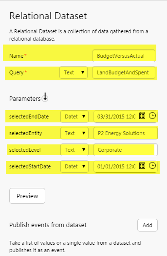
Click Add Data, then select the Dataset option. Select the Training Datasource, then click LandCostsBudgetVersusSpent and Add. Configure as follows:
- Name: BudgetVersusActual
- Query: LandBudgetAndSpent
- Parameters:
- selectedEndDate: (Datetime) 03/31/2015 12:00:00
- selectedEntity: (Text) P2 Energy Solutions
- selectedLevel: (Text) Corporate
- selectedStartDate: (Datetime) 01/01/2015 12:00:00
We've added fixed parameters; you can get these to run off events if you'd prefer. Click Preview to see what the data looks like.
Step 2. Add and configure the Chart
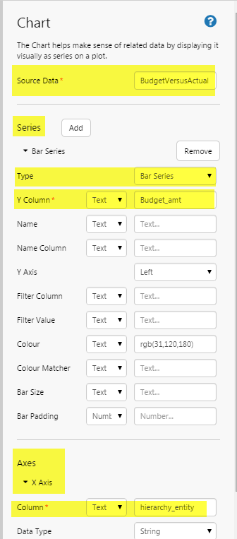
Drag and drop a Chart control onto a grid cell. Configure as follows:
- Source Data: BudgetVersusActual
- Series:
- Type: Bar Series
- Y Column: (Text) Budget_amt
- Axes:
- X Axis:
- Column: (Text) hierarchy_entity
- X Axis:
Note that the Y Column and the X Axis Column are columns from the source data.
Step 3. All done!
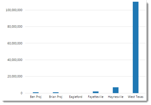
Well done! You have configured a basic bar chart. Click the preview ![]() button on the Studio toolbar, to see what your page will look like in run-time.
button on the Studio toolbar, to see what your page will look like in run-time.
![]() Don't forget to save your page!
Don't forget to save your page!