ON THIS PAGE:
P2 Explorer 4.5 addresses the need for users to build their own Explorer pages and trends. With the addition of two critical components, the Performance Curve and the Embedded Trend, Studio’s Toolbox has a comprehensive set of controls, enabling you to create the pages that you need, in order to optimise the way you display your data.
Building on the many changes and enhancements in the Explorer 4.4 releases, Explorer 4.5 offers a more usable Design Mode, and a Display Mode that makes it simpler for users to navigate through the displays, and easier to understand data and trends.
Navigation has been streamlined to give a better user experience, allowing users to link to pages, trends or related information on external URLs through hyperlinks or drill-down charts on pages, as well as view a trend or point details of data displayed on pages. Workspaces are easier to work with than before, and the ribbon tabs have been consolidated.
Release 4.5.0 includes new features and enhancements for the Trend and the Studio editor. Display mode has had several enhancements to enable additional interaction between the controls.
There are two new components in the Studio toolbox in this release: Performance Curve, and Embedded Trend.
Note: P2 Server 4.5 is a prerequisite for P2 Explorer 4.5.
Performance Curve
The Performance Curve is used to analyse the performance effects of process changes or equipment efficiencies (such as the performance of pumps). The Performance Component plots data from various sources against one or more curves.
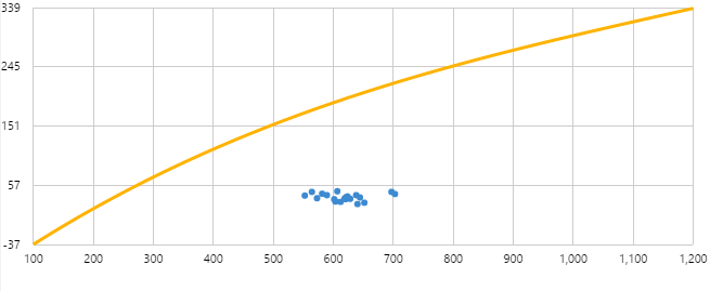
A Performance Curve on an Explorer Page
In Design Mode
The Performance Curve is a specialised chart, found under Charts in the Toolbox. It is used to show one or more idealised curves, with points of data in relation to these curves.
You can configure one or more curves in the component. Each curve is configured either as a Polynomial Curve, using a polynomial equation with fixed coefficient and constant values, or as an XY Curve, using a set of fixed X and Y co-ordinates.
The points of data are positioned on the chart based on their X and Y co-ordinates on the chart, where X and Y are each a data series, for example tag data.
You can optionally configure a highlight section for the Performance Curve. Highlighted items are shown in a different colour, and can be controlled by another control, such as a chart configured to use a range selector. The highlighted area could be a time selection, or a numeric range (for example, you could highlight the points that have an X value between 600 and 900).
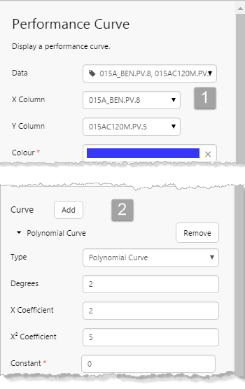
Properties of the Performance Curve, in the Component Editor. 1: Define the Data to show as points on the chart; 2. Define at least one Curve for the chart.
Embedded Trend
The new Embedded Trend component is used to embed a smaller version of a trend within an Explorer page, and is used for quick and simple diagnostics. As with the full Explorer trend, you can use hairlines on the embedded trend, and add comments to tags at a point in time, by clicking the trace line.
In Display Mode, you can drag and drop time series data labels from the page onto the trend, or drag tags and attributes from the Navigators. Right-click on the embedded trend to open a full Trend display.
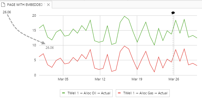
Dragging a data label onto an embedded trend
In Design Mode
The Embedded Trend component is found under Charts in the Toolbox. Drag and drop it onto a page, and then configure it to show one or more data series. It’s ready to use, or can be further configured.
Trend Enhancements
In the Trend’s trace table, you can now look up tags or attribute values from the Name column; there is also a link to the Calculation Editor. Trace names are now in a display name format, with icons representing their type (calculation, tag, or attribute value).
Trace Name
The item’s Name in the trace table has the following new features:
- The name is preceded by an icon, indicating what it is.
- There is a button linking to the Calculation Editor.
- The Name edit box has auto-complete functionality for tags and attributes.
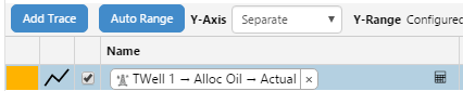
- The name for an attribute value is displayed as: Entity -> Attribute -> Attribute value
The following icons provide information regarding the trace item:
| Icon | Item | Icon | Item |
|
|
Tag |
|
An invalid definition, for example an incomplete attribute definition |
|
|
Calculation |
|
Templated attribute |
|
|
Attribute: this is the icon for the entity’s primary template, and varies, for example  |
OR Attribute (where the entity’s primary template does not have an icon) |
Auto-Complete Trace Name
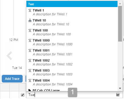
When you start typing a name directly into the Name column for a new item in the trace table, a list of tags, calculations and entities appears, where the name or description matches the search text.
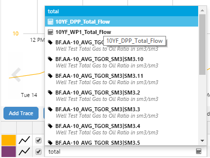
Example Search: Here the names or descriptions match the search text of ‘total’
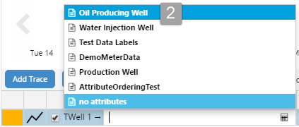
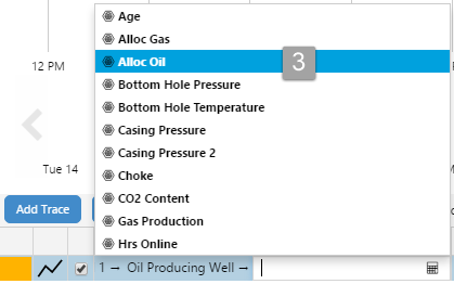
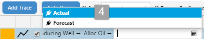
If you are adding an attribute value, you can do this using auto-complete, starting with the entity name, and qualifying until you have the attribute value, as shown in this table:
| 1. Type in part of the entity name, then select an entity (TWell 1) from the list of entities and tags.
|
2. Select a template from the list of templates for that entity.
|
| 3. Select an attribute from the selected template’s list of attributes.
|
4. Select an attribute value from the selected attribute’s list of attribute values.
|
| The fully-qualified display name appears in the Name column of the trace table.
|
For any trace item, you can click the calculation button to edit the item further in the calculation editor; for example, you can edit an attribute value to use the ‘entity’ keyword to turn this into a templated trace item.
Calculation Editor
Each item in the trace table has a calculator icon  in the Name column, linking to the Calculation Editor.
Use the Calculation Editor to build expressions with the Component Selector, and to validate these expressions as you build them, as well as preview calculation results.
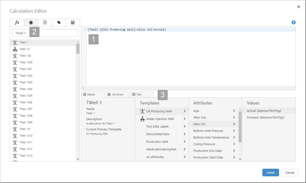
| 1. Edit Box: Drag and drop components from the Components Selector to build your calculation. |
| 2. Component Selector: Tab through Functions and Keywords, Entities, Templates, Tags and Calculations. Search, drag and drop into the edit box. |
| 3. Details/Errors/Test Tabbed Panels: View and select the details of each component, go through the list of errors, and finally test the calculation. |
Hairline Pop-up Position
When you add a hairline to the trend (or a chart), the hairline pop-up is positioned where the mouse is clicked. This gives the user more control over where to place one or more hairlines, so that trace lines or other hairline pop-ups are not obscured.
Page Times
Setting the start time and end time defaults for your page determines how the page’s data is collected when it is opened, and also how date time controls will operate. This release offers three new features for setting the start date and time.
Automatic Page Refresh
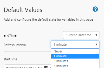
Your page can be now configured to refresh automatically without the use of the Current Date/Time component. The page refresh interval can be anything from one minute to 12 hours, depending on the configuration in Design Mode.
In Design Mode
To set an automatic refresh for the page, click Defaults on the Studio ribbon tab to open the Default Values panel. Select an endTime of Current Datetime, then select a Refresh interval from the drop-down list.
Default Values for a Page in Studio
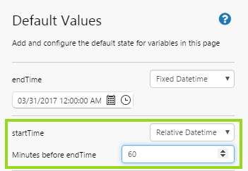
Start Time Relative to the End Time
A page can be configured to have a set interval between its start time (startTime) and end time (endTime), for example 24 hours, or one week; this is useful if you want to view a seven days report, for example. Every time the endTime page variable updates (whether through an interoperating control such as a Date/Time Picker, or when the page refreshes), the startTime updates to maintain the relative date time interval.
In Design Mode
To set startTime relative to endTime, click Defaults on the Studio ribbon tab to open the Default Values panel. Select a startTime of Relative Datetime, then capture minutes in the Minutes before endTime edit box.
Start Time or End Time as Text
You can now set the start time and end time as Text times. These could be relative to the current date and time (for example, ‘Yesterday’), or they could be fixed date times, for example ‘start of 2016’.
In Design Mode
To set an end time as text, click Defaults on the Studio ribbon tab to open the Default Values panel. Select an endTime of Text, then type in a date string, such as ‘yesterday’, ‘last week’ (a week ago), ‘next month’ (a month from now).
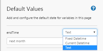
Setting an endTime relative to the current time
The same applies for setting a start time to text. Select a startTime of Text, then type in a date string, such as ‘yesterday’, ‘last week’ (a week ago), ‘end of 2017’.
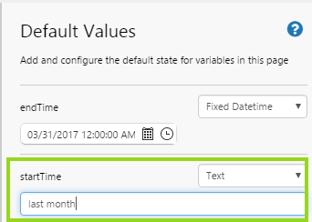
Setting a startTime relative to the current time
Changes to Default Values in Studio
The Default Values panel has a modified editor in this release, to allow for changes to startTime and endTime options. It is also more logically grouped.
The standard variables that appear when a new page is added are now fixed labels, rather than edit boxes, and are grouped into: endTime, startTime, with a separate group for the standard page defaults: confidenceThreshold, pageSampleInterval, pageSampleMethod and selectedEntity.
Defaults that are added by the page designer are listed below the standard items, in a single grouping.
|
|
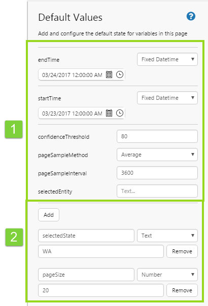
The startTime and endTime defaults have been modified to cater for the new features: Automatic Page Refresh, Start Time Relative to End Time, and Times as Text.
Changes to Comments
The comments control no longer has an Add button. To add a new comment, press the Enter key
The comment control on a page can be configured to show all comments for the entity rolled up by hierarchy, and also comments for attributes, rolled up to the entity.
Workspaces
Workspace navigation has changed in this release. There is a pop-out panel for the selected workspace, where previously the whole display area was taken up with a workspace’s pages or trends. The Workspace button on the Home ribbon tab is a toggle, for opening or closing the Workspaces. When Explorer loads, the Workspace panel is opened. When all displays are closed, the Workspaces panel appears.
Note: If there is a Home page for the logged in user’s User Group, then this displays instead of the Workspace panel, when Explorer loads.
Private Page and Trend Links
In this version of Explorer, you are now able to share trends and links from your private workspace. This does not mean that your private workspace can be accessed – just the page or trend that you have shared through a unique URL.
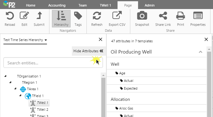
Attributes Panel
The Attributes Panel no longer opens automatically when you select an entity in the Hierarchy Navigator. This means you can select entities without the Attributes Panel obscuring the open display each time.
To open the Attributes Panel, click the Open Attributes button on the top right of the Hierarchy Navigator.
| The Attributes Panel hidden | The Attributes Panel displayed |
|
|
|
| Click Show Attributes to open the Attributes Panel | Click Hide Attributes to close the Attributes Panel |

Ribbon Tab Changes
The Explorer ribbon tabs have changed as follows:
- There is no longer a View ribbon tab
- The Navigators, Hierarchy and Tags have been added to the Page ribbon tab.
With these changes, you can now access the Tags and Hierarchy navigators from:
- The Studio ribbon tab, which is available when the selected tab is a page in design mode
- The Trend ribbon tab, which is available when the selected tab is a trend
- The Page ribbon tab, which is available when the selected tab is a page in display mode
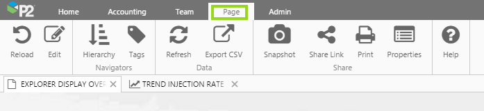
The Page ribbon tab opens when a page is opened in Display Mode
Bar and Stacked Bar Charts Drilldown
In this release, the bar charts (bar and stacked bar) can be configured to have a drilldown on the X Axis. Depending on the configuration, clicking on an X Axis link opens a page, a trend or a URL. The link can be configured to pass parameters to the page/trend/URL; these can be values from the page, and also most likely will include contextual data, such as the selected X Axis value.
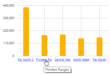
In this example, the selected X value “Flinders Ranges” is passed as a parameter to another Explorer page
Studio Enhancements
Bar Series X Axis Options
With this release, the bar series can now be configured to use the ‘Time’ Data Type on the X Axis, where previously this could only be done for line, area and dot charts. If you select ‘Time’ as the X Axis’ Data Type, you can add a range selector to the chart and you can configure it to use one or more hairlines.
Font Family Arial Style
The Arial font style has been added to the list of font families in Explorer. Font families are used in the Explorer styles wherever fonts are used, and are a way of applying your corporate standards to your Explorer pages.
Table Layout Enhancement
The table layout component now has an optional configuration for updating a page variable with any nominated column from the table layout’s dataset.