ON THIS PAGE:
How do I update a variable from a chart?
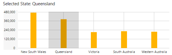
It is possible to configure a chart such that when a user clicks on an area of the chart, this updates a variable on the page with the selected X Axis value (the variable is then used by other page components, such as a text label, or a parameter to a dataset query, or a variable for a hyperlink).
To configure the chart to update a variable, follow the steps below.
Step 1: Add a text variable to the page defaults, and give it a value. See Default Values.
Step 2: Click the chart to configure it. Now click the X Axis on the chart's properties to expand the X Axis properties, and select the new variable name from the Selected drop-down list. See Charts.
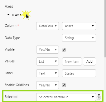
Note: Ensure that the chart is a discrete chart, i.e. the X Axis Data Type must be String.
How do I add a label?
First click on the chart to configure it.
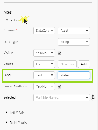
To add an X Axis label: click X Axis on the chart's properties to expand the X Axis properties. For the Label, either keep Text and type a label in the edit box, or select Variable and then select a variable from the drop-down list.
To add a Left Y Axis label: click Left Y Axis on the chart's properties to expand the Left Y Axis properties. For the Label, either keep Text and type a label in the edit box, or select Variable and then select a variable from the drop-down list.
To add a Right Y Axis label: click Right Y Axis on the chart's properties to expand the Right Y Axis properties. For the Label, either keep Text and type a label in the edit box, or select Variable and then select a variable from the drop-down list.
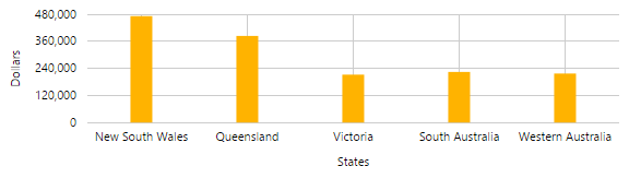
Tip: The label should match the data from the column used for that axis. For example, if your X Axis uses States, display States in the label, and if your series plotted against the Left Y Axis are showing a dollar value, the label should reflect this.
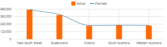
How do I add a legend?
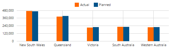
Chart legends have a key that matches to the series by colour and series type (for example, a blue bar matching the blue bar series). You need to assign a Name to each of the chart's series, and then select the chart's Legend option.
Step 1: First click on the chart to configure it.
Step 2: Click a series to open it (for example, click Bar Series). Type a name in the Name edit box (or select a Variable from the variable drop-down list). The name should match the series' Y Column (for example, if the Y Column uses actual costs, you could type 'Actual' in the Name edit box).
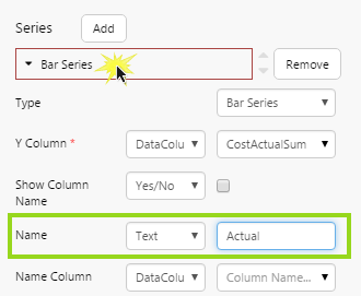
Step 3: Do the same for any other series in the chart.
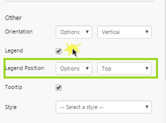
Step 4: Under Other, select the Legend check box. Optionally select a different Legend Position.
How do I change a series?
You can change an existing series in a chart. For example, change a bar series to a line series. Follow the steps below:
Step 1: First click on the chart to configure it.
Step 2: Click a series to open it (for example, click Bar Series). Select a different series type from the Type drop-down list.
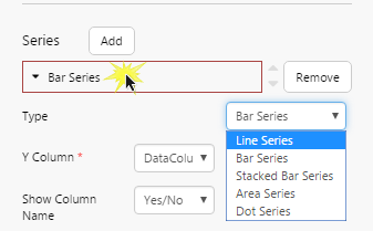
Note: If your chart is showing Continuous Data (i.e. your X Axis has a Data Type of Number or Time), you cannot change your series type to Bar or Stacked Bar. These are only available for charts showing Discrete Data).