ON THIS PAGE:
How do I update a variable from a chart?
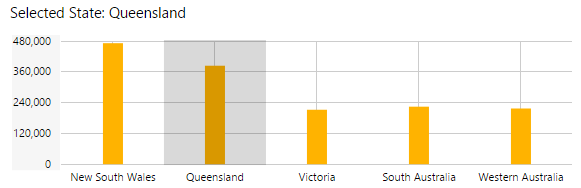
It is possible to configure a chart such that when a user clicks on an area of the chart, this updates a variable on the page with the selected X Axis value (the variable is then used by other page components, such as a text label, or a parameter to a dataset query, or a variable for a hyperlink).
To configure the chart to update a variable, follow the steps below.
Step 1: Add a text variable to the page defaults, and give it a value. See Default Values.
Step 2: Click the chart to configure it. Now click the X Axis on the chart's properties to expand the X Axis properties, and select the new variable name from the Selected drop-down list. See Charts.
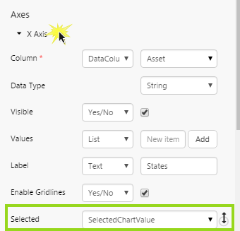
Note: Ensure that the chart is a discrete chart, i.e. the X Axis Data Type must be String.
How do I add a label?
First click on the chart to configure it.
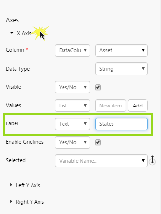
To add an X Axis label: click X Axis on the chart's properties to expand the X Axis properties. For the Label, either keep Text and type a label in the edit box, or select Variable and then select a variable from the drop-down list.
To add a Left Y Axis label: click Left Y Axis on the chart's properties to expand the Left Y Axis properties. For the Label, either keep Text and type a label in the edit box, or select Variable and then select a variable from the drop-down list.
To add a Right Y Axis label: click Right Y Axis on the chart's properties to expand the Right Y Axis properties. For the Label, either keep Text and type a label in the edit box, or select Variable and then select a variable from the drop-down list.
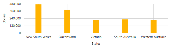
Tip: The label should match the data from the column used for that axis. For example, if your X Axis uses States, display States in the label, and if your series plotted against the Left Y Axis are showing a dollar value, the label should reflect this.
How do I add a legend?
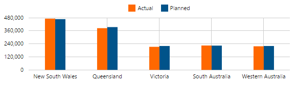
Chart legends have a key that matches to the series by colour and series type (for example, a blue bar matching the blue bar series). You need to assign a Name to each of the chart's series, and then select the chart's Legend option.
Step 1: First click on the chart to configure it.
Step 2: Click a series to open it (for example, click Bar Series). Type a name in the Name edit box (or select a Variable from the variable drop-down list). The name should match the series' Y Column (for example, if the Y Column uses actual costs, you could type 'Actual' in the Name edit box).
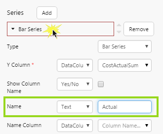
Step 3: Do the same for any other series in the chart.
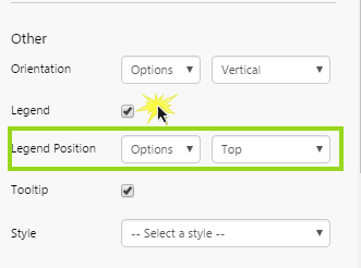
Step 4: Under Other, select the Legend check box. Optionally select a different Legend Position.
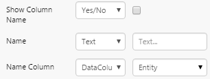
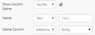
Tip: If the name of the series does not appear in the legend, check the properties for Show Column Name, Name, and Name Column, in the Series section. Here are some ways they can be configured:
| Show the name of the series in the legend. |  |
|
| Show a name in the legend that is different to the series name. This overrides the 'Show Column Name' setting. | 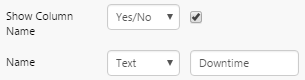 |
|
| For a split series, supply the name in the Name Column field. | 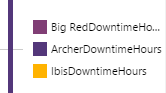 |
 |
| For a split series, the 'Show Column Name' setting appends the name of the series onto the name of the column. | 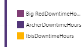 |
 |
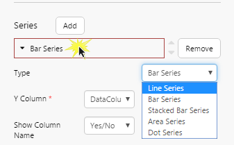
How do I change a series?
You can change an existing series in a chart. For example, change a bar series to a line series. Follow the steps below:
Step 1: First click on the chart to configure it.
Step 2: Click a series to open it (for example, click Bar Series). Select a different series type from the Type drop-down list.
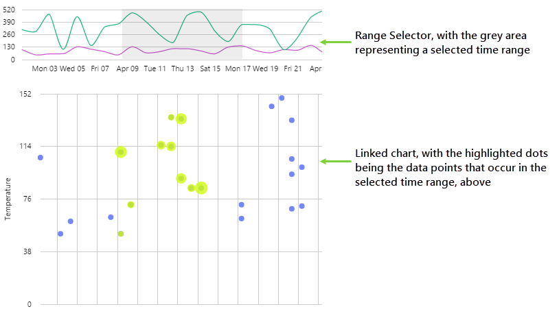
What is a Range Selector and how do I configure it?
Range selectors allow the user to select a time or number range, and are only available for continuous charts (x-axis data type is Time or Number). Range selectors are useful when linking charts and provide a more rich, interactive experience with data.
The configuration options for a range selector are found in the 'Other' properties of the range selector chart. The range selector then uses the Highlight properties of the linked chart.
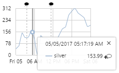
How do I enable a Hairline?
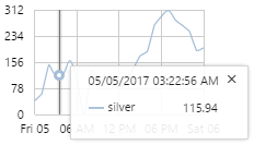
A hairline shows the value of a data point at the x axis position that a user clicks, and is only available for continuous charts (x-axis data type is Time or Number). The hairline shows the exact time and value of the data point. Charts can be configured to add one, two, or more hairlines.
Tip: If the name of the series does not appear in the hairline, check the properties for Show Column Name, Name, and Name Column, in the Series section. Here are some ways they can be configured:
| Show the name of the series in the hairline. | 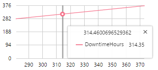 |
|
| Show a name in the hairline that is different to the series name. This overrides the 'Show Column Name' setting. | 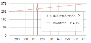 |
|
| For a split series, supply the name in the Name Column field. | 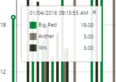 |
|
| For a split series, the 'Show Column Name' setting appends the name of the series onto the name of the column. | 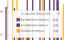 |
|
How do I enable Comments?
Comments are observations made at a point in time that users can associate with a particular tag, entity, or entity attribute. Comments are only available for continuous charts (x-axis data type is Time or Number).
When comments are enabled on a chart, a ![]() symbol in the hairline indicates that users can click it to add a comment.
symbol in the hairline indicates that users can click it to add a comment.
If a comment has been added, this is shown by a black comment symbol ![]() on the chart itself, at the point in time when the comment was added. Users can click the symbol to see the comments and add additional ones.
on the chart itself, at the point in time when the comment was added. Users can click the symbol to see the comments and add additional ones.
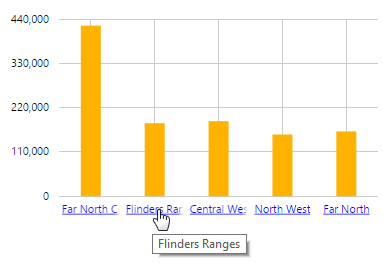
How do I add links on the X Axis?
The bar charts (bar and stacked bar) can be configured to allows users to drill down on a link in the X Axis. Depending on the configuration, clicking on an X Axis link opens an Explorer page, an existing trend, a new trend, or an external URL.
The link can also be configured to pass variables to the page/trend/URL; these can be values from the page, and can include contextual data, such as the selected X Axis value.
How do I make a Sparkline?
In Explorer, you can add a sparkline as part of a process mimic or schematic, or you can add it to a Table Layout to trend related data in a table. You need to first configure a line chart to use data, and then configure its appearance to look like a sparkline, by removing gridlines and labels.
Release History