This article applies to versions 4.17 and later of IFS OI Explorer. Note, some screenshots on this page may be of earlier versions. For more, see Release History.
Overview
A combo box is used for selecting items from a drop-down list.
The Combo Box component is similar to the Option Links. Option Links displays options as a row of buttons, while Combo Box displays options as a list.
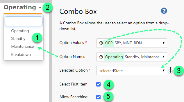
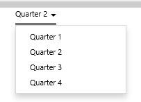
The following diagram shows a preview of a Combo Box component displaying various equipment operational states:
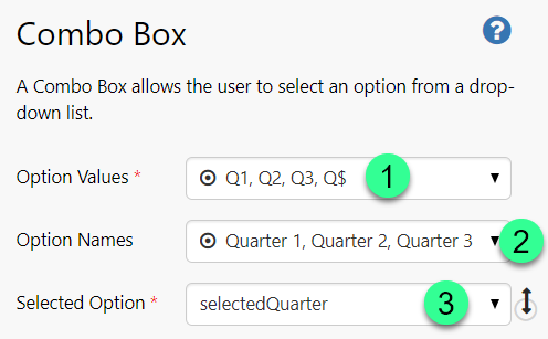
Option Values:
These are the options that set the variable defined in Selected Option.
Option Names:
If specified, then this is the text displayed in the Combo Box list. Each value in Option Names is linked to the corresponding (by list position) value in Option Values. If Option Names are unspecified, then Option Values are displayed.
Selected Option:
The variable that uses the selected Option Value.
Select First Item
When checked the first item in the list is selected by default.
Allow Searching
When checked a filter bar is added to the Combo Box. This allows a phrase to be entered to filter the list of items.
1: Here you can see Option Names displayed in the Combo Box.
2: Operating is the selected item.
3: OPR corresponds to Operating, each being in the first position on the Option Values and Option Names list, respectively. Thus the Option Value of OPR is assigned to the Selected Option, selectedState.
The Combo Box provides interactivity on your pages. You can pass the selected value to other components on the page, using a variable set in the Combo Box's Selected Option property's variable.
Watch the video below to how the Combo Box selections change a Chart's data, in preview mode. Note how the chart colour and values, as well as the legend, change as different options (products) are selected from the combo box.
This is done by using the Combo Box's Selected Option variable as configured options in some of the Chart's bar series properties. To For more detail, follow one of the Chart tutorials: Part 3: Bar Chart Driven by Combo Box.
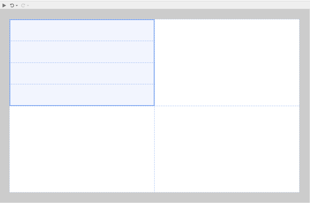
Tutorial: Adding a Combo Box with Default Value
If you're unfamiliar with the process of building pages, read the article Building an Explorer Page.
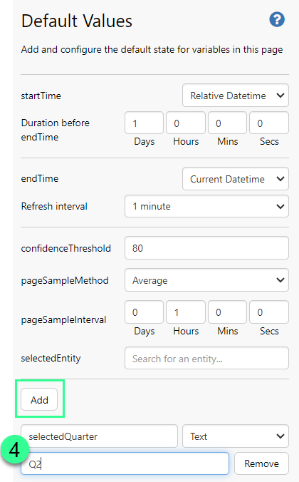
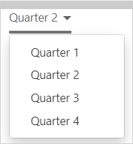
In this tutorial, we'll add a simple Combo Box component, and give it a default value of Q2.
 group.
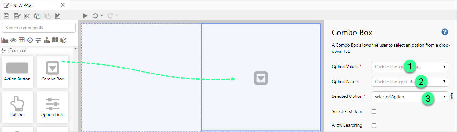
 data category.