ON THIS PAGE:
Overview
The Hierarchy Picker displays all the available hierarchies in a drop-down list, and allows the user to choose one of these hierarchies. The name of the selected hierarchy is displayed next to the drop-down list.
The following diagram shows a hierarchy picker:
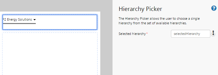
| Selected Hierarchy: |
The hierarchy that has been selected from the Hierarchy Picker. This is always an event that can both publish and subscribe. The entered value is the name of the event that is published when an entity is selected from the drop-down list. It is also the name of the event that the Hierarchy Picker listens to in order to determine the hierarchy to display. |
Tutorial
In this tutorial, we’ll look at adding a Hierarchy Picker to a page, as well as a Hierarchy component . When the user selects a hierarchy from the drop-down list in the Hierarchy Picker, the entities displayed in the Hierarchy component change depending on what is selected.
Let’s go through this process, step-by-step.
Step by Step: Creating a Hierarchy Picker That Shows the Entities in the Selected Hierarchy
Before you start, open a new tab in Explorer and click the “Create a New Page in Studio Mode” thumbnail. Choose the grid layout – you can adjust the rows and columns if you like but it’s not important for this exercise.
If you have access to the training environment, you can follow the steps exactly as outlined here. Otherwise, you will need to adjust the configuration to suit your data.
Step 1. Add the Hierarchy Picker to the page
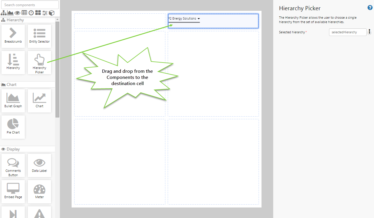
Drag and drop the Hierarchy Picker component onto a grid cell.
Step 2. Configure the Hierarchy Picker
In this step, you’ll notice that the Selected Hierarchy event is already filled in with a default event name. You can choose to change this name if you want, but often there’s no real need to. Specify the following events:
- Selected Hierarchy: selectedHierarchy
Selected Hierarchy is always an event, so that other components on the page will dynamically update when the Hierarchy Picker publishes the hierarchy that the user has selected.
- This is often used to link components such as charts and tables.
- It also means that other components on the page can listen to the event that is published when a user clicks on an item in the breadcrumb, which in turn will dynamically update the components on the page.
Step 3. Add and configure a Hierarchy component
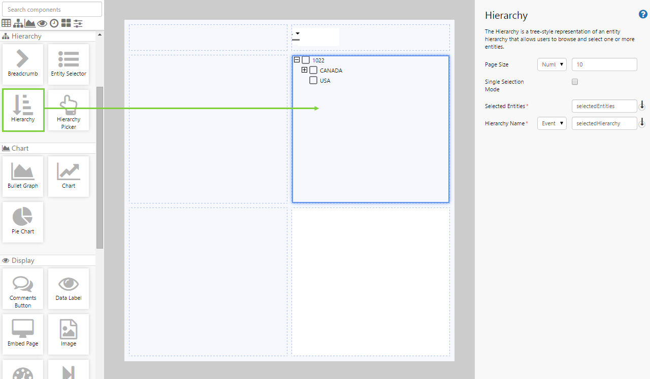
Drag and drop the Hierarchy component onto a grid cell, and configure it as follows:
- Page Size: (Number) 10
- Single Selection Mode: (unselected)
- Selected Entities: selectedEntities
- Hierarchy Name: (Event) selectedHierarchy
You will notice that Selected Entities and Hierarchy Name already have some defaults configured. You can change this if you like, but you will need to remember your changes and substitute appropriately for the next step.
Step 4. Set the event defaults
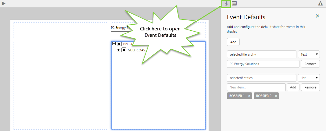
At the moment, the page shows nothing because the user hasn’t selected anything. Let’s change that and get some default data to display. We do this by creating defaults for the events specified in the components in the previous steps.
- Click the Event Defaults button on the Studio toolbar.
- Add an event called “selectedHierarchy” with the text P2 Energy Solutions.
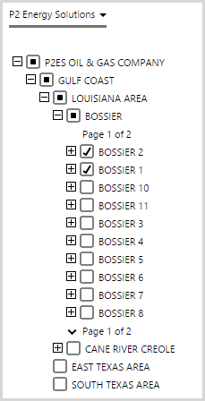
- Add an event called “selectedEntities” with the following list items: BOSSIER 1, BOSSIER 2.
You should now see the Hierarchy Picker and Hierarchy populated with the defaults. Note that you can set the event defaults at any time.
Step 5. All done!
Congratulations! You now have a fully functioning Hierarchy Picker that allows the user to change hierarchies.
- Click the preview
 button on the Studio toolbar to see what your page will look like in run-time.
 - When you select a hierarchy from the Hierarchy Picker, the entities in that hierarchy are displayed in a Hierarchy component where you can select specific entities.
 Don’t forget to save your page!