ON THIS PAGE:
Overview
The Meter displays a numeric value in the form of a needle in relation of a range of targets. The meter allows you to assign semantics to the different regions of the shape, to provide context to the data.
For example, if the meter was configured to show a pressure reading, where the pressure should be within a certain range, you can configure the meter to show different colours to indicate if a reading is OK or if it is within a danger zone.
What the Meter Looks Like
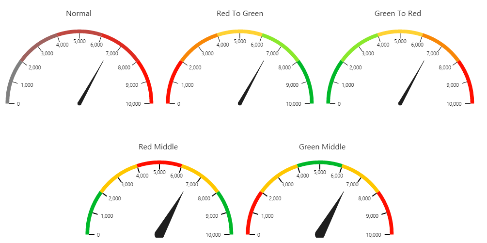
The Meter shape comes with 5 preset styles, as shown in the image below:
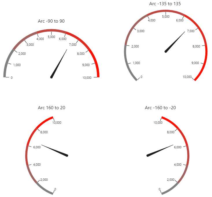
You can also change the orientation and arc angle of the meter, as shown below:
Quick Start Configuration
The following diagram shows a Meter being configured:
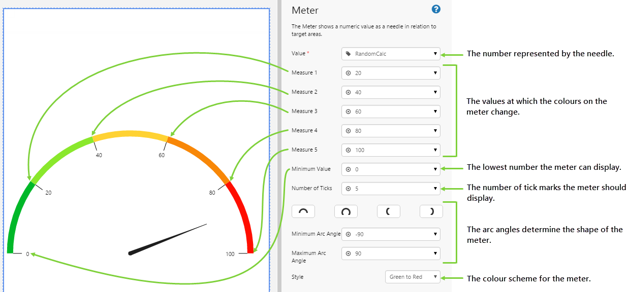
Configuring this component requires a good understanding of your data to ensure you have sensible measure points. You can achieve some quite sophisticated configurations by specifying different datasets as drivers for your measure points.
For a full description of the Meter's properties, see the Comprehensive Reference at the end of this article.
Tutorial: Displaying Changes to Tag Values as a Page Refreshes
If you're unfamiliar with the process of building pages, read the article Building an Explorer Page.
The Meter is a useful component to display a number in comparison to a range of thresholds. In this topic, we’ll show you how to use the Meter to display the value of a tag as the page refreshes every few seconds.
Let’s go through this process, step-by-step.
Step 1. Prepare a Studio Page
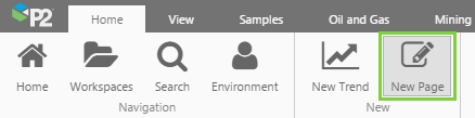
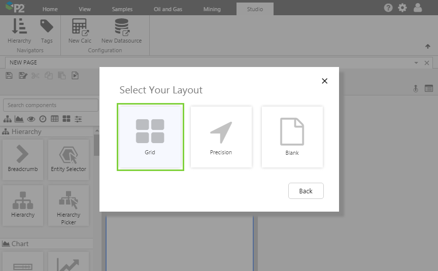
Before you start, click the New Page button on the Home tab of the ribbon. Choose the Grid layout.
- For this exercise, we only need 1 column, so remove one of the columns.
- Assign the first row a height of 50.
- Set the style to "Pods".
Step 2. Add the Meter
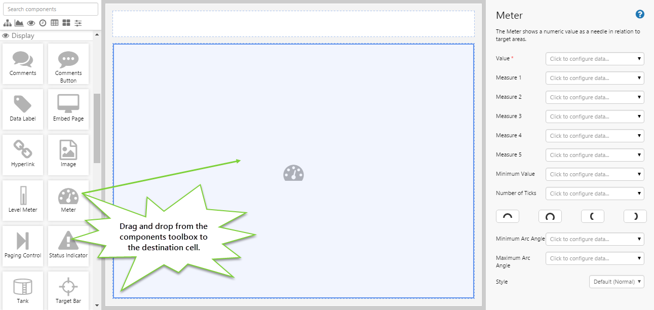
Drag and drop the Meter component onto a grid cell. The Meter is in the Display  group.
Step 3. Configure the Meter
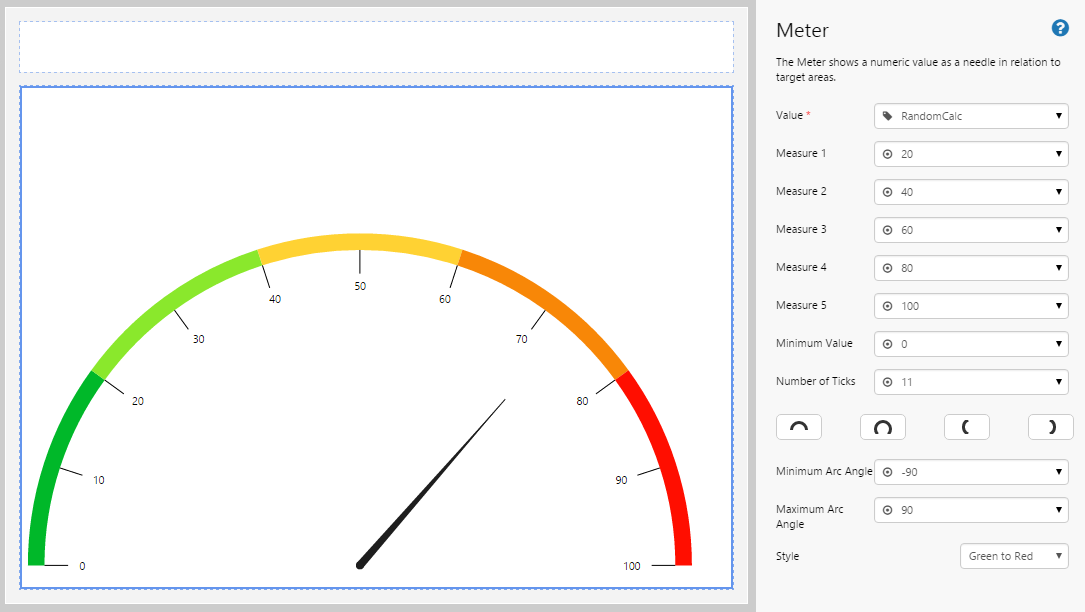
This meter shows the value of a calculation tag, which contains values between 1 and 100.
Configuring the Needle
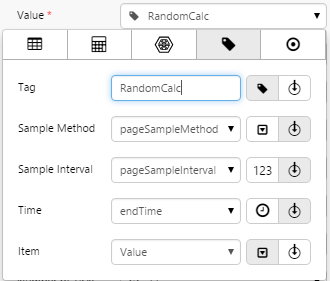
To configure the value that drives the needle, you need to configure the Value field. In this case, we are using a simple calculation tag, but you could also use a dataset, ad hoc calculation, attribute value, or a set value if you wanted to.
We're going to keep things simple and use the RandomCalc tag in the sample data. This tag contains the simple calculation Random(), which randomly generates a number between 1 and 100.
Configuring the Measures
The measures represent the limits shown in the meter, and signify where it changes colour. Intimate knowledge of your data is required here, otherwise your meter may not work the way you want it to. In this case, we know that the values will be anywhere between 1 and 100, and let's say we want the colour proportions here to be evenly spread out across the meter. Set the measures as follows:
- Measure 1: 20
- Measure 2: 40
- Measure 3: 60
- Measure 4: 80
- Measure 5: 100
The last measure represents the upper limit of the meter. Now, let's also set the lowest limit of the meter:
- Minimum Value: 0
Configuring the Presentation
You can change the colours in the meter as well as the orientation, angles, and number of ticks. Again, this is highly dependent on your intended purpose for the meter.
For the number of ticks, the meter itself will attempt to calculate the best fit that is closest to the supplied number. Feel free to play around with this value and observe how the meter changes.
- Number of Ticks: 11
For the arc angles, you can click one of the buttons for a preset value, or you can manually enter the minimum and maximum angles yourself. Feel free to play around with these values and observe how the meter changes.
- Minimum Arc Angle: -90
- Maximum Arc Angle: 90
Finally, we come to configuring the colours. For this example, let's consider the higher values to be undesirable, so the further to the right the needle is, we want the colour to be more red. Feel free to play around with the style settings and observe how the meter changes.
- Style: Green To Red
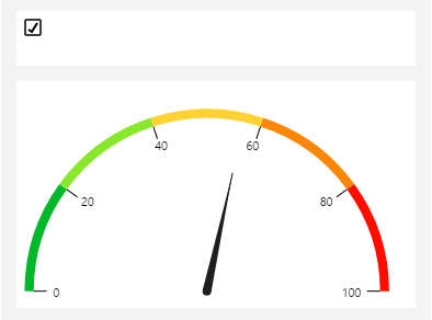
Step 4. Add the Current Date/Time Toggle
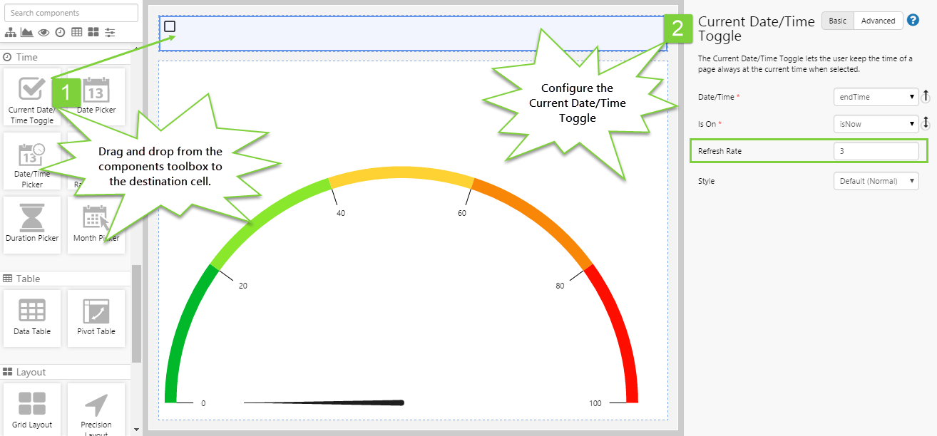
This step allows us to refresh the data on the page without having to reload it. Every time the data is refreshed, the meter needle will change its current value.
- Drag and drop the Current Date/Time Toggle component onto the canvas.
- The component can be used without any changes to its configuration, but we want to make the page refresh every few seconds so we can observe the change in data.
- Set the Refresh Rate to 3. The page will update every 3 seconds when the check box is ticked.
Step 5. All done!
Congratulations! You now have a meter that will refresh as the page is refreshed with new data.
- Click the preview
 button on the Studio toolbar to see what your page will look like in run-time.
 - Tick the Current Date/Time Toggle check box and watch the needle change value every 3 seconds.
 Don’t forget to save your page!
Comprehensive Reference
This section describes the properties of the Meter component. Most of the values are configured using the Data Selector.
| Value: |
The value that will drive the meter's needle. There are 5 data categories to choose from (see related link above).
|
| Measure 1: | The value that represents the first threshold of the meter. |
| Measure 2: | The value that represents the second threshold of the meter. |
| Measure 3: | The value that represents the third threshold of the meter. |
| Measure 4: | The value that represents the fourth threshold of the meter. |
| Measure 5: | The value that represents the upper limit of the meter. |
| Minimum Value: | The starting value of the meter. If nothing is specified, the meter will start at 0. |
| Number of Ticks: | The number of ticks to display on the meter. The meter will determine the best fit for the number supplied. |
| Minimum Arc Angle: | The angle that determines the start point location of the meter. There are 4 preset angles that are supplied. Refer to What the Meter Looks Like, above. |
| Maximum Arc Angle: | The angle that determines the end point location of the meter. |
| Style: | The predefined styles available for the meter. Refer to What the Meter Looks Like, above. If you are a Style Administrator, you can add a new Meter style. |