Overview
The Multi Select List allows a user to select multiple items from a defined list. If there are more list items than will fit on the page, the Multi Select List displays a scrollbar that provides "infinite scrolling" , and also allows users to filter the list options.
The Multi Select List publishes an event that is a list of items. This event is typically used as an input to a dataset to filter its data. For example, you may want to obtain a subset of entities from a dataset.
The following diagram shows a Multi Select List component being configured:
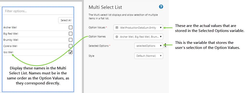
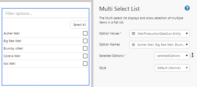
| Option Values: | The text that you want the component to pass to the variable. This can either be a set of values in text format, or you can populate the values from a dataset. This value is required. |
| Option Names: | The text that you want the component to display in the list. This can either be a set of values in text format, or you can populate the values from an event. The names must be listed in the same order as the Option Values. If this is left blank, the Option Values will be displayed. |
| Selected Options: | The name of the variable that stores the value that the user selects from this control. This is required. |
| Style: | The style you want to apply to the Multi Select List component. |
While this component could be used on a page to select Entities returned from a query, it is important to note that functionality from P2 Server, such as Template Filtering and Data Source Name Replacement, will not be available from this component. Essentially, Explorer will treat these items as text, and not apply any special functionality which could possibly be associated with Entities.
Tutorial: Populating a Multi Select List From a Dataset
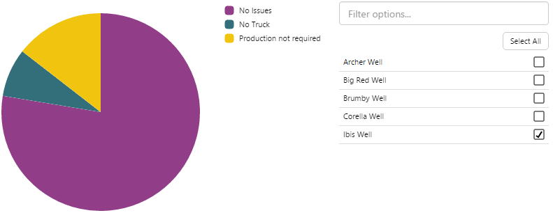
In this tutorial, we’ll look at populating the Multi Select List with entities from a dataset. We'll then use this list to drive a pie chart that shows the downtime hours for the entities selected from the Multi Select List.
Let’s go through this process, step-by-step.
Step 1. Prepare a Studio Page
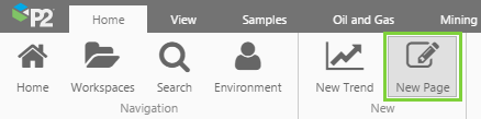
Before you start, click the New Page button on the Home tab of the ribbon. Choose the Grid layout.
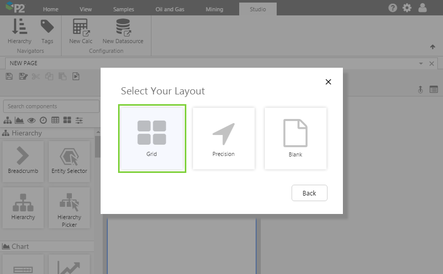
- For this exercise, we'll keep the 4 grid cells.
- Assign the first column a width of 500.
- Assign the 2nd column a width of 300.
- Assign a row spacing of 20.
Step 2. Add the Multi Select List to the page
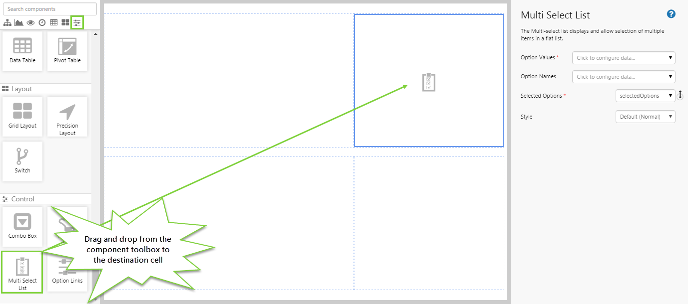
Drag and drop the Multi Select List component onto a grid cell. The Multi Select List is in the Control  group.
Step 3. Configure the Multi Select List
In this tutorial, we want to populate the Multi Select List from a dataset, but we want the names displayed in the list to be different to what is in the dataset. We'll configure these separately.
Configuring the Option Values:
- Open the Option Values Data Selector by clicking on the field. You will notice that the Value
 tab is automatically selected. However, for this tutorial, we want to get data from the Well Production Data Sum dataset query, so click the Dataset
  tab. Fill in the fields as follows:
- Dataset Query: WellProductionDataSum
- Value Column: Entity
The Value column contains a drop-down list of all the available columns in the dataset. In the Multi Select List, we want to display the names of entities. The Entity column is where this information is located.
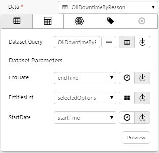
All datasets are configured in P2 Server with default values for their Dataset Parameters. Dataset Parameters affect the data that is retrieved from the dataset. You can see how this works by clicking the Preview button, and testing different values in the EndDate, EntitiesList, and StartDate fields. For this tutorial, we want to use the default values, so there is no need to complete these parameters.
- Click the Preview button and note the names in the Entity column. These should match what is displayed in the Multi Select List.
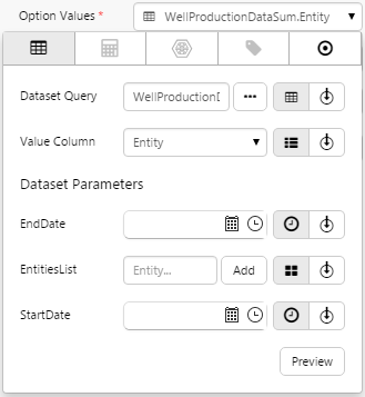
If the preview window is blank, you may have filled in a parameter incorrectly.
Configuring the Option Names:
- Click away from the Data Selector.
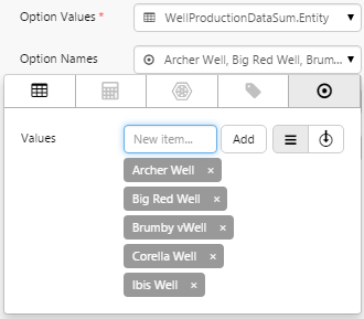
- Open the Option Names Data Selector by clicking on the field. Stay on the Value tab.
- Here you will add multiple names into the Value field. These names will replace the names from the Option Values, and MUST be entered in the order they appear in the Preview window. Type in the following names, clicking Add after each one: Archer Well, Big Red Well, Brumby Well, Corella Well, Ibis Well.
Configuring the Selected Options:
- Click away from the Data Selector.
- The Selected Options field is already populated with the default variable, selectedOption. You do not need to change this variable.
Step 4. Add and Configure a Pie Chart
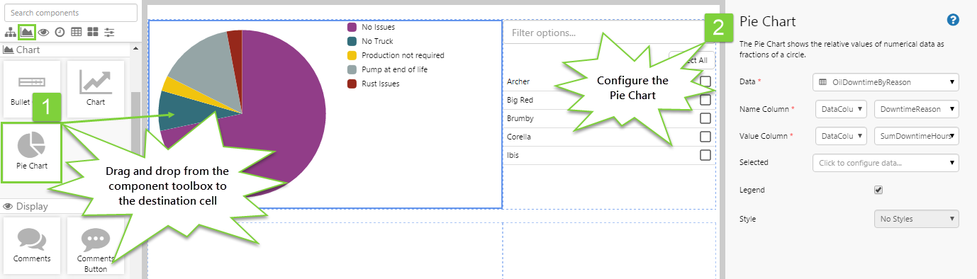
Let's add a Pie Chart that will make use of the data. This Pie Chart will show the downtime for the selected well.
Drag and drop the Pie Chart component onto the grid, and configure it as follows.
- Data: Click the field to use the Data Selector. Staying on the Dataset Query tab, fill in the fields as follows:
- Dataset Query: OilDowntimeByReason
- EndDate: endTime
- EntitiesList: selectedOptions
Note: You will need to type this in. - StartDate: startTime
-
Click away from the Data Selector. Fill in the rest of the properties for the Pie Chart as follows:
- Name Column: DowntimeReason
This is the column that contains the values that will be used as the labels of each slice (i.e. the legend).
- Value Column: SumDowntimeHours
This is the column that contains the values that will be represented as a slice of the pie.
- Name Column: DowntimeReason
Step 5. Set the Defaults
At the moment, the Pie Chart shows the default values that have been set for the OilDowntimeByReason dataset in P2 Server. This may not suit your intended purpose.
You should specify default values that are appropriate for your intended purpose.
Let’s change the default data that is displayed. We do this by creating defaults for the variables specified in the components in the previous steps. The variable we are interested in is the selectedOptions variable. Let's say that when the page first loads, we want to see the downtime for the well, Archer. We can set that here so that the user does not see a blank screen when the page is initially loaded.
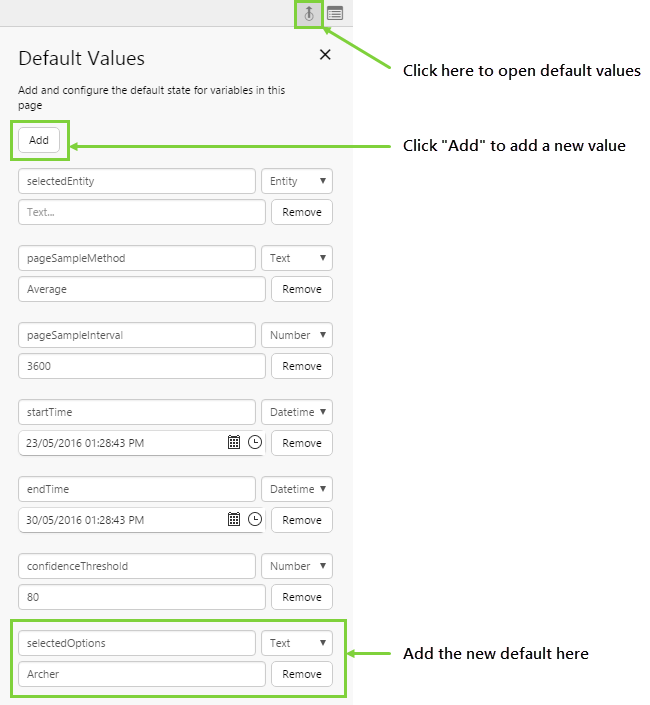
- Click the Default Values button on the Studio toolbar.
- Click the Add button.
- Add a variable called selectedOptions with a type of Text. Type in the following option: Archer
You should now see the Pie Chart update to reflect the new default. The Multi Select List should also show the Archer Well as selected.
Step 6. All done!
Congratulations! You now have a fully functioning Multi Select List that displays a list of entities. When you select entities, their downtime hours are displayed in the chart.
- Click the preview
 button on the Studio toolbar to see what your page will look like in run-time.
 - Watch the pie chart change as you select different entities in the Multi Select List.
 Don’t forget to save your page!