ON THIS PAGE:
The Date/Time Range Picker component allows a user to select two date/times, or a duration (such as 1 month) with an end date/time or "Now".
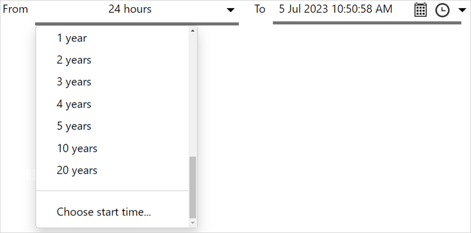
In version 4.13, the available duration time periods that can be selected have been expanded to include 3, 4, 5, 10 and 20 years.
These date/times are preconfigured to set the Page Default startTime and endTime variables, which in turn can be used for retrieving data such as trends or charts.
The Date/Time Range Picker provides two date/time pickers, and lets the user select two different date/times. These are usually used to provide a start time and end time for other controls on the page, such as a chart or trend.
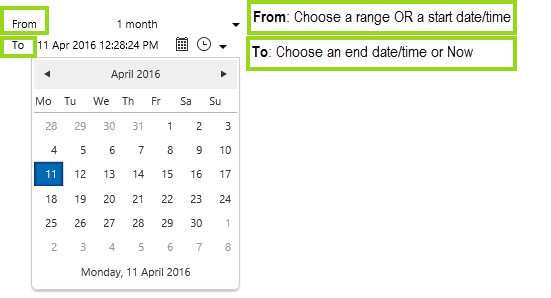
The user can select the start time to be a specific date or time, or they can specify a range that precedes the end time (e.g. 12 hours from the end time). Either selection sets a Datetime variable.
The user can specify the end time as a specific date and time, or select the current date and time (i.e. "Now"). Either selection sets a Datetime variable.
The Date/Time Range Picker Component
In run-mode, the Date/Time Range Picker displays a time range on the page, with From above To.
If From can be displayed as a duration from the list of durations (such as 5 days, 1 week, 1 month, etc.) then it is displayed that way.
Otherwise, it is displayed as a date/time (for example if there is a 4 day duration - which is not in the list).
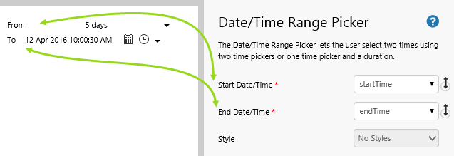
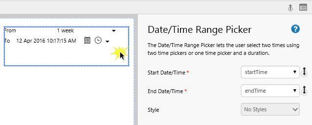
| Start Date/Time: | The start of the time range that is initially displayed when the page first loads. This is displayed on the top. This is a Datetime variable, preconfigured to use the page default, startTime. |
| End Date/Time: | The start of the time range that is initially displayed when the page first loads. This is displayed on the bottom. This is a Datetime variable, preconfigured to use the page default, endTime. |
| Style: | The style you want to apply to the component. If you are a Style Administrator, you can create a new Date/Time Range Picker style. |
Start Date/Time and End Date/Time should use variables representing the start and end of a date range, such as the preconfigured startTime and endTime page default variables.
Quick Start
You can add a date/time range picker onto any Explorer page, in Studio mode. There is no need to change the configuration of the component.
1. Open your page in Studio mode.
2. Drag a date/time range picker to the page, from the components panel, as shown in Step 3 of the tutorial below.
3. See how this affects components on the page (see Step 5 of the tutorial below).
For more detail, go through the tutorial below.
Tutorial: Date/Time Range Picker Using Default Values
If you're unfamiliar with the process of building pages, read the article Building an Explorer Page.
In this tutorial, we'll add a page based on the "Date/Time Tutorials" page. We'll add a date/time range picker, and set this to 1 month before the current time.
Step 1. Prepare the Tutorial Page
Before you start the tutorial, prepare a new date/time tutorial page. If you have already created a "Date/Time Tutorials" page, then open this. Otherwise follow the instructions in Date Time Tutorials to add the page.
Step 2. Save as a New Tutorial Page
Save the page as "Date Time Tutorials - Date Time Range Picker" in your private workspace, My Workspace.
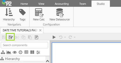
1. Click the Save As  button on the Studio toolbar.
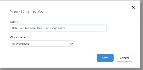
2. In the dialog that appears, type in Date Time Tutorials - Date Time Range Picker, and keep the default Workspace, My Workspace.
3. Click Save.
Step 3. Add a Date/Time Range Picker
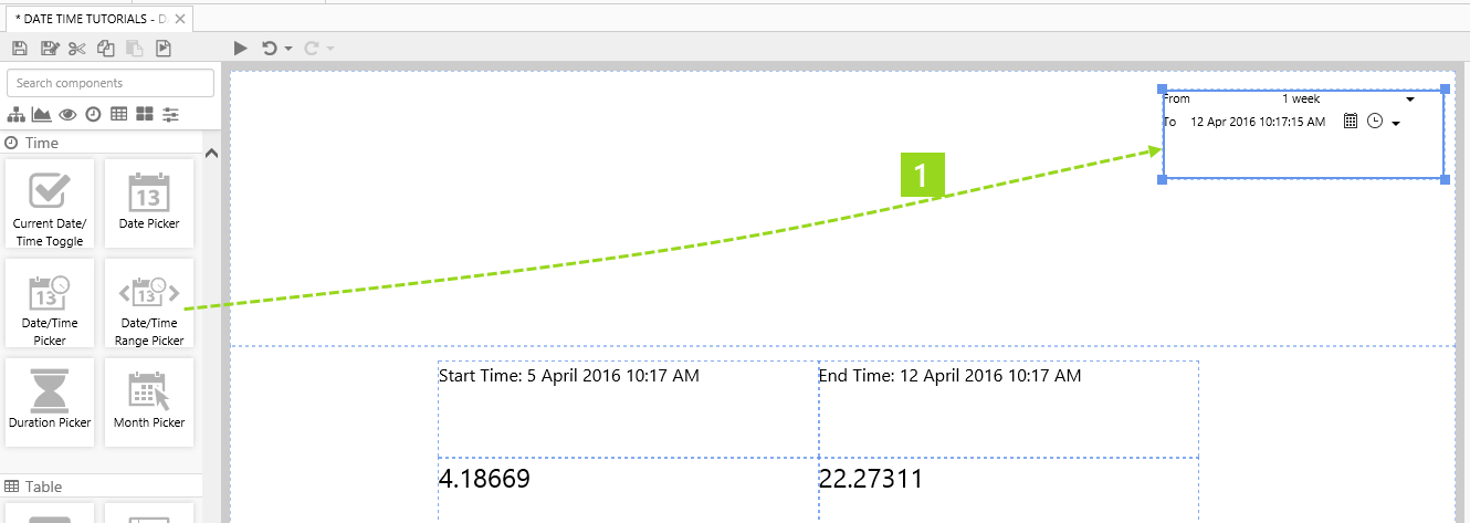
1. Drag a Date/Time Range Picker component onto top right of the Precision Layout, as shown. The Date/Time Range Picker is in the Time  group. Click and drag the borders to resize.
2. Click on the Current Date/Time Toggle component to review it.
There is no need to change any of the properties as they are preconfigured to use the Page Defaults startTime and endTime, respectively.
Remember that these variables are also used in the text labels and tags on this page, so you'll be able to observe how they change when you select a new date from the date picker.
Step 4. Select a From Date (Duration)
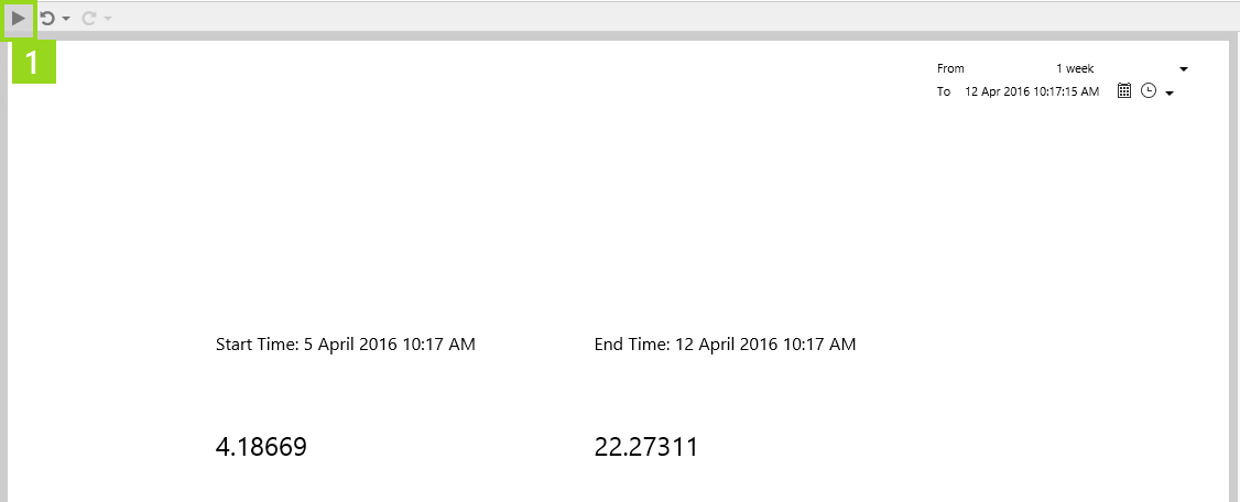
1. Preview the page, so you can select a From duration (click the Preview  button on the Studio toolbar).
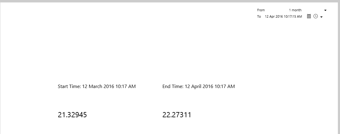
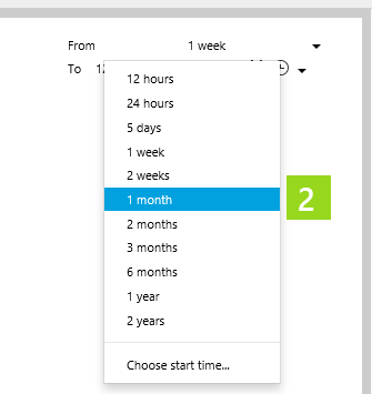
2. Click the down arrow  then select 1 month from the drop-down list.
3. Click the Preview button on the Studio toolbar, to return to design mode.
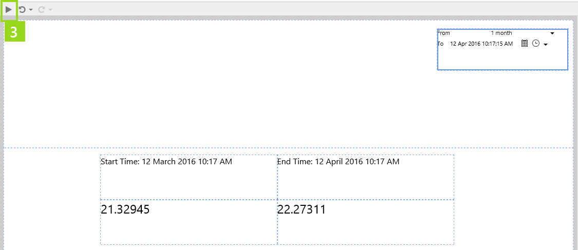
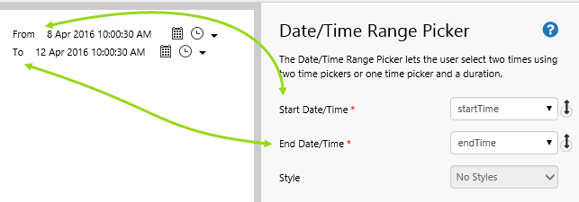
The date/time range picker is configured to From 1 month To 12 April 2016 10:17:15 AM (or current time).
Try out the New Component
- Click the Preview button on the Studio toolbar to see what your page will look like in run-time.
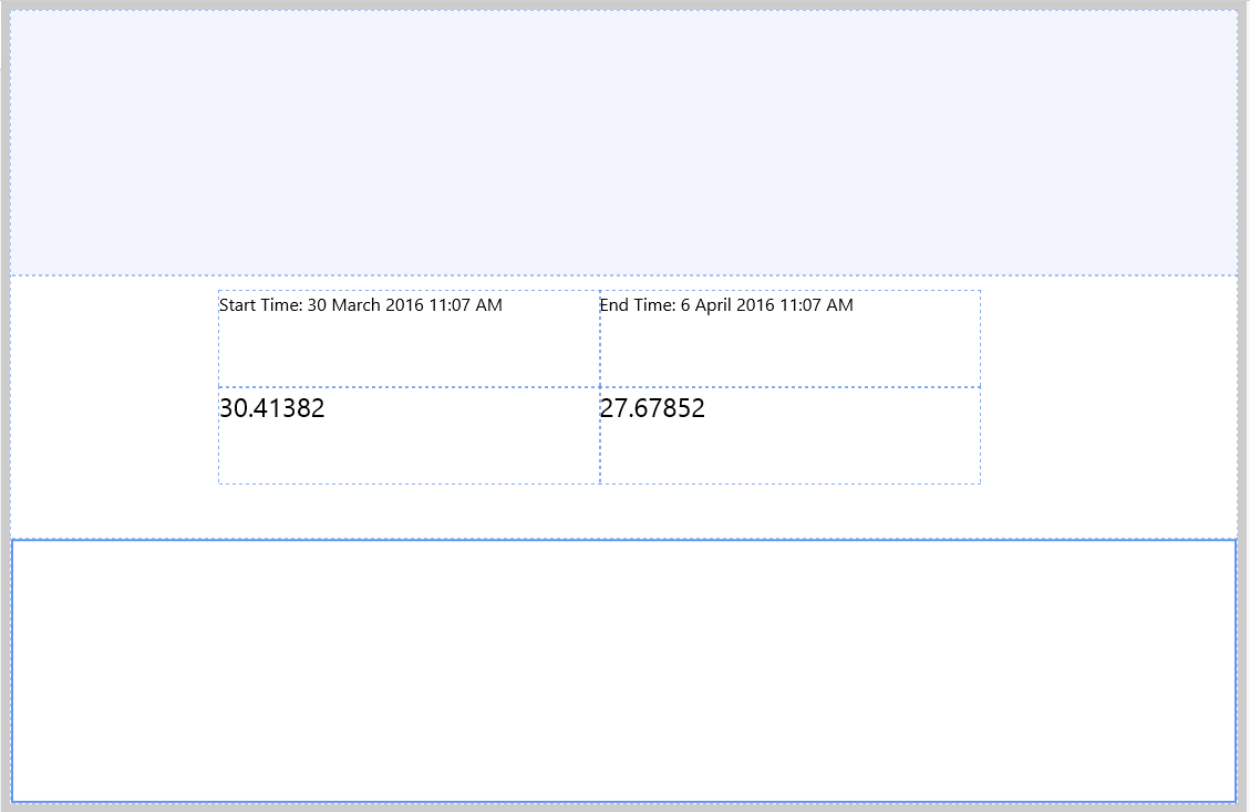
- For the date/time range picker, click the down arrow to the right of From, then select 3 months from the drop-down list.
- Still in the date/time range picker, click the calendar icon
 to the right of To, then select 29 April 2016 from the calendar.
Note how the Start Time and End Time text labels update, as well as the tag values using startTime and endTime, respectively.