ON THIS PAGE:
This article describes the styling properties of each component in the Time  group in P2 Explorer Studio. For an overview of how styling works, see Overview of Styles in P2 Explorer.
Current Date/Time Toggle
The screenshot below shows the style properties of Current Date/Time Toggle in design mode. The component is aligned in a grid cell.
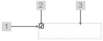 |
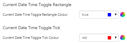
What You Can Change Change the colour of the toggle, and the alignment. 1. Current Date/Time Toggle Rectangle: Change the colour of the box.
2. Current Date/Time Toggle Tick: Change the colour of the tick.
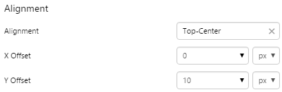
3. Alignment: Align the Current Date/Time Toggle by giving it X and Y co-ordinates, or by using an alignment option, such as Top-Left. In the screenshot, you can see the component in relation to the grid cell.
|
Examples
| Custom Style | Custom Style Properties |
|
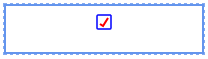
EXAMPLE: Change the colour of the box and the tick
|
 |
|
EXAMPLE: Change the alignment of the control
|
 |
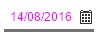
Date Picker
The screenshot below shows the style properties of Date Picker in design mode. The component is aligned in a grid cell.
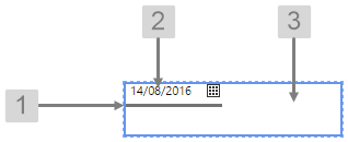 |
What You Can Change Change the font and bottom border of the Date Picker, and the alignment. 1. Date Picker Bottom Border: Change the border below the date.
2. Date Picker Font: Change the font that shows the date.
3. Alignment: Align the Date Picker by giving it X and Y co-ordinates, or by using an alignment option, such as Top-Left. In the screenshot, you can see the component in relation to the grid cell.
|
Examples
| Custom Style | Custom Style Properties |
|
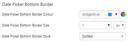
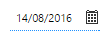
EXAMPLE: Change the bottom border
|
 |
|
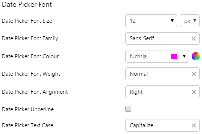
EXAMPLE: Change the font
|
 |
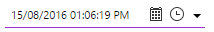
Date/Time Picker
The screenshot below shows the style properties of Date/Time Picker in design mode. The component is aligned in a grid cell.
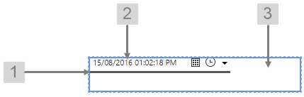 |
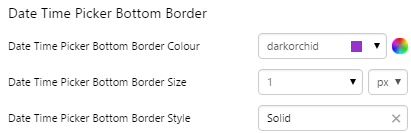
What You Can Change Change the font and bottom border of the Date/Time Picker, and the alignment. 1. Date Time Picker Bottom Border: Change the border below the date.
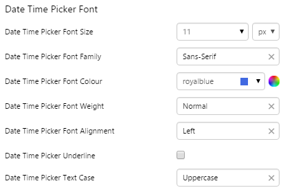
2. Date Time Picker Font: Change the font that shows the date.
3. Alignment: Align the Date/Time Picker by giving it X and Y co-ordinates, or by using an alignment option, such as Top-Left. In the screenshot, you can see the component in relation to the grid cell.
|
Examples
| Custom Style | Custom Style Properties |
|
EXAMPLE: Change the bottom border
|
 |
|
EXAMPLE: Change the font
|
 |
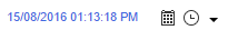
Date/Time Range Picker
The screenshot below shows the style properties of Date/Time Range Picker in design mode. The component is aligned in a grid cell.
 |
|
|
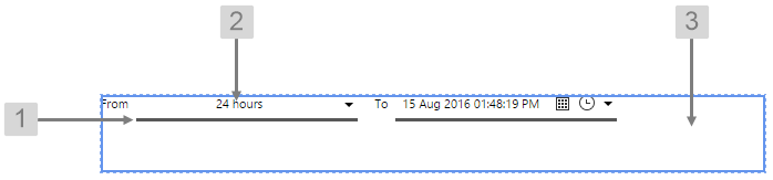
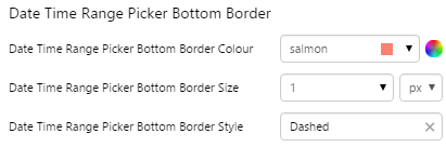
What You Can Change Change the font and bottom border of the Date/Time Range Picker, and the alignment. 1. Date Time Range Picker Bottom Border: Change the border below the date.
|
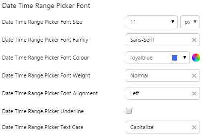
2. Date Time Range Picker Font: Change the font that shows the date.
3. Alignment: Align the Date/Time Range Picker by giving it X and Y co-ordinates, or by using an alignment option, such as Top-Left. In the screenshot, you can see the component in relation to the grid cell.
|
Examples
| Custom Style | Custom Style Properties |
|
EXAMPLE: Change the bottom border
|
 |
|
EXAMPLE: Change the font
|
 |
Duration Picker
The screenshot below shows the style properties of Duration Picker in design mode. The component is aligned in a grid cell.
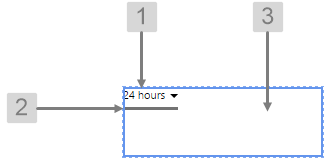 |
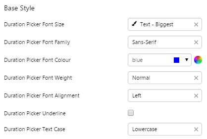
What You Can Change Change the font and bottom border of the Duration Picker, and the alignment. 1. Base Style: Change the font that shows the duration.
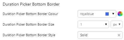
2. Duration Picker Bottom Border: Change the border below the duration.
3. Alignment: Align the Duration Picker by giving it X and Y co-ordinates, or by using an alignment option, such as Top-Left. In the screenshot, you can see the component in relation to the grid cell.
|
Examples
| Custom Style | Custom Style Properties |
|
EXAMPLE: Change the bottom border
|
 |
|
EXAMPLE: Change the font
|
 |
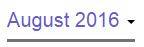
Month Picker
The screenshot below shows the style properties of Month Picker in design mode. The component is aligned in a grid cell.
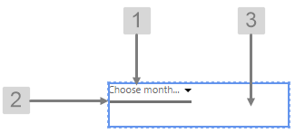 |
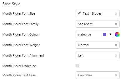
What You Can Change Change the font and bottom border of the Month Picker, and the alignment. 1. Base Style: Change the font that shows the month.
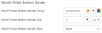
2. Month Picker Bottom Border: Change the border below the month.
3. Alignment: Align the Month Picker by giving it X and Y co-ordinates, or by using an alignment option, such as Top-Left. In the screenshot, you can see the component in relation to the grid cell.
|
Examples
| Custom Style | Custom Style Properties |
|
EXAMPLE: Change the bottom border
|
 |
|
EXAMPLE: Change the font
|
 |