ON THIS PAGE:
Overview
The Date/Time Picker component allows a user to select a date and time, which updates the Date Time property.
This is preconfigured to set the Page Default endTime variable, which in turn can be used for retrieving data (read about Page Defaults in the Default Values help).
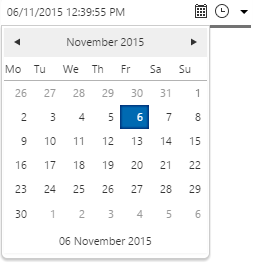
In display mode, the Date/Time Picker displays a date and time on the page. Click the calendar icon  to open a date selector, or the clock
  icon to select a time.
Use this component to set the page variable endTime if you want a user to select a date/time for fetching tags and attributes. Tags and attributes have endTime as their preconfigured Time when they are dragged onto a page.
The Date/Time Picker Component
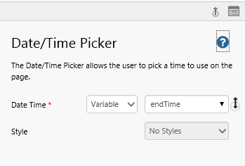
The Date/Time Picker has a single property to configure: Date Time.
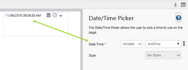
| Date Time: | The date and time displayed on the control in live mode. If this is defined as a Variable, then it updates to the selected date and time, every time a user selects a date or time from Date/Time Picker. |
| Style: | The style you want to apply to the component. If you are a Style Administrator, you can create a new Date/Time Picker style. |
Leave Date Time as a variable. If the user picks a date and time, they will expect it to affect data on the page, and this can only happen if you are using a variable.
Quick Start
You can add a date/time picker onto any Explorer page, in Studio mode.
Be aware of what other date and time components already exist on a page, as these often share the same variables, and may affect or be affected by your new component.
1. Open your page in Studio mode.
2. Add a date/time picker to the page, as shown in Step 4 of the tutorial below.
3. See how this affects components on the page (see Step 5 of the tutorial below).
For more detail, go through the tutorial, below.
Tutorial: Date/Time Picker Using Default Values
If you're unfamiliar with the process of building pages, read the article Building an Explorer Page.
In this tutorial we'll build a new page from the Date Time Tutorials page. We'll add a Date/Time Picker component and see how that affects the Text Label and Tag value on the page.
Step 1. Prepare the Tutorial Page
Before you start the tutorial, prepare a new date/time tutorial page. If you have already created a "Date/Time Tutorials" page, then open this. Otherwise follow the instructions in Date Time Tutorials to add the page.
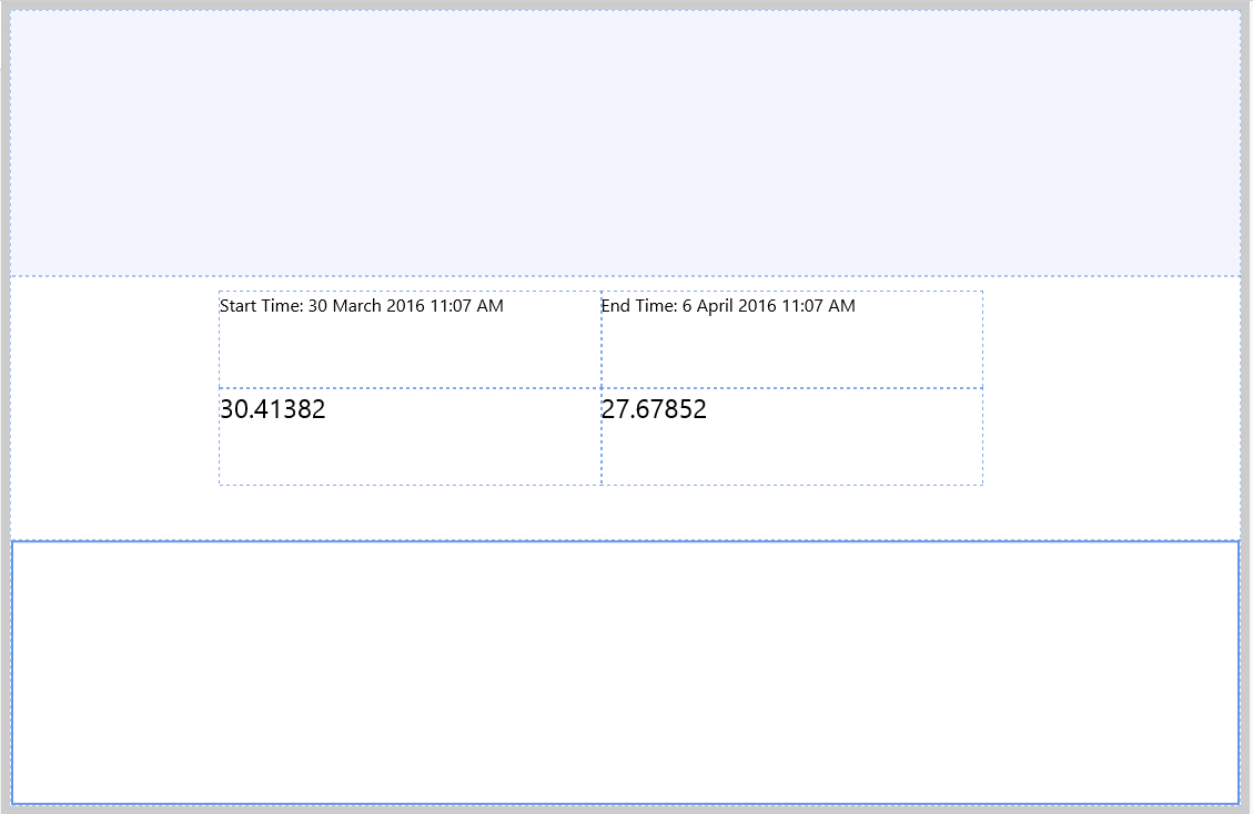
Note how the text labels and tags use two of the page defaults, startTime and endTime, respectively.
Step 2. Save as a New Tutorial Page
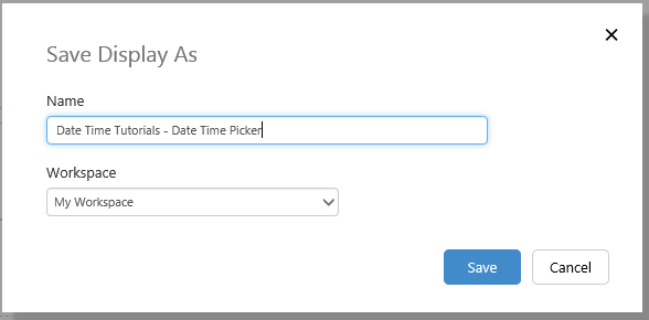
Save the page as "Date Time Tutorials - Date Time Picker" in your private workspace, My Workspace.
1. Click the Save As..  button on the Studio toolbar.
2. In the dialog that appears, type in Date Time Tutorials - Date Time Picker, and keep the default Workspace, My Workspace.
3. Click Save.
Step 3. Remove the Start Time Text Label and Tag
In this tutorial we're only observing the endTime variable changes, so start by removing the text label and data label (showing tag value), that use the startTime variable.
You can skip this step if you prefer.
1. Click on the text label on the left, Start Time, then press the Delete key to remove it.
2. Click on the data label on the left, then press the Delete key to remove it.
Step 4. Add a Date/Time Picker
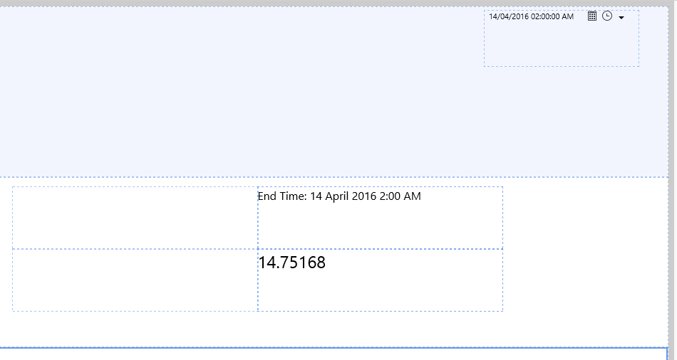
1. Drag a Date/Time Picker component onto top right of the Precision Layout. The Date/Time Picker is in the Time  group.
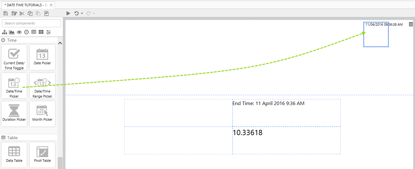
2. Click on the Date/Time Picker component to review it.
There is no need to change any of the properties as this is preconfigured to use the Page Defaults endTime.
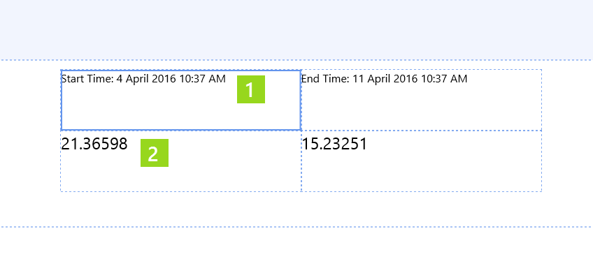
Remember that the endTime variable is also used in the text label and tag, so you'll be able to observe how these change when you select a new date and time from the date/time picker.
Step 5. Try out the New Component
- Click the Preview
 button on the Studio toolbar to see what your page will look like in run-time.
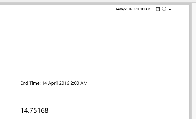
 - In the Date/Time Picker: Click the Calendar and select 14 April 2016, then click the Clock and select 2:00 AM.
Note how the End Time text label updates, as well as the tag value using endTime.