The bullet graph is similar to the target bar; for the selected entity it compares three different performance thresholds to a target. These thresholds are part of the datasource data.
Features of the Bullet Graph
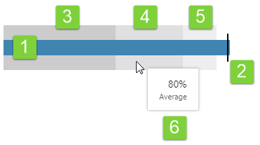
| 1. The 'Actual' performance band (blue):
This band represents actual performance, and will end in one of the threshold bands. |
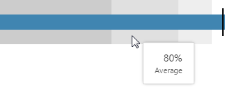
4. The 'Average' performance threshold band (medium grey):
If the actual value ends in this band, then performance is considered to be 'average'. |
| 2. Target line:
This is the target that would ideally be exceeded (with the actual line exceeding this). The target can sit anywhere on the graph. |
5. The 'Good' performance threshold band (light grey):
If the actual value ends in this band, then performance is considered to be 'good'. |
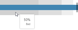
| 3. The 'Bad' performance threshold band (dark grey):
If the actual value ends in this band, then performance is considered to be 'bad'. |
6. Tooltips showing numerical values:
Hover over any of the bands, or the target line, to see the value it represents. |
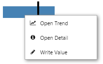
Right-click
Depending on what data your bullet graph has been configured to display, when you right-click on it a variety of menu options will be presented.
| Menu option | Displayed for |
| Open Trend | Time series data. Opens a trend containing a trace of the data. |
| Open Detail | Attribute value or tag. Opens the Point Detail page of the data point. |
| Write Value | Attribute value or tag, if the datasource allows writing to the database. Opens the Enter value dialog, where you can change the value of the data point. |
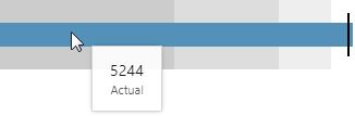
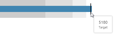
Hover
When you hover over a bullet graph, a tooltip appears showing relevant values.
 |
 |
||
| Hover over the blue bar to view the actual value. | Hover over the black bar to view the target value. |
 |
 |
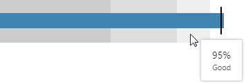 |
| Hover over the dark grey band to view the bad performance threshold value. | Hover over the mid grey band to view the average performance threshold value. | Hover over the light grey band to view the good performance threshold value. |
Watch the video below to see the different values that are displayed for the various bands and the target line, on the bullet graph. This video is for an older version of the Bullet Graph.
Release History
- Using a Bullet Graph 4.5.4 (this release)
- Last measure region obeys limits set in the editor, instead of filling the width of the container
- Added a fixed padding on the right equal to 1/2 of the target line thickness (specified in the style setting)
- The target bar is centred on the target value, instead of the left edge of the target bar corresponding with the target value
- Using a Bullet Graph 4.5