ON THIS PAGE:
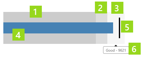
The bullet graph is similar to the target bar; for the selected entity it compares three different performance thresholds to a target. These thresholds are part of the datasource data.
Features of the Bullet Graph
|
|
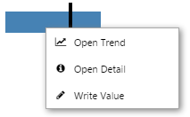
Right-click
Depending on what data your bullet graph has been configured to display, when you right-click on it a variety of menu options will be presented.
| Menu option | Displayed for |
| Open Trend | Time series data. Opens a trend containing a trace of the data. |
| Open Detail | Attribute value or tag. Opens the Point Detail page of the data point. |
| Write Value | Attribute value or tag, if the datasource allows writing to the database. Opens the Enter value dialog, where you can change the value of the data point. |
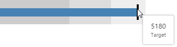
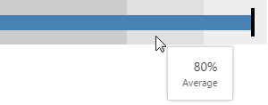
Hover
When you hover over a bullet graph, a tooltip appears showing relevant values.
 |
 |
||
| Hover over the blue bar to view the actual value. | Hover over the black bar to view the target value. |
 |
 |
 |
| Hover over the dark grey band to view the bad performance threshold value. | Hover over the mid grey band to view the average performance threshold value. | Hover over the light grey band to view the good performance threshold value. |
Watch the video below to see the different values that are displayed for the various bands and the target line, on the bullet graph.