ON THIS PAGE:
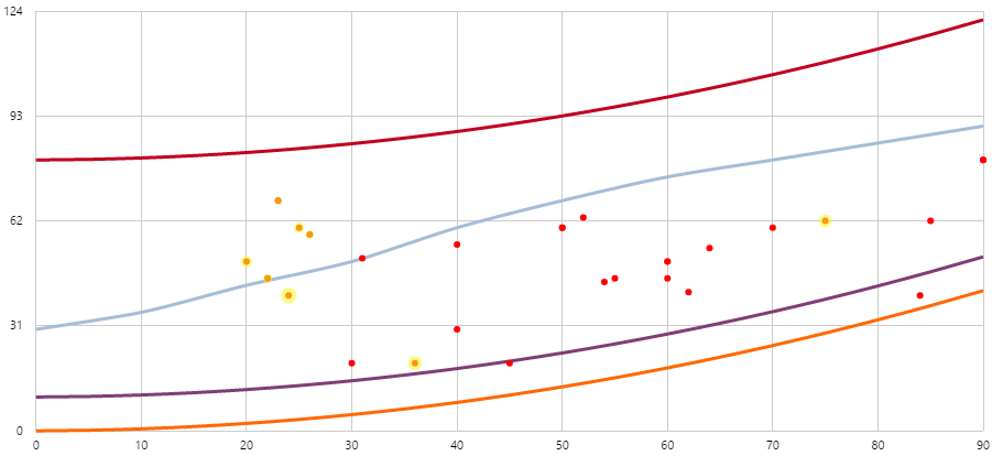
The Performance Curve draws curves defined by representative formulas, and then draws an X-Y plot of real, correlated data over these curves. In the example below, the red curve represents a pump with a new impeller and the orange curve represents the pump with a worn impeller. The data values are indicated by dots that fall between the two curves.
Right-click Menu
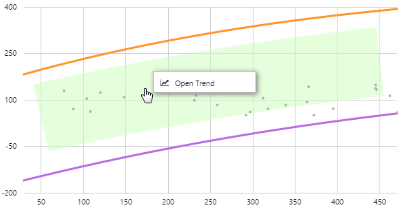
If the Performance Curve has been configured with time series data, you can open the trace data in a Trend.
| Menu option | Displayed for |
| Open Trend | Time series data. Opens a trend containing a trace of the data. |
Highlighting
If the Performance Curve is accompanied by another control, such as a chart, they will usually be linked such that the data points that fall within the selected range are highlighted in a different colour. The size of the highlight can vary - a bigger dot indicates the value is closer to the end of the selected period.
Watch the video below to see how highlighting works when the range changes. Note: This video shows version 4.5.2 of the Performance Curve.