ON THIS PAGE:
- Overview
- Configuring the Switch
- Tutorial: Using a Switch to Change the Page Display
- Step 1. Prepare a Studio Page
- Step 2. Add the Switch Trigger (Option Links)
- Step 3. Add the Switch Layout
- Step 4. Set the Switch Variable
- Step 5. Add the Conditions
- Step 6. Configure the Default Condition
- Step 7. Return to the Switch
- Step 8. Set the Chart Condition
- Step 9. Configure the Chart
- Step 10. Return to the Switch
- Step 11. Set the Table Condition
- Step 12. Configure the Table
- Step 13. Set the Default Value
- Step 14. All done!
- Release History
Overview
The Switch Layout can change the components that are displayed on a page depending on what the user selects on that page. It's typically used in conjunction with a grid layout on dashboard-style pages, and can be used to create the effect of a tabbed page.
For example, you may want the same page to display a chart or a table, or a daily or a monthly report, depending on what someone clicks. You can use the Switch layout to achieve that.
To create the effect of a tabbed page, use the option links control at the top of the page.
Configuring the Switch
The following diagram shows the configuration options for the Switch layout, and how it works with the component that triggers the layout change:
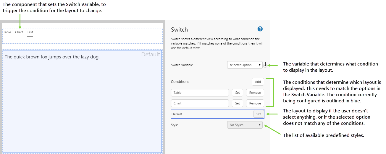
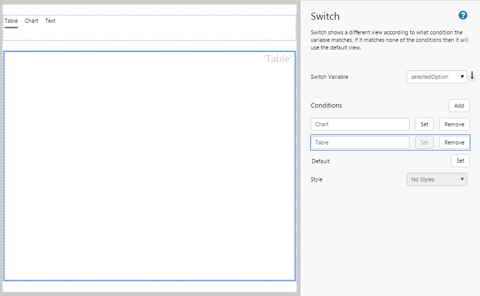
| Switch Variable: | The variable that determines what condition to display in the Switch layout. For example, you could use an Option Links component to trigger a variable called 'selectedOption'. Whenever a user selects a different item from the Option Links component, this triggers a change in what is displayed in the layout. |
| Conditions: |
The conditions for which you want to change the Switch display. The conditions must match the event options for the Switch Event. For example, if the Option Links contains 3 options (Table, Chart, Text), you should have 3 corresponding conditions (Table, Chart, Default). The buttons perform the following functions:
|
| Style | Lists the predefined styles for the Switch component. |
Tutorial: Using a Switch to Change the Page Display
If you're unfamiliar with the process of building pages, read the article Building an Explorer Page.
The Switch component provides some exciting opportunities for interactive page design. In this tutorial, we’ll look how to change the content displayed on a page, depending on what option the user selects. You need to do a little planning up front for this: in this case, we want the page to display a table, chart, or text, depending on what the user selects.
Configuring this component might seem a little daunting at first, but you'll soon get the hang of it. Let’s look at how we’re actually going to do this, step-by-step.
Step 1. Prepare a Studio Page
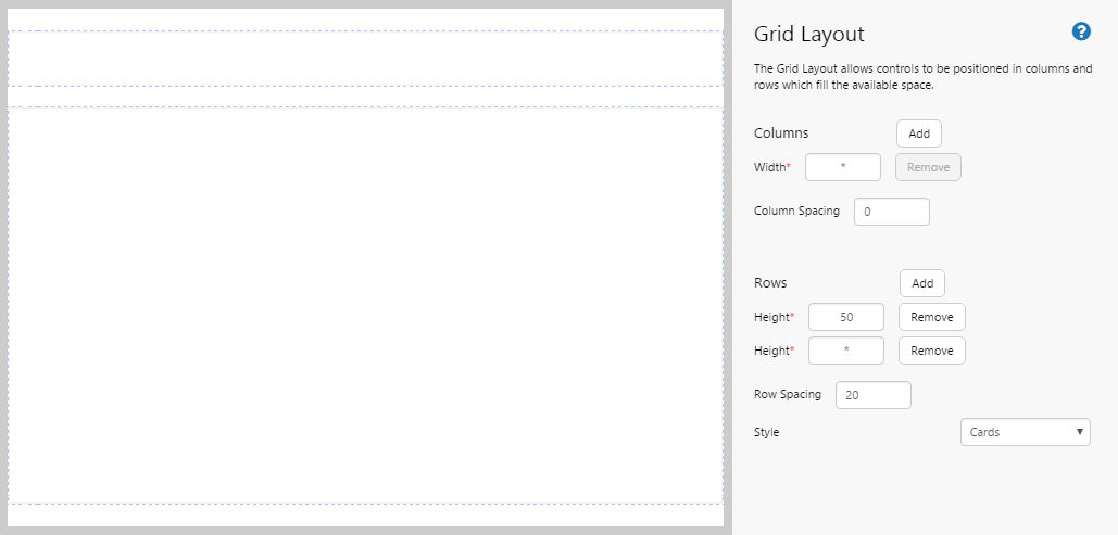
Before you start, open a new tab in Explorer and click the “New Page” button in the ribbon. Choose the Grid Layout. For this exercise, we want to adjust the rows and columns to make the page look nicer.
Note: You will need to adjust the configuration to suit your data at your site.
Let's set up the page nicely.
- Remove a column.
- Give the first row a height of 50.
- Set the Row Spacing to 20.
Step 2. Add the Switch Trigger (Option Links)
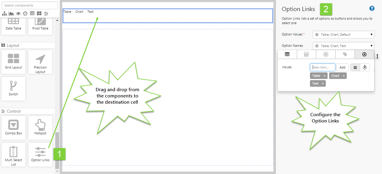
The Switch layout is controlled by a variable, which is set by another component on the page. In this case, we are using the Option Links component to set the variable. So let's add this to our page.
- Drag and drop the Option Links component (located under Controls) from the toolbox to the grid cell at the top of the page.
- Configure the Option Links with the following values:
- Option Values: Table, Chart, Default
- These option values will correspond to the conditions we will set in the Switch Layout.
- Option Names: Table, Chart, Text
- These are the names that will appear on the page, for the user to click on. In this case, we want to display the word "Text" instead of "Default", to be more user-friendly.
- Selected Option: selectedOption
- This is the variable that the Switch Layout will use to trigger a condition and change the layout. This variable will pass through the selected Option Value (Table, Chart, or Default).
- Option Values: Table, Chart, Default
Step 3. Add the Switch Layout
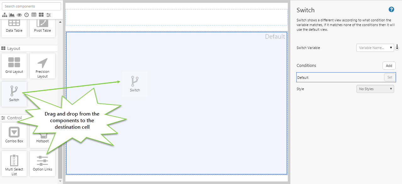
Drag and drop the Switch component onto the large grid cell. The Switch is in the Layout  group.
Step 4. Set the Switch Variable
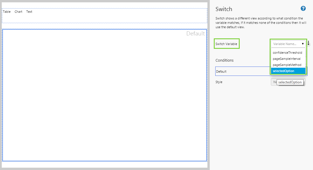
The first thing we need to do is choose the variable that will trigger the Switch Layout to change its display.
Note: A variable is required, and you cannot add conditions until the variable is set. This is why you should add your switch trigger before the Switch Layout component.
Choose selectedOption, which is the variable that corresponds with the Option Links component.
Step 5. Add the Conditions
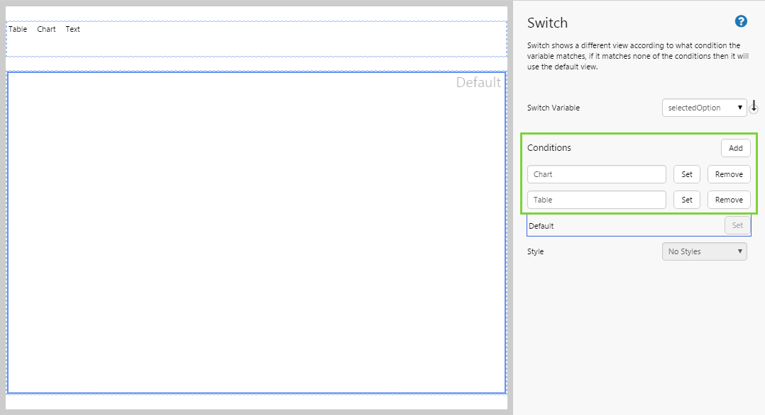
This step identifies the triggers for changes to the page. There is always a Default condition.
In this case, we are going to use text as our default state, so we want to add 2 more conditions: one to display the chart and one to display the table.
- Click the Add button. In the empty box, type Chart.
- Click the Add button again. In the empty box, type Table. Click away from the box.
Step 6. Configure the Default Condition
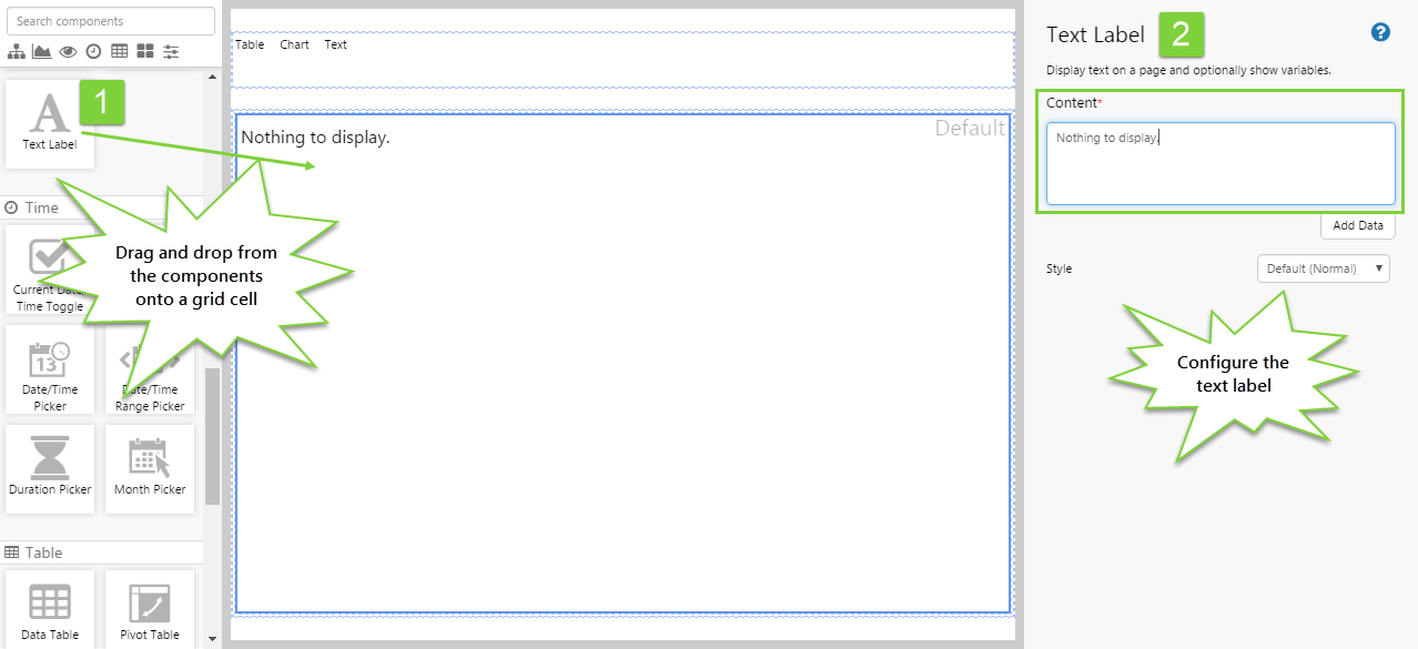
This step is where we specify what is to be displayed if the user has not selected anything from the Option Links. Usually, you will want this to be a relevant display, but you can leave it blank to display a blank page. Here, we want to display some text by default.
- Notice that the grid containing the Switch is labelled as "Default" - this indicates the condition that is being configured.
- Drag and drop the Text Label component onto the canvas in the same grid that contains the Switch component and is labelled "Default".
- Configure the Text Label as follows:
- Content: "Nothing to display."
 Your default condition has been configured!
Step 7. Return to the Switch
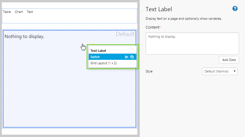
To configure the rest of the conditions, we need to return to the Switch component. To do this we make use of Studio's canvas layers, which allows us to access multiple layers within a grid cell.
- Right-click on the cell containing the Switch.
- In the shortcut menu, select "Switch".
You are returned to the Switch view, with the Default condition selected.
Step 8. Set the Chart Condition
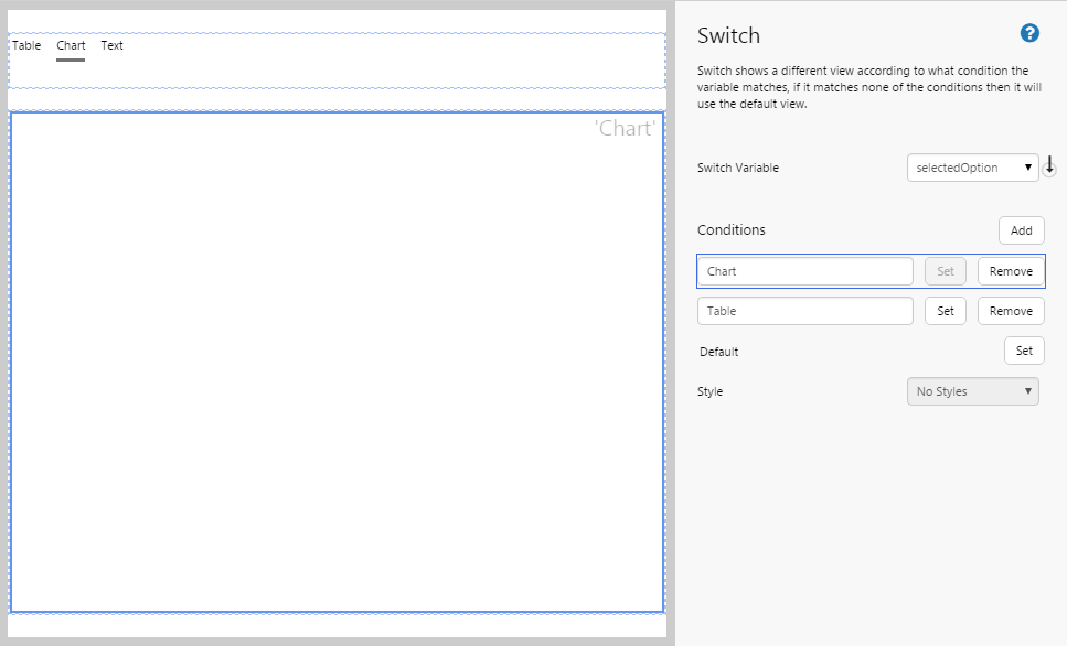
We need to change over to the chart condition in order to configure it.
- In the Switch component editor, click "Set" next to the Chart condition.
Notice:
- The blue outline moves to the Chart condition.
- The grid cell on the canvas now displays 'Chart'.
- The Option Links also has Chart selected.
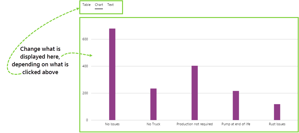
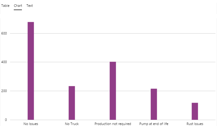
Step 9. Configure the Chart
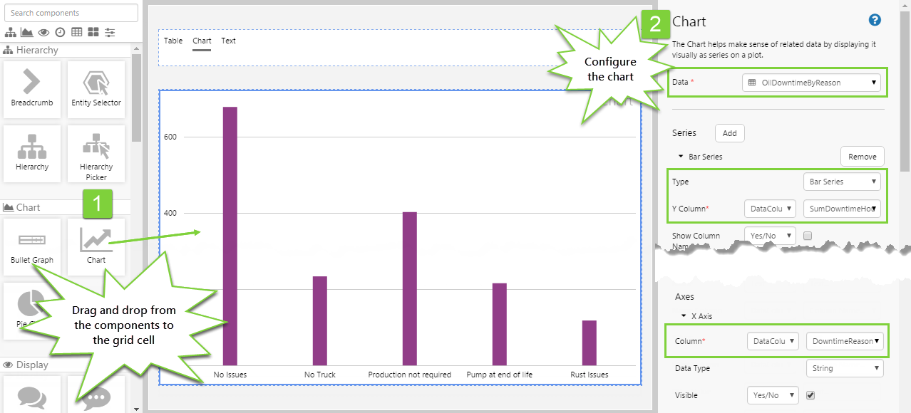
With the Chart condition set, add a chart that will display when the user selects "Chart" from the option links. Drag and drop a Chart onto the cell labelled 'Chart'. Configure a bar chart as follows:
- Source Data: OilDowntimeByReason
- For the Series:
- Type: Bar series
- Y Column: (DataColumn) SumDowntimeHours
- For the X Axis:
- Column: (DataColumn) DowntimeReason
You'll see a bar chart appear in the 'Chart' cell.
Your 2nd condition has been configured!
Step 10. Return to the Switch
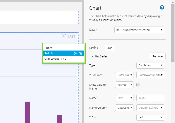
To configure the next condition, we need to return to the Switch component.
- Right-click on the cell containing the Switch.
- In the shortcut menu, select "Switch".
You are returned to the Switch view, with the Chart condition selected.
Step 11. Set the Table Condition
Each time you want to configure a condition, you need to return to the Switch component and set the active condition.
We need to change over to the Table condition in order to configure it.
- In the Switch component editor, click "Set" next to the Table condition.
Step 12. Configure the Table
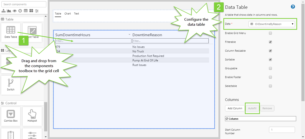
Add a data table that will display when the user selects "Table" from the option links. Drag and drop a Data Table onto the cell labelled 'Table'. Configure it as follows:
- Data: OilDowntimeByReason
- Under Columns, click the Autofill button.
You'll see a table appear in the 'Table' cell.
Your final condition has been configured!
Step 13. Set the Default Value
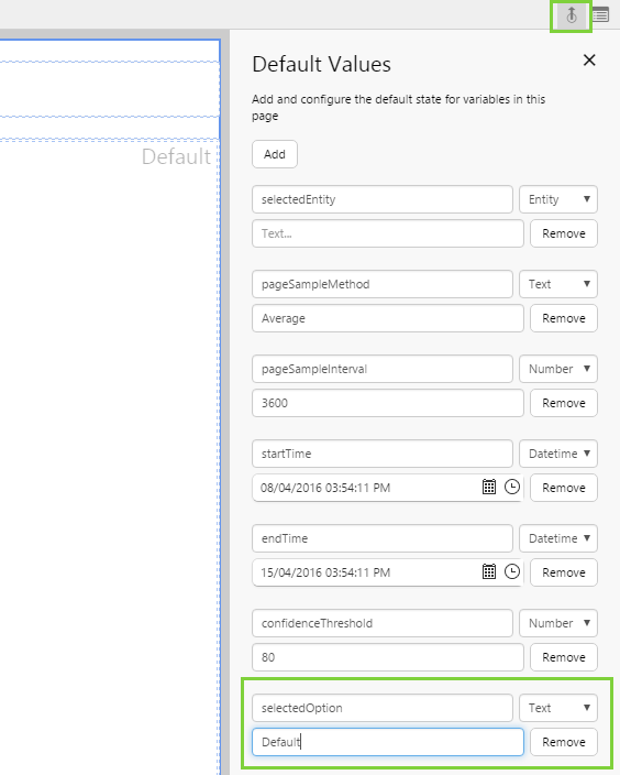
This is an optional step that will make your page look more professional. If you don't set the default value for the option links, when your page first opens it will show the default switch layout, but nothing will be selected in the option links, which can look a bit strange. You can even use this opportunity to make a different condition the default one!
- Click the Page Defaults button above the component editor.
- Click the Add button and configure the default as follows:
- selectedOption
- Default
Instead of the Default condition, you could specify the Chart or Table condition, to have those layouts displayed when the page is first opened.
Step 14. All done!
Congratulations! You now have a page with a chart, table, or text, that changes depending on what the user selects from the option links.
- Click the Finish and Open
 button on the Studio toolbar to save your page and see what it will look like in run-time.
 - Select different values from the option links and observe the changes in the page.
 Don’t forget to save your page!