ON THIS PAGE:
This article describes the styling properties of each component in the Layout  group in P2 Explorer Studio. For an overview of how styling works, see Overview of Styles in P2 Explorer.
Grid Layout
The screenshot below shows the Grid Layout in design mode.
 |
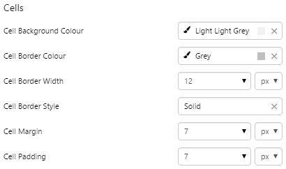
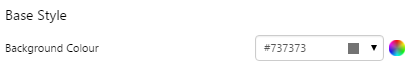
What You Can Change With the Grid Layout you can change the background colour and styles relating to the cells. 1. Base Style: Style the page background.
2. Cells: Style the appearance of the cells.
|
Examples
| Custom Style in Display Mode | Custom Style Properties |
|
EXAMPLE: Changing the page background
|
|
|
EXAMPLE: Changing the appearance of the cells
|
 |


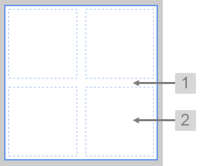
Precision Layout
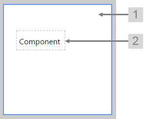
The screenshot below shows the Precision Layout in design mode, with a component added to show the cell.
 |
What You Can Change With the Precision Layout you can change the background colour and styles relating to the cells containing the added components. 1. Base Style: Style the page background.
2. Cells: Style the appearance of the cells.
|
Examples
| Custom Style in Design Mode | Custom Style Properties |
|
EXAMPLE: Changing the page background
|
|
|
EXAMPLE: Changing the appearance of the cells
|
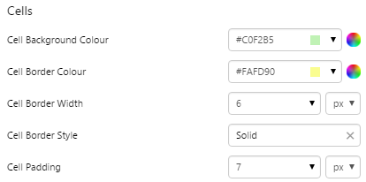 |
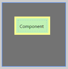
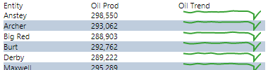
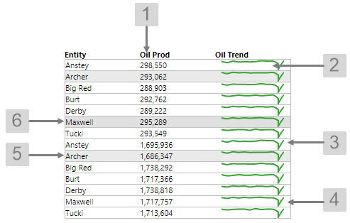
Table Layout
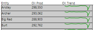
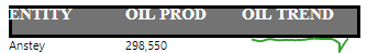
The screenshot below shows a Table Layout in display mode.
|
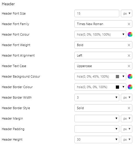
What You Can Change With the Table Layout you can change the background colour and styles relating to the cells. 1. Header Style: Style the header row.
|
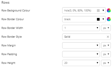
2. Rows: Style the appearance of the rows.
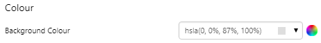
3. Colour: Style the colour of the table.
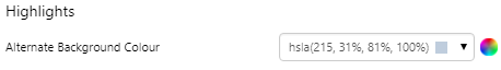
4. Highlights: Style the alternate row colour when the "highlight" option is selected.
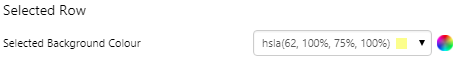
5. Selected Row: Colour of the rows that are clicked.
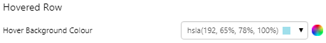
6. Hovered Row: Colour of the rows when cursor is hovering.
|
Examples
| Custom Style in Display Mode | Custom Style Properties |
|
EXAMPLE: Changing the row containing the header
|
|
|
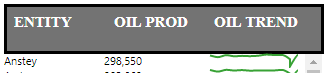
EXAMPLE: Changing the margin of the row containing the header
|
 |
|
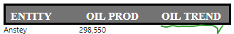
EXAMPLE: Changing the padding of the row containing the header
|
 |
|
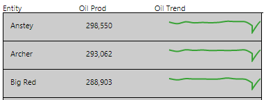
EXAMPLE: Changing the rows containing the data
|
 |
|
EXAMPLE: Changing the margin of the rows containing the data
|
 |
|
EXAMPLE: Changing the padding of the rows containing the data
|
 |
|
EXAMPLE: Changing the colour of the table
|
 |
|
EXAMPLE: Changing the highlight colour of alternating rows
|
 |
|
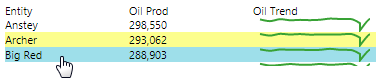
EXAMPLE: Changing the colour of the selected row
|
 |
|
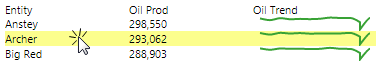
EXAMPLE: Changing the colour of the row the user is hovering over
|
 |