ON THIS PAGE:
This article describes the styling properties of each component in the Table  group in P2 Explorer Studio. For an overview of how styling works, see Overview of Styles in P2 Explorer.
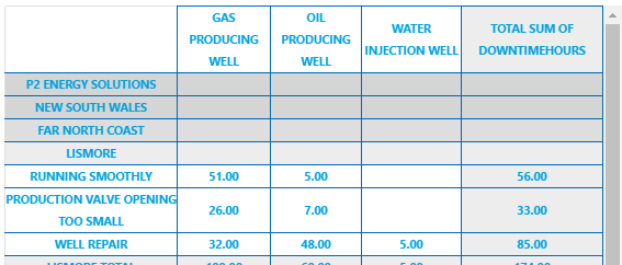
Data Table
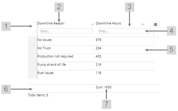
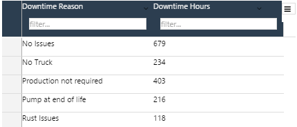
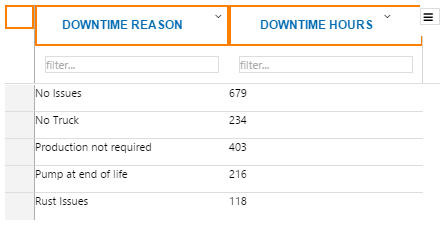
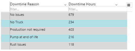
The screenshot below shows the Data Table in display mode.
 |
|
|
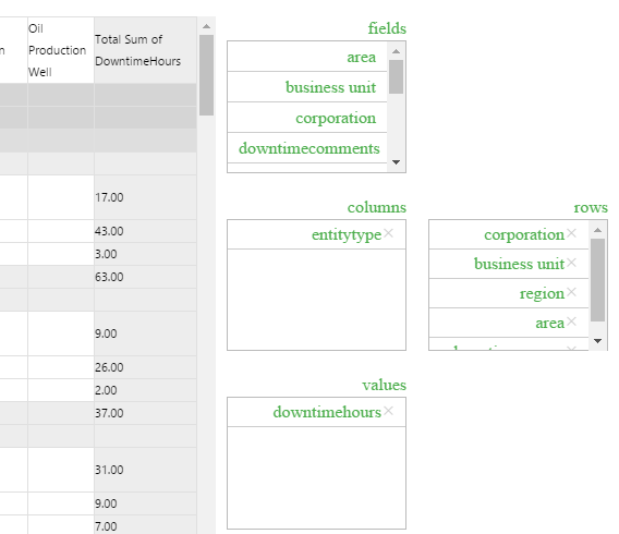
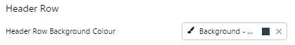
What You Can Change With the Data Table you can change the background and text appearance, in all rows. 1. Header Row: Style the colour of the header row. Includes both the column heading and the filter.
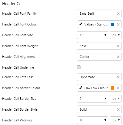
2. Header Cell: Style the appearance of the text for the column headings.
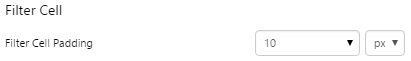
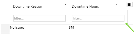
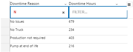
3. Filter Cell: Set the spacing around the filter box.
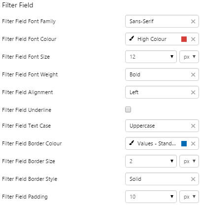
4. Filter Field: Style the appearance of the cells.
|
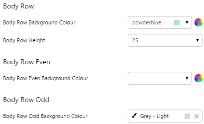
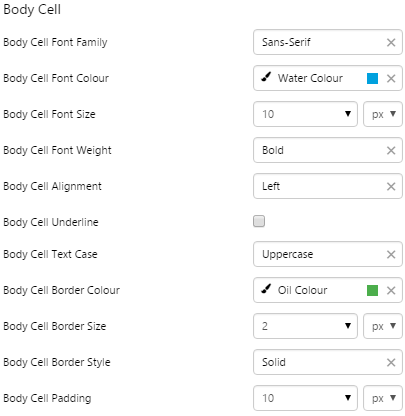
5. Body Row, Body Row Odd, Body Row Even, Body Cell: Style the appearance of the rows and text in the table. See example below for colours.
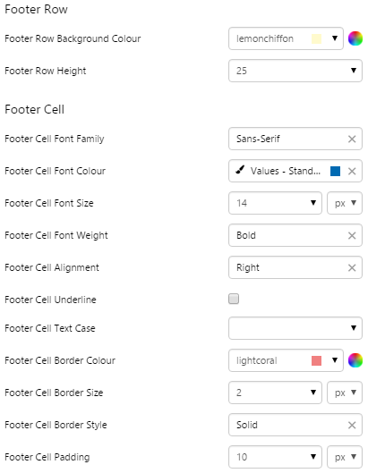
6. Footer Row: Style the appearance of the row containing the aggregation.
7. Footer Cell: Style the aggregation text.
|
Examples
| Custom Style in Display Mode | Custom Style Properties |
|
EXAMPLE: Changing the header background
|
|
|
EXAMPLE: Changing the text and borders in the header row
|
 |
|
EXAMPLE: Changing the padding around the filter cell
|
 |
|
EXAMPLE: Changing the text and borders in the filter field
|
 |
|
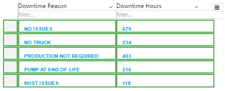
EXAMPLE: Changing the colours of the rows - note that Body Row Background Colour will not show if both Body Row Even and Body Row Odd are set
|
 |
|
EXAMPLE: Changing the body cell text and borders
|
 |
|
EXAMPLE: Changing the footer cell colour, text and borders
|
 |
Paging Control
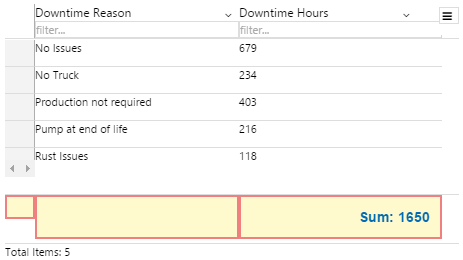
The screenshot below shows the Paging Control in display mode.

What You Can Change
With the Paging Control, you can change the styles relating to font and alignment. As the control contains links, the clickable arrows will always show the inherited blue hyperlink colour (#67809F) and inactive arrows will be greyed out.
Base Style: Style the text in the control.
- Paging Control Font Size
- Paging Control Font Family
- Paging Control Font Colour
- Paging Control Font Weight
- Paging Control Font Alignment
- Paging Control Underline
- Paging Control Text Case
Example: Changing the Paging Control Font
| Custom Style in Display Mode |
 |
| Custom Style Properties | 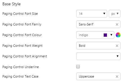 |
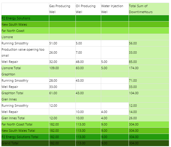
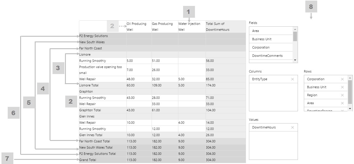
Pivot Table
The screenshot below shows the Pivot Table in display mode.
 |
|
|
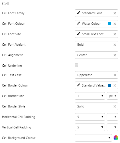
What You Can Change Because the Pivot Table can have several levels, its helpful to give these different background colours so that its easy to see subtotals at a glance. As well as being able to style these background colours, you can style the cell text appearance, and also the configuration panel. 1. Cell: Style the font and border style of all cells in the table.
2. Cell Background Colour: Style the background colour for the column headers and for all detail cells (the lowest level in the pivot table). If more than five levels are used in the pivot table, the higher levels (six and up) take on this property as well.
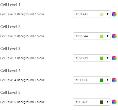
3. Cell Level 1: Style the background colour for level 1, and also for detail row sub-totals.
|
4. Cell Level 2: Style the background colour for level 2.
5. Cell Level 3: Style the background colour for level 3.
6. Cell Level 4: Style the background colour for level 4.
7. Cell Level 5: Style the background colour for level 5.
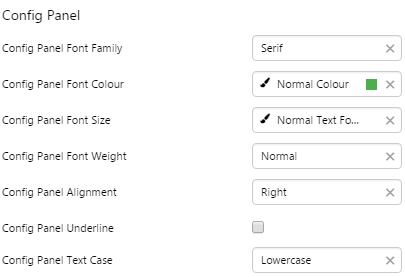
8. Config Panel: Style the configuration panel.
|
Examples
| Custom Style in Display Mode | Custom Style Properties |
|
EXAMPLE: Styling the cell level background colours
|
|
|
EXAMPLE: Styling the cell text and borders
|
 |
|
EXAMPLE: Styling the Configuration Panel
|
 |