This article applies to versions 4.4.0 and later of P2 Explorer. For help on earlier versions of the chart, see Charts (4.3.2). For help on the latest version of the chart, see Charts.
Overview
P2 Explorer charts work together with user controls to display source data interactively, using Variables.
This chart is driven by the user-selected entity (combo box) and product (option links).
Prerequisite Reading
You might find it helpful to read the following primer articles, before you configure a chart.
Default values set the context for a page or trend. A user should have access to relevant information, preferably without having to immediately change the default selections.
Find out how to add defaults to a page in Studio.
Configuring a Chart
The two aspects to configuring a chart are:
1. Selecting source data.
2. Configuring the chart's appearance.
Selecting Source Data
You can configure your chart to use data from any of the following data categories:
The following types of data can be configured for a chart.
Dataset
Configure your chart to use dataset (relational) data.
Attributes
Configure your chart to use time series data (attributes).
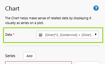
Ad-hoc Calculations
Configure your chart to use ad-hoc calculations, using time series data (tags, calculations and attributes).
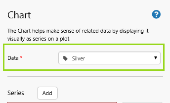
Tags
Configure your chart to use time series data (tags).
Configuring the Chart's Appearance
Once you have data for the chart, you can start configuring the chart's appearance:
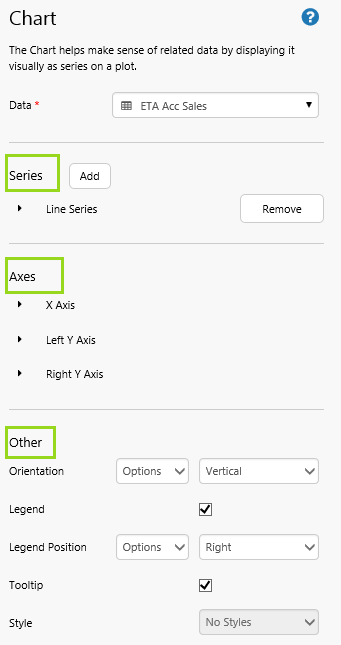
Axes: The chart has an X Axis, as well as a Y Axis (left and/or right).
Other: This includes optional configurations for the chart's general appearance, such as orientation
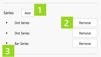
Series
An Explorer chart is made of series. Select the series depending on how you want to display your data. You can also have a combination of series types in your chart.
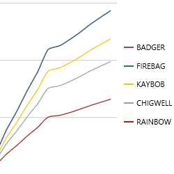
Line Series:
The Line series plots your data in a single line. You can combine this with other lines series (as shown), or with different types of series, such as bar, for, etc.
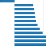
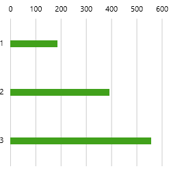
Bar Series:
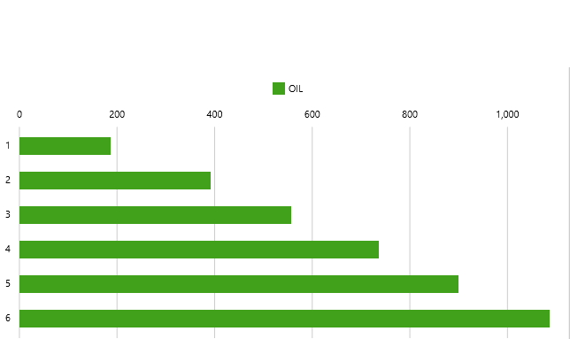
The Bar series has rectangular bars (shown horizontally or vertically), where the length of each bar is proportional to its value.
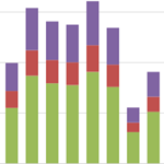
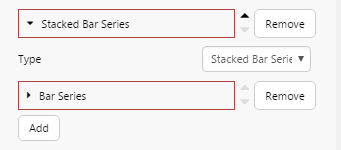
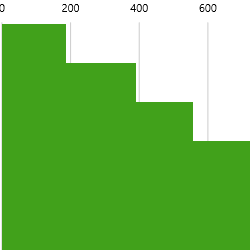
Stacked Bar Series:
The Stacked Bar series has one or more series containing bar charts which stack vertically to form single bars. This is useful when you want to show parts of a whole.
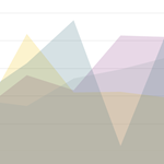
Area Series:
The Area series is a line series with the area below the line filled in with a colour. If using more than one area series, it can be helpful to adjust the opacity (as shown in this example).
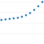
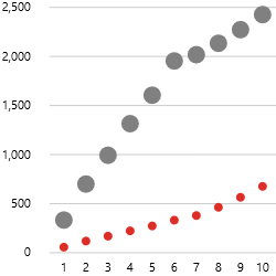
Dot Series:
The dot series displays each point as a dot, and is typically used to highlight statistical distributions.
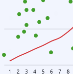
Combined Series:
Charts that combine different series are useful for showing related information in different ways.
Your chart needs at least one series.
1. To add a series, click Add, then edit the series properties.
2. To remove a series, click Remove.
3. To edit a series, click the series to open it, then edit the series properties.
The various chart series use a set of common properties, as well as a few extra properties specific to the different series types.
Part 1: Properties Common to all Types of Series
Type:
Each series can be plotted to best suit your data. The default is Line Series.
Y Column:
This is a mandatory selection, and is one of the columns from the chart's data (using a fixed or variable column name). The Y Column values get plotted against the Y Axis.
Show Column Name:
Select this check box if you want the column name (as selected in Y Column) to show in the legend. This is overriden by Name, if that has a value.
Name:
The Y Column's name. This appears in the legend, and should describe what is being represented. For example, the name COSTS can be applied to a series where the Y Column is the value TOTAL_AMT, if this value represents costs. Any value assigned to Name overrides Show Column Name.
Name Column:
Name Column is an alternative to Name. This uses one of the columns from the chart's data (using a fixed or variable column name). Each value in the data's named column is used as a separate name. An example would be a name column of 'Costs', where each separate cost in the data is plotted as a separate series. Name Column overrides the Name, effectively splitting a series into separate, smaller sub-series. For example, a line series that uses a column value as its name will show a separate line for each different name in the data.
Y Axis:
Choose left or right for the Y Axis. If you have more than one series, with a very different range of values, then you might choose to have a Left Y Axis for one series, and a Right Y Axis for others, so that values line up better on a single chart.
Filter Column and Filter Value:
Use Filter Column and Filter Value together, instead of the Name Column, if the Y Column values come from a field that stores values apart from the ones you want for this series. With Filter Column and Filter Value you will also need to specify a Name. (More)
Colour:
Specify the colour of the series in hexadecimal, for example #913D88 or RGB format, for example RGB(145,61,136). You can also just type in the name of a colour, for example RED, BLUE, MAGENTA, YELLOW etc.
Colour Matcher:
You can type in a reserved word to get the correct matching colour. For example, OIL gives you the correct values for the specific oil green. Note that Colour overrides Colour Matcher, so keep it empty if you want to use Colour Matcher. Colour matcher values you can use are OIL, GAS, NGL and WATER. This is particularly useful if you’re driving the colour from a value in the source data, and want it to be meaningful for the value that it’s representing.
Part 2: Properties Specific to the Selected Types of Series
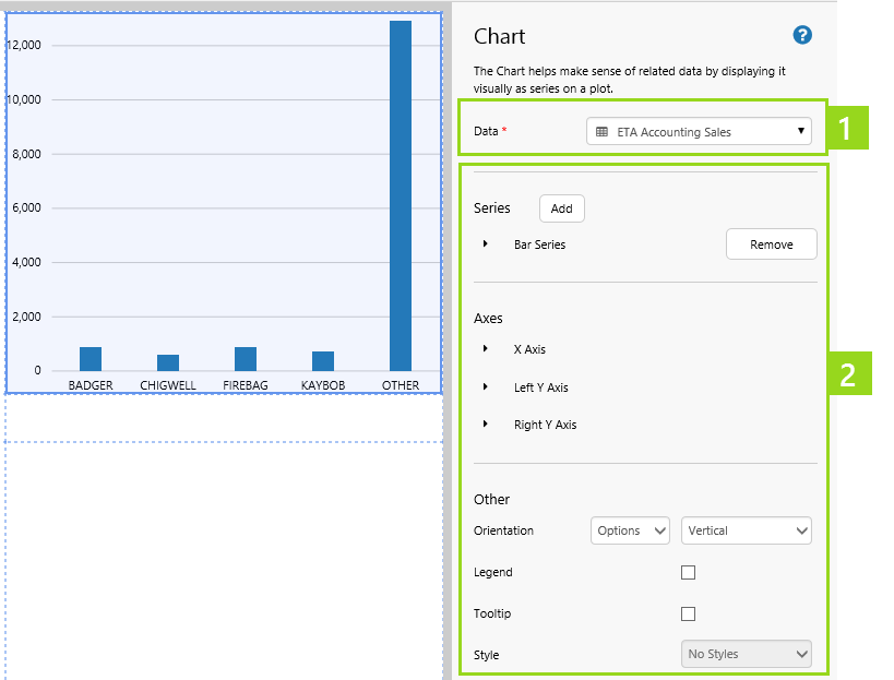
The different series types have specific properties listed after the general properties, as shown in section 2 of the screenshot above.
Line Series
The Line series plots your data in a single line.
Interpolation:
Your choice here determines how the points on the chart are connected. The default value is Monotone. Other choices include Step and Linear. The full list is in the drop-down.
Thickness:
Determines the line thickness.
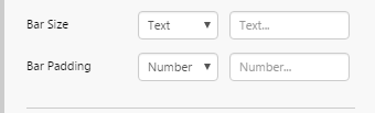
Bar Series
The Bar series has rectangular bars (shown horizontally or vertically), where the length of each bar is proportional to its value.
Bar Size:
If you want to specify a bar size, type a number here, for example 10, 20, 40 or 80. This determines the width of the bar, in pixels. Note that all the bar series on this chart will have the same width, and you only need to set this for one of the bar series. The bar size may be limited by Explorer, depending on bar padding and the available width for the chart. You can also use the word "Fill" to fill the bars completely.
Bar Padding:
This is the padding (in pixels) between the different bars for an x-value. Note that bar size and bar padding values will be overridden by Explorer, if there is not enough room on the chart.
Stacked Bar Series
The stacked bar is a series of one or more bar series.
Area Series
The Area series is a line series with the area below the line filled in with a colour.
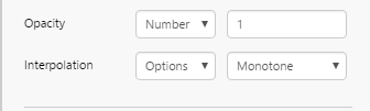
Opacity:
Determines how transparent or opaque the area is. Values range from 0 to 1 (although 0 is invisible). Adjusting the opacity is useful when you add more than one area series, with the areas in the background showing through. In such a case, make each successive area chart less opaque than the previous one. For example, the first one is Opacity 1, then next is 0.75, the next is 0.5 and so on.
Interpolation:
This is for the line demarcating the area series. Your choice here determines how the points on the chart are connected. The default value is Monotone. Other choices include Step and Linear. The full list is in the drop-down.
Dot Series
The dot series displays each point as a dot.
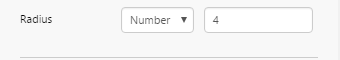
Radius:
The radius of each point. This can be a decimal value. The radius is useful if you want to emphasize one dot series (large radius) over another (smaller radius).
Here are some of the effects you can achieve by change the series properties; note that some properties are specific to the series type.
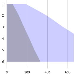
Changing the Opacity on two Area series
A narrower Bar Size (25) on a Bar series
Filled-in Bar Size (Fill) on a Bar series
Two Dot series; each has its own Colour and its own Radius (for the dot size).
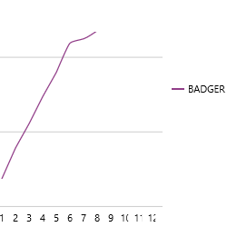
This is a single Line series. The lines are split using the Name Column.
This single Line series displays just one of the entities. Data is filtered using the Filter Column and Filter Value.
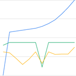
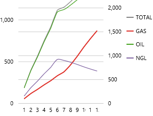
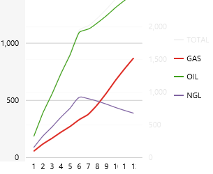
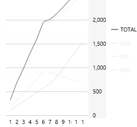
The chart in the screenshots below has four Line series, with TOTAL using the right Y Axis, and GAS, OIL and NGL on the Left Y Axis.
A) All lines appear on the chart.
B) When the user clicks on the Left Y axis, only the left-axis lines are displayed.
C) When the user clicks on the Right Y axis, only the right-axis line is displayed.
There are many options for configuring your series; try these out once you have set up a chart.
Axes
The chart has an X Axis, as well as a Y Axis (left and/or right).
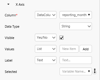
X Axis:
The X Axis is the principle axis, horizontal by default, containing the values against which other values are then measured. For example, AREAS (X Axis) with allocated BUDGETS(Y Axis).
Column:
Choose a column (fixed or variable) from your source data, for example AREA. The column values for the result rows are then plotted along the X Axis, for example Area 1, Area 2, Area 3, etc.
Data Type:
This defaults to String, and should be compatible with the Column. If Column can be represented as a number, then you can select Number from the drop-down (the third option is Time). If this is still not compatible with some of the series, then you will get a warning message.
Visible:
If this is not selected (select the check box or use a variable to control this), the X Axis values do not appear along the X Axis.
Values:
Add one or more values to the existing values on the X Axis that are returned from the source data (add a list, or use a list variable). Values are added as strings.
Label:
This can be blank, or add a label (type this in, or set a variable) to be displayed below the X Axis.
Selected:
Select a variable here if you want to use the selected X Value as a variable in a text label or other control, or as a variable parameter to other dataset queries. At run-time, click a value on the X Axis to select it. (See Tutorial 4).
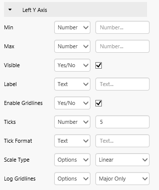
Left Y Axis and Right Y Axis:
The Left Y Axis, vertical by default, is used for plotting values of the X Axis. Note that this axis is only used if Left is selected as the Y Axis in one or more series (it is, by default). The Left Y Axis comes preconfigured.
The Right Y Axis is the same as the Left Y Axis, and can be used instead of or together with the Left Y Axis (selected in the Series).
It is useful to have these two separate axes if there are series with very different expected values; this way, all series can be better scaled to show up well in the chart. Another use of having both Y Axes would be to show different types of measures. For example, show dollars along the Left Y Axis, and counts along the right Y Axis.
Min and Max:
The max value cannot be exceeded, so only set Max if you know what the max should be, or if you are only interested in showing up to a maximum value. The same applies to Min. Min/Max can be left out (no limit set), or assigned a fixed or variable numerical value (the limit). For example, you might use source data that returns the max value of the Y Field; use this as a variable Max.
Visible:
If this is not selected (select the check box or use a variable to control this), the X Axisvalues do not appear along the X Axis.
Label:
This can be blank, or add a label (fixed or variable) to be displayed alongside the Y Axis.
Enable Gridlines:
Enable or disable gridlines.
Ticks:
Defines the number of Y Axis intervals
Tick Format:
Format the Y Field, which is displayed along the Y Axis. For example, if your Y Field is a dollar value, you can type in the dollar $ symbol. Your labels would then look like $ 50.00, $ 25.00 and so on. Other formatting to use are the signs (+/-), the comma (for a thousands separator), and precision symbols. You can use these together, for example “$ ,” displays the currency symbol and has a thousands separator.
Scale Type:
The default option is Linear (showing the actual values). Logarithmic scale (Log) displays a logarithmic calculation, which is useful when you have a wide range of values to display. Tip: You can set the this as a variable in a Combo Box, so that the user can toggle between the log and linear scale.
Log Gridlines:
Note: This only applies to the LogScale Type. Options are: Major Only, and Major and Minor.
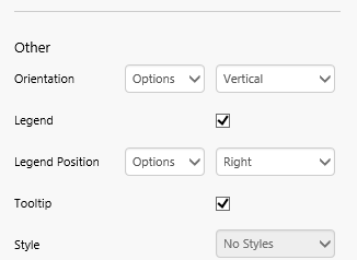
Other
This includes optional configurations for the chart's general appearance, such as orientation.
Orientation:
Charts default to vertical. If you change this to horizontal, then your Y Axis is plotted along the horizontal, and your primary values (X Axis) move to the vertical. Horizontal is useful if you are expecting a lot of X Values, as the legends stack neatly underneath each other (horizontally).
Legend:
The legend displays the values of the X Axis Field.
Legend Position:
This option only appears if you select the Legend. Right by default. This can be Left, Right, Top, or choose Top-inside if you have limited space.
Tooltip:
Tooltips show the Y value when you hover your mouse over that area of the chart (e.g. over a bar).
Style:
The style to apply to the chart component to change its appearance. If you are a Style Administrator, you can add a new Chart style.
The example screenshots below illustrate how orientation, layout and tooltips affect a chart's appearance:
This chart has vertical orientation, a legend on the right, and tooltips.
Here the same chart has horizontal orientation, a legend on the top, and no tooltips.
Tutorial 1
You can put a chart together in a matter of minutes, as most of the chart options are preconfigured.
Follow the step-by-step instructions for adding this chart.
Step by Step: Adding a Bar Chart
We're going to add a very simple chart onto a page, using the minimum configuration required.
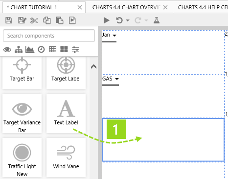
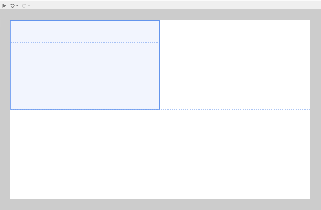
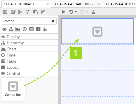
Drag and drop a Chart component onto a grid cell. The Chart is in the Chart group.
Now configure the chart as follows:
Step 2. Select Data for your Chart.
In this example we will use relational data (selecting the Dataset category). For more data options (for example, using tags or attributes), see the section: Options for Configuring a Chart's Data.
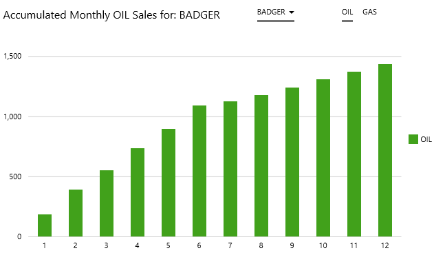
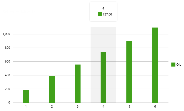
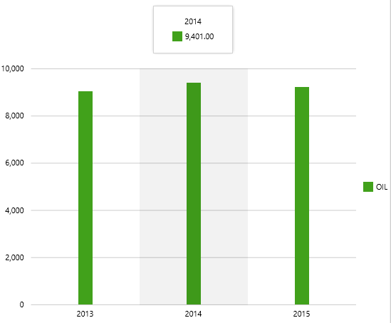
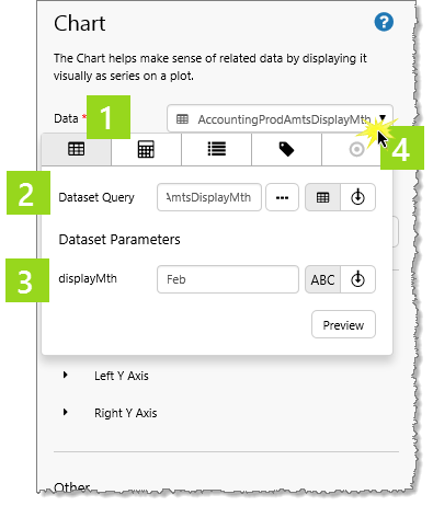
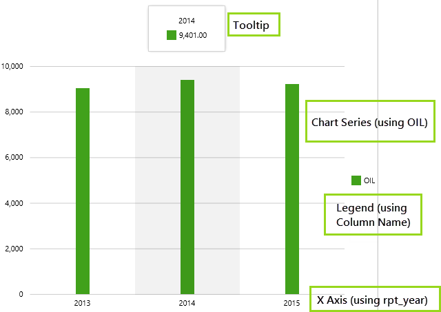
We're going to choose a dataset that returns OIL, GAS and NGL data for the selected month (Feb). In the query, product figures are summed and grouped into years (rpt_year).
The chart will have a bar series showing annual OIL amounts for February, along an X Axis of reporting years (rpt_year).
Comprehensive: Follow the instructions in Using Dataset Data, substituting with the following, if you have access to the training data (otherwise substitute to suit your own dataset and parameters):
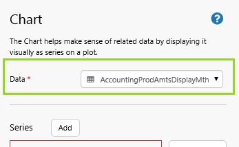
Dataset Query: AccountingProdAmtsDisplayMth
Dataset Parameters:
displayMth: Feb
Summarized: Here are the summarized instructions:
1. Click the Data drop-down, then click the Dataset button on the Categories tab.
2. In the Dataset Query edit box, select the dataset query.
Search or browse for AccountingProdAmtsDisplayMth
3. Define the Dataset Parameters.
In the displayMth edit box, type Feb.
4. Click the Data drop-down list to close it.
Step 3. Configure the Chart's Appearance.
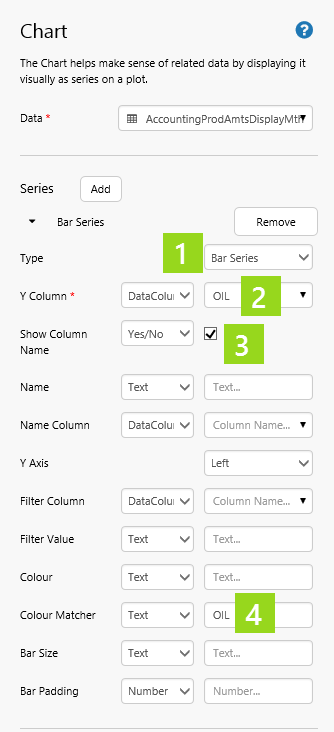
Step 3 a) Add a Bar Series.
In this step we will add a bar series showing OIL.
Click the Chart component to open its property editor.
1. For Type, select Bar Series from the drop-down list.
2. For the Y Column, keep Data Column in the first drop-down list, and select OIL from the second drop-down, which lists the names of all columns from the dataset query's data.
3. Select Show Column Name.
The column name (OIL) will show in the legend.
4. In the Colour Matcher edit box, type OIL.
This is optional; chart series are assigned a colour if nothing is specified in Colour or Colour Matcher.
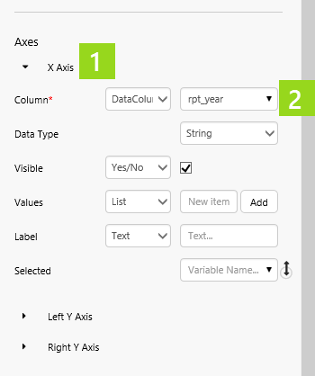
Step 3 b) Configure the Axes.
In this step we will configure the X Axis to use the rpt_year column from the dataset query results. The Y Axes do not need configuring.
1. Click X Axis to expand the X Axis section.
2. For Column, keep Data Column in the first drop-down list, and select rpt_year from the second drop-down list.
The second drop-down list contains the names of all columns from the dataset query's data.
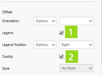
Step 3 c) Add a Legend and Tooltip.
In this step we will add a tooltip, as well as a legend for the bar series' name: OIL.
1. Select the Legend checkbox.
2. Select the Tooltip checkbox.
Well done! You've added a chart with a bar series.
The following advanced tutorials show how you can manipulate the chart's data and the chart's appearance using variables from other controls, as well as a tutorial for using the chart as a control for a variable.
Advanced Tutorials
These tutorials demonstrate how to get your chart to interact with other controls on an Explorer page.
We will be using the basic chart created in Tutorial 1.
Tutorial 2: Dataset Query Parameters using Variables
In this tutorial, we will add a Combo Box component to control the displayMth parameter for the chart's dataset query, AccountingProdAmtsDisplayMth.
Note: Before you start the tutorial, open the Studio page containing your chart from Tutorial 1, as you will be updating this.
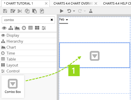
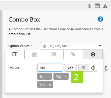
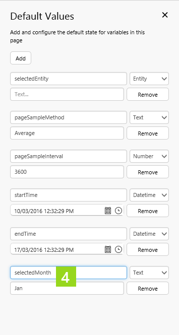
Step 1. Add and Configure a Combo Box with a Default Value.
In this step we'll add and configure a Combo Box, and provide a default value.
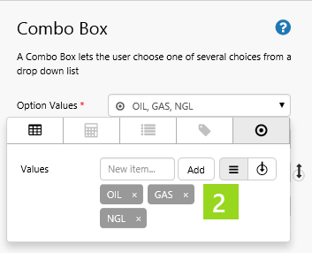
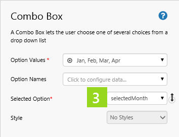
2. Add a list of Values to the Combo Box's Option Values: Jan, Feb, Mar and Apr.
3. In the Selected Option drop-down list, type selectedMonth.
4. Add a default value: selectedMonth and give it a value: Jan.
Step 2. Update Chart to use the Selected Option.
In this step, we'll update the chart's dataset query to use the new variable parameter: the Combo Box's selectedOption, selectedMonth.
Click the Chart component to open its property editor.
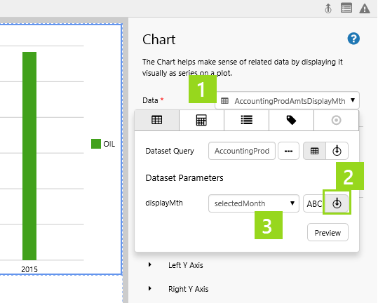
1. Click the Data drop-down list to configure the data.
2. Click the Variable button.
3. In the displayMth drop-down list, select selectedMonth.
This is the variable controlled by the Combo Box, and with a Default Value of Jan.
Watch the video below to see the Combo Box selections change the Chart's data, in preview mode. Note how the value (shown in the tooltip) changes, each time a different month is selected in from the combo box. The changing displayMth parameter causes the dataset query to re-run, returning a different set of results.
Tutorial 3: Series Configuration using Variables
In this tutorial, we will add another Combo Box component to control the Bar Series'Y Column and Name properties.
The result is that a user can control what gets displayed in the chart, by selecting an option from a Combo Box.
Note: Before you start the tutorial, open the Studio page containing your chart from Tutorial 1, as you will be updating this.
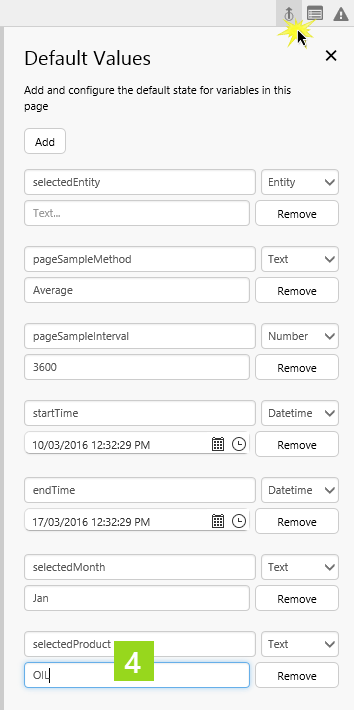
Step 1. Add and Configure a Combo Box with a Default Value.
In this step we'll add and configure a Combo Box, and provide a default value.
2. Add a list of Values to the Combo Box's Option Values: OIl, GAS, NGL.
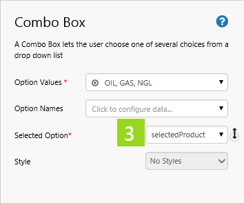
3. In the Selected Option drop-down list, type selectedProduct.
4. Add a default value: selectedProduct and give it a value: OIL.
Step 2. Update Chart to use the Selected Option.
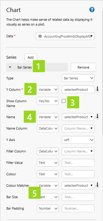
In this step, we'll update the chart's bar series to use a variable parameter for Y Column and Name: the Combo Box's selectedOption, selectedProduct.
Click the Chart component to open its property editor.
1. Click Bar Series to configure the bar series details.
2. For Y Column, select Variable from the first drop-down list, then type selectedProduct in the edit box.
3. De-select Show Column Name.
4. For Name, select Variable from the first drop-down list, and selectedProduct from the second drop-down list.
5. For Colour Matcher, select Variable from the first drop-down list, and selectedProduct from the second drop-down list.
Watch the video below to see the Combo Box selections change the Chart's data, in preview mode. Note how the chart colour and values, as well as the legend, change as different products are selected from the combo box.
Tutorial 4: Setting a Variable through a Selected X Axis
In this tutorial, we will add a variable to the X Axis' Selected property, and display this in a Text Label.
Note: Before you start the tutorial, open the Studio page containing your chart from Tutorial 1, as you will be updating this.
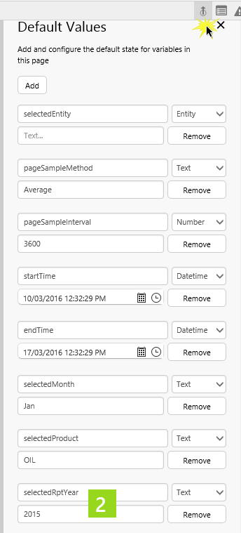
Step 1. Add and Configure a Combo Box with a Default Value.
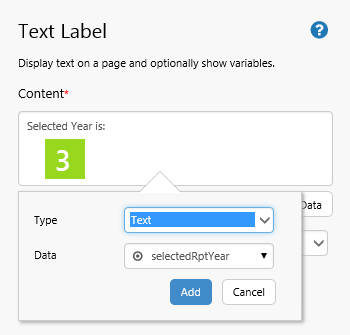
In this step we'll add and configure a Text Label, and provide a Default Value.
3. Configure the Text Label's Content: Type "Selected Year is:" then add the variable selectedRptYear.
2. Add a Default Value: selectedRptYear and give it a value: 2015.
Step 2. Update Chart to use the Selected Option.
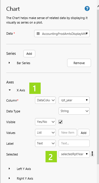
In this step, we'll update the chart's Selected X Axis to set the variable parameter: selectedRptYear.
Click the Chart component to open its property editor.
1. Click X Axis to configure the X Axis details.
2. For Selected, select selectedRptYear from the drop-down list.
Watch the video below to see the how, in preview mode, Text Label contents are updated each time a Chart's bar is clicked.
Options for Configuring a Chart's Data
There are four separate data categories that you can choose from, when configuring your chart's data.
Here is the full reference of data categories you can choose from (including the dataset category already covered in Tutorial 1).
Important Note: You can tab through the different data categories, to configure them. The one that is selected when you save the page remains the configured option. Any other configurations will be lost.
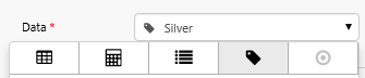
Select a Data Category
Dataset
Configure your chart to use dataset (relational) data.
 Part 1: Properties Common to all Types of Series
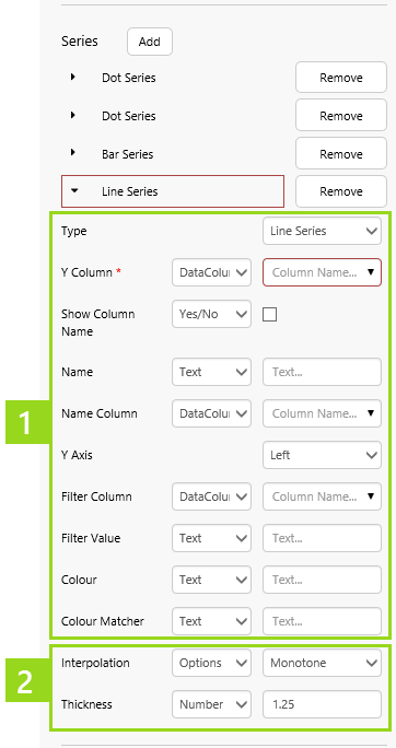
 Part 2: Properties Specific to the Selected Types of Series
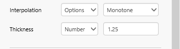
 group.
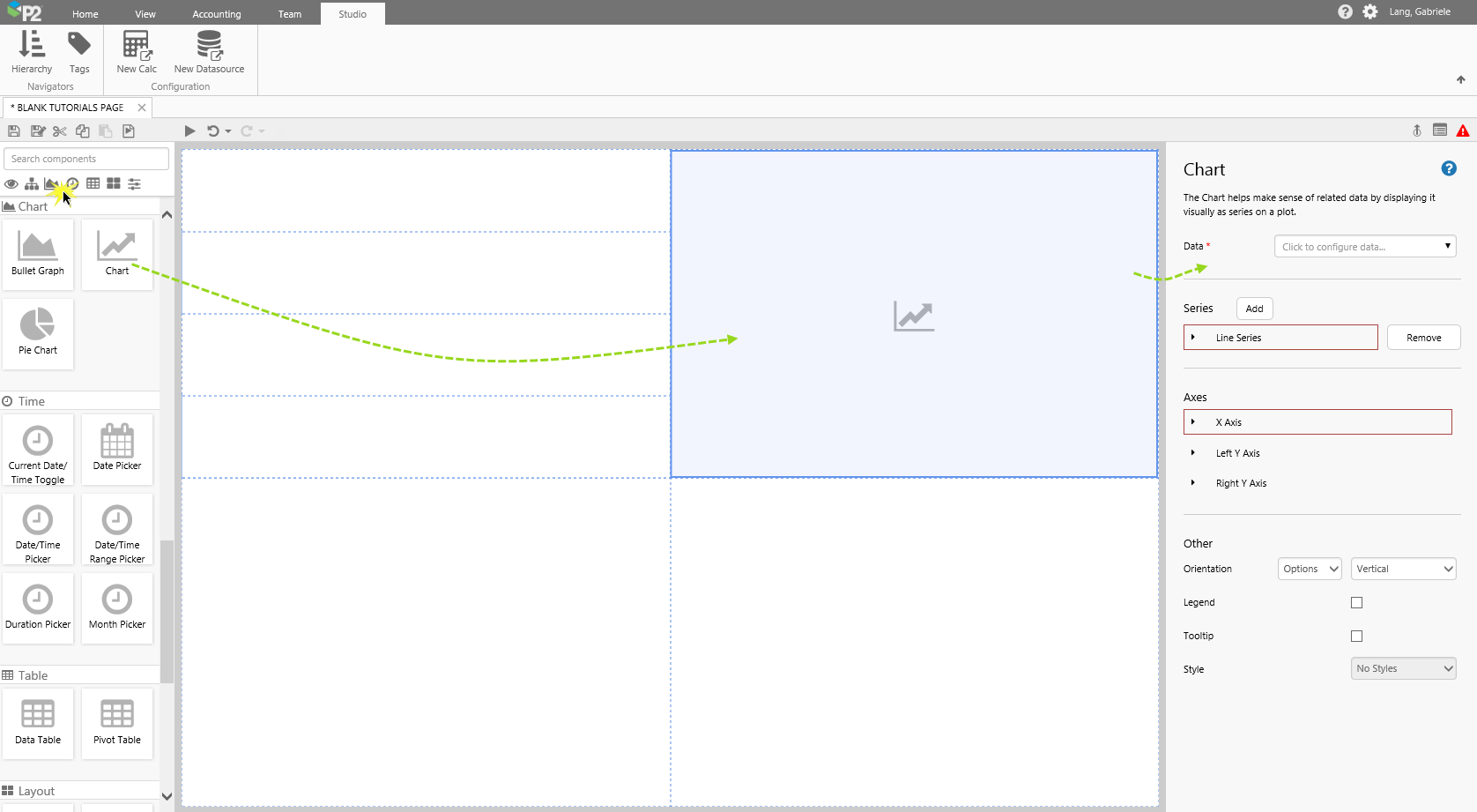
 button.