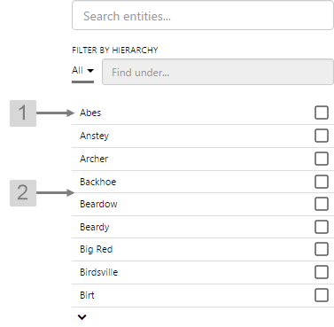
Hierarchies
Breadcrumb
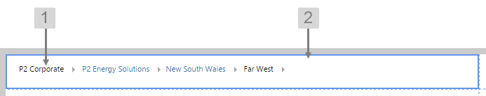
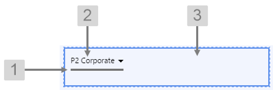
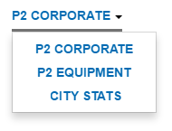
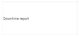
The screenshot below shows the Breadcrumb in design mode (which is indicative of display mode).
What You Can Change
With the Breadcrumb, you can change the styles relating to font and alignment. As the breadcrumb contains links, the middle nodes will always show the inherited blue hyperlink colour (#67809F).
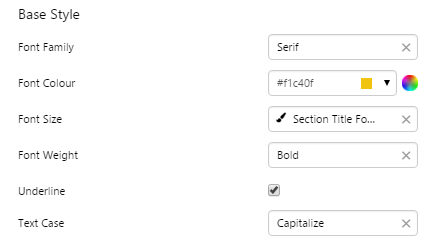
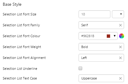
1. Base Style: Style the text that appears in the list.
- Font Size
- Font Family
- Font Colour
- Font Weight
- Font Alignment
- Underline
- Text Case
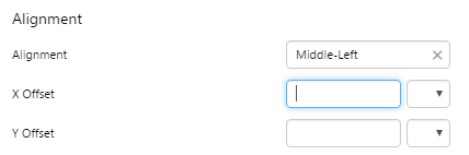
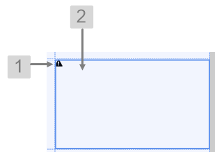
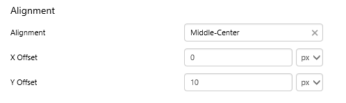
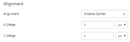
2. Alignment: Set the alignment of the breadcrumb within the cell and the offsets for padding.
- Alignment
- X Offset
- Y Offset
Example: Changing the Breadcrumb Alignment
| Custom Style in Design Mode |
 |
| Custom Style Properties | 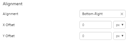 |
Example: Changing the Breadcrumb Padding
| Custom Style in Design Mode |
 |
| Custom Style Properties | 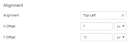 |
Example: Changing the Breadcrumb Font
| Custom Style in Design Mode |
 |
| Custom Style Properties | 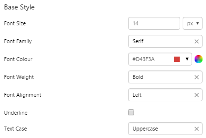 |
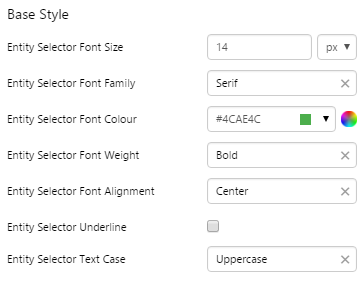
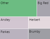
Entity Selector
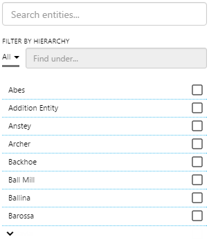
The screenshot below shows the Entity Selector in display mode.
 |
What You Can Change With the Entity Selector, you can change the styles relating to the text, and the line that separates each entity. The check boxes, search boxes, and drop-down list will remain the inherited grey colour (#737373). 1. Base Style: Style the text that appears in the list.
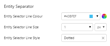
2. Entity Separator: Style the line that separates the text.
|
Examples
| Custom Style in Display Mode | Custom Style Properties |
|
EXAMPLE: Changing the text in the entity list and filter
|
|
|
EXAMPLE: Changing the separator lines in the entity list
|
|
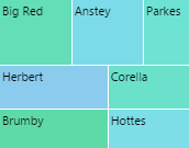
Hierarchy
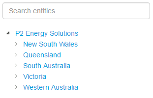
The screenshot below shows the Hierarchy in display mode.
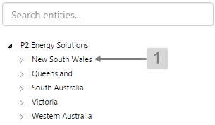 |
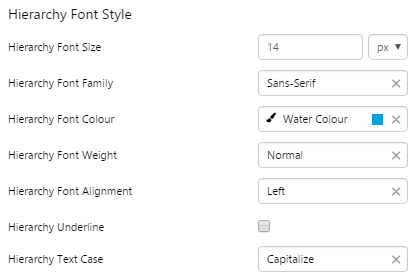
What You Can Change With the Hierarchy you can change the styles relating to the text in the tree list. The filter will remain the inherited grey colour. 1. Hierarchy Font Style: Style the text that appears in the list.
|
Examples
| Custom Style in Display Mode | Custom Style Properties |
|
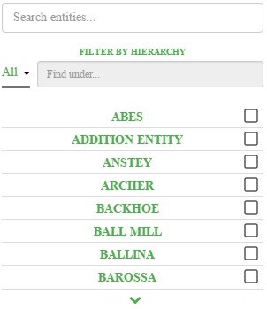
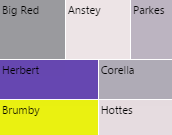
EXAMPLE: Changing the text in the tree list
|
|
Hierarchy Picker
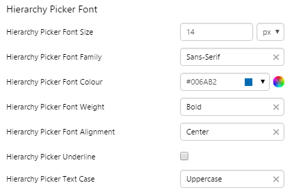
The screenshot below shows the Hierarchy Picker in design mode.
 |
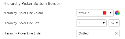
What You Can Change With the Hierarchy Picker you can change the styles relating to the text, alignment, and the line below the drop-down list. The drop-down arrow will remain the inherited dark grey colour. 1. Hierarchy Picker Bottom Border: Style the line below the drop-down list.
2. Hierarchy Picker Font: Style the text that appears in the list.
3. Alignment: Set the alignment of the Hierarchy Picker within the cell and the offsets for padding.
|
Examples
| Custom Style in Display Mode | Custom Style Properties |
|
EXAMPLE: Changing the text
|
|
|
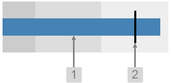
EXAMPLE: Changing the Border of the drop-down list
|
|
Charts
Bullet Graph
The screenshot below shows the Bullet Graph in display mode.
 |
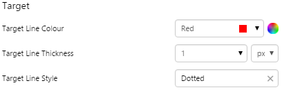
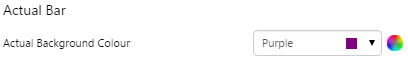
What You Can Change With the Bullet Graph you can change the colour of the bar indicating the actual value, and the target line. 1. Actual Bar: Set the colour of the value bar.
2. Target: Style the line indicating the target.
|
Examples
| Custom Style in Display Mode | Custom Style Properties |
|
EXAMPLE: Changing the Actual bar
|
|
|
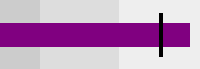
EXAMPLE: Changing the Target line
|
 |
Chart
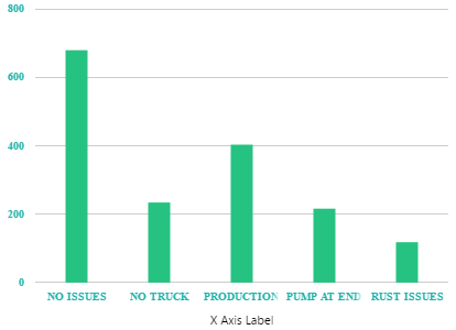
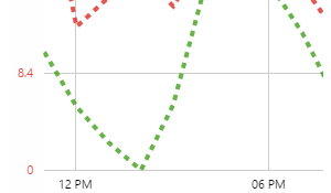
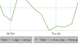
The screenshot below shows a discrete chart (left) and continuous chart (right) in display mode.
 |
|
|
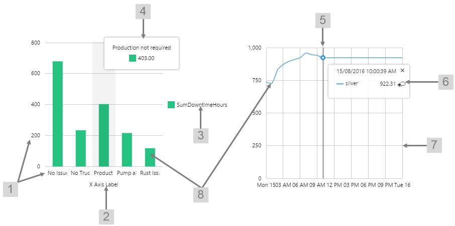
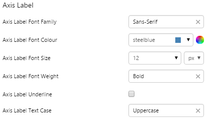
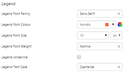
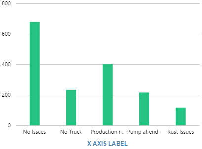
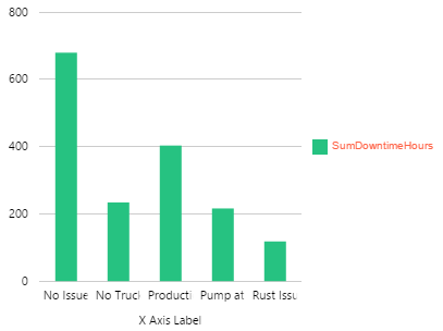
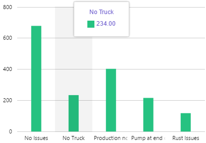
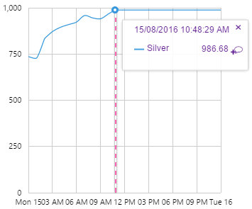
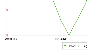
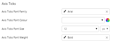
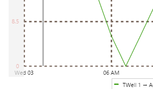
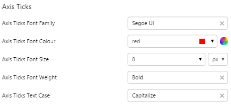
What You Can Change With the Chart you can change the appearance of the axes, gridlines, legend, tooltip, and hairline. 1. Axis Ticks: Style the text along the X and Y axes.
2. Axis Label: Style the label text for the X axis.
3. Legend: Style the text inside the legend.
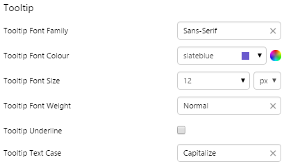
4. Tooltip: Style the text inside the tooltip popup in discrete charts.
|
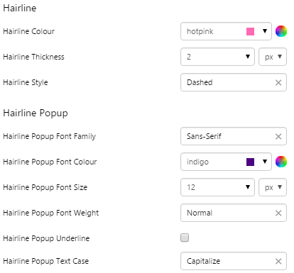
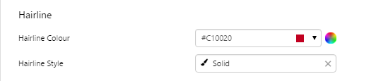
5. Hairline: Style the appearance of the hairline in continuous charts.
6. Hairline Popup: Style the text inside the hairline popup in continuous charts.
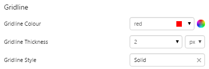
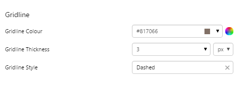
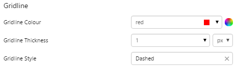
7. Gridline: Style the vertical and horizontal lines on the chart canvas.
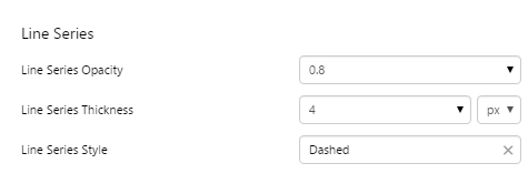
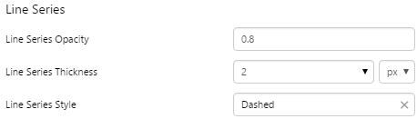
8. Line Series, Bar Series, Area Series, Dot Series: Style the trace on the chart canvas.
|
Examples
| Custom Style in Display Mode | Custom Style Properties |
|
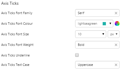
EXAMPLE: Changing the axis ticks
|
|
|
EXAMPLE: Changing the axis label
|
 |
|
EXAMPLE: Changing the legend
|
 |
|
EXAMPLE: Changing the tooltip in a discrete chart
|
 |
|
EXAMPLE: Changing the hairline and hairline popup in a continuous chart
|
 |
|
EXAMPLE: Changing the gridlines
|
 |
|
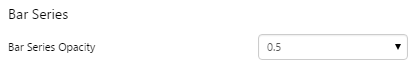
EXAMPLE: Changing the opacity of the trace in a bar chart
|
 |
|
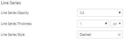
EXAMPLE: Changing the style of the trace in a line chart
|
 |
Embedded Trend
The screenshot below shows the Embedded Trend in display mode.
 |
|
|
What You Can Change With the Embedded Trend you can change the appearance of the axes, gridlines, legend, tooltip, and hairline. |
|
|
1. Axis Ticks: Style of the text along the X and Y axes.
2. Hairline: Style the hairlines.
3. Hairline Popup: Style the text inside the hairline popup.
|
4. Gridline: Style the vertical and horizontal grid lines.
5. Line Series: Style the trace lines on the embedded trend.
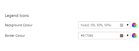
6. Legend Icons:
7. Legend Text: Style the legend text
|
Examples
| Custom Style in Display Mode | Custom Style Properties |
|
EXAMPLE: Changing the axis ticks
|
|
|
EXAMPLE: Changing the hairline
|
 |
|
EXAMPLE: Changing the gridline style
|
 |
|
EXAMPLE: Changing the line series style
|
 |
|
EXAMPLE: Changing the legend icons style
|
 |
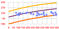
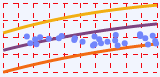
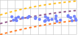
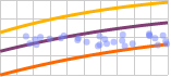
Performance Curve
The screenshot below shows the Performance Curve in display mode.
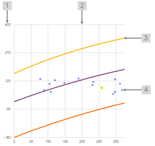 |
What You Can Change With the Performance Curve you can change the colour of the dots indicating the actual data points, and the highlight colour. 1. Axis Ticks: Set the style of the label text.
2. Gridline: Style the vertical and horizontal grid lines.
3. Line Series: Set the style of the curve lines.
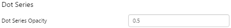
4. Dot Series: Style the dots indicating the data values.
|
Examples
| Custom Style in Display Mode | Custom Style Properties |
|
EXAMPLE: Changing the axis text style
|
|
|
EXAMPLE: Changing the style of the gridlines
|
 |
|
EXAMPLE: Changing the style of the curves
|
 |
|
EXAMPLE: Changing the style of the dots
|
 |
Treemap
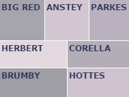
The screenshot below shows the Treemap in display mode.
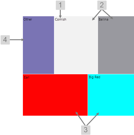 |
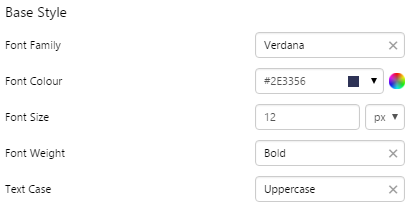
What You Can Change With the Treemap you can change the colours of the nodes, and the label text for the nodes. 1. Base Style: Set the style of the label text.
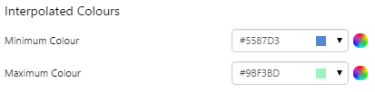
2. Interpolated Colours: The colours of the nodes are determined by the interpolation between 2 colours - the Minimum Colour and Maximum Colour. As the value approaches the specified minimum value, the node colour more closely resembles the Minimum Colour, and as the value approaches the specified maximum value, the node colour more closely resembles the Maximum Colour.
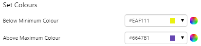
Tip: You will usually get a nicer looking treemap if your minimum and maximum colours are the same hue but different brightness (e.g. light blue and dark blue) or are next to each other on the colour wheel (e.g. red and yellow or green and blue). The values you specify for minimum and maximum will also affect how the colours are interpolated. 3. Set Colours: The colour of the node when the value is below the minimum value or above the maximum value.
4. Aggregate Colour: The colour of the node when two or more nodes have been combined. |
Examples
| Custom Style in Display Mode | Custom Style Properties |
|
EXAMPLE: Changing the Label Text
|
|
|
EXAMPLE: Changing the Interpolated Minimum and Maximum Colours
|
 |
|
EXAMPLE: Changing the Set Minimum and Maximum Colours
|
 |
|
EXAMPLE: Changing the Aggregate Colour
|
 |
Displays
Comments Button
The screenshot below shows the Comments Button in design mode.
 |
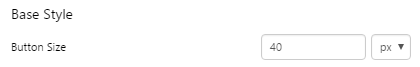
What You Can Change With the Comments Button you can change the size and colour of the button, as well as its alignment within the cell. 1. Base Style: Set the size of the button.
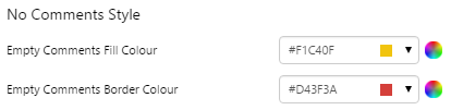
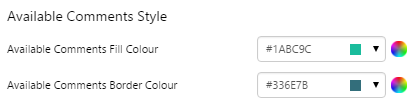
2. Border Colour: Set the colour of the border of the button. You can choose different colours for comments are available or unavailable.
3. Fill Colour: Set the colour of the button fill. You can choose different colours for comments are available or unavailable.
4. Alignment: Set the alignment of the Comments Button within the cell and the offsets for padding.
|
Examples
| Custom Style in Display Mode | Custom Style Properties |
|
EXAMPLE: Changing the size of the button
|
|
|
EXAMPLE: Changing the colour of the button when there are no comments
|
 |
|
EXAMPLE: Changing the colour of the button when comments are available
|
 |
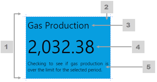
Data Label
The screenshot below shows the style properties of Data Label in display mode. The component is aligned on a grid cell.
 |
What You Can Change Style the text, and the alignment. 1. Base Style: Style the text that appears in the data label.
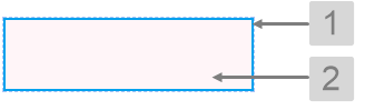
2. Alignment: Align the Data Label by giving it X and Y co-ordinates, or by using an alignment option, such as Top-Left. In the screenshot, you can see the data label component in relation to the grid cell.
|
Example
| Custom Style in Display Mode | Custom Style Properties |
|
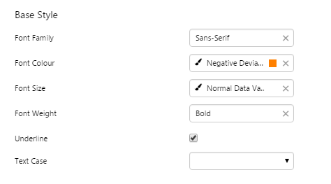
EXAMPLE: The text uses Sans-Serif font, bold, orange, and underlined
|
 |

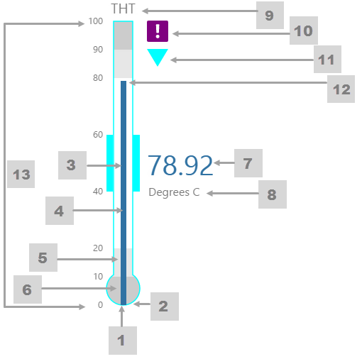
Gauge
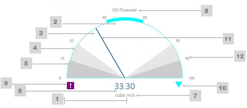
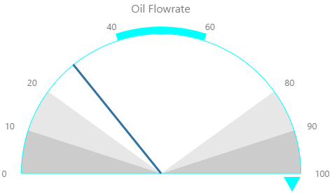
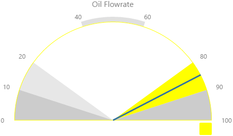
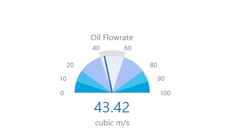
The screenshot below shows the Gauge in display mode. The style properties are numbered and described in the table below.
 |
|
|
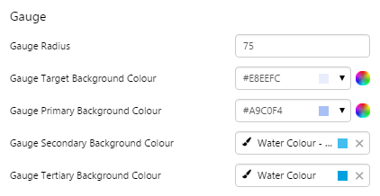
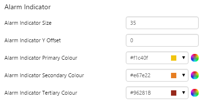
What You Can Change 1. Gauge Radius: Set the gauge size in pixels. 2. Gauge Target Background Colour: Set the background colour for the target segment. 3. Gauge Primary Background Colour: Set the background colour for the primary segments. 4. Gauge Secondary Background Colour: Set the background colour for the secondary segments. When the value is in a secondary alarm state, these segments take on the alarm indicator secondary colour (see 10). 5. Gauge Tertiary Background Colour: Set the background colour for the tertiary segments. When the value is in a tertiary alarm state, these segments take on the alarm indicator tertiary colour (see 10). 6. Value: Set the font properties, text case, and underlining of the value: Value Font Family, Value Font Colour, Value Font Size, Value Font Weight, Value Underline, Value Text Case 7. Units: Set the font properties, text case, and underlining of the units: Units Font Family, Units Font Colour, Units Font Size, Units Font Weight, Units Underline, Units Text Case 8. Label: Set the font properties, text case, and underlining of the label: Label Font Family, Label Font Colour, Label Font Size, Label Font Weight, Label Underline, Label Text Case |
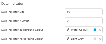
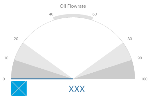
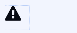
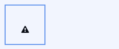
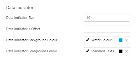
9. Data Indicator: The data indicator appears in a square background, as a cross if there is No Data  or as an exclamation mark if there is Low Confidence Data or as an exclamation mark if there is Low Confidence Data  . .
Set the style properties to size, position and colours of the data indicator: Data Indicator Size, Data Indicator Y Offset, Data Indicator Background Colour, Data Indicator Foreground Colour 10. Alarm Indicator: The alarm indicator appears if the measured value is in an alarm state (primary, secondary or tertiary). The alarm indicator is a symbol with a fixed shape and styled colour, depending on whether it is primary (an inverted triangle Set the style properties to defined the size, position, and the colours for primary 11. Value Indicator: Set the size (width) and colour of the value indicator: Value Indicator Size, Value Indicator Target Colour 12. Limits: Set the style properties define the font properties, position, text case, and underlining of the limits: Limits Font Family, Limits Font Colour, Limits Font Size, Limits Font Weight, Limits Underline, Limits Text Case, Limits Y Offset |
 ), secondary (a square
  ) or tertiary (a triangle
  ).
). , secondary
  and tertiary alarms
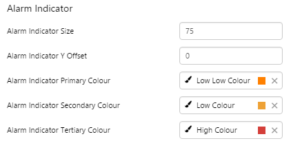
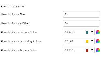
  of the alarm indicator: Alarm Indicator Indicator Size, Alarm Indicator Indicator Y Offset, Alarm Indicator Indicator Primary Colour, Alarm Indicator Indicator Secondary Colour, Alarm Indicator Indicator Tertiary Colour.
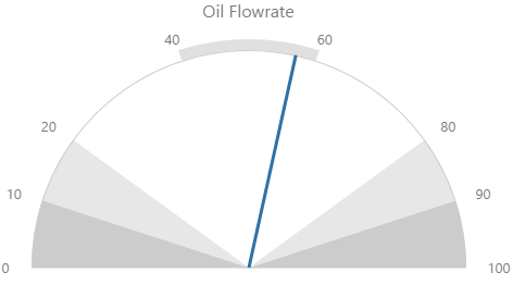
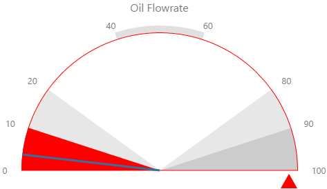
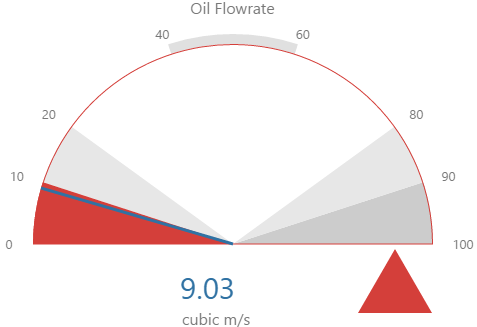
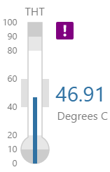
Here are some examples of how the gauge background colours change with the different alarm states. Note how the gauge's secondary and tertiary background colours change to the secondary and tertiary alarm colours, respectively. During a primary alarm state, the target area's envelope band changes to the primary alarm colour.
| No Alarm | Primary Alarm |
 |
 |
|
Secondary Alarm
|
Tertiary Alarm
|
Examples
| Custom Style in Display Mode | Custom Style Properties |
|
EXAMPLE: Small gauge, with blue background colours
|
 |
|
EXAMPLE: Large, grey-on-blue Data Indicator
|
 |
|
EXAMPLE: Large Alarm Indicator, coloured dark red for Tertiary
|
 |
Hyperlink
The screenshot below shows the style properties of Hyperlink in display mode. The component is aligned on a grid cell.
|
What You Can Change Style the text, and the alignment. 1. Base Style: Style the hyperlink text.
2. Alignment: Align the hyperlink by giving it X and Y co-ordinates, or by using an alignment option, such as Top-Left.
|
Examples
| Custom Style in Display Mode | Custom Style Properties |
|
EXAMPLE: Styled base style font, underline and text case
|
 |
|
EXAMPLE: Aligned middle left
|
 |
Level Meter
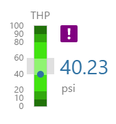
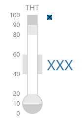
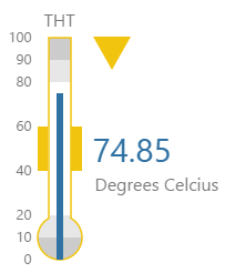
The screenshot below shows style properties of the Level Meter in display mode.
|
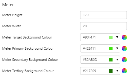
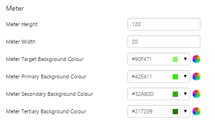
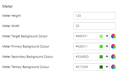
What You Can Change 1. Meter Height: Set the meter height in pixels. 2. Meter Width: Set the meter width in pixels. 3. Meter Target Background Colour: Set the background colour for the target area. When the value is in a secondary alarm state, is bordered by a band in the alarm indicator secondary colour (see 11). 4. Meter Primary Background Colour: Set the background colour for the primary band areas. When the value is in a primary alarm state, these take on the alarm indicator primary colour (see 11). (Note: In the screenshot, the colour is transparent.) 5. Meter Secondary Background Colour: Set the background colour for the secondary band areas. 6. Meter Tertiary Background Colour: Set the background colour for the tertiary band areas. When the value is in a tertiary alarm state, this takes on the alarm indicator tertiary colour (see 11). |
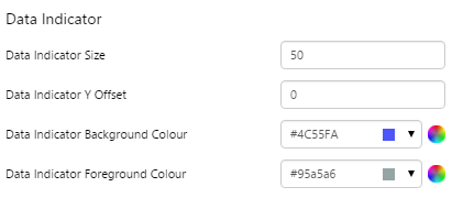
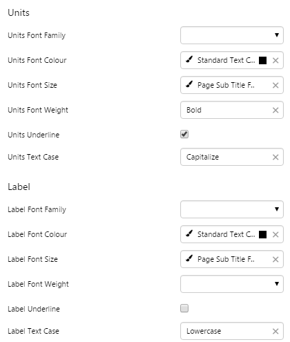
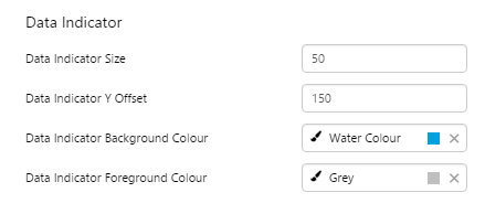
7. Value: Set the font properties, text case, and underlining of the value: Value Font Family, Value Font Colour, Value Font Size, Value Font Weight, Value Underline, Value Text Case 8. Units: Set the font properties, text case, and underlining of the units: Units Font Family, Units Font Colour, Units Font Size, Units Font Weight, Units Underline, Units Text Case 9. Label: Set the font properties, text case, and underlining of the label: Label Font Family, Label Font Colour, Label Font Size, Label Font Weight, Label Underline, Label Text Case 10. Data Indicator: The data indicator appears in a square background, as a cross if there is No Data Set the style properties to size, position and colours of the data indicator: Data Indicator Size, Data Indicator Y Offset, Data Indicator Background Colour, Data Indicator Foreground Colour 11. Alarm Indicator: The alarm indicator appears if the measured value is in an alarm state (primary, secondary or tertiary). The alarm indicator is a symbol with a fixed shape and styled colour, depending on whether it is primary (an inverted triangle Set the style properties to defined the size, position, and the colours for primary 12. Value Indicator: Set the size (width) and colour of the value indicator: Value Indicator Size, Value Indicator Target Colour 13. Limits: Set the style properties define the font properties, position, text case, and underlining of the limits: Limits Font Family, Limits Font Colour, Limits Font Size, Limits Font Weight, Limits Underline, Limits Text Case, Limits Y Offset |
Here are some examples of how the meter background colours change with the different alarm states. Note how the level meter's secondary and tertiary background colours change to the secondary and tertiary alarm colours, respectively. During a primary alarm state, the target area's envelope band changes to the primary alarm colour.
| No Alarm | Primary Alarm | Secondary Alarm | Tertiary Alarm |
 |
 |
 |
 |
Examples
| Custom Style in Display Mode | Custom Style Properties | ||||||
|
EXAMPLE: Small Level Meter with green background colours
|
 |
||||||
|
EXAMPLE: Large, grey-on-blue Data Indicator
|
 |
||||||
| EXAMPLE: Primary, Secondary and Tertiary Alarm Indicators | |||||||
|
|
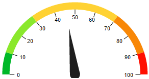
Meter
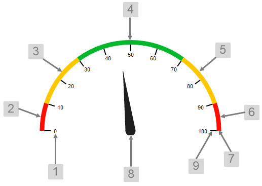
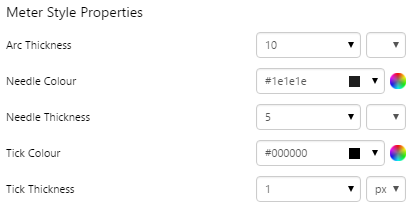
The screenshot below shows the style properties of the Meter in display mode.
|
|
What You Can Change 1. Base Style: Style the tick values on the meter.
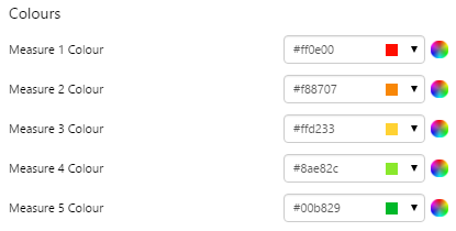
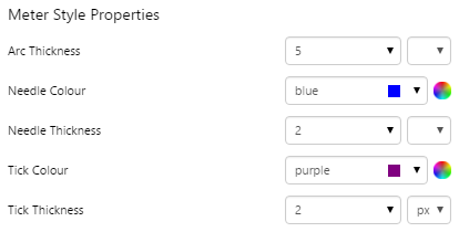
2. Measure 1 Colour: Set the colour of the first band of measure. 3. Measure 2 Colour: Set the colour of the second band of measure. 4. Measure 3 Colour: Set the colour of the third band of measure. 5. Measure 4 Colour: Set the colour of the fourth band of measure. 6. Measure 5 Colour: Set the colour of the fifth band of measure. 7. Arc Thickness: Set the width of the meter arc. 8. Needle Colour, Needle Thickness: Set the colour and width of the needle indicating the current value. 9. Tick Colour, Tick Thickness: Set the colour and width of the ticks for the values. |
Examples
| Custom Style in Display Mode | Custom Style Properties |
|
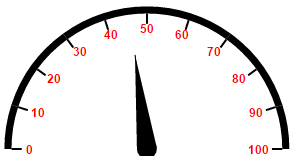
EXAMPLE: Changing the base style
|
 |
|
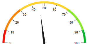
EXAMPLE: Changing the measure colours
|
 |
|
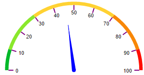
EXAMPLE: Changing the needle and ticks
|
 |
|
EXAMPLE: Changing the arc and needle thickness
|
 |
Paging Control
The screenshot below shows the Paging Control in display mode.
What You Can Change
With the Paging Control, you can change the styles relating to font and alignment. As the control contains links, the clickable arrows will always show the inherited blue hyperlink colour (#67809F) and inactive arrows will be greyed out.
Base Style: Style the text in the control.
- Paging Control Font Size
- Paging Control Font Family
- Paging Control Font Colour
- Paging Control Font Weight
- Paging Control Font Alignment
- Paging Control Underline
- Paging Control Text Case
Example: Changing the Paging Control Font
| Custom Style in Display Mode |
 |
| Custom Style Properties | 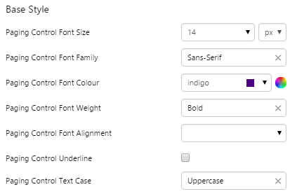 |
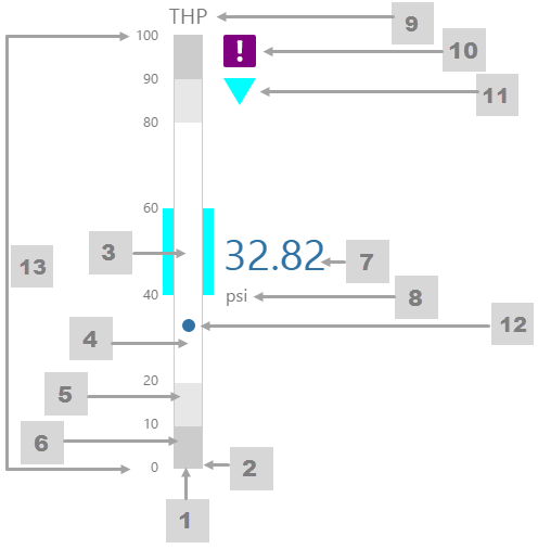
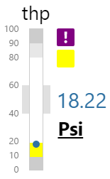
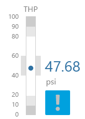
Pressure Meter
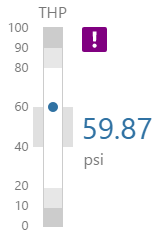
The screenshot below shows the Pressure Meter in display mode. The style properties are numbered and described in the table below.
|
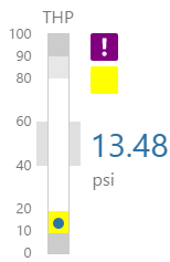
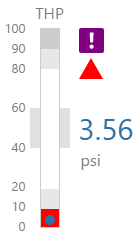
What You Can Change 1. Meter Height: Set the meter height in pixels. 2. Meter Width: Set the meter width in pixels. 3. Meter Target Background Colour: Set the background colour for the target area. When the value is in a secondary alarm state, is bordered by a band in the alarm indicator secondary colour (see 11). 4. Meter Primary Background Colour: Set the background colour for the primary band areas. When the value is in a primary alarm state, these take on the alarm indicator primary colour (see 11). (Note: In the screenshot, the colour is transparent.) 5. Meter Secondary Background Colour: Set the background colour for the secondary band areas. 6. Meter Tertiary Background Colour: Set the background colour for the tertiary band areas. When the value is in a tertiary alarm state, this takes on the alarm indicator tertiary colour (see 11). |
7. Value: Set the font properties, text case, and underlining of the value: Value Font Family, Value Font Colour, Value Font Size, Value Font Weight, Value Underline, Value Text Case 8. Units: Set the font properties, text case, and underlining of the units: Units Font Family, Units Font Colour, Units Font Size, Units Font Weight, Units Underline, Units Text Case 9. Label: Set the font properties, text case, and underlining of the label: Label Font Family, Label Font Colour, Label Font Size, Label Font Weight, Label Underline, Label Text Case 10. Data Indicator: The data indicator appears in a square background, as a cross if there is No Data Set the style properties to size, position and colours of the data indicator: Data Indicator Size, Data Indicator Y Offset, Data Indicator Background Colour, Data Indicator Foreground Colour 11. Alarm Indicator: The alarm indicator appears if the measured value is in an alarm state (primary, secondary or tertiary). The alarm indicator is a symbol with a fixed shape and styled colour, depending on whether it is primary (an inverted triangle Set the style properties to defined the size, position, and the colours for primary 12. Value Indicator: Set the size (width) and colour of the value indicator: Value Indicator Size, Value Indicator Target Colour 13. Limits: Set the style properties define the font properties, position, text case, and underlining of the limits: Limits Font Family, Limits Font Colour, Limits Font Size, Limits Font Weight, Limits Underline, Limits Text Case, Limits Y Offset |
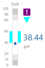
Here are some examples of how the meter background colours change with the different alarm states. Note how the pressure meter's secondary and tertiary background colours change to the secondary and tertiary alarm colours, respectively. During a primary alarm state, the target area's envelope band changes to the primary alarm colour.
| No Alarm | Primary Alarm | Secondary Alarm | Tertiary Alarm |
 |
 |
 |
 |
Examples
| Custom Style in Display Mode | Custom Style Properties |
|
EXAMPLE: Small pressure meter, with green background colours
|
 |
|
EXAMPLE: Styled Units and Label
|
 |
|
EXAMPLE: Large grey-on-blue data indicator, with a Y Offset
|
 |
Status Indicator
Note that before version 4.5.4 you could also set the icon colours in the style. In version 4.5.4 and later, the colour for a state is set in Studio, along with the icon shape.
The screenshot below shows the Status Indicator in design mode.
 |
What You Can Change With the Status Indicator you can change the size of the icon, as well as its alignment. Note that size and alignment can be overridden in Studio. 1. Base Style: Set the size of the indicator.
2. Alignment: Set the alignment of the indicator within the cell and the offsets for padding.
|
Examples
| Custom Style in Run or Design Mode | Custom Style Properties |
|
EXAMPLE: Changing the size of the indicator
|
|
|
EXAMPLE: Changing the alignment of the indicator
|
 |
Status Tile
The screenshot below shows the Status Tile in design mode.
 |
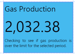
What You Can Change With the Status Tile you can change the fonts family, as well as the separate fonts for title, value and description. You can also change the colour that the tile takes on under different conditions. 1. Base Style: Set the font family for all fonts used in the status tile.
|
|
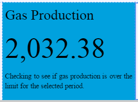
2. Under Limit, On Limit, Over Limit, Default: Set the colour of the status tile according to the value in relation to the limit.
3. Title: Set the title font and text case.
|
4. Value: Set the value font and text case.
5. Description: Set the description font and text case.
|
Note that the colour of the status tile is the only indicator of whether the value is over, under or equal to the limit. Therefore, if you add a style with different colours, you need to be sure that users can interpret these. Either keep these similar to the base colours (blue for under, green for equal, red for over, grey for unknown) or communicate what the styled colours signify.
Examples
| Custom Style in Run or Design Mode | Custom Style Properties |
|
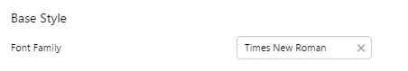
EXAMPLE: Changing the font family of the status tile
|
|
|
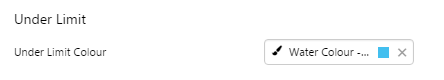
EXAMPLE: Changing the under limit colour of the status tile
|
 |
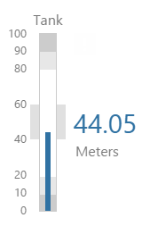
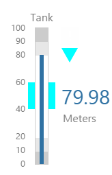
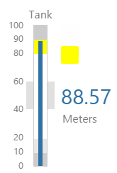
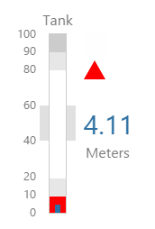
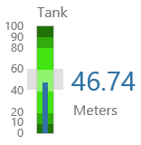
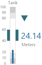
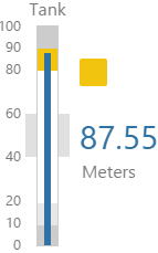
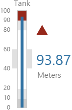
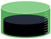
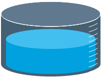
Tank
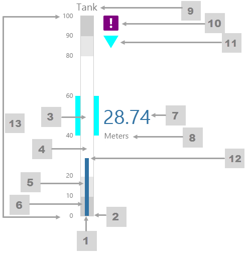
The screenshot below shows the Tank in display mode.
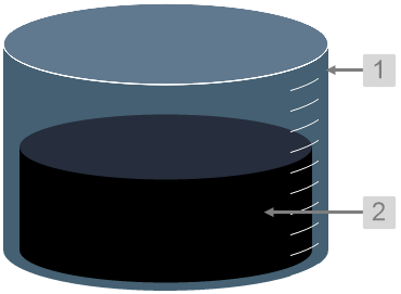 |
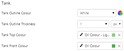
What You Can Change With the Tank you can change the colour of the tank and the thickness of the tank outline. 1. Tank: Style the outer container of the tank.
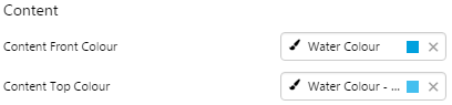
2. Content: Set the colour of the fill.
|
Examples
| Custom Style in Display Mode | Custom Style Properties |
|
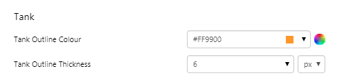
EXAMPLE: Changing the tank's outline
|
|
|
EXAMPLE: Changing the tank's container
|
 |
|
EXAMPLE: Changing the tank's fill
|
 |

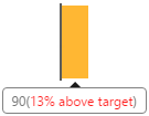
Target Bar
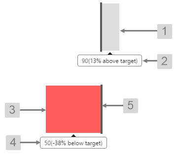
The screenshot below shows the Target Bar in display mode.
 |
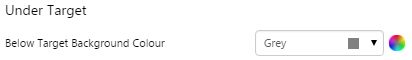
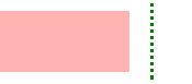
What You Can Change With the Target Bar you can change the colour of the bar when it is over or under target, and the target line. 1. Under Target: Set the colour of the bar when the value is below the target value.
2. Over Target: Set the colour of the bar when the value is above the target value.
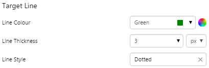
3. Target Line: Style the line indicating the target.
|
Examples
| Custom Style in Display Mode | Custom Style Properties |
|
EXAMPLE: Changing the bar colour for below target
|
|
|
EXAMPLE: Changing the bar colour for above target
|
 |
|
EXAMPLE: Changing the Target line
|
 |


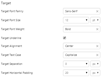
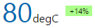
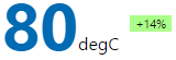
Target Label
The screenshot below shows the Target Label in design mode.
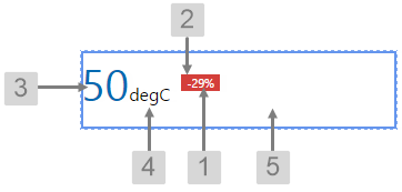 |
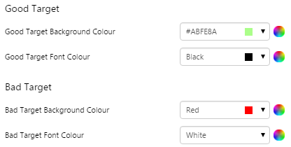
What You Can Change With the Target Label you can change both the text and label when it is over or under target. 1. Target: Style the text inside the label.
|
|
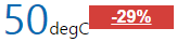
2. Good Target, Bad Target: Set the colour of the text and label when the value is above and below the target value.
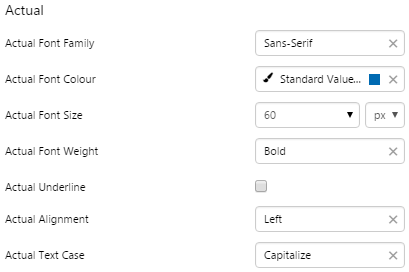
3. Actual: Style the text representing the actual value.
|
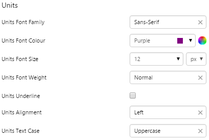
4. Units: Style the text representing the units of measure.
5. Alignment: Set the alignment of the Target Label within the cell and the offsets for padding.
|
Examples
| Custom Style in Display Mode | Custom Style Properties |
|
EXAMPLE: Changing the text inside the label, with generous horizontal padding but no separation between the label and units
|
|
|
EXAMPLE: Changing the colours of the label and label text for above and below target
|
 |
|
EXAMPLE: Changing the Actual text
|
 |
|
EXAMPLE: Changing the Units text
|
 |
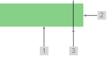
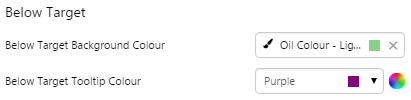
Target Variance Bar
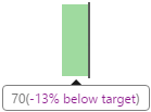
The screenshot below shows the Target Variance Bar in display mode.
 |
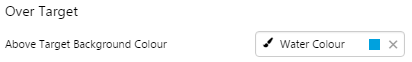
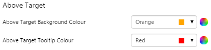
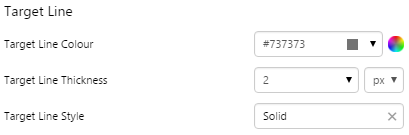
What You Can Change With the Target Variance Bar you can change the colour of the bar when it is over or under target, and the target line. 1. Above Target Background Colour: Set the colour of the bar when the value is above the target value. 2. Above Target Tooltip Colour: Set the colour of the tooltip when the value is above the target value. 3. Below Target Background Colour: Set the colour of the bar when the value is below the target value. 4. Below Target Tooltip Colour: Set the colour of the tooltip when the value is below the target value. 5. Target Line: Style the line indicating the target.
|
Examples
| Custom Style in Display Mode | Custom Style Properties |
|
EXAMPLE: Changing the bar and tooltip colours for below target
|
|
|
EXAMPLE: Changing the bar and tooltip colours for above target
|
 |
|
EXAMPLE: Changing the Target line
|
 |
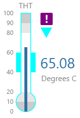
Temperature Meter
The screenshot below shows the Temperature Meter in display mode. The style properties are numbered and described in the table below.
|
What You Can Change 1. Meter Height: Set the meter height in pixels. 2. Meter Width: Set the meter width in pixels. 3. Meter Target Background Colour: Set the background colour for the target area. When the value is in a secondary alarm state, is bordered by a band in the alarm indicator secondary colour (see 11). 4. Meter Primary Background Colour: Set the background colour for the primary band areas. When the value is in a primary alarm state, these take on the alarm indicator primary colour (see 11). (Note: In the screenshot, the colour is transparent. ) 5. Meter Secondary Background Colour: Set the background colour for the secondary band areas. 6. Meter Tertiary Background Colour: Set the background colour for the tertiary band areas. When the value is in a tertiary alarm state, this takes on the alarm indicator tertiary colour (see 11). |
7. Value: Set the font properties, text case, and underlining of the value: Value Font Family, Value Font Colour, Value Font Size, Value Font Weight, Value Underline, Value Text Case 8. Units: Set the font properties, text case, and underlining of the units: Units Font Family, Units Font Colour, Units Font Size, Units Font Weight, Units Underline, Units Text Case 9. Label: Set the font properties, text case, and underlining of the label: Label Font Family, Label Font Colour, Label Font Size, Label Font Weight, Label Underline, Label Text Case 10. Data Indicator: The data indicator appears in a square background, as a cross if there is No Data Set the style properties to size, position and colours of the data indicator: Data Indicator Size, Data Indicator Y Offset, Data Indicator Background Colour, Data Indicator Foreground Colour 11. Alarm Indicator: The alarm indicator appears if the measured value is in an alarm state (primary, secondary or tertiary). The alarm indicator is a symbol with a fixed shape and styled colour, depending on whether it is primary (an inverted triangle Set the style properties to defined the size, position, and the colours for primary 12. Value Indicator: Set the size (width) and colour of the value indicator: Value Indicator Size, Value Indicator Target Colour 13. Limits: Set the style properties define the font properties, position, text case, and underlining of the limits: Limits Font Family, Limits Font Colour, Limits Font Size, Limits Font Weight, Limits Underline, Limits Text Case, Limits Y Offset |
Here are some examples of how the meter background colours change with the different alarm states. Note how the temperature meter's secondary and tertiary background colours change to the secondary and tertiary alarm colours, respectively. During a primary alarm state, the target area's envelope band changes to the primary alarm colour.
| No Alarm | Primary Alarm | Secondary Alarm | Tertiary Alarm |
 |
 |
 |
 |
Examples
| Custom Style in Display Mode | Custom Style Properties | ||
|
EXAMPLE: Small temperature meter, with green background colours |
|||
|
|
||
| EXAMPLE: Small, black-on-blue Data Indicator | |||
|
|
||
|
EXAMPLE: Large Alarm Indicator, coloured orange for Primary |
|||
|
|
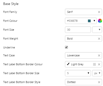
Text Label
The screenshot below shows the style properties of the Text Label in display mode. The component is aligned on a grid cell.
 |
What You Can Change Style the text, and the alignment. 1. Base Style: Style the text that appears in the text label.
2. Alignment: Align the Text Label by giving it X and Y co-ordinates, or by using an alignment option, such as Top-Left. In the screenshot, you can see the text label component in relation to the grid cell.
|
Example
| Custom Style in Display Mode | Custom Style Properties |
|
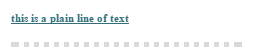
EXAMPLE: Styling the text and bottom border (note that the bottom border is on the component border)
|
 |
Wind Vane
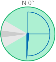
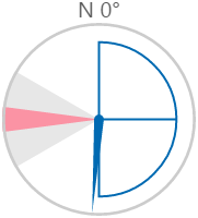
The screenshot below shows the style properties of the Wind Vane in display mode.
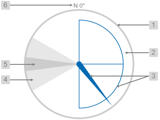 |
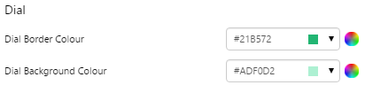
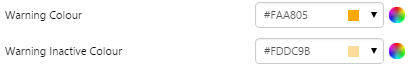
What You Can Change With the Wind Vane, you can change the colours of the dial and zones, and style the text. 1. Dial Border Colour: Change the colour of the outline of the dial. By default, this is grey. 2. Dial Background Colour: Change the colour of the background of the dial. By default, this is transparent. 3. Needle Colour: Change the colour of the needle and the min/max/average semi-circle. By default, this is blue. 4. Warning Colours: Change the colour of the Warning Zone. By default, this is light grey when inactive and yellow when active.
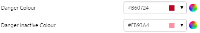
5. Danger Colours: Change the colour of the Danger Zone. By default, this is dark grey when inactive and red when active.
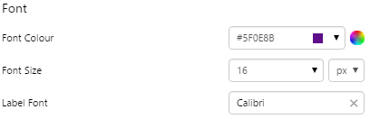
6. Font: Change the colour of the text indicating North.
|
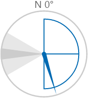
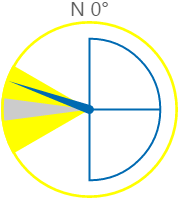
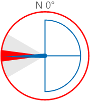
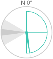
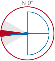
Here are some examples of how the wind vane colours change with the different states. During a warning or danger state, the dial outline and zone colours change to the corresponding warning or danger colour.
| Normal State | Warning State | Danger State |
 |
 |
 |
Examples
| Custom Style in Display Mode | Custom Style Properties |
|
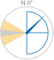
EXAMPLE: Styling the dial border and background colours
|
 |
|
EXAMPLE: Styling the needle and semi-circle colours
|
 |
|
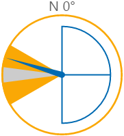
EXAMPLE: Styling the warning colours
|
 |
|
EXAMPLE: Styling the danger colours
|
 |
|
EXAMPLE: Styling the text
|
 |
Time
Current Date/Time Toggle
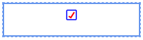
The screenshot below shows the style properties of Current Date/Time Toggle in design mode. The component is aligned in a grid cell.
 |
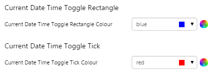
What You Can Change Change the colour of the toggle, and the alignment. 1. Current Date/Time Toggle Rectangle: Change the colour of the box.
2. Current Date/Time Toggle Tick: Change the colour of the tick.
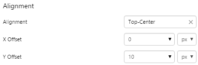
3. Alignment: Align the Current Date/Time Toggle by giving it X and Y co-ordinates, or by using an alignment option, such as Top-Left. In the screenshot, you can see the component in relation to the grid cell.
|
Examples
| Custom Style | Custom Style Properties |
|
EXAMPLE: Change the colour of the box and the tick
|
 |
|
EXAMPLE: Change the alignment of the control
|
 |
Date Picker
The screenshot below shows the style properties of Date Picker in design mode. The component is aligned in a grid cell.
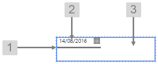 |
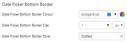
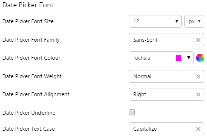
What You Can Change Change the font and bottom border of the Date Picker, and the alignment. 1. Date Picker Bottom Border: Change the border below the date.
2. Date Picker Font: Change the font that shows the date.
3. Alignment: Align the Date Picker by giving it X and Y co-ordinates, or by using an alignment option, such as Top-Left. In the screenshot, you can see the component in relation to the grid cell.
|
Examples
| Custom Style | Custom Style Properties |
|
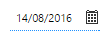
EXAMPLE: Change the bottom border
|
 |
|
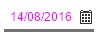
EXAMPLE: Change the font
|
 |
Date/Time Picker
The screenshot below shows the style properties of Date/Time Picker in design mode. The component is aligned in a grid cell.
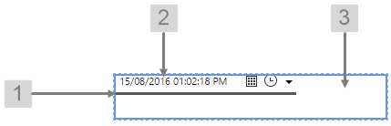 |
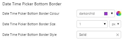
What You Can Change Change the font and bottom border of the Date/Time Picker, and the alignment. 1. Date Time Picker Bottom Border: Change the border below the date.
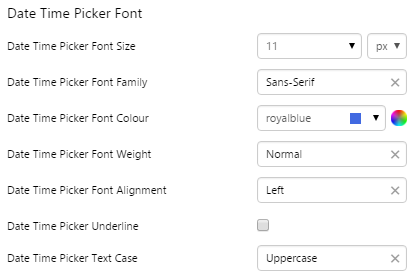
2. Date Time Picker Font: Change the font that shows the date.
3. Alignment: Align the Date/Time Picker by giving it X and Y co-ordinates, or by using an alignment option, such as Top-Left. In the screenshot, you can see the component in relation to the grid cell.
|
Examples
| Custom Style | Custom Style Properties |
|
EXAMPLE: Change the bottom border
|
 |
|
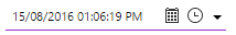
EXAMPLE: Change the font
|
 |
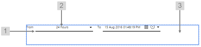
Date/Time Range Picker
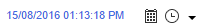
The screenshot below shows the style properties of Date/Time Range Picker in design mode. The component is aligned in a grid cell.
 |
|
|
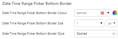
What You Can Change Change the font and bottom border of the Date/Time Range Picker, and the alignment. 1. Date Time Range Picker Bottom Border: Change the border below the date.
|
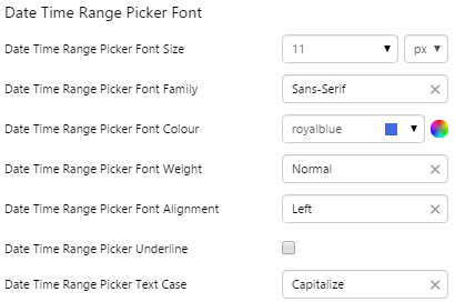
2. Date Time Range Picker Font: Change the font that shows the date.
3. Alignment: Align the Date/Time Range Picker by giving it X and Y co-ordinates, or by using an alignment option, such as Top-Left. In the screenshot, you can see the component in relation to the grid cell.
|
Examples
| Custom Style | Custom Style Properties |
|
EXAMPLE: Change the bottom border
|
 |
|
EXAMPLE: Change the font
|
 |
Duration Picker
The screenshot below shows the style properties of Duration Picker in design mode. The component is aligned in a grid cell.
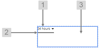 |
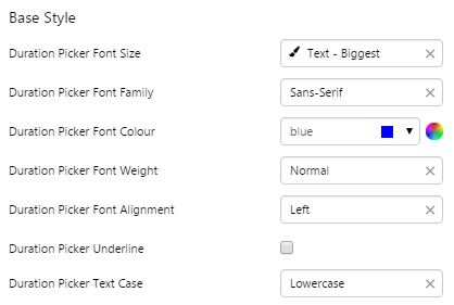
What You Can Change Change the font and bottom border of the Duration Picker, and the alignment. 1. Base Style: Change the font that shows the duration.
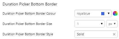
2. Duration Picker Bottom Border: Change the border below the duration.
3. Alignment: Align the Duration Picker by giving it X and Y co-ordinates, or by using an alignment option, such as Top-Left. In the screenshot, you can see the component in relation to the grid cell.
|
Examples
| Custom Style | Custom Style Properties |
|
EXAMPLE: Change the bottom border
|
 |
|
EXAMPLE: Change the font
|
 |
Month Picker
The screenshot below shows the style properties of Month Picker in design mode. The component is aligned in a grid cell.
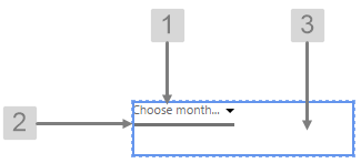 |
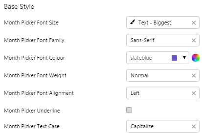
What You Can Change Change the font and bottom border of the Month Picker, and the alignment. 1. Base Style: Change the font that shows the month.
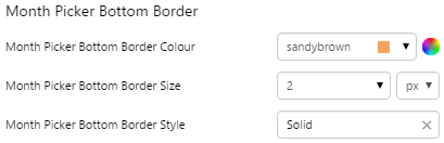
2. Month Picker Bottom Border: Change the border below the month.
3. Alignment: Align the Month Picker by giving it X and Y co-ordinates, or by using an alignment option, such as Top-Left. In the screenshot, you can see the component in relation to the grid cell.
|
Examples
| Custom Style | Custom Style Properties |
|
EXAMPLE: Change the bottom border
|
 |
|
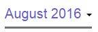
EXAMPLE: Change the font
|
 |
Tables
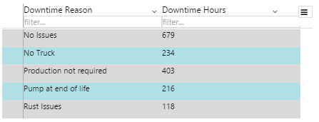
Data Table
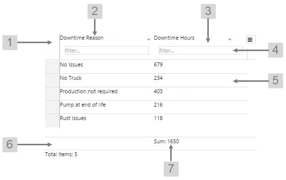
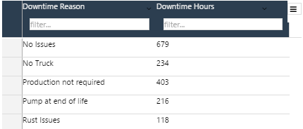
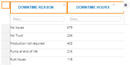
The screenshot below shows the Data Table in display mode.
 |
|
|
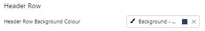
What You Can Change With the Data Table you can change the background and text appearance, in all rows. 1. Header Row: Style the colour of the header row. Includes both the column heading and the filter.
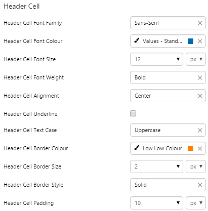
2. Header Cell: Style the appearance of the text for the column headings.
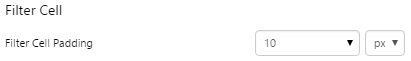
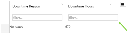
3. Filter Cell: Set the spacing around the filter box.
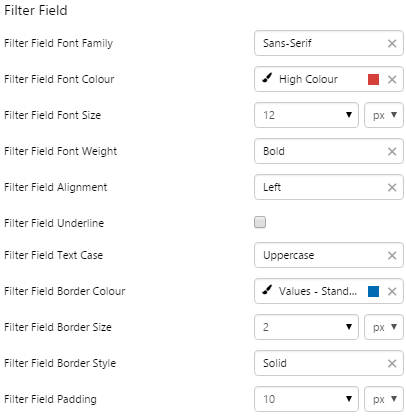
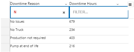
4. Filter Field: Style the appearance of the cells.
|
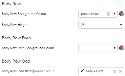
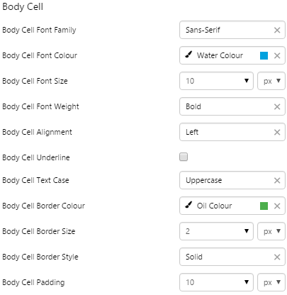
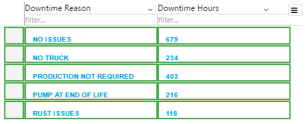
5. Body Row, Body Row Odd, Body Row Even, Body Cell: Style the appearance of the rows and text in the table. See example below for colours.
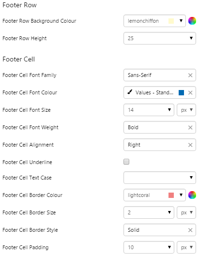
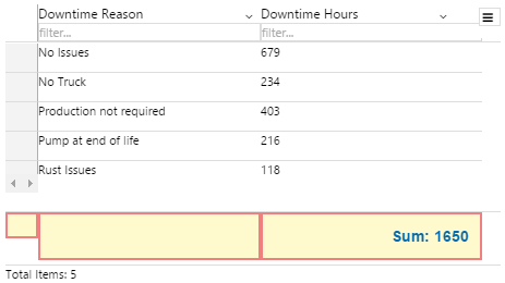
6. Footer Row: Style the appearance of the row containing the aggregation.
7. Footer Cell: Style the aggregation text.
|
Examples
| Custom Style in Display Mode | Custom Style Properties |
|
EXAMPLE: Changing the header background
|
|
|
EXAMPLE: Changing the text and borders in the header row
|
 |
|
EXAMPLE: Changing the padding around the filter cell
|
 |
|
EXAMPLE: Changing the text and borders in the filter field
|
 |
|
EXAMPLE: Changing the colours of the rows - note that Body Row Background Colour will not show if both Body Row Even and Body Row Odd are set
|
 |
|
EXAMPLE: Changing the body cell text and borders
|
 |
|
EXAMPLE: Changing the footer cell colour, text and borders
|
 |
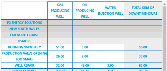
Pivot Table
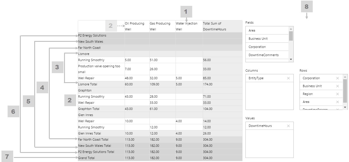
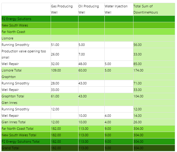
The screenshot below shows the Pivot Table in display mode.
 |
|
|
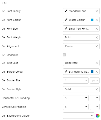
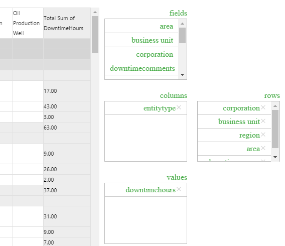
What You Can Change Because the Pivot Table can have several levels, its helpful to give these different background colours so that its easy to see subtotals at a glance. As well as being able to style these background colours, you can style the cell text appearance, and also the configuration panel. 1. Cell: Style the font and border style of all cells in the table.
2. Cell Background Colour: Style the background colour for the column headers and for all detail cells (the lowest level in the pivot table). If more than five levels are used in the pivot table, the higher levels (six and up) take on this property as well.
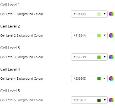
3. Cell Level 1: Style the background colour for level 1, and also for detail row sub-totals.
|
4. Cell Level 2: Style the background colour for level 2.
5. Cell Level 3: Style the background colour for level 3.
6. Cell Level 4: Style the background colour for level 4.
7. Cell Level 5: Style the background colour for level 5.
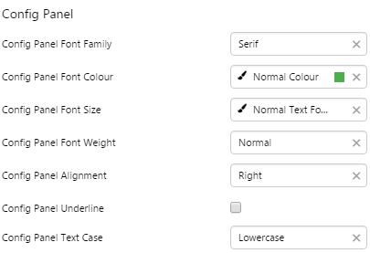
8. Config Panel: Style the configuration panel.
|
Examples
| Custom Style in Display Mode | Custom Style Properties |
|
EXAMPLE: Styling the cell level background colours
|
|
|
EXAMPLE: Styling the cell text and borders
|
 |
|
EXAMPLE: Styling the Configuration Panel
|
 |
Layouts
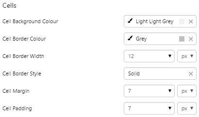
Grid Layout
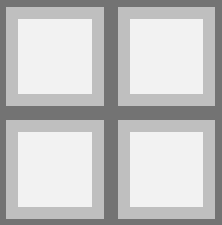
The screenshot below shows the Grid Layout in design mode.
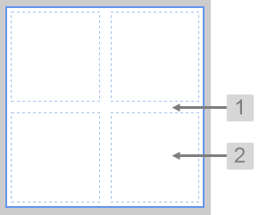 |
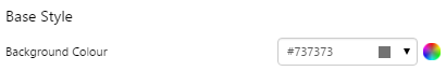
What You Can Change With the Grid Layout you can change the background colour and styles relating to the cells. 1. Base Style: Style the page background.
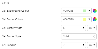
2. Cells: Style the appearance of the cells.
|
Examples
| Custom Style in Display Mode | Custom Style Properties |
|
EXAMPLE: Changing the page background
|
|
|
EXAMPLE: Changing the appearance of the cells
|
 |

Precision Layout
The screenshot below shows the Precision Layout in design mode, with a component added to show the cell.
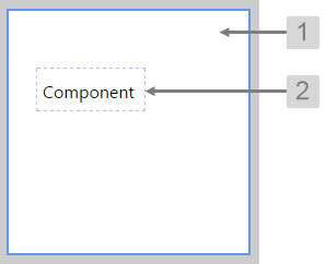 |
What You Can Change With the Precision Layout you can change the background colour and styles relating to the cells containing the added components. 1. Base Style: Style the page background.
2. Cells: Style the appearance of the cells.
|
Examples
| Custom Style in Design Mode | Custom Style Properties |
|
EXAMPLE: Changing the page background
|
|
|
EXAMPLE: Changing the appearance of the cells
|
 |
Controls
Combo Box
The screenshot below shows the style properties of Combo Box in display mode. The component is aligned on a grid cell.
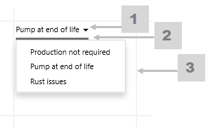 |
What You Can Change Style the base text, the border between the selected option and the list of options, and the aligment. 1. Base Style: Style the text that appears above the line (the Selected Option).
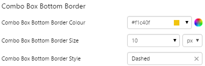
2. Combo Box Bottom Border: Style the line that separates the Selected Option from the list of values.
3. Alignment: Align the Combo Box by giving it X and Y co-ordinates, or by using an alignment option, such as Top-Left.
|
Examples
| Custom Style in Display Mode | Custom Style Properties |
|
EXAMPLE: Styled bottom border
|
 |
|
EXAMPLE: Aligned middle center
|
 |
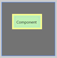
Hotspot
The screenshot below shows the style properties of the Hotspot in design mode. The component is normally used on a Precision Layout.
 |
What You Can Change With the Hotspot, you can style the border and the background; these are only visible in design mode. 1. Border: The colour, width, and style of the border.
2. Background: Style colour of the background that appears in design mode.
|
Examples
| Custom Style in Design Mode | Custom Style Properties |
|
EXAMPLE: Border Colour
|
 |
|
EXAMPLE: Border Width
|
 |
|
EXAMPLE: Border Style
|
 |
|
EXAMPLE: Background Colour
|
 |
Selection List
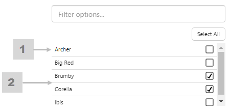
The screenshot below shows the style properties of the Selection List in display mode.
|
|
1. Base Style Style the text that appears in the list. 2. Selection List Separator Style the line that separates the items. |
Example
| Custom Style in Display Mode | Custom Style Properties |
|
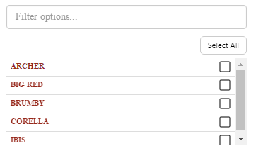
EXAMPLE: Stylised font for the list items
|
 |
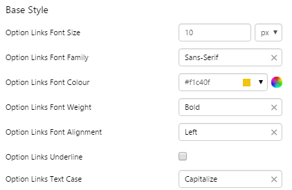
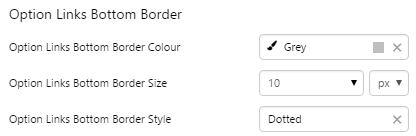
Option Links
The screenshot below shows the style properties of Option Links in display mode. The component is aligned on a grid cell.
 |
What You Can Change Style the base text, the line below the selected option, and the alignment. 1. Base Style: Style the text that appears below the Selected Option.
2. Option Links Bottom Border: Style the underline of the Selected Option.
3. Alignment: Align the Option Links Box by giving it X and Y co-ordinates, or by using an alignment option, such as Top-Left.
|
Examples
| Custom Style in Display Mode | Custom Style Properties |
|
EXAMPLE: Styled base style
|
 |
|
EXAMPLE: Styled Bottom Border: grey, dotted, thick
|
 |
Text Input
The screenshot below shows the style properties of the Text Input in display mode. The component is aligned on a grid cell.
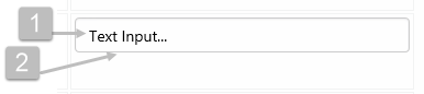 |
What You Can Change Style the text, and the alignment. 1. Base Style: Style the text that appears in the text input.
2. Alignment: Align the Text Input by giving it X and Y co-ordinates, or by using an alignment option, such as Top-Left. In the screenshot, you can see the text input component in relation to the grid cell.
|
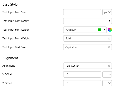
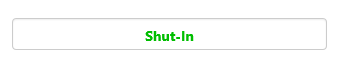
Example
| Custom Style in Display Mode | Custom Style Properties |
|
EXAMPLE: Styling the text and alignment
|
 |
Simple Shapes
Simple Line
The screenshot below shows the style properties of Simple Line in display mode. The component is aligned on a grid cell.
 |
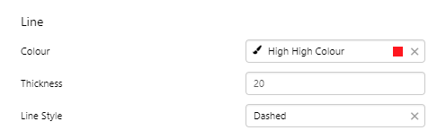
What You Can Change Style the line. The directions and corners are applied in design time. Line: Style the line colour and thickness.
|
Example
| Custom Style in Display Mode | Custom Style Properties |
|
EXAMPLE: Two styled simple lines
|
 |