This article describes how to add a Date Picker control to a page during the page design process. For details on how to use the Date Picker during run time, see: Using Time Pickers.
Overview
The Date Picker is used to select a date for which to retrieve data. The date is usually a 24-hour time range (midnight to midnight), but can be configured to start and end at a different time (e.g. 1am to 1am), or can even be shorter than 24 hours (e.g. 1am to 1pm).
The following diagram shows a typical Date Picker being configured:
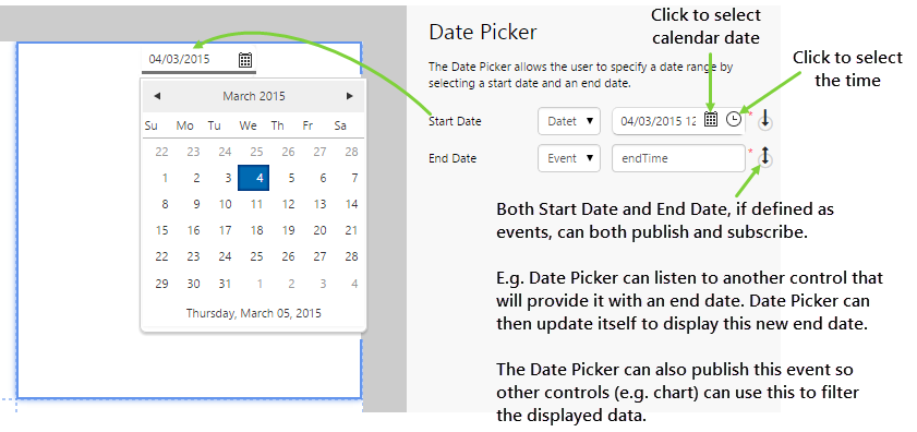
| Start Date: | The date that is displayed on the control in live mode, representing the beginning of the time range. This is used to set the date on the control when the page is first loaded. You can choose the date and time separately, however it's normally used to specify a time period of midnight-midnight. If defined as an event, Start Date can both publish the event or subscribe to an event. |
| End Date: | The finish of the date range, which should be at most 24 hours after the start date. If this is more than 24 hours from the start date, the end date is ignored and it defaults to 24 hours later. If defined as an event, End Date can both publish the event or subscribe to an event. |
Tutorial
The Date Picker is a useful control that enables users to change the type of data that is returned to other controls on a page.
In this tutorial, we'll look at adding a Date Picker that will change what is displayed on a chart as the user selects different dates.
Let's go through this process, step-by-step.
Step by Step: Creating a Date Picker that Drives a Line Chart
Before you start, open a new tab in Explorer and click the “Create a New Page in Studio Mode” thumbnail. Choose the grid layout - you can adjust the rows and columns if you like but it's not important for this exercise.
If you have access to the training environment, you can follow the steps exactly as outlined here. Otherwise, you will need to adjust the configuration to suit your data.
Step 1. Add the Date Picker to the page
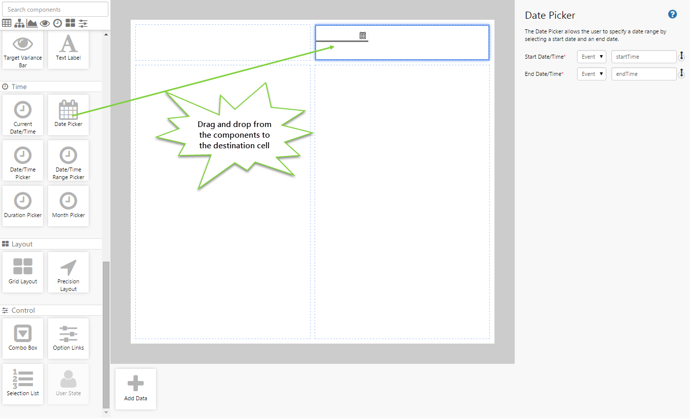
Drag and drop the Date Picker control onto a grid cell.
Step 2. Configure the Date Picker
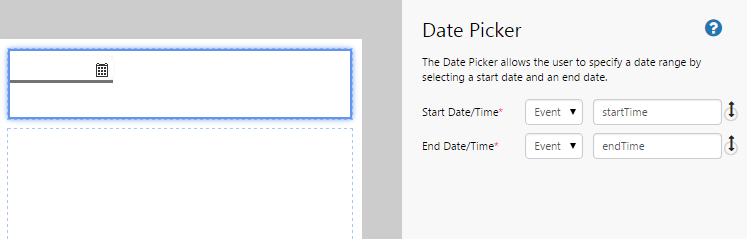
By default, the Date Picker uses events to configure all its options. In fact, you'll notice that the events all come preconfigured with event names. This is because these events are so often used, and by other controls on the page, that it's often unnecessary to bother changing the names.
It's best to leave the names as is, but you can change them if you want. If you do change them, you'll need to remember this for the next steps.
Step 3. Create the events
This step provides the hooks for the Date Picker to send and receive signals (events) to and from other controls on the page.
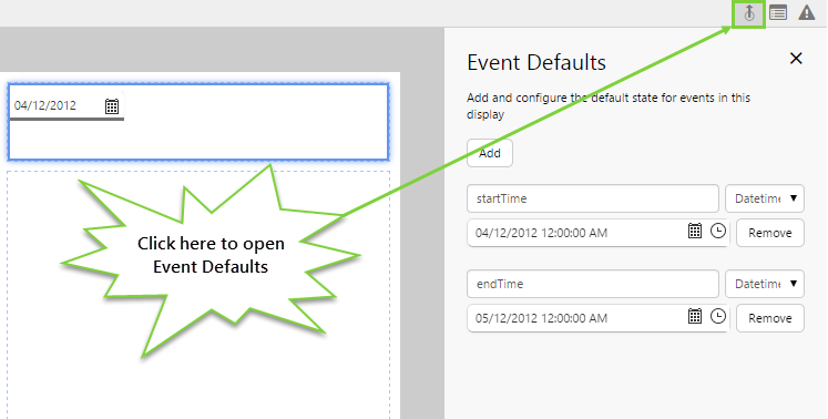
- Click the Event Defaults button on the far right side of the Studio toolbar.
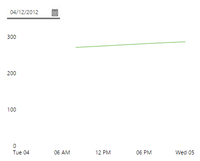
- Create an event called "startTime" with a datetime set to 4 December 2012.
- Create an event called "endTime" with a datetime set to 5 December 2012.
You can create an event at any time. In creating these events, we make them available not only to the Date Picker, but also to any other controls we may want to place on the page.
Click the preview  button on the Studio toolbar to see what your page will look like in run-time. Observe that the Date Picker displays a calendar starting at 4 December 2012.
Step 4. Add and Configure Source Data
Date Pickers don't normally do anything by themselves - you use them to drive other controls. Ultimately, we want the Date Picker to change the returned data depending on what date the user selects. Click the preview button again to switch back to edit mode, and add some data that we will use to return data to a chart.
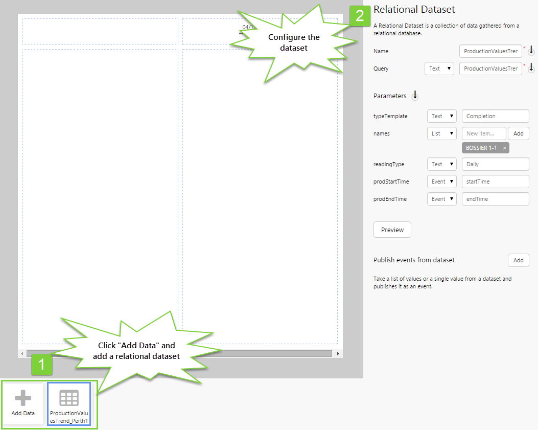
- Add the ProductionValuesTrend_Perth dataset, and configure it as follows:
- typeTemplate: (Text) Completion
- names: (List) BOSSIER 1-1
- readingType: (Text) Daily
- prodStartTime: (Event) startTime
- prodEndTime: (Event) endTime
As you can see, you need a degree of familiarity with the dataset to know what the parameters mean. In this dataset, we have 2 parameters that can listen to events published by the Date Picker: prodStartTime and prodEndTime. This is what ultimately causes the chart to change when the user selects different dates.
Step 5. Add and configure the chart
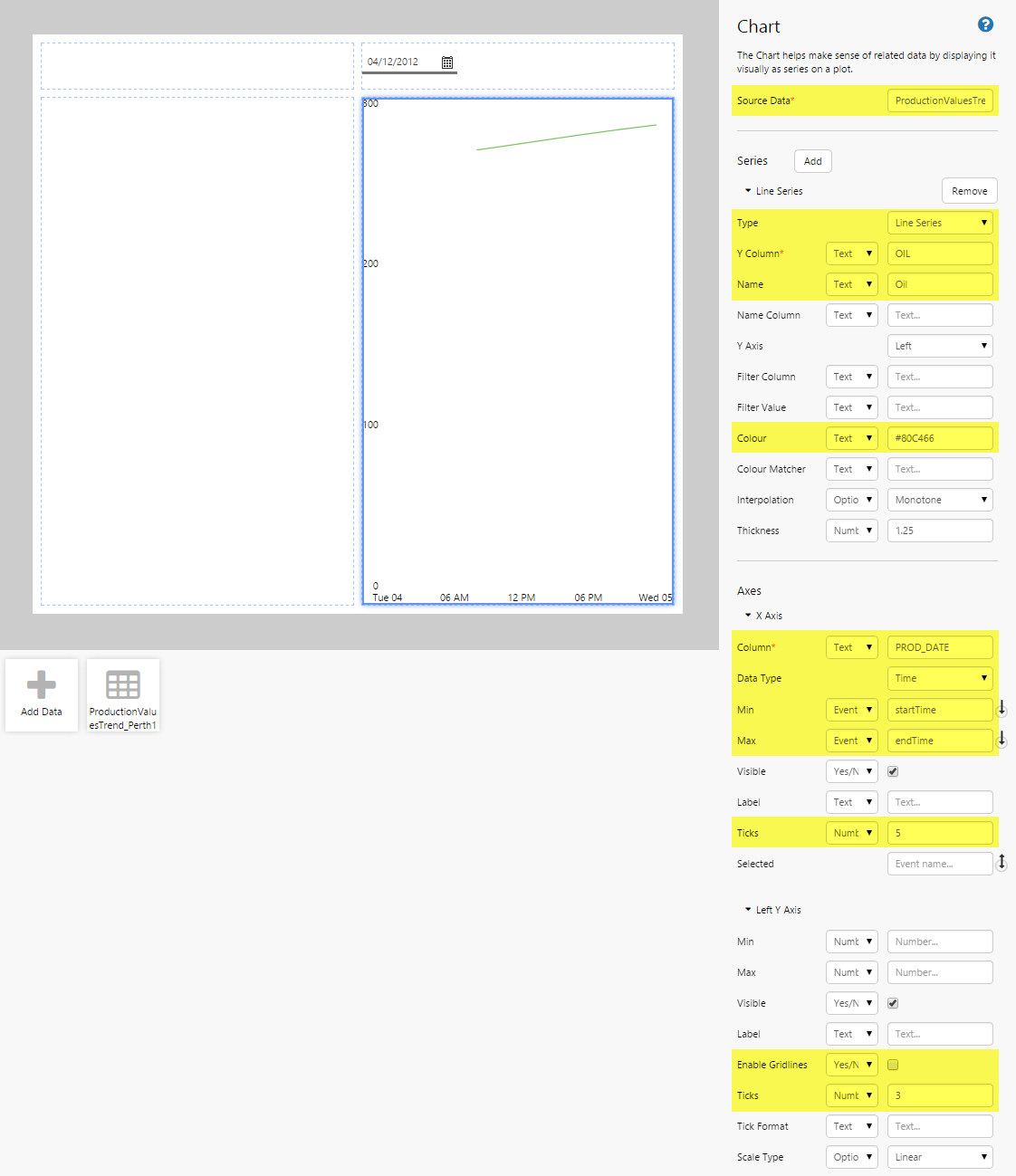
Let's add a chart that will make use of the Date Picker. Drag and drop a Chart onto another cell on the page. Configure the line chart as follows:
- Source Data: ProductionValuesTrend_Perth1
- For the chart series:
- Type: Line series
- Y Column: (Text) OIL
- Name: (Text) Oil
- Colour: (Text) #80C466
- For the X Axis:
- Column: (Text) PROD_DATE
- Data Type: Time
- Min: (event) StartTime
- Max: (event) EndTime
- Ticks: 5
- For the Left Y Axis:
- Enable Gridlines: No
- Ticks: 3
Step 4. All Done!
Congratulations! You now have a fully functioning Date Picker that drives a line chart.
- Click the preview button on the Studio toolbar to see what your page will look like in run-time.
- When the Date Picker first loads, the chart displays data for the corresponding default date.
- Try changing the date to see what happens.
 Don't forget to save your page!