ON THIS PAGE:
Overview
The Target Label shows two values side by side: a numeric value and a percentage of the value in relation to a target value.
The percentage value is shown using a background colour that changes depending on how much it varies from its target. By default, the bar is red when the value is below the target, or grey when the value is at or above the target value.
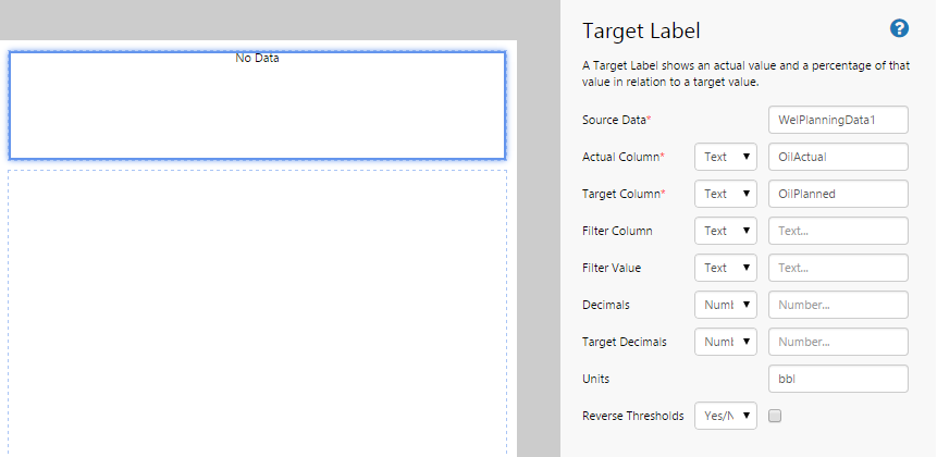
The following diagram shows a Target Label being configured:
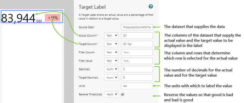
| Source Data: | The dataset from which the values are obtained. |
| Actual Column: | The column from the dataset that determines the actual value. |
| Target Column: | The column from the dataset that determines the Target value. |
| Filter Column: |
The column of the dataset that provides the values that will be assessed. This is used in conjunction with the Filter Value. |
| Filter Value: | The row of the dataset that provides the values that will be assessed. |
| Decimals: | The number of decimal points that the actual value should be displayed as. |
| Target Decimals: | The number of decimal points that the target should be displayed as. |
| Units: | Type some text that represents the units that the value is expressed in. |
| Reverse Thresholds: | Invert the thresholds so that above target is considered bad and below target is considered good. |
Tutorial
The Target Label is a useful component to display levels. In this topic, we’ll show you how to use the Target Label to display actual vs target production data for a selected well. This is often used in production summary reports.
Let’s look at how we’re actually going to do this, step-by-step.
Step by Step: Creating a Target Label That Displays Target vs Actual Data
Before you start, open a new tab in Explorer and click the “Create a New Page in Studio Mode” thumbnail. Choose the grid layout – you can adjust the rows and columns if you like but it’s not important for this exercise.
You will need to adjust the configuration to suit your data at your site.
Step 1. Add the source data
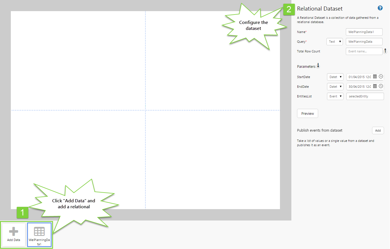
Before we can display any data on the page, we need to add the source data.
- Below the canvas, click the button labelled “Add Data“.
- Choose the data you are going to use. For this tutorial, we are using a dataset called “WelPlanningData”.
- In the configuration options, specify the following:
- Name: WelPlanningData1 (this is automatically added)
- Query: WelPlanningData (this is the query in P2 Server that is being used to return the data)
- StartDate: (Datetime) 01/04/2015 12:00:00 AM
- EndDate: (Datetime) 30/04/2015 12:00:00 AM
- EntitiesList: (Event) selectedEntity
Step 2. Add the Target Label
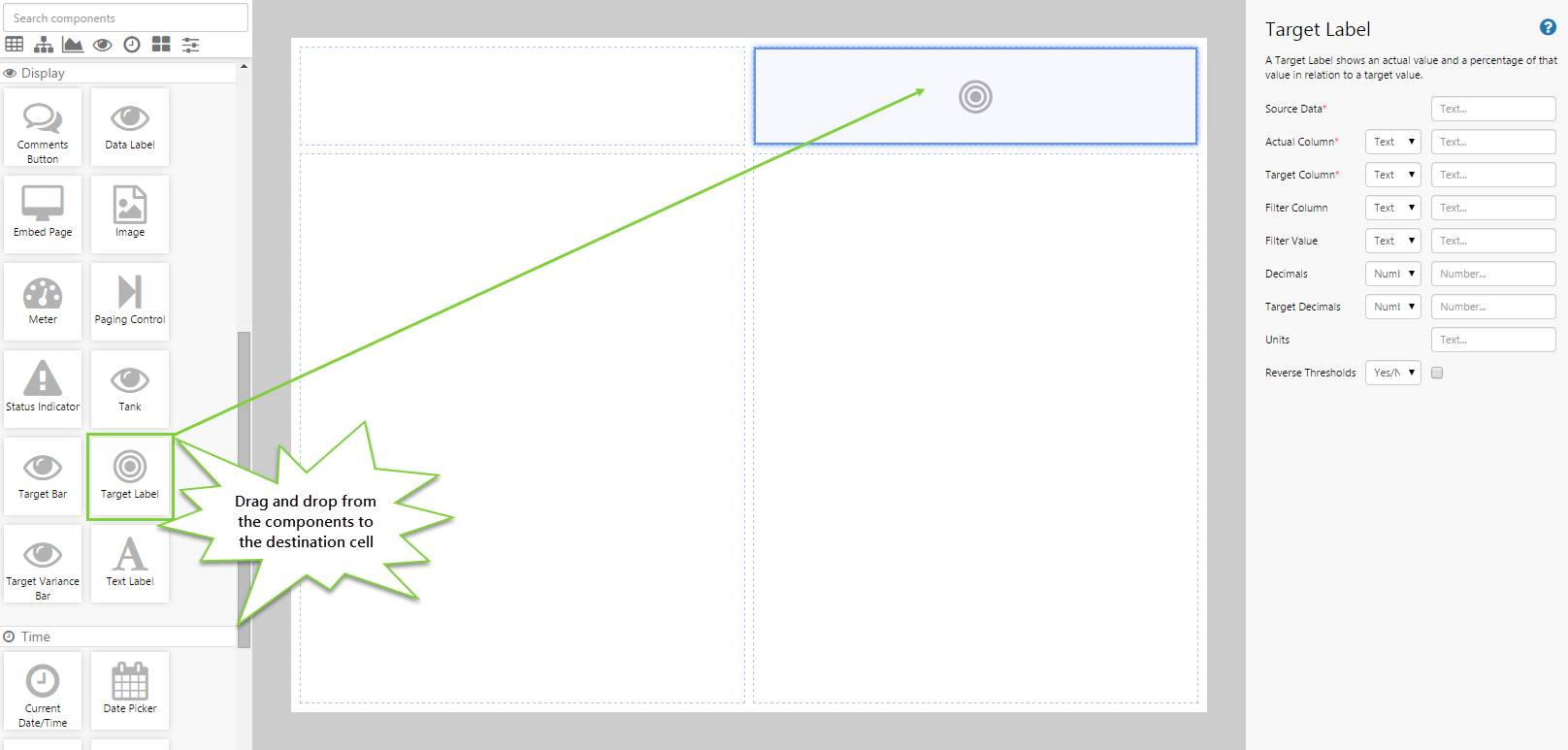
Drag and drop the Target Label component onto a grid cell.
Step 3. Configure the Target Label
Configure the Target Label as follows:
- Source Data: WelPlanningData1
- Actual Column: (Text) OilActual
- Target Column: (Text) OilPlanned
- Units: bbl
Step 4. Add the Entity Selector
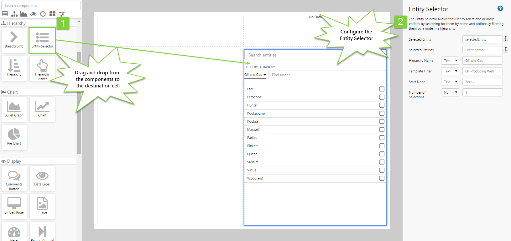
This step allows the user to select an entity, which will drive the meter indicator and measures.
- Drag and drop the Entity Selector control onto the canvas.
- Configure it as follows:
- Selected Entity: selectedEntity
- Selected Entities: (blank)
- Hierarchy Name: (Text) Oil and Gas
- Template Filter: (Text) Oil Producing Well
- Number of Selections: 1
Step 5. All done!
Congratulations! You now have a Target Label that will show you actual vs target oil production for a selected well.
- Click the preview
 button on the Studio toolbar to see what your page will look like in run-time.
 - Select entities and observe the changes in the target label values and colours.
![]() Don’t forget to save your page!
Don’t forget to save your page!