ON THIS PAGE:
Explorer charts display data in a variety of ways. Chart types and configurations are chosen by the page designer. This article describes some of the ways your data is displayed in the various chart types, and how you can interact with them.
Discrete vs Continuous Charts
Explorer Charts can be used to represent continuous data or discrete data.
Discrete Charts show chunks of data, across discrete x-axis values (e.g. physical locations, time periods such as days or months, or products types). The bar chart is often used to represent discrete data.
Continuous Charts show data over x-axis points that usually represent a timeline or numbers. The line chart is often used to represent continuous data.
Discrete charts offer different interaction options to continuous charts.
Types of Charts
The type of Explorer chart is chosen by the page designer to display your data most effectively.
|
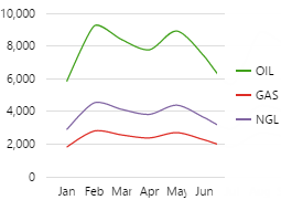
Line Chart: The line chart plots your data in a line. The line chart is typically used to show trends in data, and is also the type of chart that is used in Explorer trends. |
 |
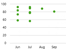
Scatter Chart: This chart displays each value as a dot, and is often used to highlight statistical distributions. In this example, downtime hours are shown as a dot. You can easily see the clustering of downtime events (lots of dots) in June and July. |
 |
|
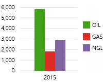
Bar Chart: The bar chart has rectangular bars (shown horizontally or vertically), where the length of each bar is proportional to its value. This type of chart is often used for comparing discrete values for separate entities. |
 |
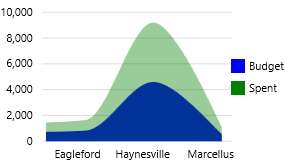
Area Chart: The area chart is a line chart with the area below the line filled in with a colour. As shown in the screenshot, you can have more than one area on a single chart. These are usually opaque in case there are overlaps. |
 |
|
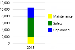
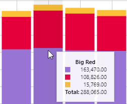
Stacked Bar Chart: This chart has one or more bar charts which stack to form single bars. This is often used for values that make sense as cumulative amounts, such as the downtime hours shown here. |
 |
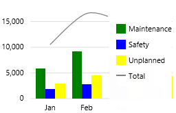
Combined Charts: Charts can be made up of a variety of charts, such as a bar chart with line, or line chart with a scatter chart. This chart shows separate bars for the different downtime reasons, with a line showing the total. |
 |
Features of a Chart
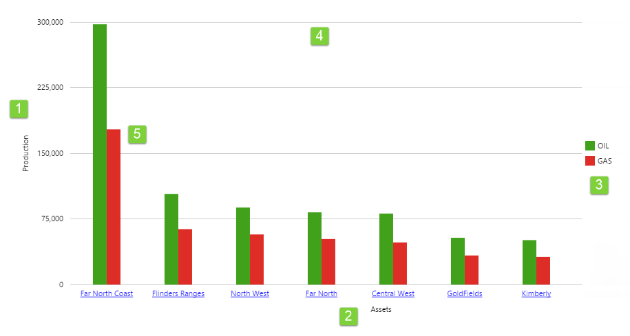
| 1. Y-axis:
Usually the chart has a single vertical y-axis on the left. The values along this axis sometimes also show formatting symbols such as a $ sign. Often there is a label as well. Sometimes the vertical axis is on the right, or there may be two separate axes, as shown in Interacting with Separate Y Axes. If the chart is oriented to be horizontal, then this axis will be shown horizontally below or above the chart data. |
2. X-axis:
The x-axis is the principal axis containing the values against which other values are then measured. For discrete charts, the x-axis may also contain links that open another page, trend, or URL. If the chart is oriented to be horizontal, then this axis will be shown vertically to the left of the chart data. |
3. Legend:
The legend has colours and labels corresponding to the different series on the chart. The legend can be located to the right of the chart, below the chart, or at the top of the chart.
|
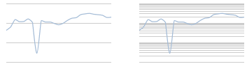
| 4. Grid lines:
Grid lines (when supplied) make it easier to estimate values above the various chart series. Grid lines may be horizontal, vertical, or both. If the chart has a logarithmic scale, the grid lines will have different spacing:
|
5. Chart data:
The chart data represents the values of the set of data. For a description of the available chart types, see Types of Charts. |
Interacting with Separate Y Axes
Sometimes your chart data might have two separate Y axes, such as when the range of applicable numbers varies greatly.
Interacting with Discrete Charts
Discrete charts show distinct values along the x-axis. The interactions available for discrete charts depend on how they are configured. For example, you might be able to hover over a series, click on the data, or click the x-axis.
Hover
Discrete charts will usually (but not always) have tooltips enabled. When you hover over the chart data, the corresponding zone along the x-axis is highlighted and a tooltip will appear. The tooltip shows the x-axis value as the heading inside the tooltip, as well as a legend showing the data values.
Click on the Chart
Some charts are interactive; you can click on a series and something else on the page is affected (e.g. the label above the chart displays the selected year).
Click the X-axis
Some charts are configured so that clicking the x-axis updates variables on the page.
Other charts are configured so that the x-axis opens a page, trend, or other website. Sometimes, the value of the x-axis will be passed into the link, so for example you could view another page configured to show other data of the same type.
Interacting with Continuous Charts
Continuous charts can be configured to show a variety of interaction options. The interactions available depend on how they are configured. For example, you might be able to right-click on the data, click on the chart, add comments, or drag to select a range.
Right Click
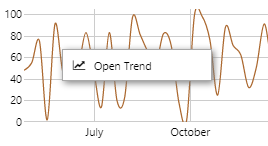
If the chart displays time series data, the Open Trend menu becomes available when you right-click on it. Click the Open Trend menu item to view the chart's data in an Explorer Trend.
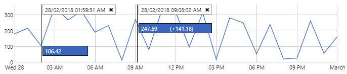
Click
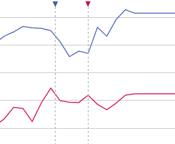
If enabled, you can often click on a continuous chart to see a hairline. A hairline shows the value of a data point at the x-axis position that you click. The hairline displays a timestamp and the value of each series on the chart.
Depending on how it has been configured, you may be able to click multiple times to add multiple hairlines.
Sometimes, a chart may be configured to allow the user to add a comment. Comments are observations made at a point in time that users can associate with a particular tag, entity, or entity attribute.
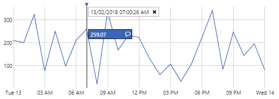
When comments are enabled on a chart, a symbol ![]() in the hairline indicates that you can click it to add a comment at that point in time. When you add a comment, a comment marker is also added to the chart.
in the hairline indicates that you can click it to add a comment at that point in time. When you add a comment, a comment marker is also added to the chart.
View and Add Comments
If a comment has been added, this is shown by a coloured comment marker ![]() on the chart itself, at the point in time when the comment was added. The comment marker has the same colour as the series it represents. You can click the symbol to see the comments and add additional ones.
on the chart itself, at the point in time when the comment was added. The comment marker has the same colour as the series it represents. You can click the symbol to see the comments and add additional ones.
Range Selector
Sometimes a chart can be configured to act as a range selector. Range selectors allow you to focus on a particular section of a chart by dragging on it, and can be used to select a time (or number) range. Range selectors are often used in linked charts, and allow data points in the linked chart to be highlighted.
Release History
- Viewing Charts 4.6.2
- Charts can be configured so that page variables are set when the X-axis is clicked.
- Viewing Charts 4.5.5
- Hairlines, tooltips, and comment markers have changed.
- Viewing Charts 4.5.2
- Only series with an explicitly defined name will appear in the legend.
- Null values are now rendered as a gap in the chart.
- Viewing Charts 4.4.6
- The component has a menu for options to view details, view a trend, or write to a tag.
- Viewing Charts 4.4