ON THIS PAGE:
Overview
Explorer charts display data from Explorer's datasources in a variety of ways. There are many different options for displaying your data in the most meaningful manner - chart types and configurations are chosen by the page designer.
This article describes some of the ways your data is displayed in the various chart types: chart, pie chart, bullet graph and treemap.
Chart
An Explorer chart is made of one or more series, chosen by the page designer to display your data most effectively.
| Line Series: | The line series plots your data in a line. | 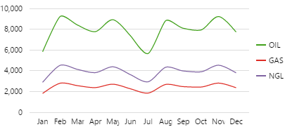 |
The line chart is typically used to show trends in data, and is also the type of chart that is used in Explorer trends. |
| Bar Series: | A chart with rectangular bars, where the length of each bar is proportional to its value. | 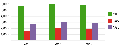 |
This type of chart is ideal for comparing discrete values, for separate entites - often with periods on the X axis.
As shown in this screenshot, you can also compare completely different values, such as two or three products, or budget versus actual. |
| Stacked Bar Series: | This chart has one or more series containing bar charts which stack vertically to form single bars. | 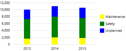 |
This is a good chart for values that make sense as cumulative amounts, such as the downtime hours shown in the screenshot. |
| Area Series: | The area chart is a line chart with the area below the line filled in with a colour. | 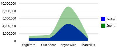 |
As shown in the screenshot, you can have more than one area on a single chart. These are usually opaque in case there are overlaps. |
| Dot Series: | This chart displays each point as a dot, and is typically used to highlight statistical distributions. | 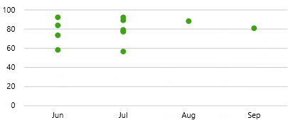 |
For example, the chart here shows downtime hours as points, with downtime shown as a dot. You would be able to tell immediately if there was a clustering of downtime events (lots of dots), in this case in June and July. |
| Combined Series: | Charts can be made up of a variety of series, for example bar chart with line, or line chart with a dot series. |  |
This chart shows separate bars for the different downtime reasons, with a line showing the total. |
Features of a Chart:
| 1. Vertical axis:
Usually the chart has a single vertical axis on the left. This can be formatted (for example, showing a $ sign here). Often there is a label as well. Sometimes the vertical axis is on the right, or there may be two separate axes, as shown in the video that follows. |
2. Grid lines:
Grid lines (when supplied) make it easier to estimate values above the various chart series. |
3. A selected group of bars (selected year: 2014):
Some charts, such as this one, are interactive: you can click on a series and something on the page is affected (in this example, the label above the chart displays the selected year: 2014) |
| 4. Hovered-over group of bars (year: 2015):
Hover over a point on the chart (above the horizontal axis), to show a tooltip with the horizontal label, as well as the vertical values with legends. |
5. Chart label:
The horizontal label desribes the chart. Sometimes labels are supplied on the vertical axes as well (as in the video that follows). |
6. Legend:
The legend has colours and labels corresponding to the different series. |
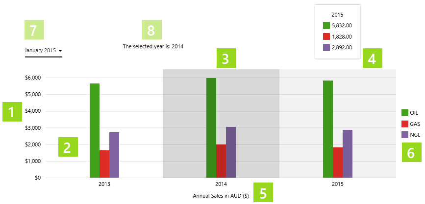 |
| 7. Chart data interaction:
This month picker interacts with the chart. Chart data is for three years leading up to the selected year from the Month Picker. |
8. Label showing selected year:
This additional label is displaying the year that's been selected in the chart. |
Separate Vertical Axes
Sometimes your chart data might have two separate axes, for example when the range of applicable numbers varies greatly.
Watch the video below to see how you can select the left (Expenses) or right (Hours) Y-Axis, by hovering over the axis.
Pie Chart
The pie chart is a circular chart divided into sectors. Each sector represents a different value, and is sized in proportion to that sector's percentage of the sum of values.
Features of the pie chart:
|
|
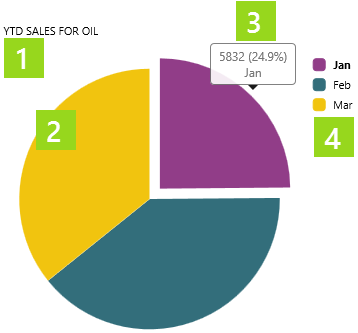
Watch the video below to see how the pie chart sections interact when different months and products are selected, and how a selected pie section changes the bar chart below.
Bullet Graph
The bullet graph is similar to the target bar; for the selected entity it compares three different performance thresholds to a target. These thresholds are part of the datasource data.
Features of the bullet graph:
|
|
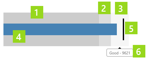
Watch the video below to see the different values that are displayed for the various bands and the target line, on the bullet graph.
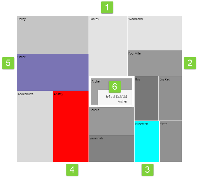
Treemap
The Treemap shows relative values of numeric data as rectangles of different sizes, with an additional dimension represented by colour coding. So the size of the rectangular regions represent one dimension (e.g. oil produced) while the colours represent another dimension (e.g. water produced). Here is how to interpret the Treemap.
Note that the colours below represent the default out-of-the-box colours for the Treemap. These may change if your Explorer Administrator has configured something different.
You can hover over a region to see the tooltip. If configured, clicking on a region can update other elements on the page.
|
1. Light Grey: Regions of light grey mean that the value of the data that determines colour, is approaching the minimum value specified in the configuration. |
4. Red: Regions with a red colour mean that the value of the data that determines colour, is lower than the minimum value specified in the configuration. |
|
2. Dark Grey: Regions of dark grey mean that the value of the data that determines colour, is approaching the maximum value specified in the configuration. |
5. Purple: If regions have been aggregated or combined, they are represented by a purple colour. |
|
3. Cyan: Regions with a cyan colour mean that the value of the data that determines colour, is higher than the maximum value specified in the configuration. |
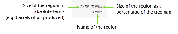
6. Tooltip: Hover over a region of the Treemap to see a tooltip. The tooltip displays the value of the size, and the percentage of the total treemap.
|
Release History
New in this release (4.4.6):
- The component now has a menu for options to view details, view a trend, or write to a tag.
- Viewing Charts 4.4